User Experience and Animations in SwiftUI app | Todo List #5
Summary
TLDR在这段视频中,Nick 带领观众构建了一个 Swift UI 待办事项应用程序,并专注于提升用户体验。当待办事项列表为空时,屏幕显得过于空白,Nick 通过添加一条消息来告知用户列表为空,并鼓励他们添加新项目。此外,他还为应用程序添加了动画效果,使界面看起来更加酷炫。Nick 展示了如何在 Xcode 中创建一个新的 SwiftUI 视图,称为“无项目视图”,并详细说明了如何使用滚动视图、文本、导航链接和按钮来设计这个视图。他还介绍了如何利用状态变量和 `.onAppear` 修饰符来实现动画效果,包括颜色变化、按钮大小变化以及阴影效果。最后,Nick 还介绍了如何自定义应用程序的强调颜色,并将其应用到整个应用程序中,以保持界面的一致性和美观性。
Takeaways
- 📝 在Swift UI中创建一个待办事项列表应用,并关注用户体验。
- 🎨 当待办事项列表为空时,添加一个提示信息,告知用户并提供添加新项的选项。
- 🔄 通过动画效果提升应用的视觉效果,使应用看起来更加酷炫。
- 🗑️ 使用UserDefaults保存应用中的项目,并在列表为空时展示一个友好的提示。
- 📱 即使列表为空,也要保持导航标题和栏项在屏幕上显示。
- 📖 创建一个新的Swift UI视图,名为“NoItemsView”,用于展示当待办事项列表为空时的界面。
- 🔍 通过ScrollView实现内容的滚动,确保内容始终位于屏幕顶部。
- 🎭 使用ZStack和条件语句来决定是展示列表还是“NoItemsView”。
- 🔗 通过NavigationView和NavigationLink在应用内部导航。
- 🎉 添加一个引人注目的按钮,鼓励用户点击以添加待办事项。
- 🌟 使用动画和交互效果,如按钮的缩放、阴影和颜色变化,增强用户界面的动态感。
- 🖌️ 通过Assets.xcassets自定义应用的Accent Color,以符合设计主题。
Q & A
在SwiftUI中,为什么要在空的待办事项列表上添加消息?
-在SwiftUI中,当待办事项列表为空时,添加消息可以提供更好的用户体验。它告知用户列表是空的,并非应用加载不完整或出现错误,同时给予用户添加新项的选项。
如何使用SwiftUI的ZStack来显示空列表消息?
-通过在ZStack中添加条件逻辑,如果`listViewModel.items`数组为空,则显示一个文本视图,上面写着“没有项目”,否则显示已剪切的列表。
在SwiftUI中,如何创建一个当待办事项列表为空时显示的自定义视图?
-创建一个新的SwiftUI视图文件,命名为`noItemsView`。在这个视图中,使用ScrollView和VStack来布局标题、描述文本和一个按钮,并通过设置字体、颜色和对齐方式来美化这个视图。
如何让待办事项列表在没有项目时显示一个提示信息,并添加一些动画效果?
-使用`@State`变量`animate`来控制动画的显示,并在`onAppear`修饰符中调用`addAnimation`函数,该函数使用`withAnimation`来改变`animate`变量的值,并添加延迟和动画效果。
在SwiftUI中,如何实现按钮的动画效果,使其看起来像是在弹跳?
-通过在`NavigationLink`上使用`.padding()`、`.scaleEffect()`和`.offset()`修饰符,以及在`.shadow()`中设置动画,可以使按钮在用户交互时产生弹跳和阴影变化的效果。
如何改变SwiftUI应用中的全局强调颜色(Accent Color)?
-在Xcode的Assets文件夹中找到并选择Accent Color,然后使用颜色面板来自定义颜色。此外,可以创建一个新的颜色集,比如命名为Secondary Accent Color,并在需要的地方使用这个新颜色。
在SwiftUI中,如何将自定义视图嵌入到应用的其他部分?
-在需要显示该视图的地方,比如`ListView`中,使用条件语句来决定是显示待办事项列表还是显示自定义的`NoItemsView`。
为什么需要在显示空列表消息时保持导航标题和栏项在屏幕上?
-保持导航标题和栏项在屏幕上有助于维持应用的导航结构和用户对应用布局的预期,即使在没有数据展示的情况下也能让用户了解他们当前在应用中的位置。
在SwiftUI中,如何避免动画效果重复执行?
-通过在执行动画代码之前添加一个检查,确保`animate`变量为`false`。如果`animate`为`true`,则不执行动画代码,这样可以避免在用户返回到该视图时动画重复执行。
在SwiftUI中,如何为新创建的空列表视图添加导航链接按钮?
-使用`NavigationLink`组件,并设置其`destination`为待添加项的视图(如`AddView`),同时为按钮设置一个吸引人的标签和可能的emoji符号,以鼓励用户进行交互。
如何让SwiftUI中的列表在删除所有项后显示自定义的空列表视图?
-在列表视图的代码中,使用一个条件语句检查列表是否有项。如果没有项,则展示`NoItemsView`视图;如果有项,则展示列表本身。
在SwiftUI中,如何为视图添加淡入效果的过渡动画?
-在视图的声明中使用`.transition(.opacity)`修饰符,并为其设置动画效果,如`.animation(.easeIn)`,以实现淡入效果的过渡动画。
Outlines

Esta sección está disponible solo para usuarios con suscripción. Por favor, mejora tu plan para acceder a esta parte.
Mejorar ahoraMindmap

Esta sección está disponible solo para usuarios con suscripción. Por favor, mejora tu plan para acceder a esta parte.
Mejorar ahoraKeywords

Esta sección está disponible solo para usuarios con suscripción. Por favor, mejora tu plan para acceder a esta parte.
Mejorar ahoraHighlights

Esta sección está disponible solo para usuarios con suscripción. Por favor, mejora tu plan para acceder a esta parte.
Mejorar ahoraTranscripts

Esta sección está disponible solo para usuarios con suscripción. Por favor, mejora tu plan para acceder a esta parte.
Mejorar ahoraVer Más Videos Relacionados
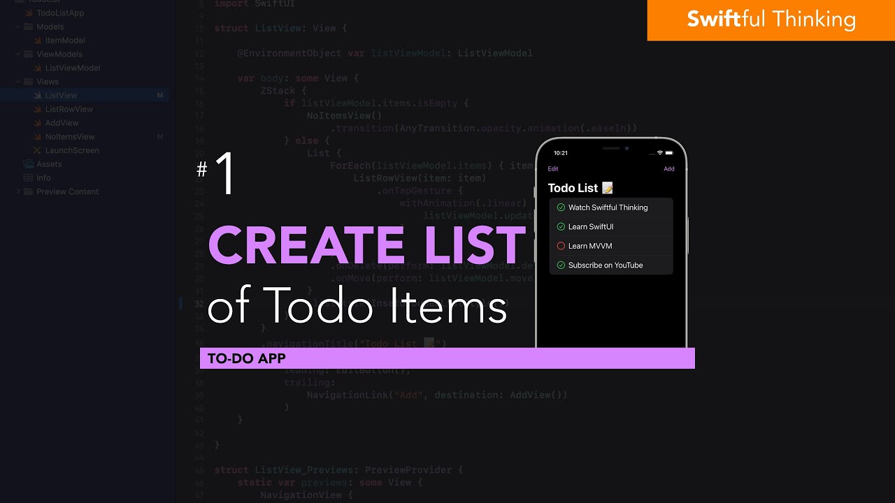
Create a List of Todo items in SwiftUI | Todo List #1

Create a custom data model for Todo items in SwiftUI | Todo List #2
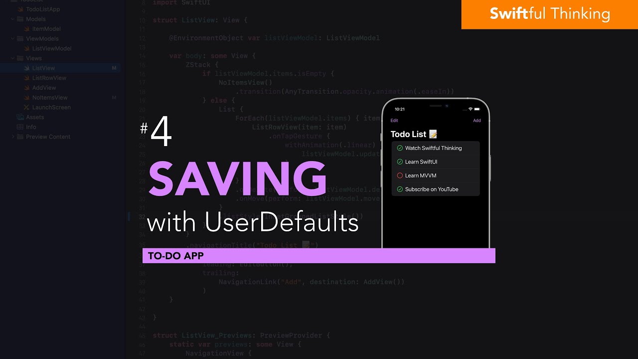
Save and persist data with UserDefaults | Todo List #4
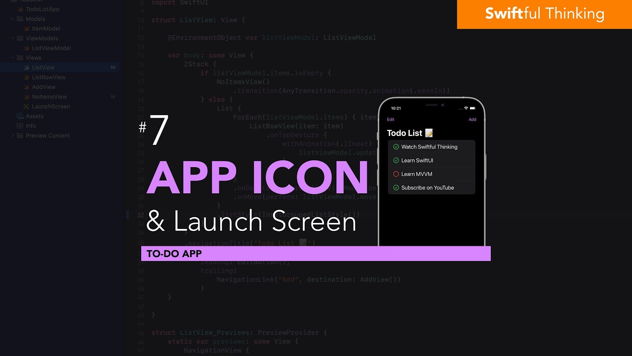
Adding an App Icon and Launch Screen to SwiftUI | Todo List #7
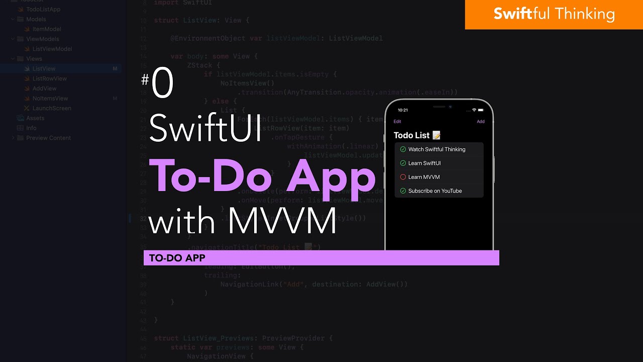
Build Todo List in SwiftUI with MVVM architecture | Todo List #0

New apk without Activation for play games with keyboard and mouse in mobile like Computer |free fire
5.0 / 5 (0 votes)
