Art Appreciation - Principles of Design (Taglish Lecture)
Summary
TLDRToday's lesson delves into the principles of design, aiming to enhance understanding of how they underpin impactful art and graphic designs. Key principles discussed include contrast, harmony, balance (both symmetrical and asymmetrical), rhythm and movement, unity and variety, emphasis and subordination, scale and proportion, and perspective. Each principle is illustrated with examples, guiding students to appreciate the depth and dimension in visual art forms.
Takeaways
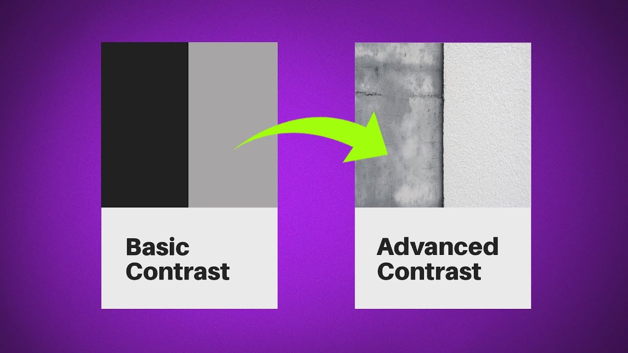
- 🎨 **Contrast**: Uses value to create depth and dimension, with light playing a crucial role in establishing good contrast.
- 🤝 **Harmony**: Elements relate to each other in form, color, or theme, creating a cohesive visual experience.
- 🕊️ **Balance**: Refers to symmetrical and asymmetrical arrangements that provide a sensible distribution of visual weight.
- 🏞️ **Rhythm and Movement**: Created by the repetition of elements, guiding the viewer's eye and creating a sense of direction.
- 🔄 **Unity and Variety**: Elements should be seen as a whole (unity) while differing in some aspects to provide interest (variety).
- 📍 **Emphasis and Subordination**: Certain areas or subjects are given focus, with other parts of the artwork providing supporting context.
- 📏 **Scale and Proportion**: The relative size of objects and parts of a whole, which can be used to emphasize or de-emphasize elements.
- 🌅 **Perspective**: Depicts three-dimensionality and spatial relationships through the use of perspective lines and vanishing points.
- 🖼️ **Art Elements**: Includes various elements like line, shape, color, texture, and space that are used to create visual interest.
- 👀 **Viewer Engagement**: Design principles are used to engage viewers, making them interact with the artwork on a deeper level.
Q & A
What are the principles of design discussed in the lesson?
-The principles of design discussed include Contrast, Harmony, Balance (symmetrical and asymmetrical), Rhythm and Movement, Unity and Variety, Emphasis and Subordination, Scaling and Proportion, and Perspective.
How does the principle of Contrast contribute to design?
-Contrast in design uses the element of value to create depth and dimension, with light playing an important role in creating good contrast.
What is meant by Harmony in design?
-Harmony in design refers to elements being related to each other in terms of form, color, or theme, creating a sense of cohesion and balance.
Can you explain the difference between symmetrical and asymmetrical balance?
-Symmetrical balance refers to an arrangement where elements are mirror images of each other across a central axis, while asymmetrical balance involves a more dynamic arrangement where visual weight is balanced without mirror symmetry.
How does Rhythm and Movement guide the viewer's eye in a design?
-Rhythm and Movement in design are created through the repetition of elements, which directs the viewer's eye and creates a sense of direction within the artwork.
What is Unity and Variety in the context of design principles?
-Unity and Variety in design refer to the concept where elements should be seen as a whole (unity), but they differ in some aspects to provide more interest (variety).
How does Emphasis and Subordination work in design?
-Emphasis and Subordination in design involve giving focus to a specific area or subject, making it stand out, while other parts of the design are subordinated to support the emphasized element.
What is Scaling and Proportion in design, and how do they affect the visual impact?
-Scaling and Proportion in design refer to the relative size of objects and parts of a whole, respectively. They affect the visual impact by showing the relationship between objects and space, and can be used to focus or emphasize certain elements.
How does Perspective contribute to the three-dimensionality of a design?
-Perspective in design contributes to the three-dimensionality by using perspective lines and vanishing points to create the illusion of depth and space.
What is the role of light in creating effective Contrast in design?
-Light plays a crucial role in creating effective Contrast by influencing the values and the perception of depth and dimension within a design.
Can you provide an example of how Harmony is achieved in a design?
-An example of Harmony in design could be a vintage park scene where the costumes, colors, and themes are consistent, creating a cohesive and balanced visual.
Outlines

Esta sección está disponible solo para usuarios con suscripción. Por favor, mejora tu plan para acceder a esta parte.
Mejorar ahoraMindmap

Esta sección está disponible solo para usuarios con suscripción. Por favor, mejora tu plan para acceder a esta parte.
Mejorar ahoraKeywords

Esta sección está disponible solo para usuarios con suscripción. Por favor, mejora tu plan para acceder a esta parte.
Mejorar ahoraHighlights

Esta sección está disponible solo para usuarios con suscripción. Por favor, mejora tu plan para acceder a esta parte.
Mejorar ahoraTranscripts

Esta sección está disponible solo para usuarios con suscripción. Por favor, mejora tu plan para acceder a esta parte.
Mejorar ahoraVer Más Videos Relacionados

Tata Letak (Layout) & Komposisi || Dasar Desain Grafis

Learning Graphic Design is SIMPLER than You Think.

5 SEGREDOS PARA O LAYOUT PERFEITO | DESIGNER INICIANTE (Composição e Layout)

Beginning Graphic Design: Fundamentals

Master 5 Design Principles With This Course! (MUST WATCH)

Level Up Your Character Design with Knight Zhang
5.0 / 5 (0 votes)
