Beginning Graphic Design: Fundamentals
Summary
TLDRThis script delves into the core principles of design, highlighting the importance of basic elements like line, shape, form, texture, and balance in creating visual art. It emphasizes how these elements, though seemingly simple, are integral to every design, from fine art to web design. The script demystifies these fundamentals, suggesting that understanding them can enhance one's ability to work with various assets and create compelling visuals. It also touches on the practical applications of these elements, encouraging viewers to explore and appreciate their presence in everyday designs.
Takeaways
- 🎨 **Fundamentals of Design**: The basics of design are crucial for all visual mediums, including fine art, web design, and typography.
- 🔵 **Elements of Design**: Key elements include line, shape, form, texture, and balance, which are integral to both what we see and create.
- 📏 **Line**: A line is a connecting shape between points, varying in thickness, waviness, and style, and is used in drawings, illustrations, and text.
- 🔺 **Shape**: 2D areas with boundaries, categorized as geometric or organic, are vital for visual communication and can organize or separate content.
- 🔲 **Form**: When a shape becomes 3D or is given the illusion of depth through techniques like lighting and perspective, it becomes a form, adding realism to 2D designs.
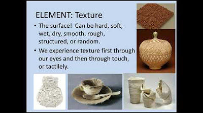
- 🖐️ **Texture**: The physical quality of a surface, which can be actual or implied, adds depth and tactility to designs and can be found in backgrounds, fonts, and icons.
- ⚖️ **Balance**: The equal distribution of visual weight in a design, influenced by color, size, number, and space, with examples like symmetrical and asymmetrical balance.
- 📏 **Rule of Thirds**: A composition technique dividing the work area into a 3x3 grid to place focal points and achieve visual balance.
- 🌟 **Design Application**: The fundamentals teach how to work with different assets and create visuals from scratch, applicable to various projects.
- 🔍 **Observation**: Encourages the viewer to look for these design elements in other designs to enhance their understanding and appreciation of design.
Q & A
What are the fundamental elements of design mentioned in the script?
-The fundamental elements of design mentioned in the script are line, shape, form, texture, and balance.
How does a line contribute to design?
-A line connects two or more points and can vary in weight, color, texture, and style, contributing to the feel and emphasis in design elements such as drawings, illustrations, and text compositions.
What are the two categories of shapes, and how do they differ?
-Shapes are categorized into geometric (regular) and organic (freeform). Geometric shapes have precise, regular boundaries, while organic shapes are more irregular and freeform.
Why are shapes important in visual communication?
-Shapes are important because they give images heft and make them recognizable, aiding in the understanding of street signs, symbols, and abstract art.
What is the difference between a shape and a form?
-A shape is a 2-dimensional area with a recognizable boundary, while a form is a 3-dimensional shape that can exist in the real world or be implied through techniques like light, shadow, and perspective.
How does texture add depth to design?
-Texture adds depth and tactility to flat images by suggesting the physical quality of a surface, which can make objects appear smooth, rough, hard, or soft.
What is visual balance and why is it important?
-Visual balance is the equal distribution of visual weight across a design, affecting how elements attract the viewer's eye. It's important for creating harmonious and appealing compositions.
What are the two types of balance discussed in the script?
-The two types of balance discussed are symmetrical balance, where both sides of an axis are the same or similar, and asymmetrical balance, where different elements are evenly distributed to maintain balance.
What is the rule of thirds, and how does it relate to design composition?
-The rule of thirds is a strategy that divides the work area into a 3x3 grid, suggesting that the focal point of an image should be placed on or near these lines to create visual balance.
How can understanding the fundamentals of design enhance one's work?
-Understanding the fundamentals of design can enhance one's work by appreciating the small details that compose every visual, which can be applied to create or enhance graphics and other design projects.
What other design topics are suggested for further exploration?
-The script suggests exploring additional design topics such as color and typography for further understanding and application in design.
Outlines

This section is available to paid users only. Please upgrade to access this part.
Upgrade NowMindmap

This section is available to paid users only. Please upgrade to access this part.
Upgrade NowKeywords

This section is available to paid users only. Please upgrade to access this part.
Upgrade NowHighlights

This section is available to paid users only. Please upgrade to access this part.
Upgrade NowTranscripts

This section is available to paid users only. Please upgrade to access this part.
Upgrade NowBrowse More Related Video

Lecture: Formal Elements and Principles of Design

Elements and Principles 3D Art - Google Slides

Introduction Principles of Design

Desain Grafis Percetakan - Dasar Desain Grafis dan Nirmana kelas XI

Elements & Principles of Art & Design #Elements #Principles #ArtEduc #Learn #VisualArt #Artistry

GRADE 10 / ELEMENTS OF ARTS / ARTS 10 / QUARTER 1 / MODULE 1
5.0 / 5 (0 votes)