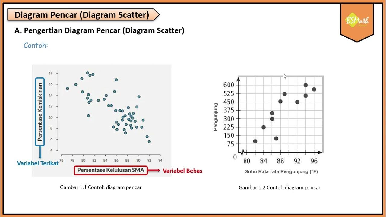
Cara Membuat Diagram Pencar atau Scatter di Excel
Summary
TLDRThis tutorial demonstrates how to create a scatter plot (scatter diagram) in Microsoft Excel. The steps include selecting the data for costs and profits, inserting the chart, and labeling both axes as 'Cost' and 'Profit.' The video also shows how to customize the chart with colors and background styles, providing a clear visualization of the relationship between cost and profit. The tutorial concludes with a reminder of the benefits of using this chart type for data analysis.
Takeaways
- 😀 The tutorial focuses on creating a scatter plot (Pencar diagram) in Microsoft Excel.
- 😀 To start, select the data for costs (biaya) and profit (laba) in your Excel sheet.
- 😀 Use the 'Insert' menu in Excel to choose the scatter plot option from the chart section.
- 😀 The lowest point on the graph corresponds to 60 costs and 40 profit.
- 😀 The highest point on the graph corresponds to 400 costs and 200 profit.
- 😀 Add a subtitle or title to the graph, such as 'Biaya dan Laba' (Cost and Profit).
- 😀 To label the horizontal axis (costs), go to 'Chart Elements' and select 'Axis Title' under the horizontal axis section.
- 😀 To label the vertical axis (profit), select 'Axis Title' under the vertical axis section in 'Chart Elements'.
- 😀 You can change the color of the data points on the chart (e.g., to green).
- 😀 To adjust the background, select a chart style (e.g., black) for the graph's appearance.
- 😀 The tutorial concludes with a greeting and a hope that the tutorial has been helpful.
Q & A
What is the first step in creating a scatter plot in Microsoft Excel according to the script?
-The first step is to select the data, then click on the 'Insert' menu.
What data is represented on the X-axis in the scatter plot?
-The X-axis represents the 'cost' data from the column.
What data is represented on the Y-axis in the scatter plot?
-The Y-axis represents the 'profit' data from the row on the left.
How do you identify the lowest point on the scatter plot?
-The lowest point is where the cost is 60 and the profit is 40.
How do you identify the highest point on the scatter plot?
-The highest point is where the cost is 400 and the profit is 200.
How can you add a title to the scatter plot in Excel?
-You can add a title by selecting the subtitle area and typing in the desired title, such as 'Cost and Profit'.
What should you do to label the X-axis?
-To label the X-axis, select 'Chart Element', then 'Axis Title', and choose 'Primary Horizontal'. Afterward, type 'Cost' as the label.
How do you label the Y-axis?
-To label the Y-axis, select 'Chart Element', then 'Axis Title', and choose 'Vertical'. Then, type 'Profit' as the label.
How can you add color to the data points on the scatter plot?
-To add color to the data points, click on the data points and select a color, for example, green.
How can you change the background of the chart?
-You can change the background by selecting the 'Chart Style' and choosing a color, such as black.
Outlines

Dieser Bereich ist nur für Premium-Benutzer verfügbar. Bitte führen Sie ein Upgrade durch, um auf diesen Abschnitt zuzugreifen.
Upgrade durchführenMindmap

Dieser Bereich ist nur für Premium-Benutzer verfügbar. Bitte führen Sie ein Upgrade durch, um auf diesen Abschnitt zuzugreifen.
Upgrade durchführenKeywords

Dieser Bereich ist nur für Premium-Benutzer verfügbar. Bitte führen Sie ein Upgrade durch, um auf diesen Abschnitt zuzugreifen.
Upgrade durchführenHighlights

Dieser Bereich ist nur für Premium-Benutzer verfügbar. Bitte führen Sie ein Upgrade durch, um auf diesen Abschnitt zuzugreifen.
Upgrade durchführenTranscripts

Dieser Bereich ist nur für Premium-Benutzer verfügbar. Bitte führen Sie ein Upgrade durch, um auf diesen Abschnitt zuzugreifen.
Upgrade durchführenWeitere ähnliche Videos ansehen

Menggambar Diagram Pencar Kelas XI Fase F Kurikulum Merdeka

Menggambar Diagram Pencar Secara Manual - Matematika Wajib SMA Kelas XI Kurikulum Merdeka

CORRELATION || MATHEMATICS IN THE MODERN WORLD
Pengertian Diagram Pencar - Matematika Wajib SMA Kelas XI Kurikulum Merdeka
Metode Kuadrat Terkecil Hal 97-101 Bab 3 STATISTIK Kelas 11 SMA Kurikulum Merdeka

STATISTIKA Part 5 - DIAGRAM PENCAR
5.0 / 5 (0 votes)
