CORRELATION || MATHEMATICS IN THE MODERN WORLD
Summary
TLDRThis video explains the concept of correlation and how it is used to measure relationships between variables. It introduces scatter plots as a tool to visually represent the relationship between independent and dependent variables. The video demonstrates how to create a scatter plot in Microsoft Excel and interpret different types of relationships: positive, negative, and no correlation. It also discusses the correlation coefficient, which quantifies the strength and direction of the relationship, with a focus on how to calculate and interpret the results using real-world examples, such as the relationship between test scores and GPA.
Takeaways
- 😀 Correlation is a statistical method used to measure the relationship between two variables, such as height and weight or test scores and GPA.
- 😀 Scatter plots are used to visualize the relationship between two variables by plotting data points on a graph with an independent variable on the x-axis and a dependent variable on the y-axis.
- 😀 A positive correlation is shown when data points move from the lower left to the upper right of the graph, indicating that both variables increase together.
- 😀 A negative correlation occurs when data points move from the upper left to the lower right, meaning that as one variable increases, the other decreases.
- 😀 To create a scatter plot in Microsoft Excel, input data into two columns, highlight it, then choose 'Insert' and 'Scatter' chart type to visualize the relationship.
- 😀 The correlation coefficient (r) quantifies the degree of correlation between two variables, with values ranging from -1 (perfect negative correlation) to 1 (perfect positive correlation).
- 😀 A correlation coefficient of 0 indicates no relationship between the variables.
- 😀 A correlation coefficient between 0.80 and 0.99 (or -0.80 and -0.99) indicates a very strong positive or negative relationship.
- 😀 To calculate the correlation coefficient, use the formula that incorporates sums of values, their squares, and the products of paired data points.
- 😀 In the example given, the correlation coefficient of 0.72 suggests a strong positive relationship between test scores and GPA, meaning as test scores increase, GPA tends to increase as well.
Q & A
What is correlation in statistics?
-Correlation in statistics refers to the relationship or association between two variables. It helps determine whether an increase in one variable corresponds to an increase or decrease in another variable, and the strength of that relationship.
What is a scatter plot and what is its purpose?
-A scatter plot is a graph that represents the relationship between two variables by plotting data points on a two-dimensional axis. Its purpose is to visualize the nature of the relationship, whether it is positive, negative, or shows no discernible pattern.
How do you distinguish between the independent and dependent variables in a scatter plot?
-In a scatter plot, the independent variable is plotted on the horizontal (X) axis and can be manipulated or controlled. The dependent variable is plotted on the vertical (Y) axis and depends on the independent variable.
What are the possible types of relationships shown by a scatter plot?
-A scatter plot can show a positive linear relationship, where both variables increase together; a negative linear relationship, where one variable increases while the other decreases; a curvilinear relationship, where the relationship is non-linear; or no discernible relationship, where the data points are scattered without a clear pattern.
What does a correlation coefficient represent?
-The correlation coefficient (denoted by 'r') quantifies the strength and direction of the linear relationship between two variables. It ranges from -1 (perfect negative correlation) to +1 (perfect positive correlation), with 0 indicating no relationship.
How is the correlation coefficient calculated?
-The correlation coefficient is calculated using a formula that involves the sum of the products of paired scores, the sum of the individual scores, and the sum of squared scores for both variables. The formula is: r = [n(Σxy) - (Σx)(Σy)] / √[n(Σx²) - (Σx)²][n(Σy²) - (Σy)²].
What does it mean if the correlation coefficient is 0.72?
-A correlation coefficient of 0.72 indicates a strong positive relationship between the two variables, meaning that as one variable increases, the other tends to increase as well, but not perfectly.
In the example with test scores and GPA, what does the correlation coefficient of 0.72 suggest?
-In the given example, a correlation coefficient of 0.72 suggests a strong positive relationship between test scores and GPA. This means that students who score higher on tests tend to have higher GPAs.
What are the steps to create a scatter plot in Microsoft Excel?
-To create a scatter plot in Microsoft Excel, input the data into two columns (X and Y), select the data, go to the 'Insert' tab, click on 'Scatter Chart,' and choose the scatter plot option. Excel will then generate the plot for you.
What is the difference between a positive and negative correlation?
-A positive correlation occurs when both variables increase or decrease together, meaning that as one variable goes up, the other also goes up. A negative correlation occurs when one variable increases while the other decreases, meaning that as one variable goes up, the other goes down.
Outlines

This section is available to paid users only. Please upgrade to access this part.
Upgrade NowMindmap

This section is available to paid users only. Please upgrade to access this part.
Upgrade NowKeywords

This section is available to paid users only. Please upgrade to access this part.
Upgrade NowHighlights

This section is available to paid users only. Please upgrade to access this part.
Upgrade NowTranscripts

This section is available to paid users only. Please upgrade to access this part.
Upgrade NowBrowse More Related Video

Korelasi Product Moment (r) Hal 110-116 Bab 3 STATISTIK Kelas 11 SMA Kurikulum Merdeka

Part 18: Multiple Correlation of Coefficient | "r" and "R" Calculation | Biostatistics & RM

Spearmen's Rank Correlation || Gnani The Knowledge ||

Pengantar Korelasi (Konsep Dasar Korelasi)

Metode Penelitian Korelasi

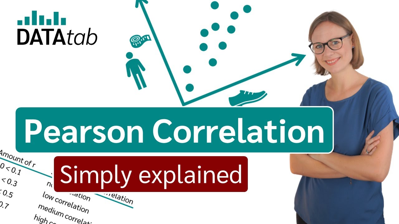
Pearson correlation [Simply explained]
5.0 / 5 (0 votes)