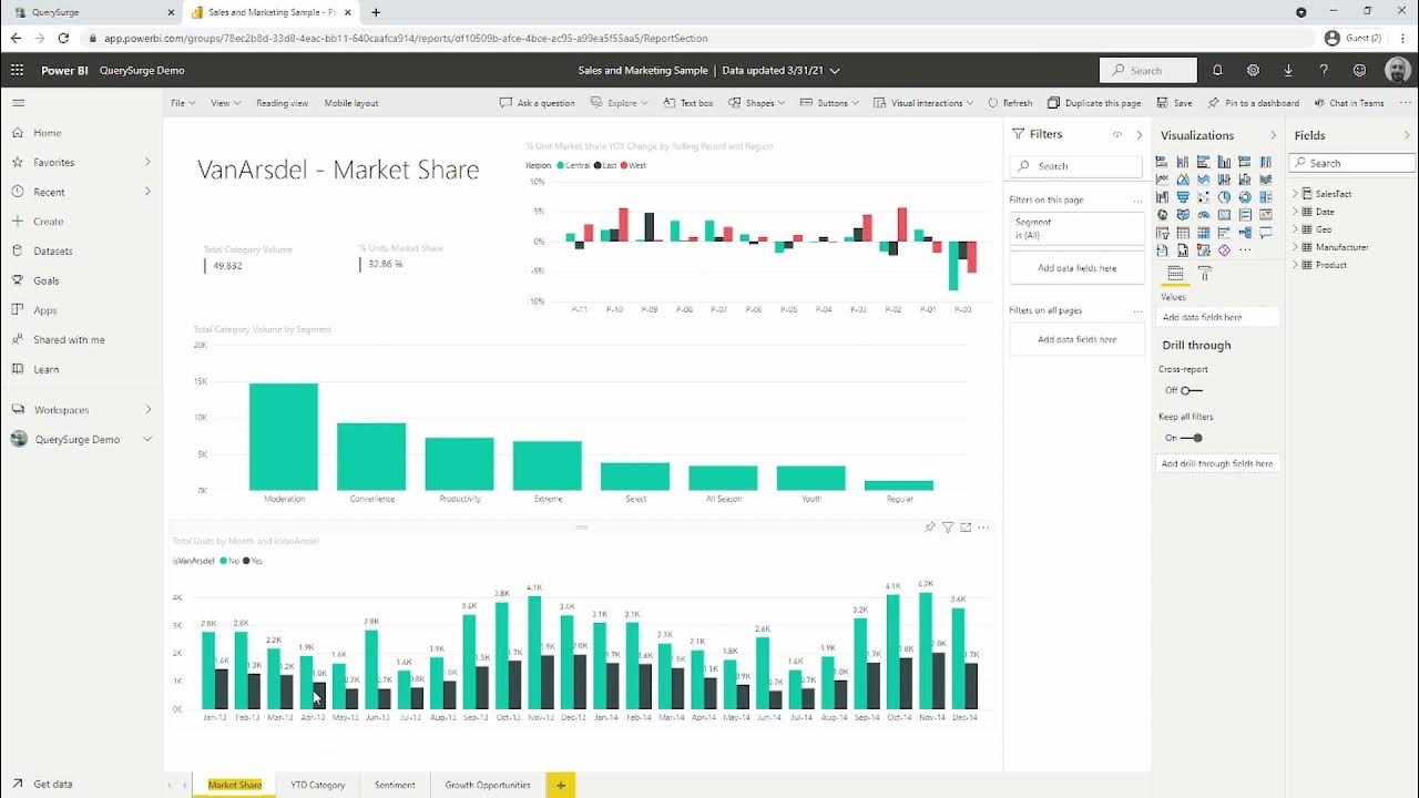
Dasar Dasar Power BI | Pembuatan Dashboard Covid-19 Indonesia
Summary
TLDRIn this tutorial, the presenter walks through how to use Power BI for data analysis and visualization, focusing on COVID-19 data in Indonesia. The video covers the process from downloading Power BI to importing and manipulating data. Viewers learn how to create basic charts, compare trends like new cases versus recoveries, and build maps to visualize the geographic spread of the virus. The tutorial also explores customizing visuals, adding filters, and analyzing key statistics like case fatality rates. This easy-to-follow guide is ideal for beginners interested in using Power BI for data-driven insights.
Takeaways
- 😀 Power BI can be used to create powerful COVID-19 dashboards, helping track and visualize key metrics like new cases, recoveries, and deaths.
- 😀 To begin using Power BI, download the desktop application from the official Microsoft website and sign in with your Microsoft account.
- 😀 The first step after installation is importing data from external sources such as COVID-19 datasets available online.
- 😀 Power BI allows users to manipulate data easily with features like drag-and-drop for organizing columns and creating visualizations.
- 😀 A simple chart can be created by placing 'Date' on the axis and 'New Cases' in the value section, allowing users to track the daily increase in COVID-19 cases.
- 😀 Users can customize chart appearance by adjusting colors, labels, and adding titles for clarity.
- 😀 A key feature in Power BI is the ability to create map visualizations, enabling users to see the geographic distribution of COVID-19 cases across different regions.
- 😀 The map visualization allows users to adjust the size and color of data points based on metrics like new cases or recoveries, helping to visually compare regions.
- 😀 Power BI enables filtering data to focus on specific areas, such as individual provinces, which helps in analyzing more localized trends.
- 😀 The tutorial emphasizes the importance of comparing different metrics, such as new cases and recoveries, to assess the current status of the pandemic in real-time.
- 😀 A final recommendation is to explore additional features like DAX calculations for deeper analysis and sharing the dashboards for collaborative insights.
Q & A
What is the main objective of the tutorial in the script?
-The main objective of the tutorial is to guide users on how to replicate a COVID-19 monitoring website using Power BI, including creating visualizations and analyzing data such as new cases, recoveries, and deaths in Indonesia.
What software is used in this tutorial for data analysis?
-The tutorial uses Power BI Desktop, which is a Microsoft application for data analysis and visualization.
How can users download and install Power BI Desktop?
-Users can download Power BI Desktop from the official Microsoft website at 'pot bdpkv.com flash desktop'. Once downloaded, they need to sign in with a Microsoft account.
What is the first step in the process after opening Power BI?
-The first step is to import the relevant data. In the tutorial, the speaker selects the 'Get Data' option and imports a COVID-19 dataset for Indonesia.
How do you analyze the daily new cases of COVID-19 in the tutorial?
-To analyze daily new cases, the user drags and drops the 'Date' column to the Axis and the 'New Cases' column to the Value. They then adjust the hierarchy to display daily data instead of breakdowns by quarter.
Why is it important to use 'New Cases' instead of 'Total Cases' for daily analysis?
-'New Cases' is used for daily analysis because it reflects the number of cases reported each day, whereas 'Total Cases' shows cumulative data and is less useful for tracking daily trends.
How can you compare new cases and recoveries in Power BI?
-To compare new cases and recoveries, the user creates a new chart with 'New Cases' and 'Recoveries' as the values. They then use color coding (e.g., red for new cases, green for recoveries) to visually distinguish between the two metrics.
What is the purpose of the Death vs. New Cases visualization?
-The Death vs. New Cases visualization helps to analyze the fatality rate by comparing the number of new cases with the number of deaths, providing insight into the severity of the pandemic.
How do you create a map visualization of COVID-19 cases in Indonesia?
-To create a map, the user adds the 'Location' field to the map and then assigns 'New Cases' as the value to determine the size of the map points based on case numbers.
What is the role of filters in Power BI, and how are they used in the tutorial?
-Filters in Power BI are used to focus on specific subsets of data. In the tutorial, the speaker uses a filter to display data for specific provinces, such as Jakarta or Yogyakarta, for more targeted analysis.
Outlines

Dieser Bereich ist nur für Premium-Benutzer verfügbar. Bitte führen Sie ein Upgrade durch, um auf diesen Abschnitt zuzugreifen.
Upgrade durchführenMindmap

Dieser Bereich ist nur für Premium-Benutzer verfügbar. Bitte führen Sie ein Upgrade durch, um auf diesen Abschnitt zuzugreifen.
Upgrade durchführenKeywords

Dieser Bereich ist nur für Premium-Benutzer verfügbar. Bitte führen Sie ein Upgrade durch, um auf diesen Abschnitt zuzugreifen.
Upgrade durchführenHighlights

Dieser Bereich ist nur für Premium-Benutzer verfügbar. Bitte führen Sie ein Upgrade durch, um auf diesen Abschnitt zuzugreifen.
Upgrade durchführenTranscripts

Dieser Bereich ist nur für Premium-Benutzer verfügbar. Bitte führen Sie ein Upgrade durch, um auf diesen Abschnitt zuzugreifen.
Upgrade durchführenWeitere ähnliche Videos ansehen

How to use Power Query in Power BI | Microsoft Power BI for Beginners

Using QuerySurge to Test & Validate Data in Microsoft Power BI

Your first 10 minutes of Power BI - A no-nonsense getting started tutorial for beginners

Can’t INPUT DATA in Power BI? Here is a WRITE BACK Option with Power Apps!

Power BI Desktop for Beginners | Step-by-Step Guide

Web scraper dasar (single page)
5.0 / 5 (0 votes)
