Five-Number Summaries and Boxplots

Stat Brat
4 Sept 202005:53

Summary

TLDRThis educational video script teaches how to use the five-number summary (minimum, Q1, median, Q3, maximum) to analyze a dataset's distribution and identify outliers. It explains how to calculate the interquartile range (IQR) and use it to determine the lower and upper limits for spotting outliers. The script also instructs on constructing a boxplot, a visual representation of the dataset's center and variation, using the five-number summary and adjacent values. The example of U.S. presidents' ages at inauguration is used to illustrate these concepts, showing how to compute and apply these statistical measures.

Takeaways

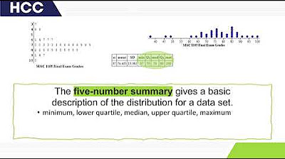
  • 📊 The five-number summary of a dataset includes the minimum, first quartile (Q1), median, third quartile (Q3), and maximum.
  • ⬆️ To find the five-number summary, data must be sorted in ascending order to easily identify the minimum and maximum.
  • 🔢 The median, which is the 50th percentile, divides the dataset into two equal halves.
  • 📈 Q1 is defined as the median of the lower half of the dataset, and Q3 is the median of the upper half.
  • 🧩 For datasets with an even number of observations, Q1 and Q3 are calculated as the average of the two middle values in their respective halves.
  • 📉 The interquartile range (IQR) is calculated as Q3 minus Q1, representing the range of the middle 50% of the data.
  • ⚠️ Outliers are identified using the IQR; values below Q1 - 1.5*IQR or above Q3 + 1.5*IQR are considered outliers.
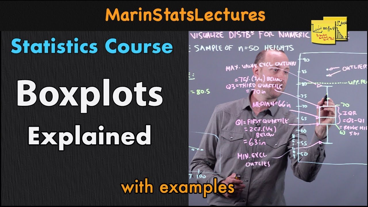
  • 📋 A boxplot, or box-and-whisker diagram, visually represents the five-number summary and can indicate the presence of outliers.
  • 📏 Adjacent values are the most extreme non-outlier data points, which are the minimum and maximum within the lower and upper limits if no outliers are present.
  • 📊 The construction of a boxplot involves plotting the quartiles and adjacent values on a horizontal axis, then drawing the box and whiskers accordingly.

Q & A

  • What is the five number summary of a dataset?

    -The five number summary of a dataset includes the minimum, the 25th percentile (Q1), the median (50th percentile), the 75th percentile (Q3), and the maximum.

  • How do you determine the minimum and maximum in a five number summary?

    -The minimum and maximum in a five number summary are the smallest and largest values in the dataset, respectively, after it has been organized in ascending order.

  • What is the median and how is it found in a dataset?

    -The median is the middle value of a dataset when it is ordered from smallest to largest. If the number of observations is odd, the median is the middle value. If it's even, the median is the average of the two middle values.

  • How is Q1 (the first quartile) defined in the context of the five number summary?

    -Q1, or the first quartile, is defined as the median of the bottom half of the dataset, which divides the lower 50% of the data.

  • What does Q3 (the third quartile) represent in the five number summary?

    -Q3, or the third quartile, is the median of the upper half of the dataset, which divides the upper 50% of the data.

  • What is the Interquartile Range (IQR) and how is it calculated?

    -The Interquartile Range (IQR) is the difference between Q3 and Q1, representing the width of the middle 50 percent of the dataset.

  • How are the lower and upper limits of a dataset determined?

    -The lower limit is calculated by subtracting 1.5 times the IQR from Q1, and the upper limit is calculated by adding 1.5 times the IQR to Q3.

  • What are outliers in a dataset and how are they identified?

    -Outliers are values that are greater than the upper limit or less than the lower limit of a dataset. They are identified by comparing each data point to the lower and upper limits.

  • What is a boxplot and what does it represent?

    -A boxplot, also known as a box-and-whisker diagram, is a graphical representation of the five number summary and is used to visualize the central tendency and dispersion of a dataset.

  • How do you construct a boxplot for a given dataset?

    -To construct a boxplot, first determine the five number summary and calculate any outliers or adjacent values. Then, draw a horizontal axis and mark the quartiles and adjacent values with vertical lines. Connect the quartiles to form a box and extend lines to the adjacent values. Mark outliers with an asterisk if present.

  • What are adjacent values in the context of a boxplot?

    -Adjacent values are the most extreme observations within the lower and upper limits of a dataset, which are not considered outliers.

  • How can the shape of a dataset's distribution be determined from a boxplot?

    -The shape of a dataset's distribution can be inferred from a boxplot by examining the relative positions and lengths of the box and whiskers. For example, a boxplot with symmetric whiskers might suggest a normal distribution.

Outlines

00:00

📊 Understanding Data Distribution with Five-Number Summary

This paragraph introduces the concept of the five-number summary, which includes the minimum, first quartile (Q1), median, third quartile (Q3), and maximum. It explains how to organize data in ascending order to easily identify these values. The median is defined as the 50th percentile, dividing the dataset into two halves. Q1 is the median of the lower half, and Q3 is the median of the upper half. The example of U.S. presidents' ages at inauguration is used to demonstrate how to calculate these values. The paragraph also introduces the interquartile range (IQR), which is the difference between Q3 and Q1, representing the middle 50% of the data. The lower and upper limits of the dataset are defined as Q1-1.5IQR and Q3+1.5IQR, respectively, which are used to identify outliers. The concept of adjacent values, which are the most extreme non-outlier observations, is also discussed. Finally, the paragraph explains how to construct a boxplot, a graphical representation of the five-number summary, to visualize the center and variation of the dataset.

05:01

📈 Constructing a Boxplot and Analyzing Distribution Shape

In this paragraph, the focus is on constructing a boxplot for the dataset of U.S. presidents' ages at inauguration. The process begins with calculating the IQR and then determining the lower and upper limits to identify any potential outliers. Since no values in the dataset exceed these limits, there are no outliers, and the adjacent values are the same as the minimum and maximum. The paragraph describes the steps to draw the boxplot, which includes creating a horizontal axis, marking the quartiles and adjacent values with vertical lines, and connecting them to form the box. The boxplot is then used to analyze the shape of the distribution, which in this case appears to be normal. The paragraph concludes by summarizing the use of the five-number summary for outlier detection and data visualization through the boxplot.

Mindmap

Keywords

💡Five number summary

The five number summary refers to the minimum, first quartile (Q1), median, third quartile (Q3), and maximum values in a dataset. These values provide a concise way to describe the central tendency and dispersion of the data. In the video, the five number summary is used to analyze the ages of U.S. presidents at their inaugurations, with the minimum being 42, Q1 being 51, the median at 55, Q3 at 59, and the maximum at 70. This summary helps in understanding the distribution's shape and identifying potential outliers.

💡Quartiles

Quartiles divide a dataset into four equal parts. Q1 (the first quartile) is the median of the lower half of the dataset, and Q3 (the third quartile) is the median of the upper half. They are used to measure the spread of the middle 50% of the data. In the context of the video, Q1 is calculated as the average of the 11th and 12th observations (51), and Q3 as the average of the 23rd and 24th observations (59), which helps in constructing the boxplot and calculating the interquartile range (IQR).

💡Median

The median is the middle value of a dataset when the numbers are arranged in ascending order. If the number of observations is odd, the median is the middle number; if even, it is the average of the two middle numbers. The video uses the median (55) to divide the dataset of presidential ages into two halves, which is crucial for determining Q1 and Q3 and understanding the central tendency.

💡Interquartile range (IQR)

The interquartile range (IQR) is the difference between the third quartile (Q3) and the first quartile (Q1). It represents the range of the middle 50% of the data, providing a measure of variability. In the video, IQR is calculated as 8 (59 - 51), which is used to identify the dataset's lower and upper limits for detecting outliers.

💡Outliers

Outliers are data points that lie outside the normal range of a dataset, often indicating errors or extreme values. They are identified using the IQR; values below Q1 - 1.5 * IQR or above Q3 + 1.5 * IQR are considered outliers. The video explains that in the dataset of presidential ages, there are no values outside the calculated lower (39) and upper (71) limits, hence no outliers.

💡Boxplot

A boxplot, or box-and-whisker diagram, is a graphical representation of the five number summary. It displays the median, quartiles, and the range of the data, and can indicate outliers. The video describes how to construct a boxplot for the ages of U.S. presidents, which helps visualize the distribution's shape and identify central tendencies and variability.

💡Adjacent values

Adjacent values are the most extreme data points within the lower and upper limits of a dataset, excluding outliers. If there are no outliers, the adjacent values are the minimum and maximum of the dataset. The video mentions that in the case of the presidential ages, since all values fall within the limits, the adjacent values are the same as the minimum and maximum.

💡Lower limit

The lower limit of a dataset is calculated as Q1 minus 1.5 times the IQR. It helps in identifying potential outliers and is part of the boxplot's construction. In the video, the lower limit is determined to be 39, which is used to assess whether any data points are outliers.

💡Upper limit

The upper limit is calculated as Q3 plus 1.5 times the IQR and, like the lower limit, is used to identify outliers. It is also a component of the boxplot. The video calculates the upper limit to be 71, which is then used to determine if any of the presidential ages are considered outliers.

💡Normal distribution

A normal distribution is a continuous probability distribution where data points are symmetrically distributed around the mean, with the majority of values clustering in the middle and fewer towards the tails. The video suggests that the distribution of the presidents' ages at inauguration appears to be normal, indicating a symmetric distribution with no skewness.

Highlights

The five number summary of a dataset includes the minimum, 25th percentile (Q1), median (50th percentile), 75th percentile (Q3), and maximum values.

Five number summary can also be considered as the 0th, 25th, 50th, 75th, and 100th percentiles.

Data must be organized in ascending order to find the five number summary.

The median divides the dataset into two halves, with Q1 being the median of the bottom half and Q3 the median of the top half.

An example dataset is the ages of U.S. presidents at their inaugurations, organized in ascending order.

The minimum age is 42 and the maximum is 70 in the example dataset.

With 45 observations, the median age is 55, the 23rd observation.

The median of the bottom half (Q1) is calculated as the average of the 11th and 12th observations, which is 51.

The median of the upper half (Q3) is the average of the 23rd and 24th observations, which is 59.

The five number summary is presented in a table format.

Interquartile range (IQR) is the difference between Q3 and Q1, representing the width of the middle 50% of the data.

Outliers are values that are greater than Q3+1.5IQR or less than Q1-1.5IQR.

Boxplot, or box-and-whisker diagram, is a graphical display based on the five number summary.

Adjacent values are the most extreme observations within the lower and upper limits, not considered outliers.

Boxplot construction involves determining quartiles, outliers, and adjacent values, then plotting them on a horizontal axis.

Outliers are marked with an asterisk in a boxplot.

If no outliers are present, adjacent values are the minimum and maximum of the dataset.

The IQR for the president's age dataset is calculated as 8.

The lower limit is 39 and the upper limit is 71 for the president's age dataset.

All values in the president's age dataset are within the limits, indicating no outliers.

The boxplot is constructed by drawing the horizontal axis and vertical lines for the five number summary, then connecting them.

The distribution shape of the presidents' ages appears to be normal.

Five number summary helps identify outliers and visualize data through boxplot construction.

Transcripts

play00:01

Previously, we learned how to use the mean and the

play00:03

standard deviation of a dataset to figure out the

play00:06

shape of the distribution and the outliers. Next,

play00:09

we will learn how to do the same using the other

play00:11

numerical summaries.

play00:14

The following values together are called the five

play00:17

number summary of a dataset. Alternatively, we can

play00:20

think of the list as the 0-th, 25-th, 50-th,

play00:24

75-th, and 100-th percentiles.

play00:28

Before finding the five number summary by hand, we have to

play00:30

make sure that the data is organized in ascending

play00:33

order - then it will be easier to find the minimum

play00:36

and the maximum.

play00:43

We already know how to find the median that

play00:45

divides the dataset into two halves - top and bottom.

play00:49

For simplicity, we're going to define the Q1 as

play00:52

the median of the bottom half and Q3 as the medium

play00:56

of the top half.

play01:00

Consider the following example - the ages of the

play01:03

U.S. presidents at their inaugurations. For

play01:06

convenience, it is already organized in ascending

play01:08

order. So let's determined the five number summary.

play01:12

The minimum is 42 and the maximum is 70. The

play01:17

number of observations is forty five which is an

play01:19

odd number so the median is 55, the twenty third

play01:23

observation that divides the data into upper

play01:27

twenty two observations and the lower twenty two

play01:30

observations. In the bottom half, the number of

play01:33

observations is twenty two which is an even number.

play01:36

So the median of the bottom half is the average

play01:39

between the 11th and 12th observations which is

play01:42

fifty one. Similarly in the upper half, the number

play01:46

of observations is twenty two which is an even

play01:48

number. So the median of the upper half is an

play01:52

average between the 11th and the 12th observations

play01:55

which is fifty nine. Thus the five number summary is

play01:59

provided in the following table.

play02:05

One of the two goals that we are trying to

play02:06

accomplish is to learn how to identify the

play02:09

outliers. For that, we're going to need the following

play02:11

vocabulary. Interquartile range (IQR) is the

play02:15

difference between the Q3 and Q1 or in other

play02:18

words, it is the width of the middle 50 percent.

play02:22

The values Q1-1.5IQR and

play02:27

Q3+1.5IQR are called the

play02:30

lower limit and the upper limit of a dataset.

play02:35

The values that are greater than the upper limit or

play02:38

less than the lower limit are called outliers.

play02:45

The other goal that we are trying to accomplish is

play02:47

to learn how to visualize a dataset. For that,

play02:50

we're going to need the following vocabulary. A

play02:53

boxplot also called a box-and-whisker diagram is

play02:56

based on the five number summary and can be used

play02:59

to provide the graphical display of the center and

play03:02

variation of a dataset.

play03:08

To construct the boxplot, we also need the

play03:10

concept of adjacent values. The adjacent values

play03:13

of a dataset are the most extreme observations

play03:15

that still lie within the lower and upper limits.

play03:18

They are the most extreme observations that are

play03:21

not outliers.

play03:25

Note that if a dataset has no potential outliers

play03:29

the adjacent values are just the minimum and

play03:31

maximum observations.

play03:34

To construct a boxplot, we're going to determine

play03:37

the quartiles and construct the five number summary

play03:40

first. Then we'll use the formulas to determine the

play03:43

outliers and adjacent values if any. Then we'll

play03:47

draw a horizontal axis on which the numbers

play03:49

obtained in steps one and two can be located. Above

play03:53

this axis we'll mark the quartiles and the adjacent

play03:56

values with vertical lines. We'll connect the

play04:00

quartiles to make a box and then connect the box

play04:03

to the adjacent values with lines.

play04:10

If there are outliers we'll mark them with the

play04:13

asterisk.

play04:16

Note that one can skip steps two and five if not

play04:20

concerned about outliers at all. In such a case,

play04:23

the adjacent values are the minimum and the

play04:25

maximum value in the five number summary.

play04:30

Let's construct the boxplot for the president's age

play04:32

at inauguration for which we've already found the

play04:35

five number summary. First, let's compute IQR by

play04:39

subtracting Q1 from Q3. It is equal to eight.

play04:43

Then let's find 1.5IQR -

play04:46

1.5 times 8 is 12. Next, let's

play04:50

compute the lower limit by subtracting 1.5IQR

play04:54

from Q1. We get thirty nine. Now,

play04:58

let's compute the upper limit by adding

play05:01

1.5IQR to Q3. We got 71.

play05:04

Since all the values are within the lower

play05:08

and upper limits there are no outliers and

play05:10

therefore there is no need to compute adjacent

play05:13

values. Next, we're going to draw the boxplot

play05:16

by creating the horizontal axis first; and then

play05:20

drawing the vertical lines for each value in the

play05:23

five number summary; and connecting them with horizontal

play05:26

lines to form the boxplot.

play05:32

After the box plot is constructed, we can check the

play05:34

following chart to identify the shape of the

play05:36

distribution. It appears that the shape of the

play05:39

distribution of the presidents' ages is normal.

play05:45

We discussed how to use the five number summary to

play05:48

identify the outliers and to visualize the data by

play05:50

constructing a boxplot.

Rate This

5.0 / 5 (0 votes)

Ähnliche Tags
Data AnalysisBoxplotOutliersStatisticsFive Number SummaryData VisualizationMedianQuartilesIQRPresidents' Ages
Benötigen Sie eine Zusammenfassung auf Englisch?