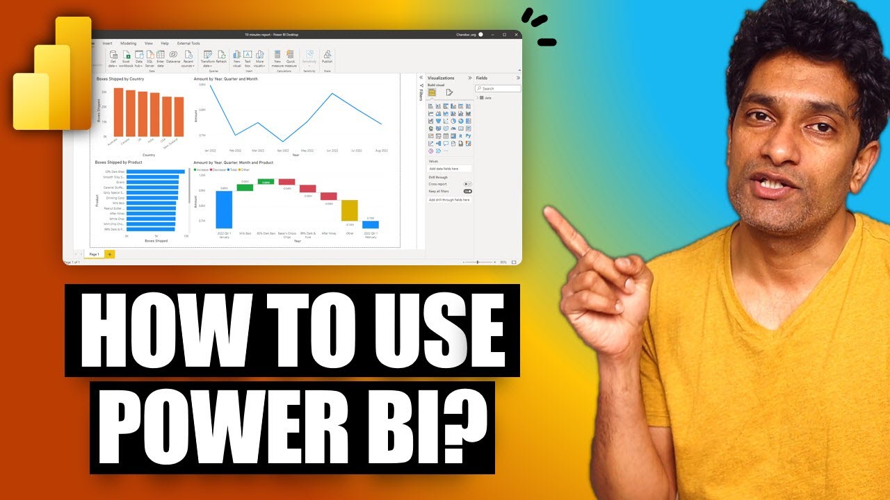
How to pick the "perfect" chart for your situation in Power BI?
Summary
TLDRThis script provides a comprehensive guide to utilizing various chart types in Power BI for effective data visualization. It explains when and how to use bar/column charts, line/area charts for trends, pie/donut charts for comparisons, card visuals for KPIs, tables/matrices for detailed views, scatter plots for correlation analysis, waterfall charts for change over time, and emphasizes the importance of titles, subtitles, and tooltips for storytelling. The tutorial also advises caution with less common chart types and encourages feedback for improvement.
Takeaways
- 📊 Bar and column charts are used for comparing two things, such as the sum of sales by country.
- 📈 Line and area charts are best used to represent trends over time, requiring a date or time component.
- 🍩 Pie and donut charts are suitable for comparing parts of a whole or showing the full picture of categories.
- 📊 When using bar or column charts, consider adding a legend for extra elements like teams or categories.
- 🔍 Utilize multi-level axes for detailed insights, like comparing team performance within each country.
- 🔑 Cards are ideal for displaying KPIs and important numbers, with context to make the data meaningful.
- 📋 Tables and matrices offer a detailed view and should be enhanced with theming, sorting, and conditional formatting.
- 📈 Scatter plots are useful for comparing two dimensions of data, like shipments versus sales.
- 💧 Waterfall charts effectively show changes or contributions over time, illustrating reasons for data fluctuations.
- 🏷️ Titles and subtitles are crucial for telling a story with data, making charts more informative and engaging.
- 🛠️ Tooltips add extra information to charts, aiding in a deeper understanding of the data presented.
Q & A
What is the main purpose of the video script?
-The main purpose of the video script is to explain and demonstrate various chart types available in Power BI, how to use them effectively, and how to create insightful visualizations for data analysis.
Why are bar or column charts recommended for comparing two things?
-Bar or column charts are recommended for comparing two things because they can visually represent the sum or comparison of categories, such as the total sales amount by country, making it easier to analyze performance across different groups.
What is the significance of using a legend in column charts?
-The legend in column charts allows for the addition of extra elements to the visualization. It can break down the data further, such as by teams or other categories, providing a more detailed comparison within the same chart.
How can multiple levels in a chart be used to navigate through data?
-Multiple levels in a chart can be used to drill down into the data. For example, after setting country and team as two levels, navigation buttons appear, allowing the user to explore performance at different hierarchical levels, such as within each country by different teams.
What is the 'small multiple' option in Power BI and how is it useful?
-The 'small multiple' option in Power BI is used to split the data into several smaller charts based on a subcategory, such as different teams. This is useful for comparing performance across categories while also understanding individual contributions within each category.
Why should line or area charts be used with a time or date component?
-Line or area charts should be used with a time or date component because they are designed to represent trends over time. Using these charts with non-temporal categories can lead to misleading interpretations of the data.
What is the recommended approach when using pie or donut charts?
-When using pie or donut charts, it is recommended to avoid having too many slices, as this can make the chart cluttered and difficult to interpret. Instead, use these charts to compare or show the full picture of a few key categories.
What is the purpose of cards in Power BI visualizations?
-Cards in Power BI visualizations are used to display key performance indicators (KPIs) and important numbers. They can provide a quick snapshot of critical data points and can be enhanced with context to make the numbers more meaningful.
How can tables and matrices enhance the detail in a report?
-Tables and matrices provide a detailed view of the data, allowing for a deep dive into the information presented. They can be enhanced with theming, sorting, conditional formatting, and icons to highlight important data points and trends.
What is the use of scatter plots in data visualization?
-Scatter plots are used to compare data across two dimensions or to show the spread of information. They can help identify patterns or relationships between variables, such as the correlation between the number of shipments and total sales.
How can the 'play axis' feature in scatter plots be utilized?
-The 'play axis' feature in scatter plots allows the user to add a time component, such as dates, to the visualization. This enables the tracking of changes over time and can show an animated story of how data points have evolved, providing insights into trends and fluctuations.
What is the purpose of waterfall charts and how should they be used?
-Waterfall charts are used to show the change or contribution of items from one point in time to another. They are effective for understanding the reasons behind changes in data, such as comparing sales figures from different months and identifying factors contributing to the increase or decrease.
Why is it important to add meaningful titles and subtitles to charts?
-Meaningful titles and subtitles are important because they provide context and tell a story about the data. They can help the viewer quickly understand the key points of the visualization and guide their interpretation of the information presented.
How can tooltips be used to enhance the information presented in a chart?
-Tooltips can be used to provide additional information when the viewer hovers over a specific data point or category in the chart. This can include breakdowns of data, further insights, or comparisons that are not immediately visible in the main visualization, making the chart more informative and interactive.
Outlines

هذا القسم متوفر فقط للمشتركين. يرجى الترقية للوصول إلى هذه الميزة.
قم بالترقية الآنMindmap

هذا القسم متوفر فقط للمشتركين. يرجى الترقية للوصول إلى هذه الميزة.
قم بالترقية الآنKeywords

هذا القسم متوفر فقط للمشتركين. يرجى الترقية للوصول إلى هذه الميزة.
قم بالترقية الآنHighlights

هذا القسم متوفر فقط للمشتركين. يرجى الترقية للوصول إلى هذه الميزة.
قم بالترقية الآنTranscripts

هذا القسم متوفر فقط للمشتركين. يرجى الترقية للوصول إلى هذه الميزة.
قم بالترقية الآنتصفح المزيد من مقاطع الفيديو ذات الصلة

Your first 10 minutes of Power BI - A no-nonsense getting started tutorial for beginners

Calculate Running Total (Rolling Total) in Power BI

Introduction to Power BI: What is it?

How to use Power Query in Power BI | Microsoft Power BI for Beginners

1 Power BI Introduction

Xây dựng văn hóa dữ liệu doanh nghiệp với Power BI | Microsoft Lunch Talks #4
5.0 / 5 (0 votes)
