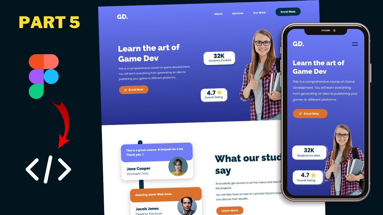
Figma To Real Website | Responsive Homepage | HTML, CSS & JavaScript | Part 4
Summary
TLDRThis tutorial series guides viewers through converting a design into a functional website using HTML, CSS, and JavaScript. The script focuses on styling the header section, setting box-sizing, and customizing buttons with different colors and icons. It also covers positioning elements, styling the navigation bar, and adjusting the hero section with images and achievement cards. The instructor emphasizes responsive design adjustments and provides step-by-step CSS implementation.
Takeaways
- 🌐 The tutorial series focuses on converting a sigma design into a functional website using HTML, CSS, and JavaScript.
- 📝 The previous video covered HTML structure creation, while the current video is about styling with CSS.
- 🔧 The initial step in CSS is setting the box-sizing to border-box for all elements to simplify width and height calculations with padding and borders.
- 🎨 Custom color variables are created for consistent theming throughout the site.
- 🔲 The default margin and font settings are reset for the body to establish a clean styling foundation.
- 🔄 A systematic approach is used to style elements such as buttons, using properties from a design tool (Figma) to match the design accurately.
- 🔄🔄 Buttons are differentiated into 'dark' and 'light' variants, each with specific background colors pulled from predefined variables.
- 🖱️ CSS pseudo-selectors are utilized to add icons to buttons and position them appropriately within the button elements.
- 📐 The 'wrapper' class is used to constrain the width of page content and center it horizontally.
- 🏠 Header elements, including the logo and navigation menu, are styled to match the design, with considerations for layout and typography.
- 🌟 The hero section of the website is styled with flexbox to arrange content effectively, paying attention to height, alignment, and spacing.
- 📊 Achievement cards are initially hidden and will be styled later, indicating a phased approach to development and styling.
- 🖼️ Image elements within the hero section are adjusted for visual balance, considering browser UI elements like the address bar and tabs.
- ✨ Z-index is used to layer elements, ensuring that certain components like the navigation menu stay above others when scrolling.
Q & A
What is the main focus of the tutorial series mentioned in the script?
-The main focus of the tutorial series is to convert a sigma design into a real website using HTML, CSS, and JavaScript.
What was covered in the previous video of the series?
-In the previous video, the tutorial covered how to write the HTML for the design.
What is the first CSS property discussed in the video?
-The first CSS property discussed is 'box-sizing', set to 'border-box' for all elements to include padding and border in the element's width and height.
Why is the 'box-sizing: border-box' property useful?
-The 'box-sizing: border-box' property is useful because it simplifies layout modeling by including padding and border widths in the element's total width and height, eliminating the need for extra calculations.
What default margin and padding are removed from the body element in the CSS?
-The default margin is set to zero, and the body's padding is not explicitly mentioned but is typically reset to zero as well in CSS.
What is the purpose of setting the 'font-family' to 'Poppins, sans-serif'?
-Setting the 'font-family' to 'Poppins, sans-serif' establishes a default font for the website, enhancing consistency in text appearance and providing a fallback font if 'Poppins' is not available.
How are the buttons in the video styled?
-The buttons are styled by setting common properties like padding, border-radius, text color, and display type. Additionally, specific styles for 'btn.dark' and 'btn.light' classes are applied to differentiate the button colors.
What is the significance of using the ':before' pseudo-element in the 'enroll' button?
-The ':before' pseudo-element is used to insert an icon (enroll icon) into the 'enroll' button without altering the HTML structure, providing a way to add decorative content.
How is the 'wrapper' class used in the video?
-The 'wrapper' class is used to set a maximum width for the content and center it horizontally, ensuring that the layout is contained and balanced.
What is the purpose of setting the 'position' property of the 'nav' element to 'fixed'?
-Setting the 'position' property of the 'nav' element to 'fixed' makes the navigation bar stay in the same place even when the page is scrolled, improving the user experience by keeping the navigation accessible.
How are the 'achievement cards' initially handled in the video?
-The 'achievement cards' are initially set to 'display: none' in the CSS, meaning they are hidden from view until they are styled and ready to be displayed.
What is the method used to vertically center the 'icon' in the button?
-The method used to vertically center the icon involves setting the button's position to 'relative' and the icon's position to 'absolute', then using 'transform: translateY' to adjust the icon's vertical position.
How is the 'hero section' of the website styled in the video?
-The 'hero section' is styled using flexbox to arrange child elements side by side, setting a 100% height to fill the viewport, and using 'align-items' and 'justify-content' to center and space the elements appropriately.
What adjustments are made to the image in the 'hero section'?
-The image's height is adjusted to fit the browser window, which may be smaller than the full screen height due to the address bar and other UI elements. The image is also positioned at the bottom using 'align-self: flex-end' and 'vertical-align: middle'.
How are the 'achievement cards' positioned relative to the 'hero section'?
-The 'achievement cards' are positioned absolutely relative to the 'hero section', with specific 'left' and 'top' values to place them in the desired locations on the page.
What is the final step mentioned in the video for styling the 'achievement cards'?
-The final step mentioned is adjusting the positioning, minimum width, and potentially other styles of the 'achievement cards' to ensure they are displayed correctly and aesthetically on the page.
Outlines
🎨 CSS Styling Introduction
This paragraph introduces the process of converting a design into a functional website using HTML, CSS, and JavaScript. The focus is on beginning CSS styling, starting with the header section. The speaker discusses setting up box sizing, adjusting body margins, and setting the font family to Poppins. They also cover styling buttons with different classes, using Figma to inspect properties and copy necessary CSS values such as padding, border radius, and text color. The paragraph concludes with the basic styling of buttons, including removing underlines and setting display properties.
🔨 Advanced Button and Icon Styling
The speaker continues with advanced button styling, including adding icons to buttons using the ':before' pseudo-element and positioning them centrally. They explain how to adjust the position of the icon and text within the button by using absolute positioning and transformations. The paragraph also covers styling the wrapper element with a maximum width and centering it horizontally. The speaker then moves on to styling the header element, setting its background color, height, and width, and ensuring it covers the full browser window height.
📘 Nav Element Styling and Logo Properties
This section delves into styling the navigation (nav) element, including aligning the logo and menu items using flexbox properties. The speaker details how to style the logo with specific font properties and colors, and how to adjust the list items within the nav element for a uniform appearance. They also discuss removing default margins and bullets from the menu items, setting text decoration to none, and ensuring the nav element remains fixed during scrolling with a higher z-index for visibility above other elements.
🏆 Hero Section and Image Positioning
The speaker begins styling the hero section of the website, setting up the layout with flexbox to position elements side by side and vertically centered. They address the need to adjust the height of the hero section's image to accommodate the browser's address bar and other UI elements. The paragraph also covers the process of positioning the image at the bottom of the hero section and aligning it vertically in the center, using properties such as 'align-self' and 'vertical-align'.
🎖️ Achievement Cards and Absolute Positioning
The paragraph discusses the styling of achievement cards, which are positioned absolutely within the hero section. The speaker describes setting the position, background color, border radius, padding, and other styles for the achievement cards. They also detail the process of positioning each card at specific coordinates and adjusting the styling of headings and paragraphs within the cards. The paragraph concludes with adding a background rectangle with a linear gradient to the achievement cards and adjusting z-index values for proper layering.
🌟 Final Touches on Achievement Cards and Hero Section
In the final paragraph, the speaker makes final adjustments to the positioning and styling of the achievement cards, ensuring they are correctly aligned and spaced. They address issues with centering text and adjust the layout of the star image within the cards. The speaker also talks about setting minimum widths for the cards and making sure all elements are visible and styled as intended. The video concludes with a reminder for viewers to ask questions, like, and subscribe for updates.
Mindmap
Keywords
💡HTML
💡CSS
💡JavaScript
💡Box-sizing
💡Flexbox
💡Poppins Font
💡Button Styling
💡SVG Icon
💡Linear Gradient
💡Z-index
💡Media Query
Highlights
Introduction to the tutorial series on converting a design into a website using HTML, CSS, and JavaScript.
Explanation of setting box-sizing to border-box for all elements to simplify width and height calculations.
Removing default margin from the body and setting the default font-family to Poppins.
Styling buttons with different classes 'btn', 'dark', and 'light', including padding, border-radius, and text color.
Using Figma to inspect and copy CSS properties for accurate styling.
Handling inline elements' padding and margin issues by setting display to inline-block.
Styling the navigation bar with flex properties to align logo and menu items.
Setting the background color and height for the header element using CSS.
Styling the logo with specific font properties and removing default list styles from navigation menu items.
Adding padding, margin, and display properties to style the hero section's layout.
Using comments in CSS to organize and separate sections of code for better maintainability.
Styling the achievement cards with absolute positioning and setting background properties.
Adjusting the hero section's image height to fit the browser window size.
Aligning the achievement cards' content using flex properties and adjusting their positions.
Adding z-index to layer elements properly and ensure the navigation bar stays on top.
Final adjustments to the hero section's layout and styling to achieve the desired design.
Encouraging viewers to ask questions in the comments and subscribe for updates.
Transcripts
hi everybody welcome to gt coding in
this tutorial series we are converting
this sigma design into a real website
using html css and javascript now in the
previous video i showed you how to write
the html of our design now in this video
we will start writing the css so we will
style this header section in this video
let's get started
[Music]
all right this is our progress as of now
we can see that we have written the html
of our website
and
we have also linked our css file over
here
so let's go to our style.css file and
let's start styling this now we already
created some variables for the colors
now the first thing we will do is that
we will set the box sizing to border box
for all the elements so just tap
asterisk to select all the elements and
i'll also select the after and the
before selectors
so just type asterisk column column
after
and asterisk column current before
and here we just type box sizing and set
it to border box
now when you add this line of chord box
sizing border box it will include the
padding and the border of the element
inside the width and the height of the
element so we won't have to calculate
the width and the height of the element
after the padding and the border is
added right now let's remove the default
margin that we have in the body so i'll
just type body
and i'll set the margin to zero
and by default we will set the font
family to
pop-ins so i'll just have poppins
and sans serif
now let's go to our design
and here you can see the font has
changed and also we don't have any
margin for the body right now the next
thing we will do is style these buttons
so let's go back to our css and
here we'll just add the selector of the
button
so if you go to the html we can see that
for the button we have a class of btn
and we have two types of buttons we have
a dark button with a class of dark
and we also have a light button with a
class of light
so here we can see we have the light
button
so let's target the btn class so let's
type dot btn
right now let's go to our figma file
and let's double click on this button
and here we can see the properties of
the button so if you go over here to
this tab called inspect
and if we scroll down we can see that we
have the css displayed over here
so let's copy some of the css that we
need so what we need from this are the
padding and the border radius so you can
just copy this from here or i'll just go
back to our css and i'll just type it
over here so i just have padding and we
have a padding of 16 pixels and 32
pixels so this type 16
and 32 and we have a border radius of 24
pixels so i just have border ranges
24 pixels
and for the button we have a text color
of white
so let's set the text color to white
now this button is basically an anchor
tag so here we can see this is an anchor
tag
now anchor tags are inline elements by
default now when you have an inline
element there can be problems with the
padding and the margin of the element
so i'll just set the display to inline
block
and let's go back to our figma file and
if we double click over here in this
text
we can see that the properties of the
text are displayed over here
so we have the font size set to 18
pixels we have the font weight set to
bold so let's copy these
and let's paste it over here
now the next thing we will do is we will
style the dark and the light buttons so
for the light button we need to have an
orange color
so here we can see this is the light
button and for the dark button we need
to have this dark blue color
so let's go back
and here we just type btn.dark
and make sure that you don't have any
space between these two classes because
we're gonna have these two classes in
the same element
let's set the background color of this
button to a variable that we created so
if we scroll up we can see that we have
created this variable called dark blue
color so we're gonna add this color to
the button so here i'll just tab var
and here let's tap dark blue color
and for the light button let's add the
orange color so i'll just type btn.light
and for the orange color we have a
variable called orange color
so let's add this over here so let's
type background
and var
orange color
right now let's go to chrome and let's
see how it looks
so here we can see we have the buttons
and the colors are being displayed over
here now we also want to remove these
underlines from the buttons
so here i'll just type
text decoration and set it to
none
now the next thing we will do is we need
to add an icon for this button so if you
go back to our figma file we can see
that for this button we have this icon
so for that let's go to our code and
let's go to the html
and let's go to the button
so this is the button enroll now now
here in this button i'll just add a
class called enroll icon
and let's save this and let's go back to
our style.css file
and now let's style the enroll icon
button
so let's type btn
dot enroll icon
and we're going to use a before selector
for adding the icon so i'll just type
colon colon before
and here i'll just type content and here
in the content i'll just add the link of
the unroll icon
so here in the images we have this
svg called enroll icon dot svg so just
type url and here i'll just provide the
link so just type images forward slash
enroll now icon dot
and now if you go back to our chrome
we can see that the icon is displayed
over here now we want this icon to be
displayed in the center vertically so
for that let's position this before
selector
relative to this button
so for that let's go back to our button
and here i'll just tap position
relative
and here for the before selector let's
set the position to absolute
now this before selector will be
positioned relative to this button
right now let's set the top position to
50
and let's say the left position to 32
pixels
and now if we go back to our chrome
we can see that the icon starts from the
50 mark
so we also have to move it 50 of itself
to the top
so let's tap transform
translate y and set it to negative 50
and now we can see that the icon and the
text are in the same place so let's add
some padding left to this button so
let's go back
and here i'll just type
btn.enroll
icon
and let's set the padding left to
60 pixels
and now we can see that it looks all
right all right that's it with the
button
so everywhere we can see that the button
is being styled
so here i'll just add a comment and just
tab
buttons and now the next thing we will
do is we will style the wrapper so if
you go back to our html we can see that
we have added this division with the
class of wrapper now we are using this
to add a maximum width to our elements
so if we go back to our figma file we
can see that we have a maximum width set
for the contents of this header so i'll
just double click over here
and here on the right we can see we have
a width of 1134 pixels
so this is going to be the max width of
our wrapper so let's go back
and let's go to our style.css file
and i'll just add the styles for the
wrapper over here just after the body so
i just tap dot wrapper
and let's set a max width of
1134 pixels
and we also need to bring it to the
center so i'll start margin 0 for top
and bottom
and auto for left and right now if you
go back to our chrome we can see that we
have a max width let's add a background
color and
let's see whether it is being applied
so here we can see we have a max width
of 1134 pixels and also the wrapper is
in the center so let's go back and let's
remove this background color
all right now the next thing we will
style is the header element so if you go
back to our html we can see that we have
created this header element over here
so let's go over here to our style.css
file
and here i'll just add a comment so
let's type header
and here we just type header
and let's go back to our figma file
and first of all let's select this
background rectangle
and if we go over here to inspect and
scroll down
we can see that the css is displayed
over here so i'll just copy this
background color
so just copy it from here so let's go
back to our css and i'll just paste it
over here
and we need to set the height of this
header to 100 report height which is 100
width of the browser window
and let's set the width to 100 percent
right now let's go back to our website
and here we can see we have this linear
gradient background color added all
right now the next thing we will do is
style this nav so if we go back to our
html we can see that we have created
this nav element
and in that we have the logo and the ul
for the menu items so let's go back to
our style.css file and let's
style the nav so i'll just type nav
now we want the elements of the nav to
be displayed one next to the other
so right now we can see that the logo is
at the top and we have the menu items at
the bottom now we want the logo to be on
the left and the menu items to be on the
right
so here we just set the display to flex
and justify content to space between
so now if you go back to our design we
can see that the logo is at the left and
we have all these menu items at the
right
now the next thing we will do is style
this logo so let's go back
and for the logo we have a class of logo
so let's style this
so just type
nav
logo
and let's go to our sigma file and let's
see what are the properties so let's
double click over here in the logo
and if you go to inspect and scroll down
we can see these are the properties for
the logo so we need to set the color to
white we need to set the font size to 40
and the font weight to 900 and also the
font family to railway so i'll just copy
all of this from here
and let's go back to our css
and i'll just paste it over here
now here for the railway we'll also add
a backup font so here i'll just type
send serif
and we don't need to have this font
style so i'll just delete this line of
code
and we also don't need to have this line
height so i'll just delete this and also
this comment
all right let's go back to our chrome
and here we can see that the logo is
styled correctly now the next thing we
will do is style these
list items inside the ul now we want all
these menu items to be displayed one
next to the other so for that let's go
back to our css and let's target the
unordered list inside the nav so here we
can see
we have this ul inside the nav
so here i'll just tap nav ul
and let's set the display to flex so
that the elements will be one next to
the other now we need to align them to
the center so i just have align items to
the center
and let's go back to our figma file and
let's see what is the spacing that we
need to have
so let's double click over here and here
we can see we have a spacing of 60
pixels
so let's go back to our css
and here i'll just type
gap and set it to 60 pixels
now if you go back to our
chrome we can see we have these menu
items displayed over here and we'll also
remove these bullets from here so let's
go back
and let's type list style and set it to
none
now the next thing we will do is style
these menu items
so let's go back
and for the menu items we have anchor
tags
so here we'll just type nav
uli a
and let's go back to our figma file
and
let's double click over here and
here we can see in the inspect we have
the css
so let's copy some of this from here
i'll just copy everything and we'll just
delete
things that we don't want
let's go back to our css and i'll just
paste it over here
and we don't need to have the line
height
and we also don't need to have
the font style
and here for pop-ins we will add a
fallback font
so just type sensorif
and we also need to remove these
underlines so i'll just type text
decoration
and set it to none
now here we can see for the ul we have
some default margin at the top
so let's go back to our css and let's go
to the ul and here i'll just type margin
and set it to zero
and now we can see we don't have any
margins
and we'll also center align this logo
vertically so let's go back and
let's go to the nav
and here let's type align items to the
center
and now we can see everything looks all
right now the next thing we will do is
we will set this uh
nav element to fixed
so when we scroll up or down it should
always be positioned at the same place
so for that let's go back and here i'll
just type
position and set it to fixed
and now we can see that the width has
changed so for that we have to set the
width back to
1134 pixels and from the top we will
have a spacing of let's say
36 pixels so just up top
36 pixels
all right now we can see when we scroll
down the nav element stays there
and we'll also set the z index of the
nav to something higher because we can
see when we scroll down the nav is below
the other elements
so let's set as the index so i'll just
type z index
and let's set it to
100
and now we can see it is above all the
other elements
right now let's start styling this hero
section so let's go back to our
vs code
and let's create a comment so just type
hero section
and
let's go back to our index.html file and
for the hero section we have a division
with the class of heroes section
so here we'll just type hero section
and let's set the display to flex so
that the elements will be one next to
the other so we want the left division
to be on the left and the right to be on
the right
and we'll also set the height to 100
report height
and the width to 100 percent
and we'll also bring it to the center
vertically so i'll just type align items
to the center and we'll also type
justify content to space between so that
both the left and right divisions are on
the extreme left and right now let's go
back to chrome
and here we can see our elements are
displayed over here for now we'll just
hide these achievement cards so let's go
back
and for the achievement cards we have
a class
of achievement cards
so let's target this here let's type
achievement cards and here let's type
achievement cards
and let's set the display to none
we will style it later right now let's
style this heading
so here i'll just type
hero section
and for the left part we have a division
with a class of
left so let's target that i'll just type
left
and in that we have the h1 for the
heading
so let's tap h1
right now let's go to our figma file
and let's double click over here on this
heading
and let's go to inspect and scroll down
and here we can see the css for the
heading so let's copy all of this
and let's paste it over here in the css
and let's remove this font style
and let's also remove this comment and
here we'll also add sensative so i'll
just type
comma and add sans serif over here let's
go back to our design
and here we can see this is how our
heading looks we'll also remove the
margin bottom from here
so here i'll just type
margin
bottom and let's set it to zero
right now the next thing we will do is
style this paragraph so let's go back to
our figma file
and
for the paragraph we have
these styles over here
so let's copy all of this
and let's go back and let's go to our vs
code and here we just type hero section
left p
and let's paste the css over here
and i'll just add sign serif over here
and i'll just remove this font style
and
we'll also set the color of the text to
white
now the next thing we will do is we will
set a fixed width for this left division
so if you go back to our figma file
we can see we have a width of
here we can see 457 pixels and even for
the heading we have 457 pixels of width
so let's go back and let's add a width
to the left division
so here let's type hero section
left
and
let's set the width to 457 pixels
right now let's add some margin between
this button and this paragraph so here
for this paragraph i'll just type margin
bottom
and we'll just set it to 30 pixels
and i feel that the font size of these
buttons are a bit too large
so let's go to our vs code
and let's go to the styles for the
button
and let's set the font size to 16 pixels
let's go back
i think this looks alright
now we'll also add a little bit of
padding top for this hero section
because we have this navigation menu
over here so that's why this content
doesn't look like it is in the center so
let's go back and for the hero section
let's add a padding top
and let's set it to
let's try 60 pixels
i think that looks alright
right now let's style this image so
let's go back to our figma file
and for the image we have a height of
582 pixels so
let's add this and let's see how it
looks so let's copy this from here and
let's go to our vs code and
here in the html we can see for the
image we simply have an image inside the
right division
so here i'll just type hero section
right img and let's paste the height
over here
let's go back to our chrome and i think
we need to decrease the height a little
bit because in the browser we also have
this address bar we also have this tab
and all of this take up some space so we
don't have the full height of the screen
now in our figma file we had designed it
with the full height and width of the
screen in mind so we have to make some
changes to the height of the elements in
the real website so let's go back and
let's change the height to
let's try 520 pixels
and i think that looks alright now the
next thing we need to do is we need to
position this image at the bottom so
right now it is at the center
so let's go back and let's target the
right division
so here just type hero section right
and here we need to type align self
so it will align itself
and you need to type flex end which will
align itself to the end
and we can see we still have a little
bit of gap over here
at the bottom so for that we have to go
over here to the image and we have to
add a line of code which is
vertical align
and set it to middle
and now we can see everything looks
alright right now the next thing we will
do is style the achievement cards so
let's go back and
let's remove this line of code and we
need to position these achievement cards
relative to the hero section now we need
to set the position of the achievement
card to absolute so if you go back to
our html
we can see for the achievement card we
have this division of the class of
achievement card so let's style that
here i'll just type achievement card
and i think we can delete this for now
all right for the achievement card we
will set the position to absolute now in
the achievement card we have this
division with the class of content
so in the content we have this heading
and this paragraph
so let's style the content
so here i'll just tab achievement card
content
and let's go back to our figma file and
here we can see for the background color
we have a white color
and we also have a border radius of 24
pixels
so let's add these tiles here let's type
border radius
24 pixels
and background color of
white
we'll also add a padding of 8 pixels top
and bottom and 32 pixels left and right
here we can see our achievement card is
displayed over here on the right now
let's position these achievement cards
over here on the left so here for the
first one we have a class of students
enrolled so let's target that i'll just
type achievement card
dot students enrolled
and we'll set the left position to 47
and we'll set the top position to
330 pixels
and here we can see the students
enrolled achievement card is displayed
over here now let's style the heading of
this achievement card so here let's type
achievement card and for the heading we
have an s3 so let's tap s3
and for this let's go back and let's see
what are the styles so let's double
click over here and here in the inspect
let's scroll down
and let's
copy these styles
so let's copy all of this
and let's go back and paste it over here
and we'll just remove the font style and
the line height and this comment and
let's add sans serif over here
and for the color we will change this to
our variable so we have a variable
called dark blue color so i'll just type
var
dark blue color
and let's go back to chrome
and we need to remove the margins so
here just type margin
0
and we'll text align it to the center
and now let's style this paragraph
so we have a paragraph over here
so let's type achievement card p
and let's go back to our figma file
and let's copy all of this
and let's paste it over here and let's
remove all of this the line height and
the font style and we'll change this to
sans serif
and we'll change the color to
the dark variable so var
dark blue color
we'll also decrease the margin top over
here so we will add a negative margin
so just tap margin top and let's set it
to negative 8 pixels and for margin
bottom we will have 8 pixels
now let's style the background rectangle
for this
achievement card so if you go back to
our figma file we can see we have this
rectangle over here
so let's go back and if you go back to
our html for that we have a division
with the class of bg
so let's style that so here i'll just
type achievement card bg
now we need to position this relative to
the achievement card so i'll just start
position absolute
and let's set the height and the width
200 percent of the achievement card
and we also need to have a linear
gradient background
so let's select this and
let's copy this color and we'll also
copy this border radius
so let's copy these two lines of code
and let's paste it over here
and now we need to move this a little
bit to the right and to the bottom so
let's go back so here just tap top and
i'll just set it to 8 pixels and left
and i'll just set it to 8 pixels as well
let's go back to chrome
and we need to add some z index over
here so for this background bg we will
add a z index of 1
and for the content
i'll just add a z index of
let's say 10
and we'll also need to add a position
over here so just a position relative
because we have a position of absolute
over here so we need to add some
position over here for the z index to
work and now we can see that it is being
displayed correctly
right now let's position this
achievement card so
for that we have a class of
overall rating so i'll just type
achievement card
dot overall rating
and let's set the left position to
45 percent
and
i just set the top position to
520 pixels let's see how it looks and we
also need to style the star image so
let's go back
and in the html we can see that we have
a division and in that we have the s3
and the image
so let's style this division so here
i'll just type
achievement card
content
div
and we'll set the display to flex so
that the elements will be one next to
the other and we'll also align items to
the center
and we'll have a gap of 12 pixels
and now we can see this
heading is not in the center so let's
right click over here and click on
inspect
and let's see what's the problem so
here for the s3 we don't have the full
width
so let's add a width of 100 percent and
let's see whether it works
and we can see it works so let's do that
let's go back
to our
vs code and here for the s3 i'll just
type width of 100
and now we need to move this image to
the right a little bit
so for that we will increase the width
of the left division and
let's go back and here we can see for
the left division we had added a width
of 457 pixels
so i'll just remove this from here and
let's add this to the paragraph and here
for the left i'll just set the flex to
one
so that it takes up all the space that
it can and now we can see it looks all
right let's also reposition these two
achievement cards so let's right click
over here and click on inspect
and let's play with the left and the top
values
so let's select the first achievement
card and i think we can decrease the top
value a little bit
we can also increase the left value a
little bit
and i think this looks alright so let's
copy these two lines of code and let's
paste it in the students enrolled
achievement card
so it is right here
and for the next one let's select it
and let's decrease the top value
i think this looks alright and let's
increase the left value
so i think this looks alright we'll also
add some minimum width for these
achievement cards
so let's type min width and let's start
with 200
pixels but that looks alright so let's
add these three lines of code and let's
paste it over here
in the second one
and i'll just remove this line of code
and paste it over here in the
achievement card
and that looks alright so that's
basically it with the hero section of
our website all right that's it for this
video if you have any doubts you can ask
in the comments below and if you like
this video please click on the like
button and subscribe to this channel to
get the latest video updates thanks a
lot for watching have a nice day
[Music]
you
تصفح المزيد من مقاطع الفيديو ذات الصلة
Figma To Real Website | Responsive Homepage | HTML, CSS & JavaScript | Part 3
Figma To Real Website | Responsive Homepage | HTML, CSS & JavaScript | Part 5
Figma To Real Website | Responsive Homepage | HTML, CSS & JavaScript | Part 8
Figma To Real Website | Responsive Homepage | HTML, CSS & JavaScript | Part 9
Figma To Real Website | Responsive Homepage | HTML, CSS & JavaScript | Part 11
Figma To Real Website | Responsive Homepage | HTML, CSS & JavaScript | Part 6
5.0 / 5 (0 votes)