Membuat Dot Plot dengan Bantuan MS Excel 2016
Summary
TLDRThis video explains how to create a dot plot both manually and using Microsoft Excel 2016. It begins by introducing dot plots and their purpose in visualizing data distributions. For manual creation, the tutorial walks through preparing graph paper, building a frequency distribution table, drawing axes, setting scales, and plotting dots according to data frequency. A sample math test dataset from 40 students is used for demonstration. The second part shows how to create the same chart in Excel by entering data, sorting values, calculating frequencies with formulas, and inserting a scatter chart, then customizing the layout, titles, and axis labels.
Takeaways
- 📊 A dot plot is a type of graph used to display data frequencies visually with dots.
- 📝 Dot plots can be created manually or by using Microsoft Excel 2016.
- 📐 The first step in making a manual dot plot is preparing graph paper to make drawing easier.
- 📋 If the data is random, a frequency distribution table should be created before drawing the dot plot.
- 📏 A manual dot plot requires drawing horizontal and vertical axes with equal scales on both axes.
- 🔢 The vertical axis should represent frequencies, while the horizontal axis should represent data values.
- 📍 Dots are placed above each data value according to how many times the value appears in the dataset.
- 🎓 The example in the lesson uses mathematics test scores from 40 tenth-grade students.
- 💻 In Microsoft Excel 2016, the first step is entering all data values into the worksheet.
- ↕️ Data in Excel should be sorted from smallest to largest using the Sort and Filter feature.
- 🧮 Frequencies in Excel can be generated automatically by using formulas and copying them down the cells.
- 📈 A dot plot in Excel can be created by selecting the data and inserting a scatter chart.
- 🎨 The appearance of the dot plot can be customized using the Quick Layout feature in Excel.
- 🏷️ Titles for the graph and axes can be added to make the dot plot clearer and more informative.
- 🎥 The video encourages viewers to replay the tutorial if they still do not fully understand the process.
Q & A
What is a dot plot and what does it represent?
-A dot plot is a simple chart that displays data points as dots along a horizontal axis, showing the frequency of each value in a dataset. Each dot represents one occurrence of a value.
What are the two main methods to create a dot plot mentioned in the video?
-The two main methods are: 1) manually drawing a dot plot on graph paper, and 2) using Microsoft Excel 2016 to generate a dot plot.
What is the first step in creating a dot plot manually?
-The first step is to prepare graph paper with grids to make it easier to plot the data points accurately.
How do you organize data before creating a manual dot plot?
-You first create a frequency distribution table that summarizes how many times each value or interval occurs in the dataset.
What is the purpose of dividing the axes with the same scale in a manual dot plot?
-Using the same scale on both axes ensures that the dot plot accurately represents the frequency and value intervals, making the data easy to read and interpret.
How do you determine how many dots to place for each value in a manual dot plot?
-The number of dots corresponds to the frequency of each value. For example, if a value occurs 7 times, you plot 7 dots above that value on the horizontal axis.
What is the first step when creating a dot plot using Microsoft Excel?
-The first step is to open Excel 2016 and input all the data values into a single column on the worksheet.
How can you calculate the frequency of each data value in Excel for a dot plot?
-You can use a formula such as =IF(A2=A1,B1+1,1) to calculate cumulative frequency, and then copy the formula down the column for all data points.
Which Excel feature is used to generate a dot plot after entering the data and frequencies?
-After entering the data and frequencies, you can select the data range and use Insert → Scatter or Bubble Chart → Scatter Plot to create the dot plot.
How can you enhance the visual presentation of a dot plot in Excel?
-You can adjust the layout using Design → Quick Layout, add chart and axis titles, and format the chart to clearly display the frequency (Y-axis) and data values (X-axis).
Outlines

هذا القسم متوفر فقط للمشتركين. يرجى الترقية للوصول إلى هذه الميزة.
قم بالترقية الآنMindmap

هذا القسم متوفر فقط للمشتركين. يرجى الترقية للوصول إلى هذه الميزة.
قم بالترقية الآنKeywords

هذا القسم متوفر فقط للمشتركين. يرجى الترقية للوصول إلى هذه الميزة.
قم بالترقية الآنHighlights

هذا القسم متوفر فقط للمشتركين. يرجى الترقية للوصول إلى هذه الميزة.
قم بالترقية الآنTranscripts

هذا القسم متوفر فقط للمشتركين. يرجى الترقية للوصول إلى هذه الميزة.
قم بالترقية الآنتصفح المزيد من مقاطع الفيديو ذات الصلة
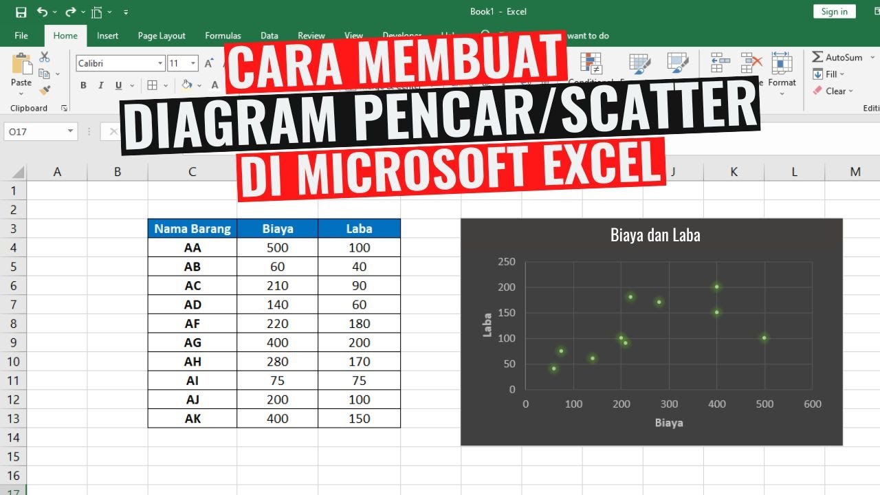
Cara Membuat Diagram Pencar atau Scatter di Excel
#1 - Belajar Excel Dari Nol | Mengenal Interface Excel

CORRELATION || MATHEMATICS IN THE MODERN WORLD

Smart Home with Google Assistant & Alexa using NodeMCU ESP8266 (Manual + Voice) | IoT Projects 2021

Penyajian Data Dalam Bentuk Dot Plot

Menggambar Diagram Pencar Secara Manual - Matematika Wajib SMA Kelas XI Kurikulum Merdeka
5.0 / 5 (0 votes)
