STATISTIKA Part 4 - PERBEDAAN BOX PLOT, HISTOGRAM DAN DOT PLOT
Summary
TLDRIn this video, the concept of statistical visualizations is introduced, focusing on the differences between boxplots, histograms, and dotplots. The presenter explains how each type of plot is constructed and highlights their specific purposes: boxplots summarize data with five key statistics; histograms display data in overlapping bars, ideal for large datasets; and dotplots represent individual data points for smaller, discrete datasets. The video also covers how to draw each plot, and concludes by comparing their core differences, providing a clear understanding of when and how to use each type of chart effectively.
Takeaways
- 😀 Boxplots, histograms, and dotplots are different ways of visualizing data, each with unique characteristics.
- 😀 Boxplot represents data through five key summary statistics: smallest observation, Q1 (first quartile), median (Q2), Q3 (third quartile), and largest observation.
- 😀 Histograms are similar to bar graphs but with adjacent bars, representing data frequency within specific intervals on the x-axis.
- 😀 Dotplots are simple graphs where each data point is represented as a dot, showing the distribution of numerical variables.
- 😀 To create a histogram, you first determine the upper and lower limits of each class interval, adjusting boundaries by 0.5 units.
- 😀 A histogram's bars are adjacent and represent continuous data, while bar graphs (diagrams) have gaps between bars.
- 😀 Dotplots are most effective for small datasets and display data as discrete points, helping visualize the mode and median directly.
- 😀 The primary difference between histograms and boxplots is that histograms display data frequency within intervals, while boxplots summarize five key statistical points.
- 😀 Dotplots are ideal for small datasets with discrete, integer-based values (known as 'discrete data').
- 😀 The key takeaway is that each visualization method has its use cases: boxplots for data summaries, histograms for frequency distributions, and dotplots for small, discrete datasets.
Q & A
What is a boxplot and what are its key components?
-A boxplot is a statistical visualization that summarizes data using five key points: the minimum value, the first quartile (Q1), the median (Q2), the third quartile (Q3), and the maximum value. It provides insight into the distribution of the data and highlights any outliers.
How is a histogram different from a bar chart?
-A histogram is similar to a bar chart but the bars in a histogram are contiguous, meaning they touch each other, while bar charts have gaps between the bars. Histograms are used to represent the distribution of numerical data, whereas bar charts are often used for categorical data.
What does a dotplot represent, and when is it useful?
-A dotplot is a graphical representation where each data point is shown as a dot. It is particularly useful for small datasets with discrete values. Dotplots help in easily identifying the mode, median, and distribution of the data.
What are the steps involved in creating a histogram?
-To create a histogram, first determine the lower and upper boundaries of each class interval. Then, calculate the frequency for each interval, and plot the bars on a coordinate system where the x-axis represents the intervals and the y-axis represents the frequency.
How do you determine the upper and lower limits for each class interval in a histogram?
-The lower limit of each class interval is found by subtracting 0.5 from the lower boundary of the interval. The upper limit is determined by adding 0.5 to the upper boundary. This adjustment helps in properly visualizing the data in the histogram.
What is the significance of the five-number summary in a boxplot?
-The five-number summary in a boxplot—minimum, Q1, median, Q3, and maximum—provides a quick overview of the data distribution, central tendency, and range. It also helps identify potential outliers in the data.
How is a dotplot created step-by-step?
-To create a dotplot, first, order the data from smallest to largest. Then, for each value, plot a dot at its corresponding position on a number line, where the number of dots corresponds to the frequency of that value.
What are the key differences between a boxplot, histogram, and dotplot?
-A boxplot summarizes data with five key points and is useful for showing distribution and outliers. A histogram represents the frequency of data using contiguous bars. A dotplot displays individual data points as dots and is best suited for small, discrete datasets.
When should a dotplot be used instead of a histogram or boxplot?
-A dotplot is best used for small, discrete datasets where individual data points are important to visualize. It is not ideal for large datasets, as it can become cluttered. In contrast, histograms and boxplots are better suited for larger datasets with continuous data.
What is meant by 'discrete data' in the context of a dotplot?
-Discrete data refers to data that can only take specific, separate values (often integers) and cannot be divided into smaller parts. In dotplots, each distinct data point is represented by a dot, making it ideal for visualizing such data.
Outlines

هذا القسم متوفر فقط للمشتركين. يرجى الترقية للوصول إلى هذه الميزة.
قم بالترقية الآنMindmap

هذا القسم متوفر فقط للمشتركين. يرجى الترقية للوصول إلى هذه الميزة.
قم بالترقية الآنKeywords

هذا القسم متوفر فقط للمشتركين. يرجى الترقية للوصول إلى هذه الميزة.
قم بالترقية الآنHighlights

هذا القسم متوفر فقط للمشتركين. يرجى الترقية للوصول إلى هذه الميزة.
قم بالترقية الآنTranscripts

هذا القسم متوفر فقط للمشتركين. يرجى الترقية للوصول إلى هذه الميزة.
قم بالترقية الآنتصفح المزيد من مقاطع الفيديو ذات الصلة

BOX PLOT, HISTOGRAM, DOT PLOT STATISTIKA KELAS 10

04-1 Memahami Data Melalui Eksplorasi Data
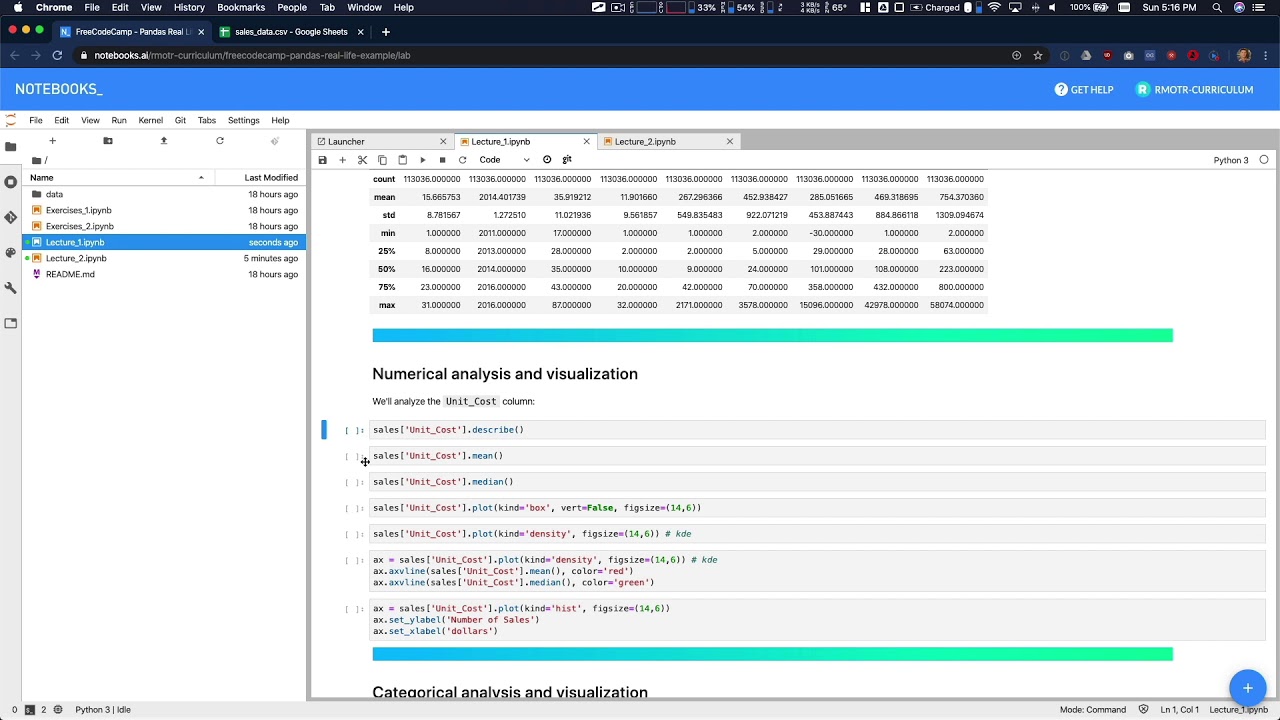
Data Analysis Example A - Data Analysis with Python

Cara Analisis Statistik Deskriptif dengan Jamovi

UJI NORMALITAS: Kenapa & Variabel apa yang dapat Diuji Normalitas-nya?
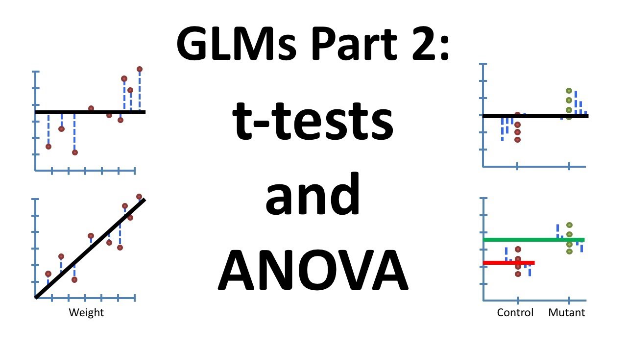
Using Linear Models for t-tests and ANOVA, Clearly Explained!!!
5.0 / 5 (0 votes)
