STATISTIKA Part 5 - DIAGRAM PENCAR
Summary
TLDRThis educational video explains how to create and analyze scatter diagrams (Diagram Pencar). It covers key steps such as identifying independent and dependent variables, determining their range, creating a Cartesian plane, and plotting the data points. The video also teaches how to interpret the diagram, highlighting patterns of relationship (linear vs. non-linear), direction (positive vs. negative), and strength (strong vs. weak). Through an example of sales data, viewers learn to visualize and understand the relationship between two numeric variables, making scatter diagrams a useful tool in data analysis.
Takeaways
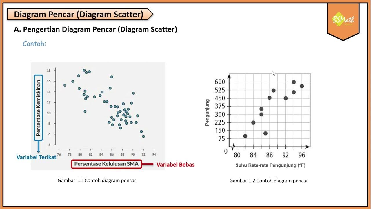
- 😀 Diagram Pencar (scatter plot) is a diagram that represents the distribution of points in a Cartesian plane, showing the relationship between two variables.
- 😀 The first step in creating a scatter plot is to determine the independent variable (X) and the dependent variable (Y). The independent variable influences the dependent variable.
- 😀 After determining the variables, the next step is to identify the highest and lowest values for both X and Y variables.
- 😀 The third step is to create a Cartesian coordinate system with scales that correspond to the highest and lowest values of the variables.
- 😀 The final step in creating a scatter plot is to plot the points on the diagram according to the pairs of data values.
- 😀 Scatter plots can help to visually analyze the relationship between two numeric variables and identify patterns or correlations.
- 😀 Relationships between variables in scatter plots can be classified into two categories: linear and nonlinear.
- 😀 A linear relationship in a scatter plot is characterized by a straight line, where the variables move together in a proportional or direct way, either positively or negatively.
- 😀 A nonlinear relationship in a scatter plot does not form a straight line and may follow a curve, such as a parabolic shape.
- 😀 The direction of the relationship between variables can either be positive or negative. A positive relationship means both variables increase together, while a negative relationship means one increases while the other decreases.
- 😀 The strength of the relationship between variables can vary from weak to strong. A strong relationship is represented by points that closely align to a straight line, while a weak relationship is shown by scattered points with no clear pattern.
Q & A
What is the primary purpose of a scatter diagram?
-A scatter diagram is used to show the relationship between two numerical variables by plotting data points on a Cartesian plane. It helps in visualizing patterns, trends, and potential correlations between the variables.
How do you determine which variable goes on the x-axis and which goes on the y-axis in a scatter diagram?
-The variable that influences the other variable should be placed on the x-axis (independent variable), while the variable that is affected or dependent on the first variable should be placed on the y-axis (dependent variable).
What are the four key steps to create a scatter diagram?
-The four steps are: 1) Identify the variables (x and y), 2) Determine the highest and lowest values for each variable, 3) Draw the Cartesian plane with an appropriate scale based on these values, and 4) Plot the points based on the data pairs.
What does a 'linear relationship' mean in a scatter diagram?
-A linear relationship means that the data points form a straight line, indicating a consistent and proportional relationship between the variables. This could either be a positive or negative linear relationship.
What is the difference between a linear and a non-linear relationship in a scatter diagram?
-In a linear relationship, the data points form a straight line, indicating a proportional change between variables. In a non-linear relationship, the data points form a curve (e.g., parabolic), indicating a more complex, non-proportional relationship.
What is the significance of the direction of a relationship in a scatter diagram?
-The direction indicates whether the relationship between the variables is positive or negative. In a positive relationship, both variables increase together, while in a negative relationship, as one variable increases, the other decreases.
How do you determine if a relationship is strong or weak in a scatter diagram?
-A strong relationship is indicated by data points that form a clear line or curve, showing a consistent pattern. A weak relationship is indicated by data points that are scattered widely without forming any discernible pattern.
Can a scatter diagram show the exact nature of the relationship between two variables?
-No, a scatter diagram only provides a visual representation of the relationship. It helps in identifying the type, direction, and strength of the relationship but does not quantify the exact nature or cause of the relationship.
What kind of data was used in the example provided in the video for creating a scatter diagram?
-The example used data from 20 salespeople, where the variables were the number of visits (independent variable, x) and the sales results (dependent variable, y).
What are the three key pieces of information you can analyze from a scatter diagram?
-The three key pieces of information are: 1) the pattern of the relationship, 2) the direction of the relationship (positive or negative), and 3) the strength or degree of the relationship (strong or weak).
Outlines

هذا القسم متوفر فقط للمشتركين. يرجى الترقية للوصول إلى هذه الميزة.
قم بالترقية الآنMindmap

هذا القسم متوفر فقط للمشتركين. يرجى الترقية للوصول إلى هذه الميزة.
قم بالترقية الآنKeywords

هذا القسم متوفر فقط للمشتركين. يرجى الترقية للوصول إلى هذه الميزة.
قم بالترقية الآنHighlights

هذا القسم متوفر فقط للمشتركين. يرجى الترقية للوصول إلى هذه الميزة.
قم بالترقية الآنTranscripts

هذا القسم متوفر فقط للمشتركين. يرجى الترقية للوصول إلى هذه الميزة.
قم بالترقية الآنتصفح المزيد من مقاطع الفيديو ذات الصلة

Menggambar Diagram Pencar Kelas XI Fase F Kurikulum Merdeka

Menggambar Diagram Pencar Secara Manual - Matematika Wajib SMA Kelas XI Kurikulum Merdeka

Pengertian Diagram Pencar - Matematika Wajib SMA Kelas XI Kurikulum Merdeka

Grade 10 English Q1 Ep3: Textual Aids in Understanding Text

09. Membuat Deployment Diagram menggunakan Draw.io

Belajar Statistika - [Scatter Plot] Diagram Pencar (bagian 1)
5.0 / 5 (0 votes)
