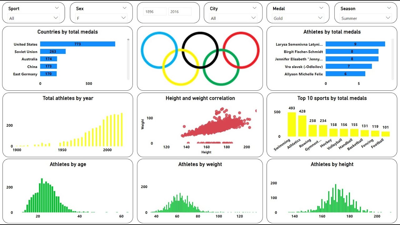
Power BI Beginner Tutorial: Analyzing The Olympics
Summary
TLDRThis tutorial introduces viewers to Power BI, guiding them through importing, analyzing, and visualizing Olympic athlete data from 1896 to the present. It covers Power BI's main components, including DAX, the Power Query editor, and report view. The video demonstrates creating visualizations like matrices and line charts, fixing data issues, and using advanced features like relationships and Power Query for data cleaning. It concludes with creating an animated ArcGIS map showing the Olympic participation and medal count evolution over time, highlighting the tool's powerful data analysis capabilities.
Takeaways
- 🏅 The script introduces an animated visualization depicting Olympic participation and medal wins from 1896 to the present, highlighting the historical concentration in Europe and North America and the recent globalization of the event.
- 📊 It provides a beginner tutorial on Power BI, covering the main components such as DAX, the M language, Power Query Editor, and Report View.
- 📈 The tutorial guides users on how to import, analyze, clean, and visualize data, using a dataset on Olympic athletes as an example.
- 🔍 The Power BI interface is explored, with instructions on importing a dataset and navigating through the report, data, and model sections.
- 📝 The script explains how to create a matrix visualization to analyze the number of competitors by team and the total number of Olympic games each country has participated in.
- 🎯 It demonstrates how to add filters to visualizations to focus on specific subsets of data, such as countries that have participated in more than 15 Olympic games.
- 📉 The tutorial shows how to create line charts to visualize the total number of competitors and the number of countries over time, revealing trends and fluctuations.
- 🌐 A map visualization is created to display the total points earned by each country, using color coding to represent different levels of achievement.
- 🕒 An ArcGIS map is used to create an animation showing the historical progression of Olympic participation and medal wins, emphasizing the growth and spread of the games.
- 🔄 The script covers the process of joining population data with medal data to calculate the ratio of medals earned per thousand people in a country.
- 📊 The concept of rolling averages is introduced, showing how to calculate and visualize the cumulative medal count for countries over successive Olympic games.
Q & A
What is the main focus of the animation in the video?
-The animation focuses on showing the historical participation of countries in the Olympics from 1896 to the present and identifying which countries have won the most medals.
What are the main components of Power BI covered in the tutorial?
-The tutorial covers Power BI's main components including DAX, the M language, Power Query Editor, and the Report View.
What is the purpose of the 'Power Query Editor' in Power BI?
-The Power Query Editor is used for cleaning, transforming, and preparing data for analysis within Power BI.
How does Power BI handle data importation from a CSV file?
-Power BI allows users to import data by clicking 'Get Data', selecting 'Text/CSV', and choosing the desired file. It provides a preview to ensure the data looks correct before loading it.
What is the significance of the 'Report', 'Data', and 'Model' sections in Power BI?
-These sections are the core areas of Power BI. The 'Report' section is for creating visualizations, the 'Data' section for viewing and manipulating data, and the 'Model' section for establishing relationships between different data sets.
How can Power BI be used to explore the number of competitors by team?
-Power BI can create a matrix visualization to pivot on the 'Team' column and count the number of competitors, allowing users to analyze the data by sorting and filtering.
What is the role of DAX (Data Analysis Expressions) in Power BI?
-DAX is used in Power BI for defining calculations and measures within the data model, creating new calculations, and filtering data for visualizations.
How can Power BI create a visualization that shows the number of Olympic games each country has participated in?
-By using a matrix visualization, users can drag the 'Games' column under values and apply a distinct count to show the total number of unique Olympic games each country has participated in.
What is the purpose of the 'Filter' feature in Power BI visualizations?
-The 'Filter' feature allows users to refine the data displayed in a visualization, such as showing only countries that have participated in more than a certain number of Olympic games.
How does Power BI handle data relationships between different data sets?
-Power BI uses the 'Model' section to visualize and create relationships between different data sets, allowing for the linking of related data across tables for comprehensive analysis.
What is the advantage of using Power Query Editor over DAX for creating new columns?
-Power Query Editor is better for creating new columns that will be used in various contexts throughout the data set, while DAX is more suitable for creating columns that are specific to a single visualization.
How can Power BI be used to analyze the total number of medals won by each country?
-By creating new columns for bronze, silver, and gold medals using Power Query Editor, and then calculating a 'Total Metals' column, Power BI can aggregate these to find the total number of medals won by each country.
What is the significance of the 'Points' system in the Power BI analysis?
-The 'Points' system assigns a value to each type of medal (e.g., bronze = 1 point, silver = 2 points, gold = 3 points), allowing for a weighted analysis of each country's performance in the Olympics.
How can Power BI create a map visualization showing the distribution of Olympic points across countries?
-By using a map visualization, setting 'Region Name' as the location, and using the 'Points' column for tooltips, fill colors, and size of the map markers, Power BI can display the distribution of Olympic points.
What does the ArcGIS map visualization in Power BI offer that a standard map does not?
-The ArcGIS map visualization allows for the creation of animations over time, showing the evolution of countries' participation and medal counts in the Olympics.
How can Power BI be used to find the number of medals per thousand people in a country?
-By joining population data with medal data and creating a 'Metal Ratio' column that divides the total medals by the population, Power BI can normalize medal counts based on country population size.
What is the purpose of creating a 'Rolling Total' in Power BI?
-The 'Rolling Total' allows for the analysis of the cumulative growth of medals over time for each country, showing how the medal count has increased with each Olympic Games.
How does the tutorial demonstrate the use of time-based data in Power BI?
-The tutorial shows how to convert a year column into a date format and use it in an ArcGIS map to create an animation that visualizes the historical progression of Olympic participation and medal wins.
Outlines

此内容仅限付费用户访问。 请升级后访问。
立即升级Mindmap

此内容仅限付费用户访问。 请升级后访问。
立即升级Keywords

此内容仅限付费用户访问。 请升级后访问。
立即升级Highlights

此内容仅限付费用户访问。 请升级后访问。
立即升级Transcripts

此内容仅限付费用户访问。 请升级后访问。
立即升级浏览更多相关视频

Create an Amazing Power BI Dashboard in 17 minutes | 120 years of olympics Dataset

Dasar Dasar Power BI | Pembuatan Dashboard Covid-19 Indonesia

Power BI Tutorial for Beginners

Olympic Data Analytics | Azure End-To-End Data Engineering Project | Part 2

Power BI Tutorial For Beginners | Create Your First Dashboard Now (Practice Files included)

Power BI Project For Beginners | Sales Insights Data Analysis Project - 3 - Data Analysis Using SQL
5.0 / 5 (0 votes)
