The 7 Quality Control (QC) Tools Explained with an Example!
Summary
TLDRIn this video, Andy from CQE Academy discusses the Seven QC Tools essential for quality management and problem-solving. He covers each tool, including flow charts, check sheets, Pareto charts, cause-and-effect diagrams, scatter diagrams, histograms, and control charts. Using a practical example involving toaster defects, Andy demonstrates how to apply these tools to identify and address quality issues, ultimately reducing defects by controlling variables like humidity. The video is valuable for those preparing for Green Belt, Black Belt, or CQE exams, as well as professionals seeking to enhance their quality improvement skills.
Takeaways
- 🛠️ The video covers the seven QC tools essential for quality improvement and problem-solving.
- 📝 The tools discussed include flow charts, check sheets, Pareto charts, cause and effect diagrams, scatter diagrams, histograms, and control charts.
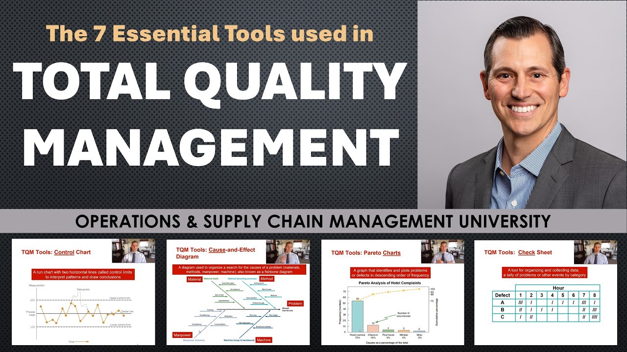
- 📈 Flow charts visually depict the sequence of a process, promoting a common understanding and simplifying complex processes.
- 📊 Check sheets are vital for collecting, organizing, and analyzing data, ensuring decisions are based on accurate information.
- 📉 Pareto charts help identify the most significant issues by applying the 80/20 rule, focusing on the vital few causes of problems.
- 🐟 Cause and effect diagrams, also known as fishbone diagrams, are used to identify potential root causes of problems through structured brainstorming.
- 🔍 Scatter diagrams illustrate relationships between two variables, helping to determine potential correlations without assuming causation.
- 📅 Histograms display the frequency of data over time, helping to understand process variation and distribution patterns.
- 🔬 Control charts monitor and confirm that processes remain in control by showing data within control limits and detecting any significant changes.
- 📉 Practical example: The video uses a toaster defect problem to demonstrate the application of these tools, highlighting how controlling humidity can reduce defects.
Q & A
What are the seven QC tools discussed in the video?
-The seven QC tools are the flow chart, check sheet, Pareto chart, cause and effect diagram, scatter diagram, histogram, and control charts.
Why are these seven QC tools important according to the video?
-These tools are considered incredibly powerful for solving problems and making improvements, with the claim that 95% of quality problems can be solved with these fundamental tools.
What is the purpose of a flow chart in the QC tools?
-A flow chart is a visual tool that helps depict the flow or sequence of a process, making complex processes simple and promoting a common understanding of the process.
What is a check sheet and how is it used?
-A check sheet is a simple tool for collecting, organizing, and analyzing data. It ensures that decisions are based on data and should include metadata such as who, when, and where the data was collected.
What is the Pareto principle and how does it relate to the Pareto chart?
-The Pareto principle, or the 80/20 rule, states that 80% of problems are often due to 20% of causes. A Pareto chart helps identify these 'vital few' causes so that efforts can be focused on the most significant issues.
What is a cause and effect diagram and what is its purpose?
-A cause and effect diagram, also known as a fishbone diagram or Ishikawa diagram, is used to systematically identify potential causes of a problem and understand the relationship between them.
How can a scatter diagram be used in QC processes?
-A scatter diagram plots pairs of data to identify and analyze the relationship between two variables, helping to understand if and how one variable affects another.
What does a histogram show and why is it useful?
-A histogram is a bar chart that graphs the frequency of occurrence of continuous data, showing the distribution and variation within a process, which helps in understanding process behavior and capability.
How does a control chart help in maintaining process control?
-A control chart monitors the stability of a process over time, ensuring that it remains within control limits and only experiences normal variation, confirming the effectiveness of implemented changes.
What was the specific example used in the video to demonstrate the use of the seven QC tools?
-The example used was reducing the number of defects in a toaster manufacturing process, where the tools were applied to identify and control for high humidity during assembly as a root cause of defects.
Outlines
📈 Introduction to the Seven QC Tools
Andy from CQE Academy introduces the seven quality control (QC) tools, emphasizing their importance in work efficiency, problem-solving, and preparation for exams like the Green Belt, Black Belt, and CQE. The video will cover an overview of the tools, their role in the problem-solving process, and a practical application to reduce defects in toasters. The quote from Kaoru Ishikawa highlights the power of these tools in solving up to 95% of quality problems. The session will also explain the Plan-Do-Check-Act (PDCA) cycle and the Define, Analyze, Improve, Control (DMAIC) methodology.
🛠️ Utilizing the Flow Chart and Check Sheet
The first tool discussed is the flow chart, a visual representation of process steps that simplifies complexity and fosters a common understanding. The speaker uses a toaster example to demonstrate creating a flow chart, emphasizing the importance of boundaries and team collaboration. The second tool, the check sheet, is introduced for data collection with a focus on including metadata for data integrity. The team uses the check sheet to identify the most frequent defects during final testing, setting a goal to reduce defects by 25% based on collected data.
📊 Analyzing Defects with the Pareto Chart
The Pareto chart is introduced as a tool to apply the 80/20 rule, identifying the most significant issues affecting quality. The video explains the historical background of the Pareto principle and its application in focusing on key defects. Using the check sheet data, the Pareto chart reveals that 'control PCB issues' account for 40% of defects, indicating the primary area to target for improvement. The speaker also discusses the importance of teamwork and structured analysis in identifying root causes.
📚 Cause and Effect Diagram and Scatter Diagram
The cause and effect diagram, also known as the fishbone diagram or Ishikawa diagram, is detailed as a method for root cause analysis. The process involves a well-defined problem statement and structured thinking across different categories like the 8Ms (Man, Machine, Material, etc.). The video also introduces the scatter diagram for understanding the relationship between two variables, using the example of how humidity affects defect rates. The speaker cautions against assuming causality from correlation alone.
📈 Histogram and Control Chart for Process Analysis
The histogram is explained as a tool for analyzing the pattern of process variation, allowing engineers to understand the behavior of a process and its capability when compared to specification limits. The control chart is introduced as a method to confirm process stability, ensuring that only normal variation is occurring. The video concludes with an example of how controlling humidity reduced defects in the toaster process, demonstrating the effectiveness of the QC tools in achieving the improvement target.
🎓 Conclusion and Resources for Quality Engineering
The video concludes with a summary of the QC tools' effectiveness in reducing defects by controlling humidity in the toaster example. The speaker invites viewers to engage with the content, offering a free course for those interested in becoming a Certified Quality Engineer (CQE). The course is available at CQE Academy's website and includes practice exams to assist in exam preparation.
Mindmap
Keywords
💡Seven QC Tools
💡Flow Chart
💡Check Sheet
💡Pareto Chart
💡Cause and Effect Diagram
💡Scatter Diagram
💡Histogram
💡Control Chart
💡Plan-Do-Check-Act (PDCA) Cycle
💡Defects
Highlights
Introduction to the seven QC tools: Flow Chart, Check Sheet, Pareto Chart, Cause and Effect Diagram, Scatter Diagram, Histogram, and Control Charts.
Flow Chart: A visual tool that simplifies complex processes and promotes a common understanding.
Quote from Dr. Deming: 'If you can't describe what you're doing as a process, you don't know what you're doing.'
Check Sheet: A powerful tool for collecting, organizing, and analyzing data with an emphasis on including metadata for data integrity.
Pareto Chart: Helps identify the vital few issues that account for most problems, using the 80/20 rule popularized by Joseph Juran.
Cause and Effect Diagram (Fishbone/Ishikawa Diagram): Used to identify potential root causes and contributing factors of a problem.
Scatter Diagram: Illustrates the relationship between two variables, highlighting the importance of distinguishing correlation from causation.
Pearson Correlation Coefficient: Quantifies the relationship between variables, ranging from -1 (perfect negative correlation) to 1 (perfect positive correlation).
Histogram: A bar chart that displays the frequency of occurrence of continuous data, useful for understanding process variation and capability.
Control Chart: Monitors and controls processes to ensure changes are effective over time, distinguishing normal variation from special cause variation.
Application of the seven QC tools in a practical example to reduce defects in a toaster manufacturing process by 25%.
Ishikawa's quote on QC tools: 'As much as 95% of quality problems can be solved with seven fundamental tools.'
Importance of team-based activities in quality improvement processes.
Use of Plan-Do-Check-Act (PDCA) or DMAIC cycle in problem-solving with QC tools.
Encouragement to use brainstorming and cross-functional teamwork to identify potential root causes in the cause and effect diagram.
Transcripts
hey guys andy here with cqe academy and
in today's video i want to talk about a
really important topic
which is the seven qc tools now whether
you just want to get better at work and
use these tools in your everyday job
or you're preparing for something like
the green belt exam or the black belt
exam or the cqe exam
today's lecture is for you all right
let's head over to the computer get
started
all right let's go ahead and jump in
right into the agenda so we're gonna
start with a brief
intro of the seven qc tools kind of talk
about all of them and how they fit into
the
problem solving process or the the
improvement process and then we're gonna
go through each one we're gonna start
the flow chart
the check sheet the pareto chart the
cause and effect diagram
scatter diagram histogram and then the
control charts and then
along the way as we go through this
we're actually gonna work a problem
using all seven tools and we're gonna
reduce the number of defects
associated with our toaster all right
let's go and get started so the seven qc
tools
i love this quote from kerou ishikawa
who said
as much as 95 of quality problems can be
solved with seven fundamental tools and
i
absolutely agree with that i think these
tools are probably
the seven most powerful tools whether
you're talking about
green belt or black belt or quality
engineering it doesn't matter
these seven tools are incredibly
powerful for
solving problems and making improvements
and and this is a really important topic
by the way as we go through this i'll
make sure to talk about
where we're at in something like the
plan do check act or the domain cycle
we're gonna solve a problem with our
toaster and we'll we'll use either the
domain or the plan do check out process
to do it
all right let's get into it all right so
the very first tool is the flow chart
and what a flowchart does is say it's a
visual tool
that helps you depict the flow or the
sequence of a process
this could be things like the flow of
information or the flow of tasks or
material or people or decisions
it doesn't matter the reason that a
flowchart is so incredibly valuable is
it makes a
really complex process simple and
it promotes a common understanding of a
process anytime you get more than one
person in a room to talk about a process
there's likely going to be disagreement
about how the process works
and i love using this analogy often
times when when we sit down to
analyze a process there's what
management thinks is happening
there's what the procedure says is
happening there's what's actually
happening on the production floor
and then there's what could be happening
and the beauty of a flow chart is it it
does just that it gets everyone on the
same page
about what's actually happening and i
love this quote
from dr deming who said if you can't
describe what you're doing as a process
you don't know what you're doing and the
best way
to describe what you're doing is to use
a flowchart
and that's why this tool is so powerful
if you're in the planning phase of the
define phase
it's really good to use a flow chart
define your process
and then use that flow chart to plan out
your experiment and plan out how you're
going to make an improvement
so let's do just that let's say we're
talking about our toaster
and we want to make an improvement right
and so the first thing we're going to do
is we're going to start with the
boundaries we want to analyze a process
but we want to start with our boundaries
first
so we're going to go from receiving a
work order to completing a workload
that's the boundaries of our flow chart
now i've got the team here because all
of these activities all these tools are
all team based so imagine you're sitting
down with your team
and the first thing you're going to do
is brainstorm all of the steps in the
process right
talk to the experts how does the process
work use post-it notes right don't try
to do this in some software
use post-it notes write down all the
activities and then once you're done
brainstorming
organize those thoughts into that
logical flow
that logical sequence of activities for
your process
and now that we have our process here
we're in that planning phase and we want
to create a target right
what sort of improvement are we going to
make and we want to reduce defects by 25
now we can't make an improvement and we
can't solve a problem without data
and we know that most of our defects
happen during final testing
so now we need to collect a little bit
of data and this is where the check
sheet comes into play
so the check sheet is a very simple tool
for collecting
organizing and analyzing data every
problem you solve or every improvement
you make
should be based on data and the check
sheet is probably the most powerful tool
for collecting data
now there's something wrong with the
check sheet that i'm showing you here on
the screen
and that problem is is it doesn't have
any metadata
if you're collecting data and you want
to make a high quality decision
using that data you also need metadata
so when you're creating your check sheet
don't forget to include things like who
and when and where
all those key elements of data integrity
and data accuracy
are really important for making high
quality decisions
okay so we've got the team together and
again we did a little bit more
brainstorming we said
okay at final testing we have eight
defects that we want to collect some
data on so we create this check sheet
we've got our metadata here
we hand this off to the team and they
come back to us a week later
with a bunch of data now this is
fantastic we finally have some data
that we can analyze and the question is
which defect
do we focus on i want to improve our
target so we originally said
we want to reduce defects by 25 percent
well now that we have a little bit of
data we can actually create a target
so we have 145 defects across a whole
week that's seven days
that means we're averaging about 20 to
21 defects
per day now if we can reduce that by 25
percent
we will eliminate five defects per day
now we obviously can't focus on all
these defects so the real question is
how do we know
what to focus on and that's where the
pareto chart comes into play
so the pareto chart is another qc tool
that allows you to
analyze your data in search of the
pareto principle
so what it what is the pareto rule what
is this 80 20 rule
so this this is a a natural phenomenon
that was discovered by a guy named
vilfredo paredo
he's an italian researcher who was
studying
land ownership and wealth distribution
in italy
and in europe and what he found is that
80 percent of the land
was owned by 20 percent of the people
and this 80 20 rule in this 80 20
phenomenon
was also experienced by a guy named
joseph duran
now he gave credit for the tool to
wilfredo praeto but he was the one who
popularized this idea
of the 80 20 rule and this idea of the
pareto chart and what he told us and
what he taught us is that
a pareto chart helps you separate the
vital few
from the trivial many now what did joran
mean what he means is when you're
solving a problem there's often
one or two key issues key root causes or
key
defects that you need to focus on to
have a major impact
on that particular situation and that's
exactly what you see here
when we take our data from the check
sheet and we put it into this pareto
chart
we see that control pcb issues accounts
for
nearly 40 of our defects you can see if
we come across here
we've got 40 percent of our defects
coming directly from control pcb
now there's two things happening on this
graph obviously there's the blue bars
which are simply just the frequency or
the count
of defects that occurred throughout the
week and then this black bar is actually
the cumulative
line so this first defect accounts for
40 percent and then we go up and up and
up all the way to 100
now that we have this pareto analysis we
know that control pcb
is our primary issue it tells us what to
focus on now we still don't understand
why
these issues are happening and this is
where something like the cause and
effect diagram can be incredibly useful
so this is the the fish bone diagram or
the ishikawa diagram
there's all sorts of different names for
it but it is a cause and effect diagram
and the way this works is we start with
the effect
that's over here on the right that's the
head of the fish here in orange this is
our effect
and so step one of the cause-and-effect
diagram is to start with a really
well-written problem statement
so i've put in pcb failures but in
reality you want to have a
much more descriptive problem statement
than this and once you have this effect
you can start working through the the
fish bone process
to analyze all of the potential causes
and failures
now i'm showing here what's called the
8ms and this is the beauty of the
fishbone process
is that it's a well-structured approach
to root cause analysis
it forces you to think about all of the
potential
different categories or scenarios or
causes that might be contributing to
your problem
now along with the cause and effect
diagram are a number of tools that you
should be using
so i would recommend you get out your
flow chart look at your process
use your flow chart and and ask yourself
how might each step in the process fail
and contribute to the the effect that
we're seeing teamwork is also a must
here
you're not going to be a subject matter
expert in all of those eight m's and you
need people from operations and
engineering and quality and r d
and marketing and maintenance to really
do a thorough analysis
in each of those areas to truly
understand the root cause and then of
course brainstorming
you know you're going to have to
creatively think about and talk about
and discuss
potential root causes that maybe you're
not even aware of
and then the five-way analysis i love
the five wise it really helps you go
from a high-level symptom
down to the true root cause and really
ask why why why
to truly get to those those real root
causes that you need to address
and then as you have that team
discussion and you you go through the
process
you can identify potential root causes
and contributing factors
to the problem you're trying to solve
now obviously again it's we have to go
back to that parade of principle we
can't focus on everything
we have to talk about the most likely
root causes and the most likely
contributing factors
so again at the end of your cause and
effect diagram you might identify three
or four issues that you need to study
further
now i wanna i wanna talk about this one
high humidity during assembly
now as we were working through the cause
and effect diagram process the engineer
who was helping us
looked at our check sheet and noticed an
interesting pattern
what they noticed here and i've
highlighted here in yellow is that
sunday monday tuesday we
we only had a few defects right six and
four and one whereas on wednesday
thursday friday you'll notice that our
defect rate jumped up a little bit
and what the engineer remembered is that
we had a rainstorm come through
on tuesday night and the humidity level
in the facility really jumped up
and so what the hypothesis here is that
humidity
is affecting our defect rate so i've
created this little table here to show
the days of the week
along with the defects and the humidity
now to truly understand this
relationship
we have to create a scatter diagram
so here's exactly what that scatter
diagram looks like
what we do here is we're plotting pairs
of data so for example on sunday we had
six defects
and 18 humidity you can see that right
here that's this data point right here
we had six defects
18 humidity now the way this scatter
diagram works
or you might hear this called an xy
scatter plot is here on the x-axis
we put our controllable variable our
independent variable
and then on the y-axis we put our
response variable so here we believe
that
relative humidity is the the independent
variable that is affecting
our response variable which is defects
and you can see here that there appears
to be some relationship
between pcb failures and humidity
now it's really important when you're
looking at the scatter diagram not to
assume that this relationship
is a causal relationship right there's
this really important concept that you
can have
correlation without causation two
parameters or two variables can
correlate
without having a cause and effect
relationship so let's assume though
let's assume that we've done a doe here
and we've proven
that humidity has an effect on our pcb
defects
we could come back to the scatter
diagram we could say okay
our target for pcb defects is five or
less let's call it let's call it five or
less
and so we come down here to humidity and
say okay we wanna control
humidity to around 20
to keep our defects low does that make
sense and that's a this is a great way a
scatter diagram is a great way to
understand the relationship
between two possible variables now once
you've done your scattered diagram
you can quantify the relationship
between those two variables
so what i'm showing here is the pearson
correlation coefficient
and this coefficient ranges from
positive 1 all the way
over here on the left to negative 1 all
the way over here on the right
and that ranges from a perfectly
positive correlation here you can see
that as x changes y changes
identically and then same thing here
with r equals minus one this is a
perfect negative correlation
now as we get closer to zero we start to
lose that relationship
so an r value of zero means there's no
correlation between those two parameters
as x changes
y basically does whatever it wants
there's no relationship between those
two variables
now the next thing we could do in our
analysis is to look at
relative humidity over time so let's say
we go out
we talk to our facilities engineers we
say okay give us the relative humidity
within our environment
you know every six hours for the last
six months and we can take that data and
we want to plot it because we need to
understand
how relative humidity is changing within
our facility
and one of the ways you could analyze
that data is with a histogram
so a histogram is just a very simple bar
chart that graphs the frequency of
occurrence
of continuous data and again this is a
great way to talk about your process
every process or every product or every
quality attribute out there
has some level of random normal
variation
that will often occur in a pattern and
as engineers we need to understand what
is the pattern
associated with with our outputs or our
process and a histogram is a great way
to understand the pattern or the
variation in your process
now you might grab this data and you
might get like a skewed distribution or
maybe a bimodal distribution
or exponential distribution there's all
sorts of distributions you might get
but it's great to know how your process
is behaving
now the other beautiful part about a
histogram is you can take this data
and let's overlay some some
specification limits right
now what we have is the beginnings of
process capability
so the histogram is a fantastic tool to
quantify and understand how your process
behaves
and if you compare that against the
specification limits we can now start
talking about process capability
okay so we're on to the very last and
final qc tool
let's assume we now control for humidity
and we want to make sure that that
change has been effective over time
a control chart is the right tool or the
perfect tool to do that
so what is a control chart it is
essentially a tool that allows you to
confirm that your process
is in control now when i say in control
what i mean is
that you're only experiencing normal
variation when your process is
experiencing normal cause variation
your data should fall with within those
control limits
by the way if you're new to spc i have a
whole separate video on control charts
you can go check it out
i've got both the x bar on our chart as
well as attribute data
and a control chart is a fantastic tool
to use at the end of a project
to monitor and control your process and
make sure that your changes were
effective
and let's take a look at what this looks
like for our particular process
so here's our process right the first
week of data you can see we're really
all over the place
and our control limits are really wide
because we're not controlling for
humidity
and we've got all this data and you can
see on average we have about
eight defects per day right we're really
jumping around here and then let's say
on day nine we start controlling for
relative humidity
and we've got our our control chart
we're collecting data and you can see
that for the next
you know 20 plus days our defect rate
has dramatically fallen in fact our new
mean defects per day is around three
so essentially we've gone from eight
defects per day down to three defects
per day
and we've hit our target of reducing
defects by 25 percent
we've gone from 20 plus defects a day
down to about 15
all by controlling relative humidity in
our process all right that's it for
today
i hope you enjoyed it if you did hit
that like button also if you're serious
about becoming a cqe
i've got a free course go check it out
it's at cqe academy.com
free course where i cover the top 10
topics on the cq exam
and i also give you a bunch of great
free practice exams to help you on that
journey
all right i hope you enjoyed it thanks
so much i'll see you again bye
浏览更多相关视频
Las 7 Herramientas de Control de Calidad
Control Charts simply explained - Statistical process control - Xbar-R Chart, I-MR Chart,...
Six Sigma Complete Project Example HD
Chapter 3 Levey-Jennings Charts & Westgard Rules
Episode 9: Using Standard Deviations Day Trading - ICT Concepts
15 Creative Graphic Organizer Types to Visualize Your Content
5.0 / 5 (0 votes)