STATISTIK. Cara membuat tabel distribusi frekuensi (tabel data kelompok)
Summary
TLDRIn this educational video, the presenter explains how to create a frequency distribution table, a fundamental concept in statistics. The video covers essential steps like sorting data, determining the number of classes using a formula, calculating class intervals, and counting frequencies for each class. A detailed example is provided to illustrate the entire process, making it easy for viewers to follow. The video concludes by offering further assistance to those who have questions and encourages viewers to engage with the content. This tutorial is perfect for anyone learning how to organize and analyze grouped data.
Takeaways
- 😀 Always start by greeting the audience and encouraging them to like, subscribe, comment, and share for more educational content.
- 😀 The video focuses on explaining how to create a frequency distribution table, also known as a grouped data table.
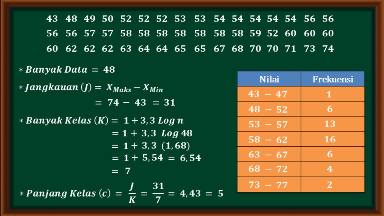
- 😀 Before proceeding, it's important to arrange the data in ascending order, from the smallest to the largest values.
- 😀 The first step in creating a frequency distribution table is identifying the number of classes (groups).
- 😀 To find the number of classes, use the formula: k = 1 + 3.3 * log(n), where n is the number of data points.
- 😀 In this example, the calculated number of classes is approximately 6, which is then rounded to the nearest whole number.
- 😀 The next step is to determine the class intervals or the width of each class. This is done by finding the range of the data (largest value minus smallest value) and dividing it by the number of classes.
- 😀 In the example, the class interval or width is calculated as 10, which means each class will cover a range of 10 numbers.
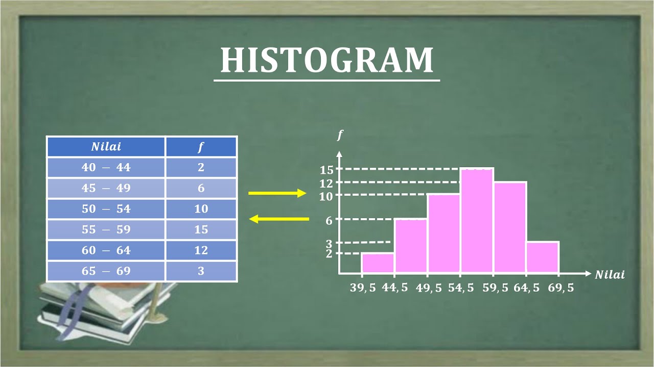
- 😀 After calculating the class intervals, the table is constructed by organizing the data into intervals such as 40-49, 50-59, and so on.
- 😀 For each interval, count the number of data points that fall within the range. This count is referred to as the frequency of that class interval.
Q & A
What is the main topic of the video?
-The main topic of the video is how to create a frequency distribution table, also known as a grouped data table, in statistics.
What is the first step when creating a frequency distribution table?
-The first step is to arrange the given data in ascending order, from the smallest to the largest number.
How is the number of classes (k) determined for the table?
-The number of classes (k) is determined using the formula k = 1 + 3.3 * log(n), where n is the number of data points. In the example, this resulted in 6 classes.
What is the purpose of calculating the range of the data?
-The range is used to determine the class width or interval for the frequency distribution table. It is calculated by subtracting the smallest value from the largest value.
How is the class interval (or length) calculated?
-The class interval is calculated by dividing the range by the number of classes. The resulting value is then rounded to the nearest whole number, which in this case was 10.
What is the significance of using a class interval of 10 in this example?
-Using a class interval of 10 means each class will contain 10 values. This makes it easier to group the data into manageable categories.
How is the frequency for each class calculated?
-The frequency is determined by counting how many data points fall within each class interval. For example, for the interval 40-49, there are 4 data points.
What are the class intervals used in the example?
-The class intervals used are 40-49, 50-59, 60-69, 70-79, 80-89, and 90-99.
What should you do if you're unsure about a step in the process of creating the table?
-If you're unsure about any step, you can ask for clarification in the comment section or directly contact the video creator through their provided contact details.
What is the final goal of creating a frequency distribution table?
-The final goal is to organize data in a structured way, making it easier to analyze and interpret the frequency of data within different ranges.
Outlines

此内容仅限付费用户访问。 请升级后访问。
立即升级Mindmap

此内容仅限付费用户访问。 请升级后访问。
立即升级Keywords

此内容仅限付费用户访问。 请升级后访问。
立即升级Highlights

此内容仅限付费用户访问。 请升级后访问。
立即升级Transcripts

此内容仅限付费用户访问。 请升级后访问。
立即升级浏览更多相关视频
Cara mudah menyusun tabel distribusi kelompok

STATISTIKA : nilai jangkauan banyak kelas panjang kelas dan menyusun tabel distribusi frekuensi
HISTOGRAM
Statistika Deskriptif (Bag 1): Cara Membuat dan Membaca OGIVE

FREQUENCY DISTRIBUTION: Common Terminologies Vid#4 FREE Tutorial | Statistics | EASILY EXPLAINED!
Distribuição de frequência com classes
5.0 / 5 (0 votes)
