STATISTIKA | PENYAJIAN DATA TUNGGAL [Tabel, Diagram Garis, Diagram Batang, Lingkaran]
Summary
TLDRThis video tutorial explores fundamental concepts in statistics, focusing on how to present data through various methods such as tables, bar charts, line diagrams, and pie charts. It covers the creation of Cartesian coordinates for bar and line graphs, calculating percentages and degrees for pie charts, and solving practical problems related to data interpretation. The video offers detailed steps on how to represent single and compound data effectively, providing valuable insights into understanding and presenting statistical data in a clear, visual manner.
Takeaways
- 😀 Data presentation is a crucial step in statistics, and it involves organizing, displaying, and analyzing data to draw conclusions.
- 😀 Single data can be presented in different formats: tables, bar diagrams, line diagrams, and circle diagrams.
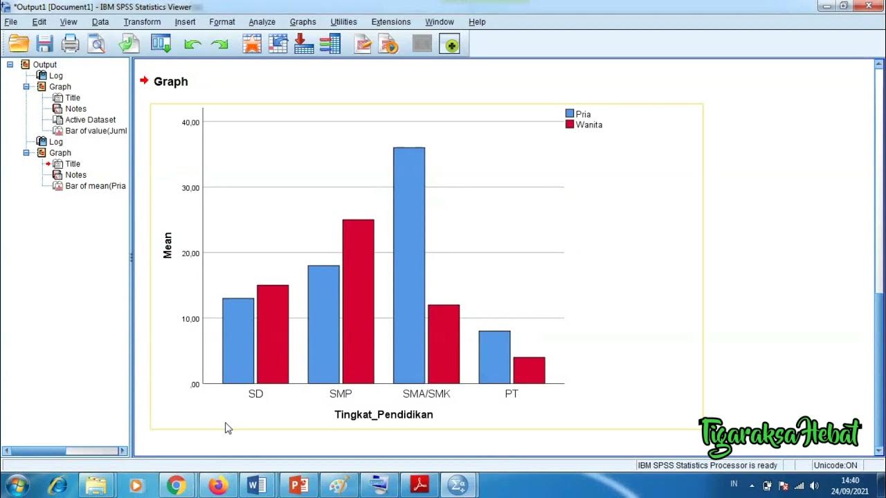
- 😀 A table is a simple method to present data with rows and columns, showing categories and their corresponding frequencies.
- 😀 A bar diagram uses rectangular bars to represent frequencies, where the height of the bar corresponds to the data value.
- 😀 Line diagrams plot data as points on a Cartesian plane, connecting the points with lines to represent trends or patterns.
- 😀 A circle diagram can show data in percentages or degrees, where 100% or 360° represents the entire data set.
- 😀 When presenting data as a percentage, each data value is divided by the total and multiplied by 100 to get the percentage.
- 😀 To present data as degrees, the percentage of each category is converted to an angle (out of 360°).
- 😀 Examples provided in the script illustrate practical applications of data presentation, such as calculating the number of students in each category or the population in each city.
- 😀 The script walks through multiple examples, including education plans for students after high school, city population distributions, election vote counts, and a savings plan for Wulan.
- 😀 For Wulan's savings example, the total savings are plotted on a line diagram, and the missing amount is calculated to meet her target goal.
Q & A
What are the steps involved in statistics as mentioned in the script?
-The steps involved in statistics are data collection, data organization, data presentation, data processing, and drawing conclusions.
How is data presented in the form of a table according to the video?
-Data is presented in a table with rows and columns, where each row represents a category, and the columns represent the corresponding data values.
What is the purpose of the x-axis and y-axis in a bar chart?
-In a bar chart, the x-axis represents the categories (such as job types), while the y-axis represents the frequency or quantity of data.
How are bar charts created in the script's example?
-Bar charts are created by drawing rectangular bars, where the height of the bar corresponds to the frequency of the category, and the width remains constant.
What is a line chart and how is it drawn?
-A line chart is a graphical representation where data points are plotted on a Cartesian coordinate system and connected with lines to show trends or relationships.
What is the difference between presenting data in percentages and degrees in a pie chart?
-In a pie chart, data can be presented as percentages, where the total sum is 100%, or in degrees, where the total is 360°. The percentages are converted to degrees by multiplying with 360°.
How is the percentage for each category calculated in the pie chart example?
-To calculate the percentage for each category, divide the frequency of the category by the total data points and then multiply by 100.
What is the formula used to convert data to degrees for the pie chart?
-To convert data to degrees, divide the frequency of the category by the total data points and then multiply by 360°.
How does the script explain data presentation using a pie chart for the education plan after high school?
-The script demonstrates calculating percentages for different education plans after high school, using a pie chart where the total percentage sums up to 100%, and each education category's percentage is shown.
What is the method used to calculate the number of students who selected a specific education option in the example?
-To calculate the number of students selecting a specific education option, multiply the percentage of students by the total number of students, then divide by 100.
Outlines

此内容仅限付费用户访问。 请升级后访问。
立即升级Mindmap

此内容仅限付费用户访问。 请升级后访问。
立即升级Keywords

此内容仅限付费用户访问。 请升级后访问。
立即升级Highlights

此内容仅限付费用户访问。 请升级后访问。
立即升级Transcripts

此内容仅限付费用户访问。 请升级后访问。
立即升级浏览更多相关视频

[1] Penyajian Data (Tabel)
Statistika - Penyajian Data Eps.2 l Ruang Belajar #StudyWithDiida
Penyajian Data Statistik Menggunakan SPSS

Kurikulum Merdeka Materi Matematika Kelas 7 Bab 6 Data dan Diagram

Penyajian Data (Part-1) ~ Tabel dan Diagram (Materi PJJ Kelas VII / 7 SMP)

Pengantar Statistika Kelas 7 SMP
5.0 / 5 (0 votes)
