Getting Started With Using Maps In Tableau | Tableau Maps For Beginners | Data Deep Dive
Summary
TLDRIn this Tableau tutorial, the presenter demonstrates how to create interactive drill-down dashboards using a geographical dataset. The video covers steps for building maps that allow users to drill down from country to state and city levels, enhancing data exploration through clickable actions. The tutorial emphasizes proper data preparation, visualization techniques, and dashboard interactivity. Viewers are guided on setting up geographical roles, visualizing data on maps, and activating filters for dynamic interaction between different dashboard elements. The video provides a clear, beginner-friendly walkthrough of creating intuitive and functional data dashboards in Tableau.
Takeaways
- 😀 Use geographic roles in Tableau to automatically recognize data like city, country, and region for mapping.
- 😀 Ensure data fields are properly labeled with the correct geographic role (e.g., city, country, state) to enable mapping functionality.
- 😀 Tableau makes it easy to visualize locations by automatically pulling longitude and latitude data for geographic fields.
- 😀 When setting up a drill-down dashboard, follow a logical order, such as starting with broad-level data (country) and drilling down to more specific levels (state, city).
- 😀 Avoid cluttering dashboards with too many elements—focus on presenting data in a clean, logical flow for better understanding.
- 😀 Use Tableau’s filter functionality to make dashboards interactive. Clicking on a country or region will drill down to more granular data, such as states or cities.
- 😀 The 'funnel' filter tool in Tableau helps create automatic filters to enable interactivity and drill-down capabilities.
- 😀 Customize map visualizations by adjusting colors, boundaries, and size to enhance readability and data insights.
- 😀 When building a dashboard, consider the layout carefully. Tableau uses tiles to ensure elements are properly aligned and organized.
- 😀 For advanced filtering and interactivity, Tableau dashboards allow users to filter data in real-time by selecting multiple data points or layers.
- 😀 If you want to dive deeper into advanced Tableau techniques, consider exploring additional resources like online courses for more specialized features.
Q & A
What is the main focus of the tutorial in the video?
-The tutorial focuses on creating drill-down dashboards in Tableau, specifically using geographical data (e.g., city, state, country) and demonstrating how to make the dashboard interactive.
How does Tableau recognize geographical fields like 'city' or 'country'?
-Tableau automatically recognizes geographical fields based on their names and the data inside them. For example, if a field is named 'city', Tableau checks its content and associates it with geographical data types such as 'City'.
What happens if a field is not recognized as a geographical data type?
-If Tableau doesn't recognize a field as geographical, it will treat it as a regular string field (e.g., 'abc'). To fix this, you can manually assign a geographical role by right-clicking the field and selecting the appropriate geographical role, such as 'City' or 'Country'.
What is the purpose of drill-down dashboards in Tableau?
-Drill-down dashboards allow users to click on a data point (such as a country) to see more detailed information (such as states or cities within that country), making it easier to analyze data at different levels of granularity.
How should the order of drill-down levels be organized in the dashboard?
-The order should be logical and follow a clear flow. Start with the highest-level data (e.g., country), and then move to more granular levels (e.g., state, city). This ensures that the dashboard is intuitive and easy to navigate.
What is the purpose of using the 'actions' feature in Tableau for drill-downs?
-The 'actions' feature in Tableau enables interactivity within the dashboard. By clicking on a country, state, or city, users can trigger actions like filtering or highlighting related data in other visualizations, allowing for dynamic exploration of the dataset.
How can users add interactivity to their Tableau dashboard?
-Users can add interactivity by using filters or highlight actions. For example, selecting a country on the map can filter the dashboard to show only the relevant states or cities. This can be done by activating the filter and applying it to the relevant fields.
Why is it important not to overload a Tableau dashboard with too many elements?
-Overloading a dashboard with too many elements can make it confusing and difficult for users to interpret the data. The goal is to present complex data in a simplified and digestible way, focusing on key insights without unnecessary clutter.
Can Tableau dashboards be created with other types of visualizations, like bar charts?
-Yes, Tableau dashboards can include a variety of visualizations, such as bar charts. These visualizations can also be interactive, with filters applied across different sheets, similar to the map-based drill-down examples shown in the video.
What is the key takeaway from this video tutorial for beginners using Tableau?
-The key takeaway is that building a drill-down dashboard in Tableau involves organizing data logically, making it interactive through actions like filtering, and ensuring that the dashboard is clear and user-friendly. The tutorial provides a simple, step-by-step process for achieving this.
Outlines

此内容仅限付费用户访问。 请升级后访问。
立即升级Mindmap

此内容仅限付费用户访问。 请升级后访问。
立即升级Keywords

此内容仅限付费用户访问。 请升级后访问。
立即升级Highlights

此内容仅限付费用户访问。 请升级后访问。
立即升级Transcripts

此内容仅限付费用户访问。 请升级后访问。
立即升级浏览更多相关视频

How to Install Tableau and Create First Visualization | Tableau Tutorials for Beginners
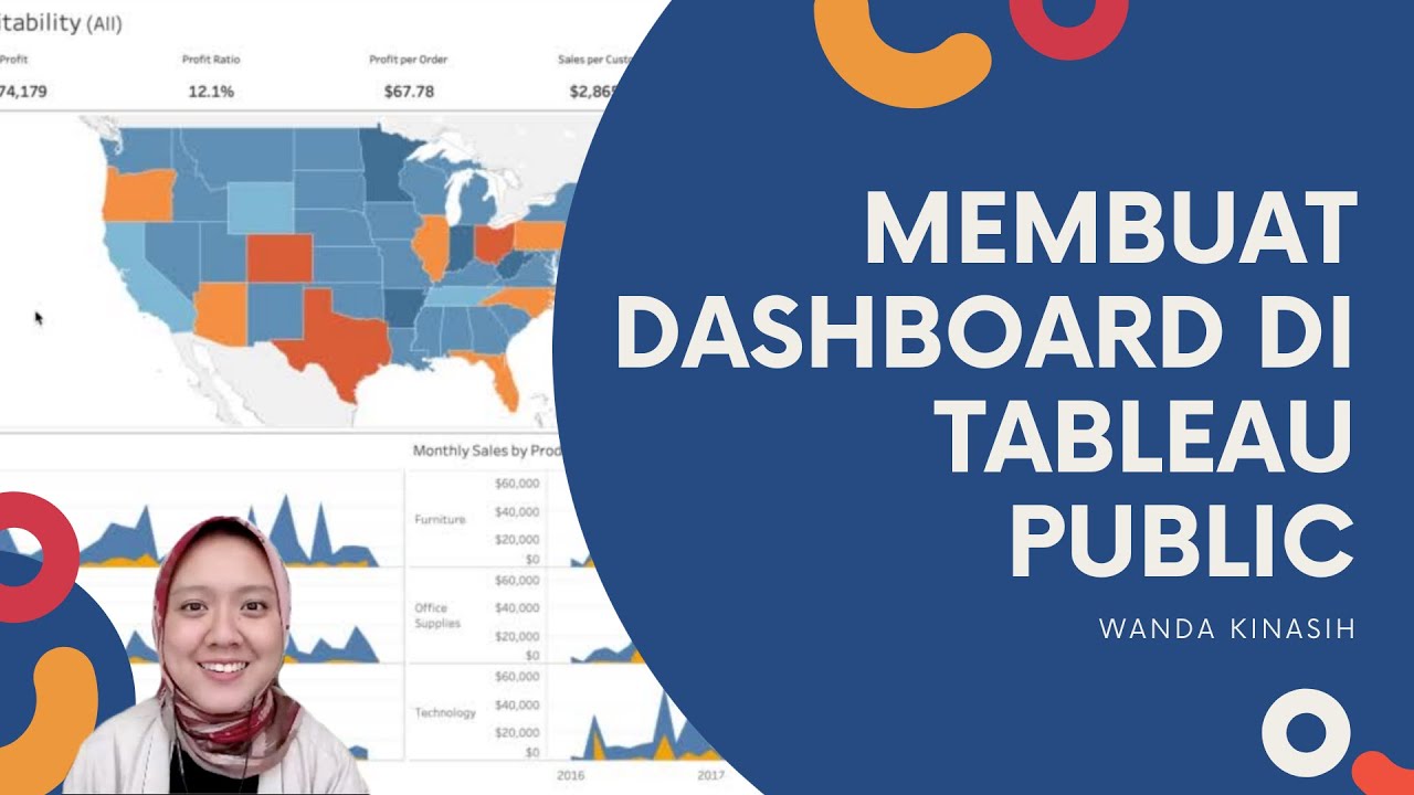
Tableau Dashboard Tutorial dalam 12 Menit | Bahasa Indonesia
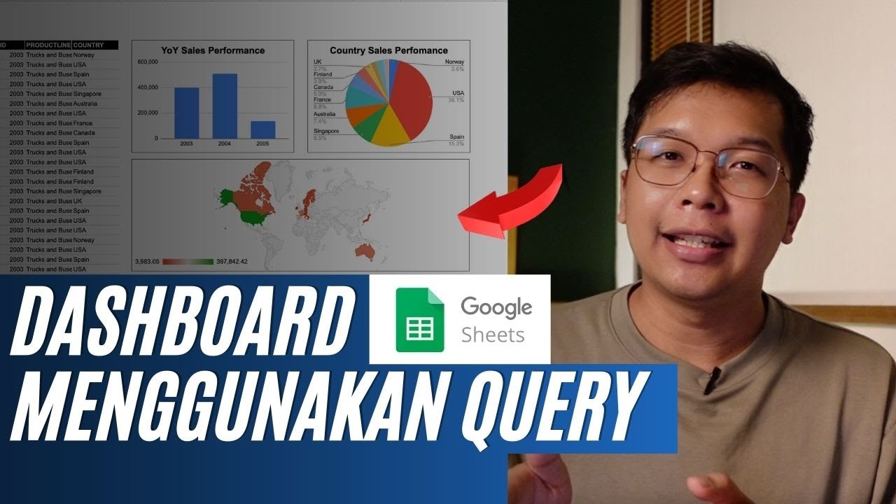
Membuat Dashboard di Google Sheet | Belajar Fungsi Query | Indonesia
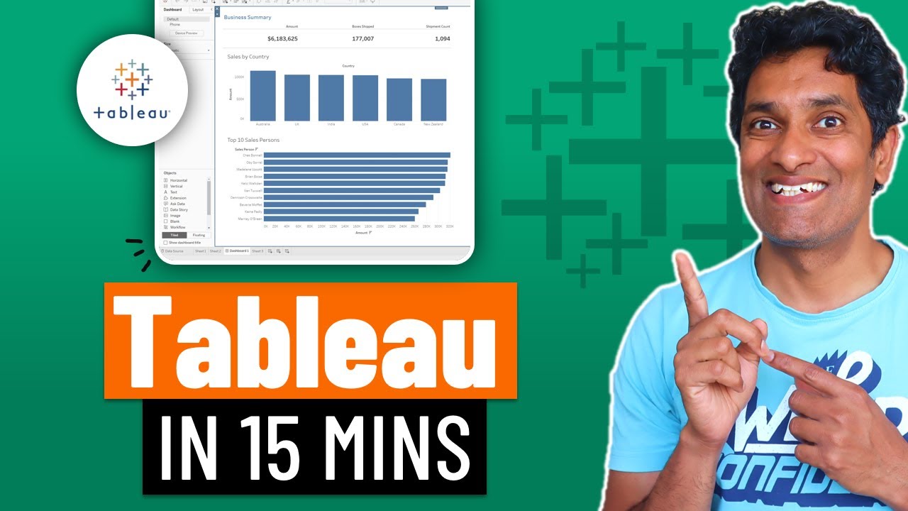
Learn Tableau in 15 minutes and create your first report (FREE Sample Files)

Tableau Tutorial for Beginners in 20 Minutes | Complete Tableau Training for Beginners | Simplilearn
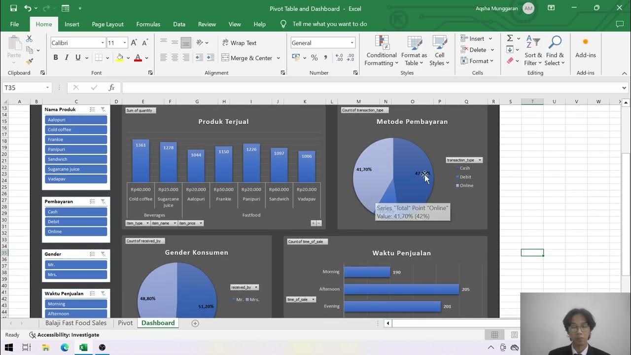
Presentasi Tugas TAD: Dashboard dan PivotTable - Muhammad Aqsha Munggaran
5.0 / 5 (0 votes)
