Build a Slicer Panel in Power BI Like a PRO

Your Own KPI
20 Apr 202420:39

Summary

TLDRThe video demonstrates how to create a clean, organized filter pane for a customer churn dashboard in a bank. The presenter shows how to hide filters behind a button and arrange them in a pop-up window to avoid overcrowding the dashboard. Steps include reformatting the filter pane, adjusting slicer alignment, and customizing the appearance of filters and buttons. Additionally, the video covers creating bookmarks and actions to show or hide the filter pane and clear all slicers efficiently. The guide aims to improve dashboard usability and aesthetics while maintaining functionality.

Takeaways

  • 😀 Having filters directly on the dashboard is often fine, but to avoid overcrowding, they can be hidden behind a button as a popup.
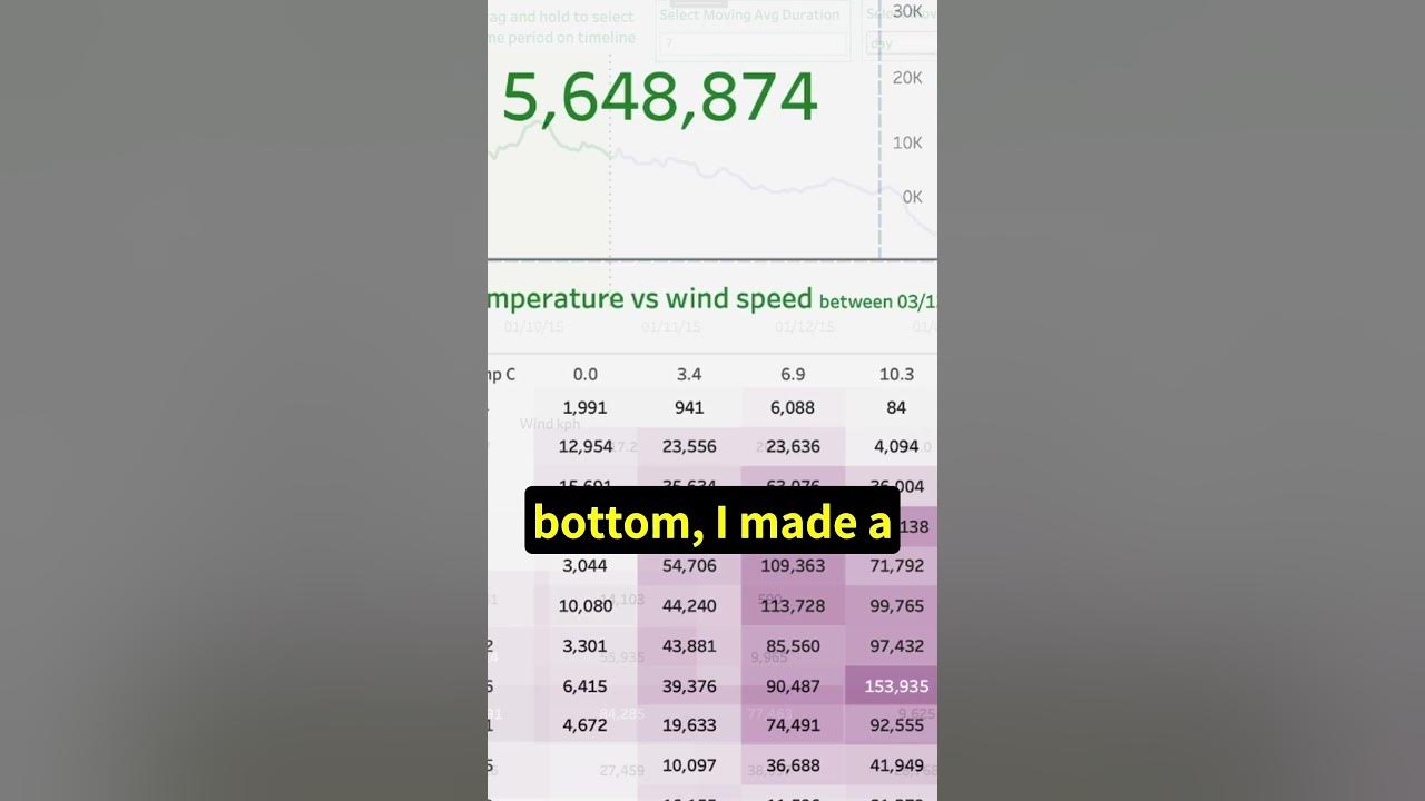
  • 💡 The video demonstrates how to create a popup filter pane for a customer churn dashboard of a bank.
  • 📊 The filter pane needs reformatting, including rearranging filters into three columns with three rows each.
  • 🛠️ To align filters, adjust their size, add borders temporarily for alignment, and distribute them horizontally and vertically.
  • 🔍 Changing slicer values from numerical to textual improves user understanding (e.g., 'true/false' to 'active/inactive').
  • 🎨 Formatting includes adjusting font sizes, colors, and adding a transparent background to the filter pane for better alignment.
  • 🔘 Add buttons for actions like opening/closing the filter pane, and reset or clear all slicers.
  • 📁 Use bookmarks to save the current state of the dashboard, affecting only selected visuals without altering data.
  • 🔄 Add a close button at the bottom of the filter pane for user convenience.
  • ⚠️ Consider limitations of 'clear all slicers' actions, such as unintended effects on slicers outside the filter pane.

Q & A

  • Why might it not be an option to have filters directly on the dashboard?

    -In some cases, having filters directly on the dashboard is not an option because it could overcrowd the dashboard or there might not be enough space.

  • What solution is proposed for managing filters without overcrowding the dashboard?

    -The proposed solution is to hide the filters behind a button and have them appear as a popup to maintain a clean look on the dashboard.

  • What are the initial steps to create a popup filter pane?

    -The initial steps include copying the filter pane from another page, reformatting it by making the background shape larger, and rearranging the filters into three columns with three rows each.

  • How can you format multiple slicers at the same time?

    -You can select all slicers by holding down shift, then go to visualizations, formatting, General properties, and adjust the height and width uniformly.

  • What adjustments can be made to improve the readability of slicer labels in one column?

    -To improve readability, you can increase the gap between the slicers, format them with borders temporarily for better alignment, and ensure proper alignment using the align and distribute functions.

  • How can slicers with true/false values be made more user-friendly?

    -Slicers with true/false values can be converted into textual values (e.g., active/inactive) and displayed as a vertical list to make them easier for the user to understand and select.

  • What styling changes can be made to slicer headers and values for a cleaner look?

    -Slicer headers can be styled by changing the font to Segoe UI SemiBold, reducing the size to 9 pixels, and changing the color to dark gray. Values can have their font size set to 10 and font color to dark gray as well.

  • How can a button be styled to fit the overall design of the dashboard?

    -A button can be styled by setting a rounded corner, enabling text with a specific font and size, setting a color that matches the design, and adjusting the border and fill properties for different states (default, on hover, and on press).

  • How do you create actions for buttons to show and hide the filter pane?

    -Actions are created by using bookmarks. You create two bookmarks (show filter pane and hide filter pane), configure them to affect only the display of selected visuals, and then assign these bookmarks as actions to the respective buttons.

  • How can you ensure that a 'clear filters' button only affects certain slicers?

    -You can create a bookmark that affects the data of selected slicers without affecting their display. Group all the relevant slicers, update the bookmark to save the state with all slicers deselected, and assign this bookmark to the 'clear filters' button.

  • What is a potential improvement to indicate active filters when the filter pane is closed?

    -A potential improvement is to dynamically color the filter button when something is selected and to provide a filter counter that shows the number of active filters.

Outlines

00:00

📊 Managing Dashboard Space with Pop-Up Filters

This paragraph discusses the issue of limited space on dashboards, which can be resolved by hiding filters behind a button and using a pop-up format. The example given is a customer churn dashboard for a bank, where filters are overcrowding the dashboard. The solution involves copying and reformatting the filter pane, adjusting the layout to fit three columns with three rows each. The filters are formatted for better alignment and visibility, with detailed steps on resizing, rearranging, and formatting the slicers for a cleaner look.

05:03

🔧 Adjusting Slicer Headers and Filter Pane Title

This section focuses on further refining the appearance of the filter pane. The slicer headers are adjusted to a smaller font size and a dark gray color for a less prominent look. The values are also resized for better visibility. The filter pane title is aligned using buttons instead of text boxes for more formatting flexibility. The background shape is resized and made temporarily transparent for better alignment. Additional buttons are added for interaction, including a filter button and a close button, with specific formatting for hover and press states.

10:06

🔘 Adding Interactive Buttons and Aligning Elements

This paragraph continues the process of adding and formatting interactive buttons. A rounded filter button is created with specific colors and transparency settings for different states (default, hover, and press). A close button is also added, using a copied filter button with an 'X' symbol, and formatted similarly. Both buttons are resized and aligned for consistency. Another close button is added at the bottom for user convenience. A clear button is introduced to reset all slicers, with specific formatting to indicate a clearing action. An apply filters button is suggested but left out due to functionality limitations.

15:06

🔖 Creating Bookmarks for Filter Pane Actions

This section explains how to create bookmarks to toggle the visibility of the filter pane. Two bookmarks are created: one to show the filter pane and one to hide it. The bookmarks save the current state of the dashboard, affecting only the display of selected visuals. The steps include hiding and showing the filter pane, updating the bookmarks, and ensuring that the buttons are included in the slicer base for consistent visibility toggling. The bookmarks are then assigned as actions to the filter and close buttons, and a clear button action is configured to reset all slicers.

20:07

🔄 Enhancing User Experience with Dynamic Indicators

The final paragraph addresses potential improvements for the filter pane. It suggests dynamically coloring the filter button and adding a counter to show the number of active filters, providing users with better feedback when filters are applied. A reference is made to another video that will cover these enhancements in detail, offering step-by-step instructions to implement these dynamic indicators for a more user-friendly dashboard.

Mindmap

Keywords

💡Dashboard

A dashboard is a visual interface displaying various data metrics and KPIs. In the context of the video, it shows customer churn metrics for a bank. The dashboard's layout and available space are crucial considerations when adding features like filters.

💡Filter Pane

The filter pane is a section of the dashboard that allows users to apply various filters to the data displayed. The video explains how to create a pop-up filter pane to avoid overcrowding the main dashboard area.

💡Popup

A popup is an on-screen element that appears temporarily to display additional information or options. The video demonstrates how to use a popup to house the filter pane, keeping the main dashboard clean and uncluttered.

💡Slicers

Slicers are visual controls used to filter data in a dashboard. The video covers how to arrange and format multiple slicers within the filter pane to enhance usability and appearance.

💡Alignment

Alignment refers to the positioning of elements in a visually consistent manner. The video details steps to align slicers and other components within the filter pane to improve readability and aesthetic appeal.

💡Formatting

Formatting involves adjusting the visual style of dashboard elements, such as size, color, and borders. The video emphasizes the importance of formatting slicers and buttons to ensure a clean and professional look.

💡Bookmarks

Bookmarks in this context are saved states of the dashboard that can be quickly recalled. The video shows how to create bookmarks for showing and hiding the filter pane, enabling dynamic interaction within the dashboard.

💡Button Actions

Button actions are interactive features assigned to buttons that perform specific tasks, such as showing or hiding the filter pane. The video guides how to set up button actions to improve user experience.

💡User Interaction

User interaction refers to how users engage with the dashboard elements. The video discusses optimizing user interaction by adding buttons for filtering, clearing filters, and closing the filter pane.

💡Visual Properties

Visual properties include attributes like size, color, and border style of dashboard elements. The video details how to adjust these properties to maintain a consistent and user-friendly design across the dashboard.

Highlights

Having filters directly on the dashboard often works well, but sometimes it's necessary to hide them to avoid overcrowding.

Creating a popup filter pane can help maintain a clean dashboard look.

To build a popup filter pane, copy the filter pane to another page and reformat it.

Rearrange the filters into three columns with three rows each for better organization.

Use larger gaps between slicers to distinguish labels more clearly.

Uniformly format slicers by adjusting height, width, and adding borders for easier alignment.

Replace true/false slicer values with more user-friendly textual values.

Switch to a vertical list style for two-value slicers to save space.

Change slicer headers to a smaller, less prominent font to reduce visual clutter.

Add interactive buttons for opening and closing the filter pane, formatted for clear user interaction.

Create an 'Apply Filters' button for user convenience, though it can't close the filter pane simultaneously.

Use bookmarks to manage the visibility of the filter pane effectively.

Ensure that buttons are grouped with the filter pane so they are affected by the same bookmarks.

Incorporate a 'Clear All Slicers' button for resetting filters, keeping in mind it affects all slicers on the page.

Consider adding dynamic indicators on buttons to show active filters, enhancing user experience.

Transcripts

play00:00

in a lot of cases having the filters

play00:02

directly on the dashboard works just

play00:03

fine but sometimes it's not really an

play00:06

option because we don't want to

play00:07

overcrowd the dashboard or we just

play00:10

simply don't have enough space in this

play00:12

case we could hide the filters behind

play00:13

the button and have them as a popup I

play00:16

show you in this video how to build such

play00:19

a popup and have a clean look to

play00:23

it this is a customer turn dashboard of

play00:26

a bank showing how many customers are

play00:29

leaving the bank across different

play00:31

dimensions and as you can see there is

play00:34

really not much room to play with we

play00:36

have a lot of filters if you go to page

play00:39

one you can see this filter Pane and we

play00:42

can copy it on page two and this is

play00:44

going to be the basis of our filter pain

play00:47

here as well but we are going to

play00:48

reformat it first of all select the

play00:51

background shape by double clicking on

play00:53

it we can make it larger and after that

play00:56

we can rearrange our filters we can have

play01:00

three columns with them three rows in

play01:02

each column I'm just going to put them

play01:04

side by

play01:05

side if you look at one column it's a

play01:08

bit hard to distinguish which label

play01:11

belongs to which one so we can have a

play01:13

larger gap between the slicers we can

play01:16

format them at the same time if we

play01:17

select them all we can open the

play01:20

selection pane open the slicer base and

play01:24

select all the slicers here holding down

play01:27

shift and then we can go to

play01:28

visualizations formatting General

play01:32

properties and let's make the height 80

play01:35

and the vid also to unify them

play01:39

172 then temporarily we can add some

play01:42

borders to it to be able to align them

play01:44

better easier and then we can just

play01:46

rearrange the First Column I select the

play01:49

second slicer here and move it below the

play01:52

previous one so the lines are simply

play01:56

touching and we can also move it it

play01:59

doesn't work sometimes when they are

play02:01

grouped and yeah this way simply then we

play02:04

also want to align the first row so how

play02:08

I like to do it is to have a base line

play02:12

which is going to be the first slicer

play02:14

here and make sure that you move the

play02:17

other two slicers to a lower position

play02:20

then select the first one first then the

play02:23

other two and then go to formatting

play02:26

alignment and align top it's going to

play02:30

align them to the top of the highest

play02:33

slicer after that we can select the last

play02:36

top slicer here and we want to have

play02:38

smaller gaps between the columns so

play02:41

holding down shift and pushing the left

play02:43

Arrow we can move it to the side and

play02:46

then select all three of the top slicers

play02:49

format a line and distribute them

play02:53

horizontally after that we can align the

play02:55

second column properly select all the

play02:57

free slicers align line and align them

play03:01

to the left then you can select the

play03:04

second Slicer in both columns align them

play03:07

to the

play03:08

bottom and do the same with age group

play03:11

and seller range Aline bottom with the

play03:15

last two slicers before aligning them

play03:17

let's look into them what kind of values

play03:19

do they have so has credit card and is

play03:22

active member it's like the two true

play03:25

false value so showing zero for false

play03:29

and for

play03:31

true we can do it little bit better and

play03:34

changing them into textual values I

play03:38

already created some columns for it go

play03:40

to CH modeling and is active member we

play03:43

can replace it with is active member

play03:46

label now you can see it's either active

play03:49

or inactive it's easier to the user to

play03:52

actually see what they select and we do

play03:54

the same for the credit card we have

play03:56

this H credit card label here replace

play04:00

the measures or the columns holding not

play04:02

holding and since we have only two

play04:05

values instead of a drop down we could

play04:07

actually use a vertical list and showing

play04:10

the values directly so select them both

play04:12

holding down shift go to formatting SL

play04:15

of settings and style vertical list and

play04:19

since they are taking up more space we

play04:22

can go to General properties change the

play04:25

he

play04:26

204 and then simply we can select the

play04:29

second one and move it below the first

play04:34

slicer we can also change the titles so

play04:37

has credit card label that could be

play04:40

going to slicer header let's call it

play04:43

credit card

play04:45

holders and is active member is going to

play04:48

be active members now we can select all

play04:52

of our slicers again going here on the

play04:54

section pain this is the easiest way

play04:57

then go to formatting General we can

play04:59

remove move the visual borders

play05:02

effects and then go back to

play05:05

visual we can also change the slicer

play05:08

headers because they are a little bit

play05:10

too black and a little bit too big so we

play05:14

want to deemphasize them a little bit

play05:16

let's go to slicer headers we can change

play05:19

the font to seg UI semibold let's change

play05:22

the size to 9 pixels only and the font

play05:26

color is going to be this dark gray the

play05:29

second Row in the second column then we

play05:31

can go to

play05:33

values and we change the font size also

play05:36

to 10 and the font color is going to be

play05:39

dark gray again and we have to make sure

play05:42

that all the values are visible so none

play05:45

of them are like cut off we have the

play05:47

longest values I think in credit score

play05:49

or seller range and also let's check if

play05:53

we select multiple values that this

play05:55

multiple selection text is visible I'm

play05:58

going to remove here the selection and

play06:01

you can already see that it has a less

play06:03

heavy feeling it's more clean it's more

play06:06

organized next we can move the filter

play06:10

pane title to the left I like to use

play06:14

buttons in a lot of cases instead of

play06:16

text boxes because we have more

play06:18

flexibility with the formatting and also

play06:21

on selection you don't activate this

play06:25

text editing Fields then we can go to

play06:27

style and we can change the font color

play06:30

to the same gray and then left align the

play06:33

text and we can make sure to align it

play06:37

above this geography text so on this

play06:41

side they are aligned on the same line

play06:44

then we carry size the background shape

play06:47

and double click on it and this filter

play06:50

background we can make it transparent

play06:53

temporarily so we see how it fits the

play06:57

slicers change the transparent see and

play07:00

then we can move it around what we want

play07:03

is to have kind of like the same Gap

play07:06

what we have between the slicers around

play07:09

the slicers as well also above the

play07:13

filter paint text and on the right side

play07:16

we want to leave a little bit more space

play07:19

because we will have a button there and

play07:22

also in the bottom we will have two

play07:24

buttons so let's leave a little bit room

play07:27

for that then we can remove the transer

play07:29

curency and then deselecting it and

play07:32

selecting it again we can just align it

play07:35

on the top of this visuals below and

play07:38

maybe you have to change the corner

play07:42

radius as well as you see here they

play07:44

don't align properly and let's go to

play07:47

shavee and let's change it to maybe 8

play07:50

pixel or 8% so now we can add some

play07:53

buttons to be able to interact with it

play07:56

let's go to insert

play07:58

buttons and and we are going to add a

play08:01

blank button then go to button shape and

play08:05

we are going to give it around the

play08:06

corner completely rounded corner so we

play08:09

can just max it out then go to style

play08:13

enable text and add filter as text the

play08:18

font is going to be sway UI semi bold

play08:22

and 12 pixel then we are going to give a

play08:25

color a blue color to it to fit the

play08:28

overall color of the design I already

play08:31

selected a color so we can just go to

play08:33

more colors and you can add this blue to

play08:37

it then we can disable the icon and

play08:40

enable The Fill but in the default State

play08:43

it's going to be 100 person transparent

play08:47

then go to border we add the same blue

play08:50

color to it and make the WID two pixels

play08:54

after that we go to the state and change

play08:56

it to onover in this case the font color

play08:59

is going to be white The Fill is going

play09:03

to be blue and we add 70%

play09:06

transparency and the Border color can

play09:08

stay the same you can see up on Hover

play09:12

how it changes then we can go and change

play09:15

the state to on press text color white

play09:19

again the F color is blue with 50%

play09:24

transparency the Border color stays the

play09:26

same again and now when you click it you

play09:29

have a slight effect indicating the

play09:32

click this is going to open our filter

play09:35

pane but we also need buttons to be able

play09:38

to close it so let's copy the filter

play09:41

button and for this filter I searched

play09:45

for a cancel symbol like an x on Google

play09:50

but I already copied it in this XXX

play09:52

value measure here you can just select

play09:55

this and copy it into the button

play10:00

style make sure that you change the

play10:02

state to default and replace the text

play10:06

with this we can also make it larger

play10:08

let's make it 18 pixel and in this case

play10:11

we are going to change the color to dark

play10:13

gray it matches the text colors on the

play10:16

filter Pane and we can remove the fill

play10:18

and also the Border then go to the on

play10:21

Hover State and we just make it a

play10:24

lighter

play10:26

gray and then on press is going to be

play10:30

dark ray again so then we have this

play10:33

interaction when we are clicking on it

play10:35

and we can go to General properties and

play10:38

make the anti but smaller 40 by 40 and

play10:42

then we will move it to the side and the

play10:45

close button and the filter Paine should

play10:47

be also aligned it seems like the text

play10:50

is lower so we can select them both then

play10:53

go to formatting align align to the top

play10:57

and you can see how often we were and

play11:01

now this seems a little bit too large

play11:03

here this gap on the left side so we can

play11:06

just make the background shape by double

play11:09

clicking on it a little bit smaller

play11:12

something like this so now also this

play11:15

distance on the side and on the top

play11:18

seems like the

play11:20

same so this button is going to close

play11:23

the filter Paine but to make it more

play11:26

user friendly we can add another close

play11:29

button in the bottom to make the life of

play11:31

the user easier so we are going to copy

play11:34

the filter button one more time move it

play11:36

to the bottom of the filter panel and go

play11:40

to style change the state to default the

play11:44

text is going to be close the font color

play11:47

dark gray we will remove the border and

play11:51

then in the field for the default white

play11:53

is okay the state on

play11:56

Hover we make the font color white

play11:59

that's okay we can keep it like that and

play12:02

in this case the fill is going to be

play12:04

this second gray in the First Column and

play12:08

I would also change the transparency

play12:10

here to zero on the FI so when we are

play12:13

clicking it it's actually getting darker

play12:16

the same way like the filter button

play12:18

here if we select multiple slicers

play12:22

multiple values in different

play12:25

slicers and then we want to remove them

play12:27

it can be a lot of work work to do that

play12:31

so to make it easier we can add another

play12:33

button to reset or clear all the slicers

play12:36

at the same time for that we are going

play12:38

to copy the close

play12:40

button align it with the other close

play12:42

button and when they are touching I just

play12:44

move it four pixel to the left to have

play12:47

some gap between them and then go to

play12:50

style select the state default the text

play12:53

is going to be

play12:55

clear and in this case the font color is

play12:58

going to be red this middle red the

play13:01

third row this indicates that if you

play13:05

click on this clear it's going to

play13:07

execute like a negative action it's not

play13:09

really negative but still removing

play13:12

something so it's like kind of like a

play13:15

warning color for that then go to fill

play13:19

the white is okay for the default then

play13:22

we can go to un

play13:23

hover font color white is fine and the

play13:26

fear color in this case is going to be

play13:29

the first threed then go to the state on

play13:33

press here we have to change the text to

play13:36

clear again and the Feld color is going

play13:39

to be the second red so when we click on

play13:42

it it also going to be a bit

play13:44

darker then one more thing if you double

play13:47

check here the distances between the

play13:49

bottom Edge and the right Edge it's also

play13:52

different so I would just move both of

play13:55

the buttons a little bit up another

play13:58

thing which would be cool tool is to add

play14:00

an apply filters button because we have

play14:03

the option actually if you open the

play14:06

actions in one of the buttons there is

play14:08

this apply or slicers option available

play14:12

but we cannot use it in a way that when

play14:15

we click on the button it applies the

play14:17

filters and also closes the filter pane

play14:20

so we are going to leave it out okay

play14:23

next we are going to create the actions

play14:25

the bookmarks for these buttons we can

play14:28

go to view view open the bookmark

play14:32

pane I'm going to hide the data here we

play14:35

don't need it for now and let's add two

play14:38

bookmarks let's call them show filter

play14:42

pain and hide filter name so how the

play14:47

bookmark works it saves a Current stand

play14:50

of the dashboard if you right click on

play14:53

one of them you can see what is affected

play14:56

the data being shown that could be for

play14:58

example select in a slicer and whenever

play15:00

going back to this bookmark the same

play15:02

slicer is selected the display whether a

play15:06

visual is visible or not and only on the

play15:09

current page or not in this case we can

play15:12

leave it on and whether we want to

play15:15

affect all the visuals on the dashboard

play15:17

or on the page or only the selected

play15:20

visuals in this case we want to hide the

play15:23

filter pane so we only want to affect

play15:26

the selected visual the right click

play15:28

again

play15:29

and we don't want to affect the data

play15:31

only the display so that's select the

play15:35

data then we can select the slicer base

play15:40

and hide it when you hide it then make

play15:43

sure that it's selected again and the

play15:45

right click on the filter Pane and it's

play15:48

going to affect only the selected

play15:50

visuals click

play15:52

update then we can show the slicer base

play15:55

again the filter pane select it one more

play15:58

time

play16:00

and now this time we're going to change

play16:03

the show filter pane effect only

play16:06

selected visuals don't affer data and

play16:09

then click on

play16:10

update now when you switch between the

play16:13

two

play16:14

views you see that it shows and hides

play16:17

the filter

play16:19

Paine you see that the buttons are not

play16:21

affected by it it's because they are not

play16:24

in this group this button is the filter

play16:28

button

play16:30

we are going to leave it as it is but we

play16:32

will move the other fre buttons within

play16:35

the slicer

play16:38

base now all the visuals are affected by

play16:42

the

play16:43

bookmarks then we can add these

play16:45

bookmarks as actions to the buttons

play16:48

select the filter button enable the

play16:50

action on the formatting pane type

play16:54

bookmark and show filter pan then we

play16:57

select the two close buttons enable the

play17:02

action and here is going to be also a

play17:06

bookmark and hide filter

play17:09

pain now when we click on the buttons

play17:12

they are going to execute the

play17:14

actions for the clear button if we go

play17:17

select it and go to the action we have

play17:20

this clear all slices

play17:23

option then select some

play17:25

slicers and now when we click on clear

play17:29

it removes all the filters this is good

play17:32

for us here but you might have scenarios

play17:35

where it's not a very good option for

play17:37

example if you have a slicer for example

play17:40

we have a date slicer outside of this

play17:42

filter Pane and you don't want it to be

play17:44

affected by this clear oil slicers

play17:47

that's not going to work because that

play17:50

affects every single slicer on the page

play17:53

without exception and you can't control

play17:55

it that's one thing to keep in mind and

play17:58

another thing thing to keep in mind that

play18:00

it doesn't affect the selections on this

play18:04

default filter pane that could be also a

play18:06

thing what you want to influence but

play18:08

it's not going to be influenced by this

play18:10

clear all slicers

play18:13

action so instead of that we could also

play18:15

create a bookmark let's add a new

play18:18

bookmark and call it clear filter P it's

play18:23

going to affect also the sected visuals

play18:26

and in this case it's going to affect

play18:28

the data but not going to affect the

play18:31

display so disable the display and now

play18:35

we can group all our

play18:38

slicers by holding down shift and

play18:40

selecting the top and bottom slicers

play18:42

then you can press contrl G or you can

play18:45

just right click and group

play18:48

them going to call it

play18:51

slicers and select the group then right

play18:55

click on the clear filter Pane and

play18:57

update it

play18:59

then go to the clear button actions type

play19:03

bookmark and add the clear filter

play19:07

pane oh yeah one thing if you save or

play19:11

update this clear filter pane make sure

play19:15

that all the slicers are dis selected so

play19:18

nothing is selected because that's the

play19:21

state how it's going to be saved if

play19:23

something is selected and then you

play19:25

update this clear filter pane whenever

play19:28

you activate that bookmark it's going to

play19:31

go back to the current selection so make

play19:34

sure that nothing is selected then

play19:36

select the slicers group and then update

play19:39

this clear filter pane but for us

play19:41

everything is all right now so we can

play19:44

just select some

play19:45

filters and text the clear

play19:48

button you can click on it by holding

play19:51

down control and you see that everything

play19:54

is removed so this is how to build it up

play19:57

I think it's pretty clean looking but

play19:59

there are some improvements we could

play20:01

make for example when we close the

play20:04

filter pane we select something and

play20:07

close it we have no indicator that a

play20:11

filter is selected we don't see anything

play20:14

we could make some formatting changes

play20:16

for example dynamically coloring the

play20:18

button when something is selected and we

play20:21

could also give a counter a filter

play20:23

counter show how many filters are

play20:26

filtered if you want to see how to do it

play20:28

you can click on this video we are going

play20:30

to build these indicators step by step

play20:32

take care

Rate This

5.0 / 5 (0 votes)

相关标签
Dashboard DesignUser ExperienceFilter PopupsData VisualizationBanking DashboardStep-by-StepInteractive FiltersClean UISpace OptimizationPower BI
您是否需要英文摘要?