Performing Customer Churn Rate Analysis in Excel
Summary
TLDRThis tutorial video walks viewers through the process of performing a customer churn analysis using Excel. It emphasizes the importance of understanding churn rates for business success and offers a step-by-step guide on how to set up an analysis using a free dataset from Kaggle. The video demonstrates how to calculate tenure in years, create churn counters, and use pivot tables to analyze churn rates across different customer parameters such as gender, contract type, and paperless billing preferences. The presenter also provides insights on how to reduce churn and increase customer retention.
Takeaways
- 📊 Customer churn rate is a critical metric for businesses to track as it indicates the percentage of existing customers lost over a period.
- 💰 Retaining existing customers is more cost-effective than acquiring new ones, making churn analysis essential for business growth.
- 🔍 The tutorial uses a dataset from Kaggle to demonstrate how to perform churn analysis in Excel, emphasizing the importance of data granularity.
- 👥 The analysis includes examining churn rates across different customer segments such as gender, contract type, and paperless billing preferences.
- 📈 Excel's pivot table feature is highlighted as a powerful tool for calculating and visualizing churn rates and other metrics.
- 📋 The presenter suggests creating additional columns for tenure in years and churn counters to simplify the analysis process.
- 📊 A calculated field for churn rate is added to the pivot table to dynamically reflect changes in customer churn across different segments.
- 📊 The tutorial demonstrates how to create a combo chart in Excel to visually compare churn rates and average monthly charges.
- 🔑 The analysis reveals that month-to-month contract customers have the highest churn rate, suggesting the need for strategies to convert them to longer-term contracts.
- 📊 The tutorial concludes by emphasizing the importance of playing with different data parameters to gain insights and inform business decisions.
Q & A
What is the importance of customer churn analysis in business?
-Customer churn analysis is crucial as it shows the percentage of existing customers lost over a given period. Understanding and reducing churn is vital because retaining an existing customer is cheaper than acquiring a new one.
What is the primary source of data used for the churn analysis in the video?
-The primary source of data used for the churn analysis in the video is a free dataset from Kaggle, which is in CSV format.
What are the key variables included in the dataset used for the churn analysis?
-The key variables in the dataset include customer ID, gender, senior citizen status, partner status, dependents, tenure, months, different services, contract type, paperless billing, payment method, monthly charges, total charges, and churn status.
How does the video suggest splitting the data for analysis?
-The video suggests splitting the data into cohorts to see how many customers churn and if it correlates with different parameters such as gender, contract type, and paperless billing.
What is the purpose of calculating tenure in years during the churn analysis?
-Calculating tenure in years simplifies the data, making it easier to analyze trends and patterns over time rather than looking at tenure in months.
Why is a churn counter column added during the analysis?
-A churn counter column is added to simplify the calculation of churn rates by converting churn status (yes/no) into a numerical format (1/0), making it easier to count and calculate.
What is the significance of the total counter column added to the dataset?
-The total counter column ensures that each customer is unique and that there are no duplicates in the data set, which is important for accurate churn rate calculations.
How does the video demonstrate the calculation of churn rate using a pivot table?
-The video demonstrates creating a pivot table with a calculated field for churn rate, which is the churn counter divided by the total counter, providing a dynamic way to calculate churn rates for different cohorts.
What insights can be gained from analyzing churn rates based on contract types?
-Analyzing churn rates based on contract types can reveal that month-to-month customers have higher churn rates compared to those on one-year or two-year contracts, suggesting that longer-term contracts may be more effective in retaining customers.
How does the video suggest using the churn analysis results to improve business strategies?
-The video suggests using churn analysis results to identify areas for improvement, such as incentivizing customers to switch to longer-term contracts, and targeting marketing campaigns to reduce churn.
What additional parameters can be analyzed to gain further insights into customer churn?
-Additional parameters that can be analyzed include gender, partner status, paperless billing preference, and tenure, which can provide insights into customer behavior and help refine marketing strategies.
Outlines

This section is available to paid users only. Please upgrade to access this part.
Upgrade NowMindmap

This section is available to paid users only. Please upgrade to access this part.
Upgrade NowKeywords

This section is available to paid users only. Please upgrade to access this part.
Upgrade NowHighlights

This section is available to paid users only. Please upgrade to access this part.
Upgrade NowTranscripts

This section is available to paid users only. Please upgrade to access this part.
Upgrade NowBrowse More Related Video
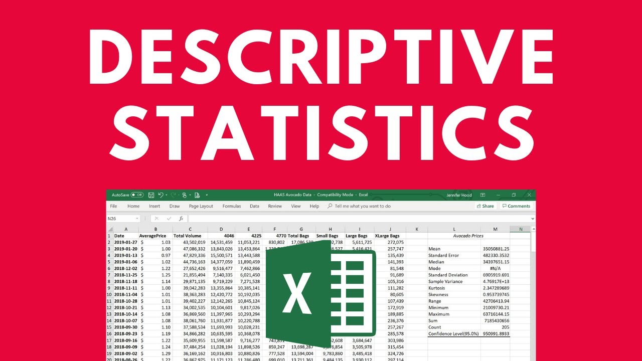
Descriptive Statistics in Excel
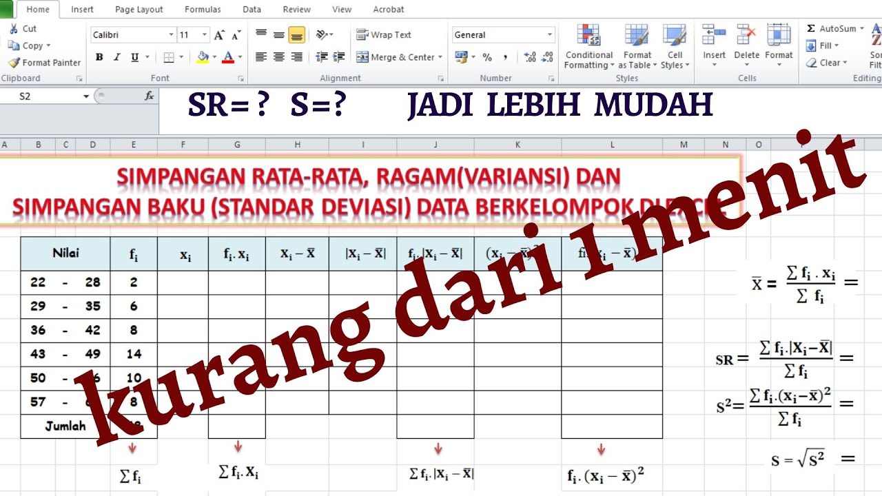
MENGHITUNG SIMPANGAN RATA-RATA, RAGAM DAN SIMPANGAN BAKU DATA KELOMPOK DI EXCEL

Excel毛利率公式:1個快速計算成本利潤的範例
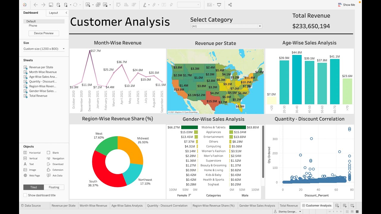
Customer Analysis using Tableau - Dashboard From Scratch

Вправа 17. Математичні та статистичні функції | 9 клас | Бондаренко
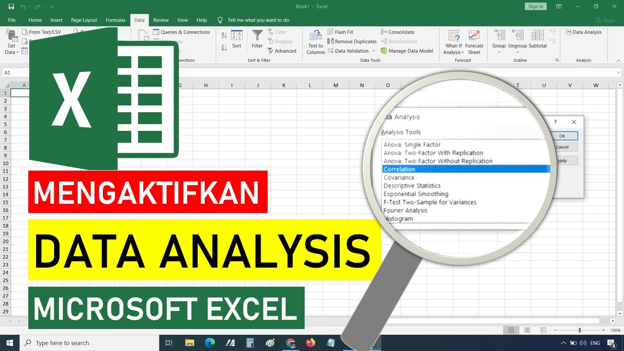
Cara Mengaktifkan Data Analysis di Excel || STATISTIK EXCEL
5.0 / 5 (0 votes)