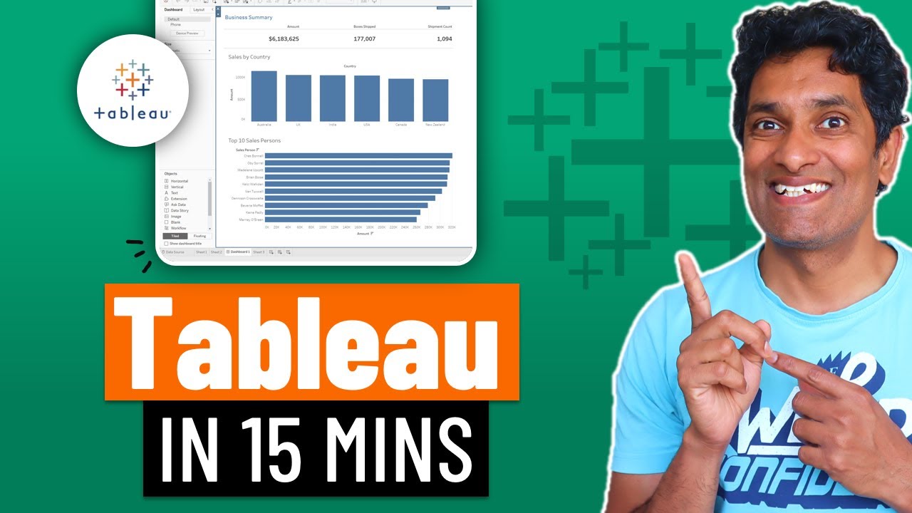
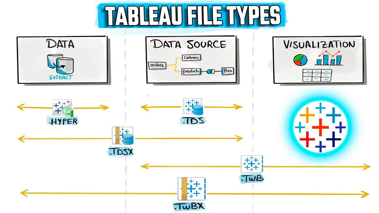
How I Use TABLEAU as a DATA ANALYST
Summary
TLDRIn this video, a data analyst demonstrates the use of Tableau to create interactive and dynamic visualizations. The dashboard focuses on analyzing bike rides in London. Dynamic parameters allow users to select different moving averages (2-month, 5-week, or 7-day) and use a timeline filter to explore specific periods. The dashboard also includes a heat map comparing temperature and wind speed to identify favorable weather for bike rides. Additionally, tooltips provide bar charts with granular details, including hourly bike rides and specific weather conditions, offering deeper insights.
Takeaways
- 📊 The speaker is a data analyst who uses Tableau to create interactive and dynamic visuals.
- 🚴 The dashboard focuses on analyzing bike rides in London.
- 🔄 Dynamic parameters allow users to select various types of moving averages (2-month, 5-week, 7-day).
- ⏳ A timeline filter enables users to select specific time periods of interest by dragging and holding.
- 🌡️ A heat map compares temperature and wind speed to identify the most popular weather conditions for bike riding.
- 📈 The line chart in the dashboard also contains additional charts in the tooltip for more detailed information.
- 📊 Bar charts provide granular details on bike rides by the hour and specific weather conditions.
- 🌦️ The tool includes a comparison between weather factors and bike ride trends.
- 📋 The dashboard emphasizes flexibility, allowing business users to explore data in various ways.
- 🔍 The visuals give users the ability to analyze data at multiple levels, from high-level trends to detailed insights.
Q & A
What tool is the data analyst using to create interactive visuals?
-The data analyst is using Tableau to create interactive and dynamic visuals.
What type of data is being analyzed in the dashboard mentioned in the script?
-The dashboard analyzes the number of bike rides in London.
What feature allows the business user to select different types of moving averages?
-The analyst created dynamic parameters that allow the user to choose between a 2-month moving average, a 5-week moving average, or a 7-day moving average.
How can users filter the data by time in the dashboard?
-The dashboard includes a timeline filter, allowing users to drag and hold to select a specific time period of interest.
What type of chart is used to analyze weather conditions in relation to bike rides?
-A heat map is used to compare temperature versus wind speed to identify the most popular weather conditions for bike rides.
What additional information is provided in the tooltips for the line chart and heat map?
-The tooltips contain two bar charts that give more granular details, such as the number of bike rides by the hour and by specific weather types.
What is the primary benefit of using dynamic parameters in the dashboard?
-Dynamic parameters allow business users to customize the dashboard based on their specific needs, such as selecting different types of moving averages for deeper analysis.
What types of charts are used in the dashboard besides the heat map?
-The dashboard also includes a line chart, and both the line chart and the heat map feature additional bar charts in their tooltips.
What insights can be gained from the heat map in the dashboard?
-The heat map helps identify which weather conditions, based on temperature and wind speed, are most popular for bike rides.
How does the dashboard provide more detailed information at a granular level?
-The bar charts in the tooltips of the line chart and heat map offer granular details on the number of bike rides by the hour and specific weather types, giving a deeper insight into the data.
Outlines

This section is available to paid users only. Please upgrade to access this part.
Upgrade NowMindmap

This section is available to paid users only. Please upgrade to access this part.
Upgrade NowKeywords

This section is available to paid users only. Please upgrade to access this part.
Upgrade NowHighlights

This section is available to paid users only. Please upgrade to access this part.
Upgrade NowTranscripts

This section is available to paid users only. Please upgrade to access this part.
Upgrade NowBrowse More Related Video

How Much SQL, Python, Excel & Tableau Is Enough? | Realistic Expectations

Belajar Tableau : Apa itu Tableau?

Learn Tableau in 15 minutes and create your first report (FREE Sample Files)

Getting Started With Using Maps In Tableau | Tableau Maps For Beginners | Data Deep Dive

Make a Power BI Dashboard in 15 Minutes!

Tableau File Types: TWB, TWBX, TDS, TDSX, HYPER | #Tableau Course #20
5.0 / 5 (0 votes)