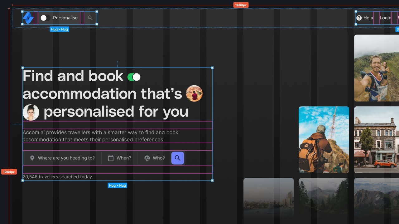
Create a Responsive Grid System for Web & UI Design | Figma Tutorial
Summary
TLDRIn this video, viewers learn to create a responsive grid system for UI designs in Figma, covering essential setups for desktop, tablet, and mobile frames. The tutorial emphasizes the importance of horizontal and vertical grids for consistent spacing, recommending specific column counts and container sizes for different devices. It also provides practical tips for using grids effectively, such as maintaining consistent padding and adjusting nudge settings for precise element alignment. Ultimately, the video serves as a valuable resource for designers seeking to enhance their projects with structured, adaptable layouts.
Takeaways
- 😀 Start by creating three frames in Figma for desktop, tablet, and mobile designs.
- 📏 Use a horizontal grid with 12 columns for desktop layouts to maintain consistent spacing.
- 📐 Set margins and gutters appropriately: 160 points margin and 32 points gutter for desktop.
- 🧱 Implement a vertical grid to organize elements vertically, with a row height of 8 points.
- 📦 Understand the concept of a container, which helps in organizing content consistently within the design.
- 🔄 Adjust grid settings for tablet and mobile: use 8 columns for tablet and 4 for mobile, with reduced margins.
- 🚀 Make use of responsive grids by setting the grid type to 'stretch' to allow elements to adapt to various screen sizes.
- ⚙️ Modify nudge settings in Figma to control movement increments for precise alignment of elements.
- 🔍 Not every internal element needs to align with the grid; focus on consistent padding within containers instead.
- 🛠️ Use grids as guides but feel free to break the rules creatively for enhanced UI design.
Q & A
What is the main purpose of creating a grid system in Figma?
-The main purpose is to maintain consistent spacing and alignment in UI designs across different devices, ensuring a responsive layout.
How many frames should be created for responsive design, and what are their types?
-Three frames should be created: one for desktop, one for tablet, and one for mobile.
What is the recommended column count for the desktop frame?
-The recommended column count for the desktop frame is 12 columns.
How should the gutter and margin values be set for the desktop grid?
-For the desktop grid, the gutter is typically set to 32 points, and the margin can be adjusted based on container width, commonly set to 160 points.
What defines a container in the context of a grid system?
-A container is an area that holds content organized towards the center of the frame, providing a consistent structure across the design.
What column count is suggested for the tablet frame?
-For the tablet frame, it is suggested to use 8 columns.
What should the margin and gutter values be for mobile devices?
-For mobile devices, the margin and gutter are usually set to 16 points each.
Why is it important that margin and gutter values are divisible by 8?
-It ensures that the design adheres to an 8-point grid system, maintaining visual consistency and alignment in the layout.
How does Figma assist in aligning elements with the grid?
-Figma allows elements to snap to the nearest row or column in the grid, ensuring precise alignment when creating or resizing elements.
What is a common misconception about using layout grids in design?
-A common misconception is that all elements must align perfectly with the layout grid; instead, only the container should align, while internal elements can vary as long as they maintain consistent padding.
Outlines

此内容仅限付费用户访问。 请升级后访问。
立即升级Mindmap

此内容仅限付费用户访问。 请升级后访问。
立即升级Keywords

此内容仅限付费用户访问。 请升级后访问。
立即升级Highlights

此内容仅限付费用户访问。 请升级后访问。
立即升级Transcripts

此内容仅限付费用户访问。 请升级后访问。
立即升级浏览更多相关视频

Create Responsive Grid System - Figma Tutorial (FREE TEMPLATE)

Create A Beautiful Responsive Header in Bricks builder

Practice: Designing Fluid Layouts in Framer (Fundamentals Lesson 24)

The Perfect Spacing Framework in UI Design | Figma Tutorial

Figma Tutorial: Layout Grids

Design a simple UI from scratch for a Food App in Figma - For beginners
5.0 / 5 (0 votes)
