Jenis-jenis Chart Saham untuk Trading | feat. Michael Yeoh
Summary
TLDRIn this video by Michael on Stockbit Academy, viewers learn about different types of charts used in stock analysis: line charts, bar charts, and candlestick charts. He explains how daily stock prices fluctuate, introducing the concept of OHLC (Open, High, Low, Close). While line charts provide minimal information, bar charts depict comprehensive price movements clearly, and candlestick charts, originating from Japanese rice traders, offer a visually rich representation of price trends. The video highlights the importance of these tools for traders, emphasizing candlestick charts as the most popular for their ease of analysis.
Takeaways
- 📈 The four key price points in daily stock movement are Open, High, Low, and Close (OHLC).
- 📉 Line charts show only the closing price, making them less informative for technical analysis.
- 📊 Bar charts provide a complete OHLC representation, displaying opening, highest, lowest, and closing prices visually.
- 🔍 Reading bar charts involves observing the opening price on the left and the closing price on the right, with vertical lines indicating high and low prices.
- 🟢 A green bar indicates that the closing price is higher than the opening price, while a red bar indicates the opposite.
- 📅 Candlestick charts originated from Japan and visually represent OHLC data more effectively than line or bar charts.
- 💡 Candlesticks consist of a body and wicks (or shadows) that show price movement within a specific period.
- 🌟 Traders often prefer candlestick charts for their visual appeal and ease of analysis.
- 🔄 The timeframe for charts can be adjusted to display different periods, such as days, weeks, or months.
- 👨🏫 Each trader may have their preferred charting method, but candlestick charts are among the most popular in trading.
Q & A
What are the four key price points in stock trading?
-The four key price points in stock trading are Open (the price at market opening), High (the highest price during the day), Low (the lowest price during the day), and Close (the price at market closing), collectively referred to as OHLC.
What is the primary characteristic of a line chart?
-A line chart is the simplest form of charting that displays only the closing prices for each trading day, lacking information about the opening, high, and low prices.
How does a bar chart present stock price information?
-A bar chart presents all OHLC data by depicting the opening price on the left side of the bar, a vertical line showing the high and low prices, and the closing price on the right side. It visually illustrates price movements more comprehensively than a line chart.
What visual indicators are used in a bar chart to represent price movement?
-In a bar chart, bars are often colored green if the closing price is higher than the opening price (indicating a price increase) and red if the closing price is lower (indicating a price decrease).
Why are candlestick charts popular among traders?
-Candlestick charts are popular among traders because they provide a more intuitive visual representation of OHLC data, making it easier to analyze price trends and market sentiment through their body and wick structure.
What does the body of a candlestick represent?
-The body of a candlestick represents the price movement between the opening and closing prices, with its color indicating whether the closing price was above (green) or below (red) the opening price.
How do traders typically use candlestick charts?
-Traders use candlestick charts to analyze market trends, identify price patterns, and gauge market sentiment due to their clear and detailed visual format.
Can the time period displayed on these charts be adjusted?
-Yes, the time period displayed on line, bar, and candlestick charts can be adjusted to show data over various intervals, such as days, weeks, or months.
What is the main limitation of line charts compared to bar and candlestick charts?
-The main limitation of line charts is that they only show closing prices, which provides less information about market activity and price movements compared to bar and candlestick charts that include all OHLC data.
What historical context does Michael provide regarding candlestick charts?
-Michael notes that candlestick charts originated in Japan from the rice trading practices of a businessman named Homma Munehisa in the 1700s, and they have since been adopted worldwide for visualizing price movements.
Outlines

此内容仅限付费用户访问。 请升级后访问。
立即升级Mindmap

此内容仅限付费用户访问。 请升级后访问。
立即升级Keywords

此内容仅限付费用户访问。 请升级后访问。
立即升级Highlights

此内容仅限付费用户访问。 请升级后访问。
立即升级Transcripts

此内容仅限付费用户访问。 请升级后访问。
立即升级浏览更多相关视频

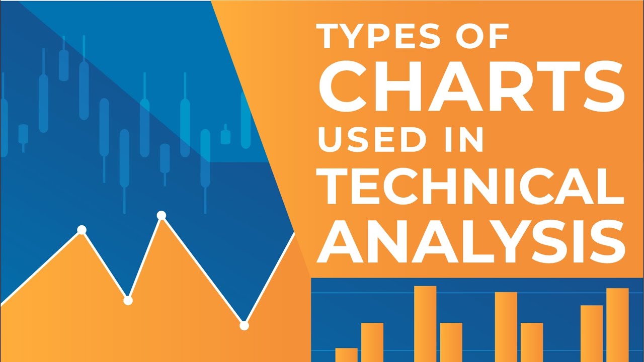
Types of Charts Used in Technical Analysis

Types of Data: Nominal, Ordinal, Interval/Ratio - Statistics Help

Candlestick para iniciantes - O que é e como interpretar

Misleading Graphs - Corbettmaths

Video Pembelajaran Matematika Kelas 7 SMP ( Pengolahan Data )

informatika Kl 8 bab 6 Analisis Data kurikulum Merdeka bag 32 hal 130 137
5.0 / 5 (0 votes)
