Why is THIS the PERFECT Landing Page?
Summary
TLDRThe video script offers a proven blueprint for creating high-converting landing pages, emphasizing the importance of the hero section to capture attention and convert traffic. It details the essential elements, including a compelling headline, subheadline, clear call-to-action (CTA), minimal opt-in forms, and reassuring text to alleviate privacy concerns. The script also discusses the role of social proof, benefits, and addressing objections through an FAQ section, ultimately aiming to double the average landing page conversion rate of 9% by leveraging psychological principles and customer trust.
Takeaways
- 📊 The average landing page converts about 9% of its traffic, but a well-designed one can double that rate by leveraging simple layout and human psychology.
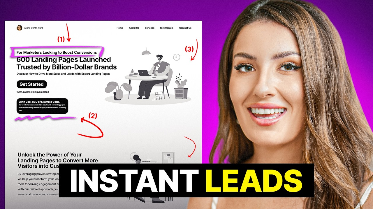
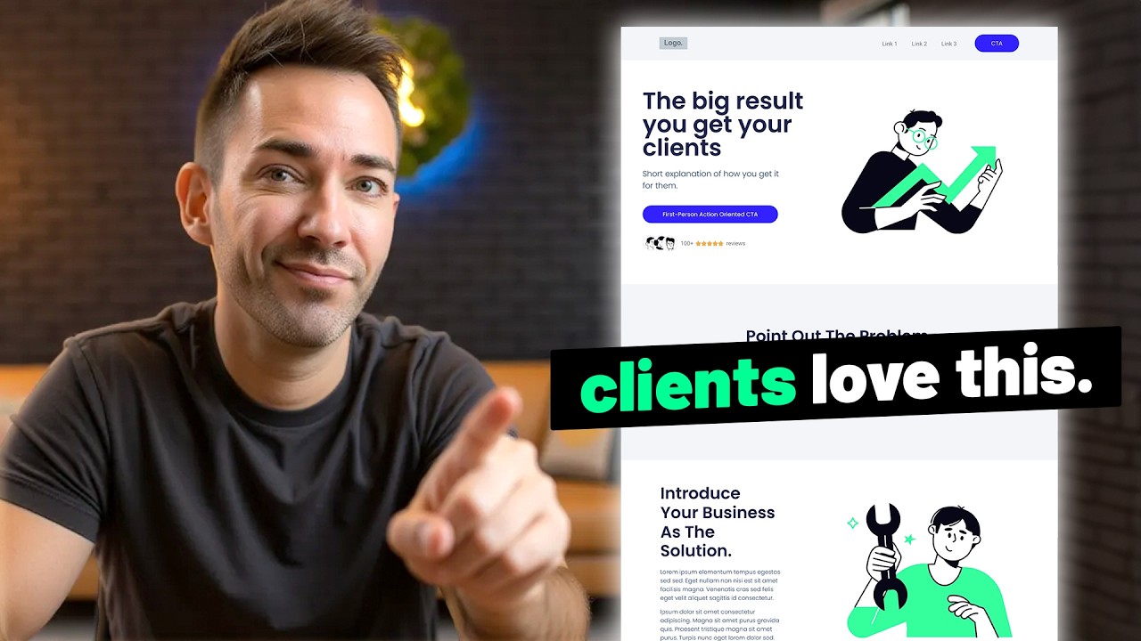
- 🏆 The 'Hero Section' at the top of the landing page is crucial as it must engage visitors quickly to prevent them from leaving the page prematurely.
- 🔒 Purposefully removing navigation from the landing page helps to keep visitors focused on the single action you want them to take, rather than giving them multiple exit points.
- 📝 The headline should reflect the big idea or transformation promised by your offer, not just the product or service itself, to connect with the visitor's desire for a better future.
- 🔑 The subheadline should specify the actual offer, providing a logical backup to the emotional appeal made by the headline.
- 📝 The Call to Action (CTA) should be clear and specific, indicating exactly what the visitor will receive or do upon interaction, like 'Send me the free guide' or 'Book my free consultation'.
- 🚫 Keep opt-in forms minimal to increase conversions, asking only for essential information like first name and email address to avoid overwhelming the visitor.
- 🔒 Addressing privacy concerns directly on the landing page can boost conversion rates by assuring visitors that their information is safe and will not be misused.
- 🌟 Including third-party social proof, such as star ratings and reviews, helps build trust and demonstrates the effectiveness of the offer.
- 🖼️ An image or illustration of people enjoying the benefits of the offer can emotionally connect with visitors and make the offer feel more tangible.
- 📈 The benefits section should clearly articulate how the offer improves the visitor's life, focusing on the outcomes rather than just the features of the product or service.
Q & A
What is the average conversion rate for a landing page?
-The average landing page converts about 9% of the traffic it receives.
Why is the hero section of a landing page so important?
-The hero section is crucial because it does most of the heavy lifting to engage visitors right at the top of the page, and if it fails to capture their attention, they are unlikely to scroll down further.
What is the purpose of removing navigation from a landing page?
-Navigation is removed to prevent giving visitors multiple ways to exit, keeping them focused on the single action the page is designed to encourage.
How should the headline of a landing page be crafted?
-The headline should be based on the big idea, result, or transformation that the offer promises, focusing on the better future or version of the customer, rather than just the product or service itself.
What is the role of the subheadline in a landing page?
-The subheadline serves to bring the headline's promise back to reality by specifying the actual product or service being offered, providing both emotional and logical reasons for the customer to engage.
What are some best practices for a Call to Action (CTA) button on a landing page?
-The CTA button text should be clear about the action taken upon clicking, and it's often more effective to phrase it using 'my' or 'me' to personalize the offer, such as 'Send me the free guide' or 'Book my free consultation'.
Why is it recommended to keep the information requested in an opt-in form minimal?
-Asking for minimal information increases conversions because visitors are less likely to provide personal details like phone numbers or addresses if they do not know the brand well, especially on first contact.
What is the significance of including a statement about not sharing customer information on a landing page?
-Addressing customer fears about email spam or personal data use can increase form conversion rates by as much as 7%, as it builds trust and reassures visitors that their information is safe.
How can social proof be used effectively on a landing page?
-Social proof can be shown through third-party star ratings, the number of reviews, or logos of businesses worked with. It serves to build trust by demonstrating that others have had positive experiences with the product or service.
What is the purpose of the image or illustration on the right side of the hero section?
-The image should depict a person or people using the product or enjoying its end result, serving as a customer stand-in to help visitors connect emotionally with the offering and make it feel more tangible.
Why is it important to differentiate between features and benefits on a landing page?
-While features describe the attributes of a product or service, benefits explain how those features improve the customer's life. Focusing on benefits helps visitors understand the value they will receive.
Outlines
📈 Landing Page Optimization Blueprint
This paragraph introduces a proven blueprint for optimizing landing pages, which typically convert at a 9% rate, by simplifying the design and leveraging human psychology to achieve over 20% conversion. The focus is on the 'hero section' at the top of the page, which is crucial for capturing attention and preventing bounces. The importance of a clear and compelling headline based on the offer's transformational promise is emphasized, followed by a subheadline that specifies the actual offer. The paragraph also discusses the intentional absence of navigation to maintain focus and the inclusion of a clear call-to-action (CTA). Additionally, it touches on best practices for opt-in forms, such as minimizing the information requested to improve conversion rates and the psychological impact of using possessive language in CTA buttons.
🔒 Building Trust with Transparency and Social Proof
The second paragraph delves into the importance of addressing customer fears regarding privacy and data use to increase form conversion rates, as demonstrated by Marcus Sheridan's experiment. It suggests transparently reassuring customers about the safety of their information can boost conversions by 7%. The inclusion of mini social proof, such as third-party star ratings and review counts, is recommended to build trust. The paragraph also discusses the use of images that depict the use or enjoyment of the offered product or service to create an emotional connection. It further explains the necessity of a benefits section that clearly articulates how the offer improves the user's life, distinguishing between features and benefits, and the use of graphics to enhance readability and engagement.
🗣️ Leveraging Testimonials and Addressing Objections
This paragraph emphasizes the power of testimonials in building trust and showcasing the effectiveness of the offer. It advises keeping testimonials concise and selecting those that highlight specific results or overcome common objections, such as cost concerns. The use of photos alongside testimonials is encouraged to increase authenticity and trust. The paragraph also introduces the concept of an FAQ section that proactively addresses both common questions and potential objections, serving to further reassure potential customers. The inclusion of a direct call to action at the end of the landing page is recommended to provide another opportunity for conversion. Lastly, it suggests that while an optimized landing page is crucial, it is only one part of a comprehensive customer generation strategy.
Mindmap
Keywords
💡Landing Page
💡Conversion Rate
💡Hero Section
💡Navigation
💡Headline
💡Subheadline
💡Call to Action (CTA)
💡Opt-in Form
💡Social Proof
💡Benefit Section
💡Testimonials
💡FAQ Section
Highlights
The average landing page converts about 9% of its traffic, but common mistakes can be avoided to improve conversion rates.
A proven landing page blueprint can double the conversion rate to over 20% by leveraging simplicity and human psychology.
The 'Hero' section at the top of the landing page is crucial as it is the first impression and can heavily influence whether visitors proceed further.
Landing pages are designed to direct traffic towards a single action, such as signing up for an email list, booking an appointment, or making a purchase.
The absence of navigation on landing pages is intentional to prevent distractions and maintain focus on the desired action.
Headlines should reflect the transformation promised by the offer rather than just the product or service itself.
Subheadlines should clarify the actual offer, providing both emotional appeal and logical support for the headline's promise.
The Call to Action (CTA) should be clear and direct, indicating what will happen when the button is clicked, to reduce ambiguity and increase conversions.
Opt-in forms should be minimal, asking only for essential information to avoid deterring potential leads.
Using possessive language in CTA statements can increase conversions by making the action feel more personal.
Addressing customer fears about data privacy and misuse can significantly boost form conversion rates.
Including third-party reviews and ratings serves as social proof and helps build trust with potential customers.
An image or illustration of people enjoying the end result of the offer can emotionally connect visitors to the product or service.
Benefits should be clearly articulated, focusing on how the offer improves the user's life rather than just listing features.
Visual elements like icons or photos can enhance the presentation of benefits and increase the likelihood of them being read.
Testimonials are an effective way to demonstrate social proof, with short, impactful statements being most effective.
Including photos with testimonials increases trust and authenticity, as it shows the person stands by their statement.
An FAQ section that addresses both common questions and potential objections can proactively overcome customer hesitations.
A final direct CTA at the end of the landing page provides another opportunity for visitors to take the desired action.
While a well-designed landing page is important, it is only one part of a comprehensive customer generation strategy.
Transcripts
the average landing page converts just
about 9% of the traffic it gets but the
average landing page also makes a ton of
mistakes either leaving important stuff
out or including too much that nobody
needs that's why I'm just going to make
it really easy on you with the proven
landing page blueprint that easily
doubles on that 9% in fact this layout
routinely converts it over 20% just
because of how simple it is and how well
it plays on good oldfashioned human
psychology so let's see what works so
well starting with this top section what
we call the hero section and since this
is right up top this section is going to
need to do most of the heavy lifting on
your whole page cuz guess what if people
land here and this section doesn't give
them all of this they're not going to
make it any further down and of course
I'm going to explain each of these
elements but first let's just talk about
what a landing page like this is even
for you know pretty much anytime you're
directing someone to a specific page to
get them to take you up on one specific
offer that's what a landing page is this
could be for a lead magnet to get people
on your email list or a free
consultation with you to book an
appointment or to buy a product and
since it's meant to just get people to
take one specific action this page needs
to make them not only feel confident
enough to take that action but it needs
to make it incredibly clear and easy for
them to do it too so you'll notice that
something is missing here can you tell
what it is it's the navigation and
that's very much on purpose you know you
ran an ad or a social media campaign to
get people here for one purpose so let's
not give them a bunch of ways to exit
that flow okay so now let's talk about
what is here starting with the headline
this should basically be based on the
big idea the result or the
transformation that your offer promises
not just the thing that you're offering
because it's super important to keep in
mind that people don't buy products or
collect services or lead magnets just to
have them right they're really buying a
better future and a better version of
themselves so lead with that first but I
realized that on its own might be a
little fluffy or at least unclear right
so let's bring it back to reality with
the how you're going to get them that
result right here in the sub headline
you'd basically just call out the actual
thing that you offer here and in
practice this might look like never make
the wrong higher again again with our
you know seveno hiring checklist or look
10 years younger with customized skin
care for any age and when you do it this
way it hits on both the emotional buyin
and The Logical backup that's really
needed to get pretty much anyone to take
action on what you're offering okay so
next we have the CTA or the call to
action so this can take on a few
different forms here I have it as a
really simple form that people need to
fill out in order to sign up for
something or download a piece of content
or it could be a simple calendar booking
tool if you're trying to get people into
a consultation or appointment or it
might be as simple as a buy now button
it obviously just depends on what you're
selling here but now it's time for a few
uh rules for the road when it comes to
opt-in forms if that's what you need
here so first what I've done here I've
kept this very minimal you know try to
keep the information you're asking for
to the bare minimum if you're trying to
match ciz conversions cuz the thing is
landing page conversions are going to
drop really significantly the more
personal information you ask for
especially if you ask for things like
phone numbers addresses that kind of
stuff most people that get here just
don't know you enough yet and they don't
want to give out that kind of
information so if you're offering a free
lead magnet to build your email list a
simple first name and email address are
really all you need there so let's talk
about the CTA button itself you want to
make sure that the text on that button
is super clear about what's going to
happen once they click on it you know
will they get their free guide will they
schedule their free consultation putting
it that way eliminates the mystery that
can just trip a lot of people up so
don't say soft things here like you know
let's go or the dreaded contact us and
it's interesting a lot of Studies have
actually shown that when you rephrase
these uh CTA statements with the words
my or me as in send me the free training
or book my free website review session
conversions actually do seem to go up
when you phrase it that way as opposed
to you know get your website review
session so now is where the real Jedi
Mind Tricks start coming into play so
see this little text right here
underneath the call to action and no my
lawyers did not make me put that in
there it actually serves a very clever
purpose so 71% of people are just really
leery about filling out forms like this
this because they don't know what you're
going to end up doing with their
information as a matter of fact Marcus
Sheridan who's a pretty genius level
sales and marketing guy ran this
experiment where he found that
addressing customer fears like email
spam or personal data use on his landing
pages that increased his form conversion
rate which is why we just want to come
right out and say don't worry we're not
going to share it your info is safe with
us and this one little line right here
can increase your conversion rates by 7
% all by itself okay so next we have
some mini social proof I have it like
this to show third party star ratings
and the number of reviews and if you
have lots of good reviews on the
internet this is a great thing to
include here honestly you could even
just get away with showing your overall
star rating then showing what platform
they're on like Google reviews or Yelp
and if you didn't have reviews here you
could use logos of businesses you've
worked with if you're B2B or you could
just say text how many people you've
helped or how much money you saved them
how much time you saved them or you know
whatever statistic is relevant to your
offer the whole idea for this is really
just to show some kind of proof that you
can deliver what you say you can and
that's why I really like this to be
third party review info it just makes it
much more unbiased and people tend to
trust it more because at the end of the
day this is here purely to build trust
before they even need to scroll down and
the last element we need to talk about
here is the image over here on the right
so what generally works best is a photo
or even an illustration like I have here
of a person or people either using what
you're offering or enjoying the end
result of it so it should definitely be
some kind of a customer standin type of
image not one of you or even something
just of your product or your lead magnet
cover necessarily showing it being used
is actually going to help people connect
more emotionally to it now for my lead
magnets like the one you're seeing here
what I usually like to do is I I like to
mock it up into an iPad or something and
then show the screen with someone
holding it that just helps it feel much
more tangible like it's a real thing as
opposed to just you know slapping up the
cover and calling it a day so that is a
lot in just this one section but if you
do it right and you include all of this
you'll get a pretty large chunk of your
traffic to opt in right here without
even having to scroll down but for the
rest of them there are definitely a few
more simple sections every landing page
should include starting with the benefit
section how does your offer make their
life better now it is important to say
here I'm not talking features features
are really just things but benefits are
what those things can do for you so
let's take a look at a landing page that
gets this right it's the farmers dog.com
and take a look at these three benefits
never run out so this could have easily
just said something like schedule
delivery but that's really just the
feature that makes the benefit possible
which is never running out of food for
your dog then we have health goals which
might have just said customized
ingredients or you know something like
that but your dog being healthy is the
real benefit not the ingredients
themselves so the easiest way to get to
your benefits is to start with all the
features that you include with your
offer things like 24/7 support or if
it's a lead magnet maybe you include a
free Facebook group along with it so
start with the features then for each
one just ask yourself why should people
care about this even if it's super
obvious to you just write it down then
you're going to title each with the true
benefit then give a super short you know
less than one full sentence description
of the feature that makes the benefit
possible and I do highly recommend
adding some kind of graphic here whether
it's an icon or a photo or illustration
that just shows the benefit visually
because Studies have shown that content
combined with pictures has an 80%
greater chance of being read so adding
that is definitely going to get people
to actually pay attention to what's in
it for them next you need to show some
more social proof to build more trust
and just to show that other people just
like them have gone before them and
gotten good results so this is most
commonly in the form of testimonials but
again it can be logos of businesses
you've helped or logos of websites or
Publications where your Brand's been
featured stats of how many people you've
helped or have downloaded your freebie
there's a ton of ways to show that
you're helping people get results but
testimonials are probably the most
effective and certainly the most common
type to put here so just a few things to
keep in mind here first of all keep them
relatively short like this length right
here that I have I'd say it's pretty
ideal for a testimonial that people will
actually read and you should definitely
try to choose reviews that hit on either
a specific result or transformation you
help them get as a result of what what
you're offering or they should help
overcome a common objection like maybe
you have one that says you know at first
I thought it was pretty expensive but
the amount of money and the time I saved
as a result of the investment made it
all worth it or something like that
that's taking a really common price
objection that people are already
thinking and just turning it on its head
so that people can see why it's not that
big of a concern next you definitely
want to try to use the person's photo if
you possibly can you know this just UPS
the trust level and helps it feel more
genuine like hey this person stands by
the statement so much that they're
actually putting their name in their
face behind it it's a small thing that
makes a big difference even if it's
operating on a pretty subconscious level
and I personally always like to use a
nice five-star graphic along with every
testimonial it just helps it read as a
positive review even if people don't
read it because again most people skim
websites they don't always read them you
know certainly not word for word and I
have three here because three just tends
to be the number that works best in
people's brains you know people's brains
are just wired to respond to things in
groupings of three I also think it's
just the perfect number to show that
you're helping people without being
overwhelming or taking people out of it
and next up we have a section that seems
pretty straightforward at first glance
but it actually serves a really specific
purpose it's not just an FAQ section
that answers FAQs what it's really
designed to do is bust through
objections proactively so you want to
list out not just the questions that
people legitimately have about your
offer but also I want you to write down
those big objections too you know why
are people hesitant to take you up on
your offer is it money time they don't
think it'll work whatever they are just
phrase them as questions then write out
your best rebuttal to it as the answer
then just pick your best five or six you
know objections and FAQs and put them
right in this section next up we just
have a really super direct call to
action you know you can literally just
copy and paste it from the top section
to give them one more chance to opt in
but even the best landing page is only
one weapon in your customer generation
Arsenal and there's much more to the
story if you actually want to get more
people to this page and to trust you
enough to pull the trigger but I'm here
to show you the ropes and share my
complete customer Generation website
system with you so just click right here
to save your seat to the complete Master
Class where I'm going to show you every
everything you need and what's possible
so click here and I'll show you all of
it
浏览更多相关视频
Perfect Landing Page Design Explained (in 5 minutes)
Daniel Fazio Made 40k in 30 days with a simple landing page Hack (Genius strategy)
Proven Funnel Formula That Has Made MILLIONS
4 Proven Steps to Build a MILLION DOLLAR Landing Page
Copy This Perfect Landing Page To Double Your Leads Instantly
How To Create Successful Facebook Video Ads (4-Part Script)
5.0 / 5 (0 votes)