How to create a histogram | Data and statistics | 6th grade | Khan Academy
Summary
TLDRThe video script discusses visualizing age distribution in a restaurant by categorizing ages into 10-year buckets and creating a histogram. This method helps to understand the demographic composition, highlighting the presence of more young people and fewer seniors, suggesting a family-friendly environment.
Takeaways
- π½οΈ The script discusses a scenario of visiting a restaurant and analyzing the age distribution of the patrons present.
- π The speaker suggests categorizing ages into 'buckets' or 'bins' to simplify the visualization of the age distribution.
- π It is recommended to use 10-year age ranges for creating the buckets, starting from zero to nine and going up to sixty to sixty-nine.
- πΆ The zero to nine age bucket is highlighted as having the most people, indicating a higher presence of young children in the restaurant.
- π¦ The 10 to 19 and 20 to 29 age buckets have a moderate number of people, suggesting a good mix of teenagers and young adults.
- π©βπΌ The 30 to 39 age bucket has the least number of people, with only one individual, indicating a low presence of patrons in this age group.
- π΄ The script mentions that there are no patrons aged 70 or older, which could imply a lack of senior representation.
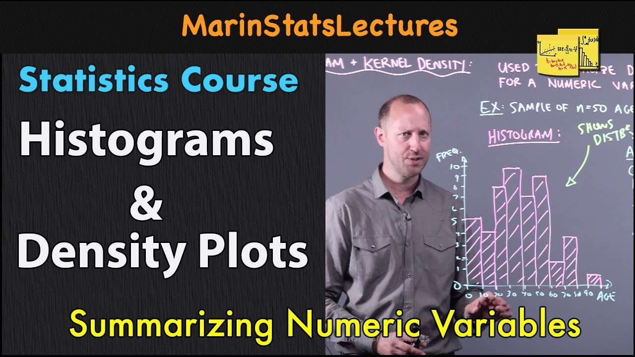
- π A histogram is introduced as a method to visualize the data, with the x-axis representing age buckets and the y-axis showing the number of people in each bucket.
- π The speaker emphasizes the importance of counting the number of people in each age bucket to create an accurate histogram.
- π¨ The visualization process is described in detail, with the speaker using different colors to represent different age groups for clarity.
- π The final histogram provides a visual insight into the age distribution, suggesting that the restaurant might be family-friendly due to the high number of young patrons.
- π The script concludes by stating that the method of creating histograms can be applied to various types of data, not just age distributions in a restaurant.
Q & A
What is the main purpose of categorizing ages into buckets in the script?
-The main purpose is to visualize the distribution of ages in the restaurant, making it easier to understand if there are more young people, teenagers, middle-aged, or seniors present.
What does the script refer to as 'buckets' or 'bins'?
-In the script, 'buckets' or 'bins' are categories or ranges of ages used to group the ages of individuals in the restaurant for easier visualization.
How are the age ranges defined in the script?
-The age ranges are defined in 10-year increments, starting from zero to nine and ending at sixty to sixty-nine.
What is the first age bucket mentioned in the script?
-The first age bucket mentioned is for individuals aged zero to nine.
How many people are counted in the zero to nine age bucket according to the script?
-Six people are counted in the zero to nine age bucket.
What visualization technique is used to represent the distribution of ages in the script?
-A histogram is used to visualize the distribution of ages, showing the number of people in each age bucket.
What does the script suggest about the type of restaurant based on the age distribution?
-The script suggests that the restaurant might be family-friendly, as there is a high number of younger individuals, possibly indicating that adults with children frequent the establishment.
How many people are in the 10 to 19-year-old bucket according to the script?
-Three people are in the 10 to 19-year-old bucket.
What mistake does the speaker make when writing 'histogram' in the script?
-The speaker initially writes 'histograph' instead of 'histogram'.
What conclusion can be drawn from the age distribution in the restaurant as described in the script?
-The conclusion is that there are significantly more younger people and fewer senior citizens in the restaurant, indicating a potential bias towards a younger demographic.
How does the script differentiate between the visualization of a histogram and a dot plot?
-The script explains that a histogram groups data into buckets and counts the number of individuals in each, while a dot plot would plot each data point individually, which would not be as informative with many single occurrences.
Outlines
π Visualizing Age Distribution with Buckets
This paragraph introduces a scenario where one is interested in understanding the age distribution of patrons in a restaurant. The speaker suggests categorizing the ages into 'buckets' or 'bins' of 10-year ranges to simplify the data. They enumerate the buckets from 0 to 9, 10 to 19, and so on up to 60 to 69, noting the absence of anyone 70 or older. The speaker then counts the number of people in each age group, ranging from one to six individuals per bucket, and proposes creating a histogram to visually represent this distribution.
πΌοΈ Constructing a Histogram for Age Distribution
In this paragraph, the speaker describes the process of creating a histogram to visualize the age distribution data collected in the previous paragraph. They recount the number of individuals in each age bucket and proceed to draw a bar for each, reflecting the count of people in that age range. The speaker humorously acknowledges the challenge of writing labels on the bars due to their initial sizing. The histogram reveals a predominance of younger individuals, suggesting the restaurant may be family-friendly. The speaker concludes by emphasizing the utility of histograms for visualizing data beyond just age distributions, such as any other collected data.
Mindmap
Keywords
π‘Restaurant
π‘Age Distribution
π‘Visualization
π‘Buckets
π‘Histogram
π‘Data Points
π‘Bar Chart
π‘Categories
π‘Data Collection
π‘Teenagers
π‘Seniors
Highlights
The concept of visualizing age distribution in a restaurant setting is introduced.
The importance of categorizing data into buckets or bins for better visualization is emphasized.
A step-by-step method for creating age buckets with 10-year ranges is demonstrated.
The process of counting individuals in each age bucket is explained.
The visualization technique known as a histogram is introduced for data representation.
A practical example of creating a histogram with the restaurant's age data is provided.
The significance of choosing the right bucket size for data categorization is discussed.
The histogram's ability to quickly convey the distribution of a large set of data is highlighted.
The transcript humorously addresses a mistake in writing 'histograph' instead of 'histogram'.
The construction of a histogram with actual data points is shown.
The transcript suggests the restaurant might be family-friendly due to the high number of young patrons.
The difference between a dot plot and a histogram in data visualization is clarified.
The transcript illustrates how histograms can simplify complex data into understandable visual formats.
The practical application of histograms extends beyond the restaurant scenario to various data sets.
The transcript concludes by emphasizing the value of histograms in making data analysis more accessible.
Transcripts
- [Voiceover] So let's say you were to go to a restaurant
and just out of curiosity you want to see
what the makeup of the ages at the restaurant are.
So you go around the restaurant
and you write down everyone's age.
And so these are the ages of everyone
in the restaurant at that moment.
And so you're interested in somehow presenting this,
somehow visualizing the distribution of the ages,
because you want just say, well,
are there more young people?
Are there more teenagers?
Are there more middle-aged people?
Are there more seniors here?
And so when you just look at these numbers
it really doesn't give you a good sense of it.
It's just a bunch of numbers.
And so how could you do that?
Well one way to think about it,
is to put these ages into different buckets,
and then to think about how many people
are there in each of those buckets?
Or sometimes someone might say
how many in each of those bins?
So let's do that.
So let's do buckets or categories.
So, I like,
sometimes it's called a bin.
So the bucket, I like to think of it more of as a bucket,
the bucket and then the number in the bucket.
The number in the bucket.
Number, I'll just write the number, oops.
It's the, oops.
It's the number (laughing),
it's the number in the bucket.
Alright.
So let's just make buckets.
Let's make them 10 year ranges.
So let's say the first one is ages zero to nine.
So how many people...
Why don't we just define all of the buckets here?
So the next one is ages 10 to 19,
then 20 to 29, then 30 to 39,
and 40 to 49, 50 to 59,
let me make sure you can read that properly,
then you have 60 to 69.
And I think that covers everyone.
I don't see anyone 70 years old or older here.
So then how many people fall into
the zero to nine-year-old bucket?
Well it's gonna be one, two, three,
four, five, six people fall into that bucket.
How many people fall into the...
How many people fall into the 10 to 19-year-old bucket?
Well, let's see.
One, two,
three.
Three people.
And I think you see where this is going.
What about 20 to 29?
So that's one, two, three,
four, five people.
Five people fall into that bucket.
Alright, what about 30 to 39?
We have one, and that's it.
Only one person in that 30 to 39 bin or bucket or category.
Alright, what about 40 to 49?
We have one, two people.
Two people are in that bucket.
And then 50 to 59.
Let's see, you have one, two people.
Two people.
And then finally, finally, ages 60-69.
Let me do that in a different color.
60 to 69.
There is one person, right over there.
So this is one way of thinking about
how the ages are distributed, but let's actually
make a visualization of this.
And the visualization that we're gonna create,
this is called a histogram.
Histogram.
Histogram.
We're taking data that can take on
a whole bunch of different values,
we're putting them into categories,
and then we're gonna plot how many
folks are in each category.
How big are each of those?
How big are each of those categories?
And actually, I wrote histogram.
I wrote histograph, I should have written histogram.
So a histogram. So let's do this.
Alright.
So on this axis, let's see, the largest category has six.
So this the number, number of folks.
And it's gonna go one, two, three,
four, five, six.
One, two, three, four, five, six.
This is the number.
And on this axis I'm gonna make the buckets.
The buckets, and let me scroll up a little bit.
Now that I have my data here,
I don't have to look at my data set again.
So I have one bucket.
This is going to be the zero to nine bucket,
right over here.
Zero to nine.
Then I'm going to have the three...
Actually, let me just plot them,
since I have my pen that color.
So in zero to nine there are six people.
Zero to nine, there are six people.
So I'll just plot it like that.
And then we have the 10 to 19.
There are three people.
So 10 to 19, there are three people.
So I'll do a bar, like this.
Then, 20 to 29, I have five people.
20 to 29, which is gonna be this one,
just getting, I'm writing too big.
So 20 to 29 is gonna be this bar.
There's five people.
Five people there.
So it'll look like this.
I should have made the bars wide enough
so I could write below them.
But I've already, that train has already left.
(laughing) Alright, alright.
Then 30 to 39, I'll try to write smaller.
30 to 39, that's gonna be this bar right over here.
We have one person.
One person.
And then we have 40 to 49.
We have two people.
40 to 49, two people.
So, it looks like this.
40 to 49, two people.
Almost there. 50 to 59.
We have two people.
50 to 59, we also have two people.
So that's that right over there.
That's this category.
And then finally, 60 to 69 we have one person.
60 to 69, we have one person.
We have one person.
And what I have just constructed,
I took our data.
I took our data.
I put it into buckets that are kind of representative
of the categories I care about.
Zero to nine is kind of young kids.
10 to 19, I guess you could call them adolescents
or roughly teenagers, although, obviously
if you're 10 you're not quite a teenager yet.
And then all the different age groups.
And then when I counted the number in each bucket
and I plotted it, now I can visually get a sense
of how are the ages distributed in this restaurant.
This must be some type of a restraunt
that gives away toys or something,
because there's a lot of younger people.
Maybe it's very family-friendly.
So every adult that comes in,
maybe there's a lot of young adults with kids,
or maybe grandparents up here,
and they just bring a lot of kids to this restaurant.
So it gives you a view of what's going on here.
Just a lot of kids here, a lot fewer senior citizens.
So once again, this is just a way of visualizing things.
We took a lot of data that can take multiple data points.
Instead of plotting each data point,
like we might do in a dot plot,
instead of saying how many one-year-olds are there?
Well there's only one one-year old.
How many three-year-olds are there?
There's only one three-year old.
That wouldn't give us much information.
We would just have these single dots
if we were doing a dot plot.
But as a histogram, we're able to put them into buckets.
Everybody was like, hey, you know generally
between the ages zero and nine we have six people.
And so you see that plotted out, just like that.
And obviously this doesn't apply just to
ages of people in a restaurant,
it applies to all sorts of data that you might
want to collect and observe.
Browse More Related Video
"λΆμ ν 60λ λμμ μν΄κ° μμλλ€" μμΌλ‘ λμ 'μ΄κ³³'μΌλ‘ λͺ°λ¦½λλ€ [κΉκ²½λ‘ λ°μ¬ 3λΆ]
We Are Kenyaβs Future: Young People and Our Nationβs Growth
10 Best Trips for Seniors and Retirees Who Love to Travel
BPS Sebut 9,9 Juta Gen Z di Indonesia Tak Bekerja dan Tak Sekolah
How To Gain 10 Years Of Experience In 1 Year | Like Ayanokoji Kiyotaka
OOP Principles: Composition vs Inheritance
5.0 / 5 (0 votes)