Figma Button Components (Variables, Tokens, Variants & Component Properties ) | Design System Part 5
Summary
TLDRIn this design system series video, the focus is on creating a versatile button component using Figma. The process includes planning button types, states, and sizes, building the button with text and icons, applying colors and states, and using variables to standardize properties. The tutorial also covers naming and componentizing the buttons, setting up component properties for text and icons, and hints at the next step of prototyping.
Takeaways
- 📚 The video is part of a design system series focusing on building components, specifically buttons, in phase two.
- 🔍 Viewers can join the series at any point, with exercise files and Figma sign-up links provided in the description.
- 🎨 The process involves an eight-step system: planning, building, coloring, varying, maximizing, naming, componentizing, and prototyping buttons.
- 🔑 Planning involves deciding on button types (primary and secondary), states, shapes (pill or rounded corners), sizes (small, medium, large), and whether they include labels or icons.
- 🛠️ Building starts with creating a text component for the button label and then adding icons in different variations (no icon, icon on left, icon on right, just icon).
- 🎨 Coloring involves applying primary and secondary colors to buttons, including different states like default, hover, focus, selected, and disabled.
- 🔢 Variables are created for button properties like border radius, padding, icon size, and spacing, using tokens to maintain consistency.
- 🔄 Modes are used in Figma to create different button sizes (small, medium, large), allowing for easy adjustments and scalability.
- 📝 Naming and componentizing involve organizing buttons into a component set with variants for type, state, pill shape, size, and icon, making them reusable in designs.
- 🔍 Component properties are added for labels and icons, allowing for text changes and icon swapping directly from the design panel.
- 🚀 Prototyping is mentioned as the next step, focusing on creating interactions for buttons in the design system, which will be covered in a subsequent video.
Q & A
What is the main focus of the video?
-The main focus of the video is to guide viewers through the process of designing a comprehensive button component for a design system, using Figma.
What is the eight-step system mentioned in the video?
-The eight-step system for creating a button includes planning, building, coloring, varying, maximizing, naming, componenting, and prototyping.
What are the two types of buttons the video suggests to have in a design system?
-The video suggests having two types of buttons in a design system: a primary button and a secondary button, differentiated by color.
What are the different states for the button that the video covers?
-The video covers different states for the button, including default, hover, focus, selected, and disabled.
What are the three sizes of buttons that the video plans to include?
-The three sizes of buttons planned in the video are small, medium, and large.
How does the video suggest handling icons in the button design?
-The video suggests having icons on the left, right, or no icon at all, and using the icon as an instant swap in the design.
What is the purpose of using semantic colors in the button design?
-Semantic colors are used in the button design to ensure that the buttons are visually consistent with the brand's identity and to enhance readability and legibility.
What is the role of tokens in the button design process described in the video?
-Tokens are used to set properties like border radius, padding, size of the icon, and spacing between items, making the design process more efficient and consistent.
How does the video handle the creation of different button variants?
-The video uses Figma's component properties and modes to create different button variants, such as primary and secondary types, different states, pill shapes, and icon placements.
What is the final step in the button design process mentioned in the video?
-The final step mentioned in the video is prototyping, which will be covered in the next video, focusing on how to use component interactions for prototyping.
Outlines

This section is available to paid users only. Please upgrade to access this part.
Upgrade NowMindmap

This section is available to paid users only. Please upgrade to access this part.
Upgrade NowKeywords

This section is available to paid users only. Please upgrade to access this part.
Upgrade NowHighlights

This section is available to paid users only. Please upgrade to access this part.
Upgrade NowTranscripts

This section is available to paid users only. Please upgrade to access this part.
Upgrade NowBrowse More Related Video
Figma Tutorial: A Beginners Tutorial (2023 UI UX Design)
Figma tutorial: Component properties
Figma To Real Website | Responsive Homepage | HTML, CSS & JavaScript | Part 7
WEB DESIGN IN FIGMA ep.04: Horizontal Text + Image Cards (Free Web Design Course)
Explaining Figma Components Like You’re Five (Simplest Way Possible)
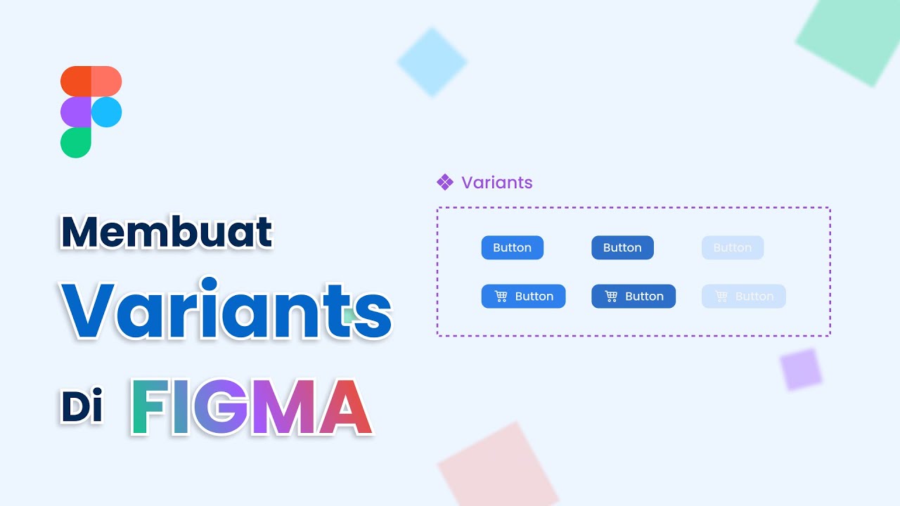
Cara Membuat Variants Di Figma
5.0 / 5 (0 votes)