7 Things to Remove From Your Website Immediately
Summary
TLDRThis video script offers expert advice for boosting website effectiveness in converting visitors into clients. It suggests removing confusing color schemes, complicated menus, self-indulgent wording, traditional contact forms, distracting social media links, and inauthentic stock photos. Instead, it recommends streamlined navigation, clear communication, direct booking tools, and genuine imagery to enhance credibility and guide visitors toward becoming paying customers. The script also teases a master class video for a comprehensive blueprint on optimizing service business websites.
Takeaways
- 🌈 Remove confusing color schemes to improve site credibility and ensure a professional appearance.
- 🧭 Simplify your website's menu to five items to guide visitors clearly and avoid overwhelming them with choices.
- 🗣️ Use selfless language that focuses on the visitor's needs rather than self-promotion to build trust and engagement.
- 📚 Keep the language simple and relatable, avoiding jargon and complex terms to ensure accessibility and understanding.
- 📝 Replace traditional contact forms with direct calendar booking tools for a seamless and clear booking process.
- 🚫 Eliminate social media buttons and feeds from your website to prevent visitors from leaving your sales funnel prematurely.
- 🎨 Avoid using overly posed or generic stock photos that can detract from the authenticity of your business.
- 🖼️ Opt for natural and high-quality images that reflect the genuine experience of working with your business.
- 👥 Remove detailed team bios and social media links to keep the focus on the business and not divert potential clients.
- 👋 Include a simple group photo on the 'About Us' page to show the real people behind the business without oversharing.
- 📈 The script offers a blueprint for converting first-time visitors into leads and clients through an on-demand video training.
Q & A
What is the primary issue with websites that fail to generate leads or attract paying clients?
-The primary issue is not that they need to add more elements, but rather they need to remove confusing and off-putting elements that distract visitors from the intended actions.
Why should a website's color scheme be reconsidered according to the transcript?
-A color scheme that is too vibrant, uses too many colors, or is improperly coordinated can make a website look amateurish and detract from the site's credibility.
What is the recommended approach for using color on a website?
-Colors should be used subtly, primarily for accents like buttons, headlines, and icons, against a more neutral background to guide visitors without overwhelming them.
Why is a complicated menu considered detrimental to a website's effectiveness?
-A complicated menu can confuse visitors and make it difficult for them to find the information they need, potentially leading them to leave the site without taking the desired action.
What is the suggested number of menu items for optimal navigation?
-The magic number for menu items is five, which helps to cut through the clutter and provide a clear path for visitors.
What should be the focus of a website's written content according to the transcript?
-The content should focus on the visitor, addressing their challenges and how the business can help solve them, rather than self-indulgent wording or corporate jargon.
Why is using easily understandable language recommended for a website?
-Using simple language helps the audience understand that the business is an expert in their field without making them feel confused or overwhelmed by complex terminology.
What is the issue with traditional contact forms on websites?
-Traditional contact forms can be vague about what happens after submission, creating uncertainty which may deter potential clients from taking the next step.
What alternative to traditional contact forms is suggested in the transcript?
-A direct calendar booking tool like Calendly is suggested, allowing visitors to see available times and book appointments without back-and-forth communication.
Why should social media buttons and feeds be removed from a website according to the transcript?
-Including social media buttons and feeds can distract visitors and encourage them to leave the site, moving backward in the sales funnel rather than progressing towards a conversion.
What is the problem with using overly posed or exaggerated stock photos on a website?
-Such stock photos can make a site feel staged and disconnected from the actual experience of working with the business, potentially leading to a loss of authenticity and trust.
What should be done with the 'About Us' page to avoid using misleading stock photos?
-Instead of using stock photos that might be mistaken for the actual team, a genuine group shot should be used to show real people behind the business, fostering trust and authenticity.
Why should detailed team bios be removed from a website?
-While it's good to celebrate the team, detailed bios can distract potential clients from the main path you want them to follow, leading them away from the conversion process.
What is the final call to action offered in the transcript?
-The transcript offers a master class video training that provides a blueprint for converting first-time visitors into leads and paying clients, encouraging the viewer to click and learn more.
Outlines

This section is available to paid users only. Please upgrade to access this part.
Upgrade NowMindmap

This section is available to paid users only. Please upgrade to access this part.
Upgrade NowKeywords

This section is available to paid users only. Please upgrade to access this part.
Upgrade NowHighlights

This section is available to paid users only. Please upgrade to access this part.
Upgrade NowTranscripts

This section is available to paid users only. Please upgrade to access this part.
Upgrade Now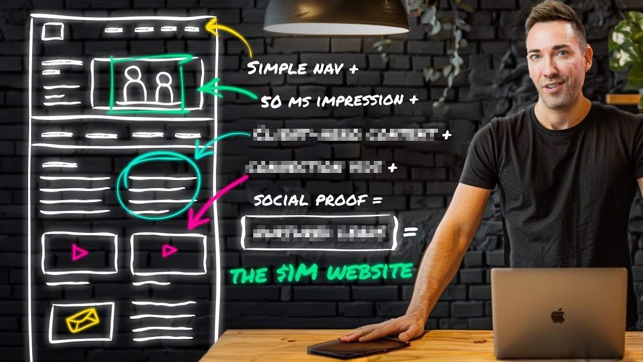


5.0 / 5 (0 votes)