Latihan Soal Statistika | Matematika Kelas 7
Summary
TLDRIn this educational video, the presenter discusses various topics related to statistics for middle school students. The video covers key concepts such as defining population and sample, determining data types (qualitative vs quantitative), and presenting data in tables, bar charts, and pie charts. Several practical examples are provided, such as identifying the population of a study on vehicles, calculating sample sizes, and interpreting data about various subjects like Instagram followers and the economy. The presenter offers step-by-step explanations of how to solve common statistical problems, helping students to understand and apply these concepts in real-life scenarios.
Takeaways
- 😀 Understanding the difference between population and sample is essential in statistics, and it's important to identify which is which in research scenarios.
- 😀 The population in a study refers to the entire group being researched, while a sample is a subset of that group chosen for analysis.
- 😀 The population in a study on vehicles passing a road in a city is the types of vehicles on that road, while the sample would be a selection of those vehicles.
- 😀 When dealing with quality control, the population might be all the units produced, and the sample is the portion of those units that is selected for inspection.
- 😀 Qualitative data includes non-numeric information, such as descriptions or categories, and examples include causes of water pollution or economic conditions.
- 😀 Data that involves numerical values, such as follower counts or temperature, is not considered qualitative data.
- 😀 Presenting data in a table helps organize and summarize information, such as displaying the favorite colors of students.
- 😀 Bar graphs are useful for visualizing data, such as the number of participants in different sports at an event.
- 😀 When using a bar graph, ensure that the horizontal axis represents the categories and the vertical axis represents the data values.
- 😀 Pie charts can help represent proportional data, such as the distribution of crop harvests, where each sector of the pie corresponds to a specific category.
- 😀 When interpreting a pie chart, you can calculate totals by using percentages and understanding the relationship between different sectors of the chart.
Q & A
What is the definition of 'population' in statistics as discussed in the video?
-Population refers to the entire group that is being studied or analyzed in a statistical investigation. In the example from the video, the population was the types of vehicles passing through a specific road in a city.
What is a sample, and how is it different from a population?
-A sample is a subset of the population, selected for the purpose of conducting an analysis. It is a smaller group that represents the larger population. In the video, for example, the sample was a selection of vehicles from the population of all vehicles passing through a specific road.
What is the role of quality control in determining a sample, as mentioned in the example of the factory producing bags?
-In the factory example, quality control is used to ensure the quality of the products. A sample of 400 bags was selected out of a total of 3000 to check for defects. The sample serves to represent the quality of the entire production batch.
What is the difference between qualitative and quantitative data?
-Qualitative data refers to non-numeric information, such as categories or descriptions, while quantitative data involves numeric values. In the video, examples of qualitative data included information about the causes of water pollution and the economic status of residents, while quantitative data included the number of social media followers or temperature readings.
How should data be presented in a table, based on the example in the video?
-Data can be organized in a table by listing categories (e.g., favorite colors) in rows and presenting corresponding frequencies (e.g., the number of students who prefer each color) in columns. The video showed an example of presenting students' favorite colors and the frequency of each color preference.
What does a bar graph represent, and how was it applied in the video?
-A bar graph visually represents data using rectangular bars, with the length of each bar corresponding to the frequency of each category. In the video, a bar graph was used to show the number of participants in different sports during a school sports event.
How was a pie chart used to represent data, and what was the main task in the given example?
-A pie chart is used to show the proportion of different categories in relation to the whole. The video provided an example where the pie chart represented the harvest of various crops, and the task was to calculate the total harvest based on the known proportion of soybeans.
In the case of a decrease in soybean yield, how was the previous yield calculated using the given data?
-The video used a percentage relationship to calculate the previous yield of soybeans. By knowing that the fifth harvest was 10% lower than the fourth, a proportion (100% vs. 90%) was set up to determine the fourth harvest's yield.
How is the total harvest of crops calculated from the given pie chart data?
-To find the total harvest, the quantities of each crop (based on the percentages in the pie chart) are first calculated. For example, knowing that 72% of the total harvest is soybeans and equals 200 quintals, the total harvest was found to be 1000 quintals after summing the individual crops.
What is the procedure for calculating the number of students who prefer a certain subject based on a pie chart?
-To calculate the number of students who prefer a subject based on a pie chart, the percentage representing that subject is used. In the video, it was explained that 25% of students preferred English, and by using the known number of students who preferred another subject (e.g., 18 students for Indonesian), a proportion was used to determine the number of students who prefer English.
Outlines

This section is available to paid users only. Please upgrade to access this part.
Upgrade NowMindmap

This section is available to paid users only. Please upgrade to access this part.
Upgrade NowKeywords

This section is available to paid users only. Please upgrade to access this part.
Upgrade NowHighlights

This section is available to paid users only. Please upgrade to access this part.
Upgrade NowTranscripts

This section is available to paid users only. Please upgrade to access this part.
Upgrade NowBrowse More Related Video

UNBK BAHASA INDONESIA SMP/MTS LENGKAP DENGAN PEMBAHASAN 2020 #BELAJARDIRUMAH
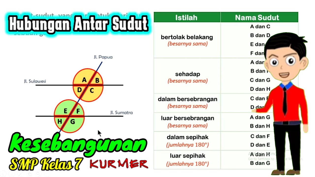
kesebangunan bagian 1 (hubungan antar sudut)

Part 3 Pembahasan Soal Ujian Sekolah US IPA Fisika SMP
PEMBAHASAN SOAL OSN EKONOMI TAHUN 2020 TINGKAT KABUPATEN KOTA

Question 1 ✅️ OSN IPS SD || 2025 || Syllabus Analysis || HOTS Questions

Materi BK Semester Genap kelas X - Remaja dan Permasalahannya
5.0 / 5 (0 votes)