05-2 Eksplorasi Hubungan Antar Peubah
Summary
TLDRThis video discusses the exploration of relationships between variables using scatter plots. It covers different types of relationships: linear positive, linear negative, and non-linear, with examples of how the data points are distributed around trend lines. The video highlights the concept of correlation, explaining how values range from -1 to 1 and how to interpret the strength and direction of relationships. It also includes real-world examples, such as life expectancy vs. fertility rates in various regions, and examines economic indicators like income and infant mortality. Overall, it provides insights into interpreting statistical data and trends.
Takeaways
- 😀 Scatter plots (diagrams) are used to explore the relationship between two variables, showing their correlation and trends.
- 😀 A scatter plot representing a non-linear relationship between variables X and Y shows a complex pattern, where X increases and Y initially decreases, then increases as X continues to rise.
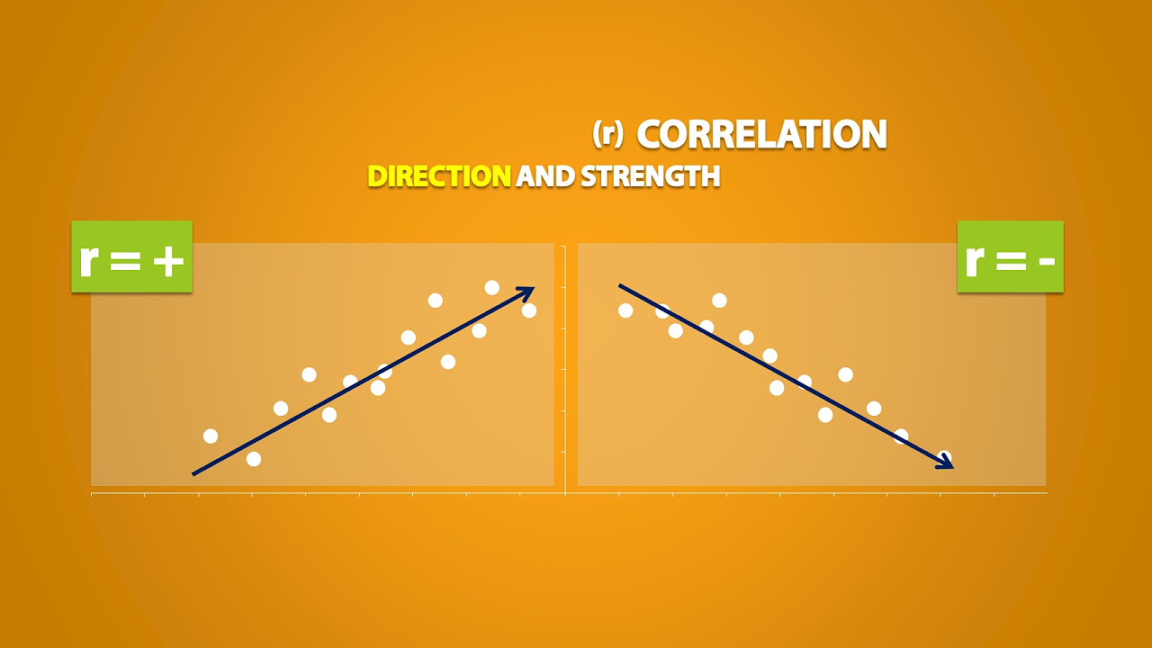
- 😀 A scatter plot illustrating a strong positive linear relationship shows a clear upward trend, where as X increases, Y also increases in a consistent manner.
- 😀 Weak positive linear relationships show more scattered points around the trend line, indicating a less consistent correlation between X and Y.
- 😀 Negative linear relationships can also be shown on scatter plots, where an increase in X corresponds with a decrease in Y, depicted by a downward slope in the trend line.
- 😀 A weak negative linear relationship shows more spread-out points around the trend line compared to a strong negative relationship.
- 😀 Correlation values range from -1 to 1, with negative values indicating an inverse relationship and positive values indicating a direct relationship.
- 😀 A scatter plot can show no clear relationship between two variables, meaning there is no correlation between them.
- 😀 The correlation between life expectancy and fertility rates in 1962 reveals that developed nations had higher life expectancy, while developing nations had lower life expectancy.
- 😀 The trend observed in 2012 shows that life expectancy increased globally, with developed countries experiencing a decrease in fertility rates, further supporting the linear negative relationship between life expectancy and fertility.
Q & A
What is a scatter plot and how is it used?
-A scatter plot, also known as a scatter diagram, is a graph that uses dots to represent the relationship between two variables. Each point represents one pair of values, showing the potential correlation between the variables. It is commonly used to visualize whether there is a linear or non-linear relationship between the variables.
What does a positive, strong linear relationship look like on a scatter plot?
-A strong positive linear relationship on a scatter plot appears as points that closely follow a straight line with a positive slope. As the value of the X-axis increases, the value on the Y-axis also increases. The points are tightly clustered around the trend line.
How can you recognize a weak positive linear relationship in a scatter plot?
-A weak positive linear relationship is identified by a scatter plot where the points are more spread out around the trend line. While the relationship still shows a positive trend (as X increases, Y also increases), the points are not tightly grouped around the line, indicating a weaker correlation.
What does a negative linear relationship look like on a scatter plot?
-In a negative linear relationship, the points on the scatter plot follow a line with a negative slope. As the value of X increases, the value of Y decreases. The points tend to closely align with the trend line but move in the opposite direction (downward).
How can a weak negative relationship be identified in a scatter plot?
-A weak negative relationship on a scatter plot is visible when the points are dispersed more widely around the trend line. While there is a negative correlation (as X increases, Y decreases), the points are not closely aligned, indicating that the relationship is weaker.
What does it mean if there is no clear correlation between two variables on a scatter plot?
-If there is no clear correlation, the points on the scatter plot will appear scattered randomly without following any discernible pattern or trend. This suggests that there is no significant linear relationship between the two variables.
How is correlation quantified and what do the values represent?
-Correlation is quantified using a correlation coefficient that ranges from -1 to 1. A value of -1 indicates a perfect negative linear relationship, 0 indicates no linear relationship, and 1 indicates a perfect positive linear relationship. Values between 0 and ±1 represent varying degrees of correlation.
What does a correlation coefficient of -0.3 indicate?
-A correlation coefficient of -0.3 indicates a weak negative linear relationship between the two variables. While there is a trend where one variable decreases as the other increases, the relationship is not very strong.
What can be concluded from a scatter plot showing a positive correlation of 0.9?
-A correlation of 0.9 represents a strong positive linear relationship. The points on the scatter plot would be closely packed along the trend line, showing that as one variable increases, the other variable also increases in a predictable manner.
How does the 2012 data in the script demonstrate changes in life expectancy and fertility rates?
-In 2012, the data shows that both life expectancy and fertility rates have improved across different regions. Specifically, life expectancy has increased in both developed and developing countries, while fertility rates have generally decreased, especially in regions like Europe, indicating a shift towards smaller families and better healthcare.
Outlines

This section is available to paid users only. Please upgrade to access this part.
Upgrade NowMindmap

This section is available to paid users only. Please upgrade to access this part.
Upgrade NowKeywords

This section is available to paid users only. Please upgrade to access this part.
Upgrade NowHighlights

This section is available to paid users only. Please upgrade to access this part.
Upgrade NowTranscripts

This section is available to paid users only. Please upgrade to access this part.
Upgrade NowBrowse More Related Video


5.0 / 5 (0 votes)