09 Data visualization Key Perfomance Indicators
Summary
TLDRIn this tutorial, the speaker demonstrates how to create and format KPIs in a data visualization tool, focusing on comparing current performance with last year’s metrics. The process includes adding data fields like SES amount, ERS, profit margin, and discount offered, adjusting visual elements, resizing, and aligning the KPIs. The video walks through customizing labels, formatting decimal places, and ensuring consistency in design. The speaker also covers how to duplicate KPIs and modify them to display different metrics, preparing viewers for the next steps in building comprehensive reports.
Takeaways
- 😀 Start by selecting the KPI visual in Power BI to display key performance metrics.
- 😀 Add the 'Source Amount' as the value in the KPI and 'Source Amount for Last Year' as the trend to compare year-over-year data.
- 😀 Resize the KPI visualization for better visibility and adjust its overall layout.
- 😀 Turn off the title for the visual under the General settings in the format panel.
- 😀 In the Call-Out Value section, adjust the font size to make the KPI values more legible.
- 😀 Disable the Trend Axis if you're only comparing data for two years (current vs. last year).
- 😀 Change the Target Label from 'Goal' to 'Last Year' to reflect the comparison metric.
- 😀 Set the display unit to 'None' and remove decimal places in the Call-Out Value for simplicity.
- 😀 Align the KPIs and ensure consistent spacing between them using Power BI's alignment tools.
- 😀 Duplicate the original KPI visual and modify it to show different metrics like ERS, Profit, Profit Margin, and Discount Offered.
- 😀 Fine-tune the formatting of each KPI to ensure a consistent and professional appearance across all visuals.
Q & A
What is the primary goal of this tutorial?
-The primary goal of the tutorial is to demonstrate how to create and customize Key Performance Indicators (KPIs) in Power BI to compare metrics from the current year and the previous year.
Which visualization type is selected to display the KPIs?
-The KPI visualization type is selected to display the key metrics.
What metric is initially chosen for the KPI visualization?
-The initial metric chosen for the KPI visualization is 'SES Amount'.
How is the trend analysis added to the KPI?
-The trend analysis is added by selecting the 'Year' from the Date Table and dropping it into the trend field of the KPI visualization.
Why is the Trend Axis turned off in this tutorial?
-The Trend Axis is turned off because the comparison is made only between the current year and the previous year, and a full trend is not necessary.
What is the purpose of adjusting the Target Label to 'Last Year'?
-The Target Label is adjusted to 'Last Year' to clearly indicate that the comparison is being made between the current year’s metric and the metric from the previous year.
What is the display unit set to for the Call-Out Value in the KPI?
-The display unit for the Call-Out Value is set to 'None' to prevent any unnecessary units (like thousands or millions) from being shown.
How does the visual formatting change the appearance of the KPIs?
-The visual formatting changes include adjusting the font size, aligning the values, reducing decimal places, and adjusting the position of the KPIs to ensure consistency and clarity in the display.
How are multiple KPIs added to the report?
-Multiple KPIs are added by duplicating the initial KPI visualization using 'Ctrl + C, Ctrl + V', and then changing the metrics being displayed (e.g., ERS, Profit, Profit Margin, Discount Offered).
What is the significance of the final arrangement of KPIs in the report?
-The final arrangement of KPIs ensures that the visual elements are neatly aligned and evenly distributed, creating a clear and professional-looking layout that allows easy comparison between current and previous year metrics.
Outlines

This section is available to paid users only. Please upgrade to access this part.
Upgrade NowMindmap

This section is available to paid users only. Please upgrade to access this part.
Upgrade NowKeywords

This section is available to paid users only. Please upgrade to access this part.
Upgrade NowHighlights

This section is available to paid users only. Please upgrade to access this part.
Upgrade NowTranscripts

This section is available to paid users only. Please upgrade to access this part.
Upgrade NowBrowse More Related Video

Understanding Digital Marketing Analytics (Metrics and Tools)

THIS Data Analytics Portfolio will ACTUALLY get you a Job

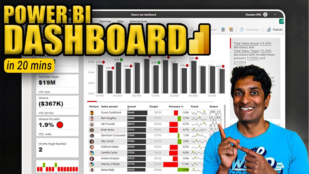
Make an Incredible Finance KPI Dashboard with Power BI in 20 minutes

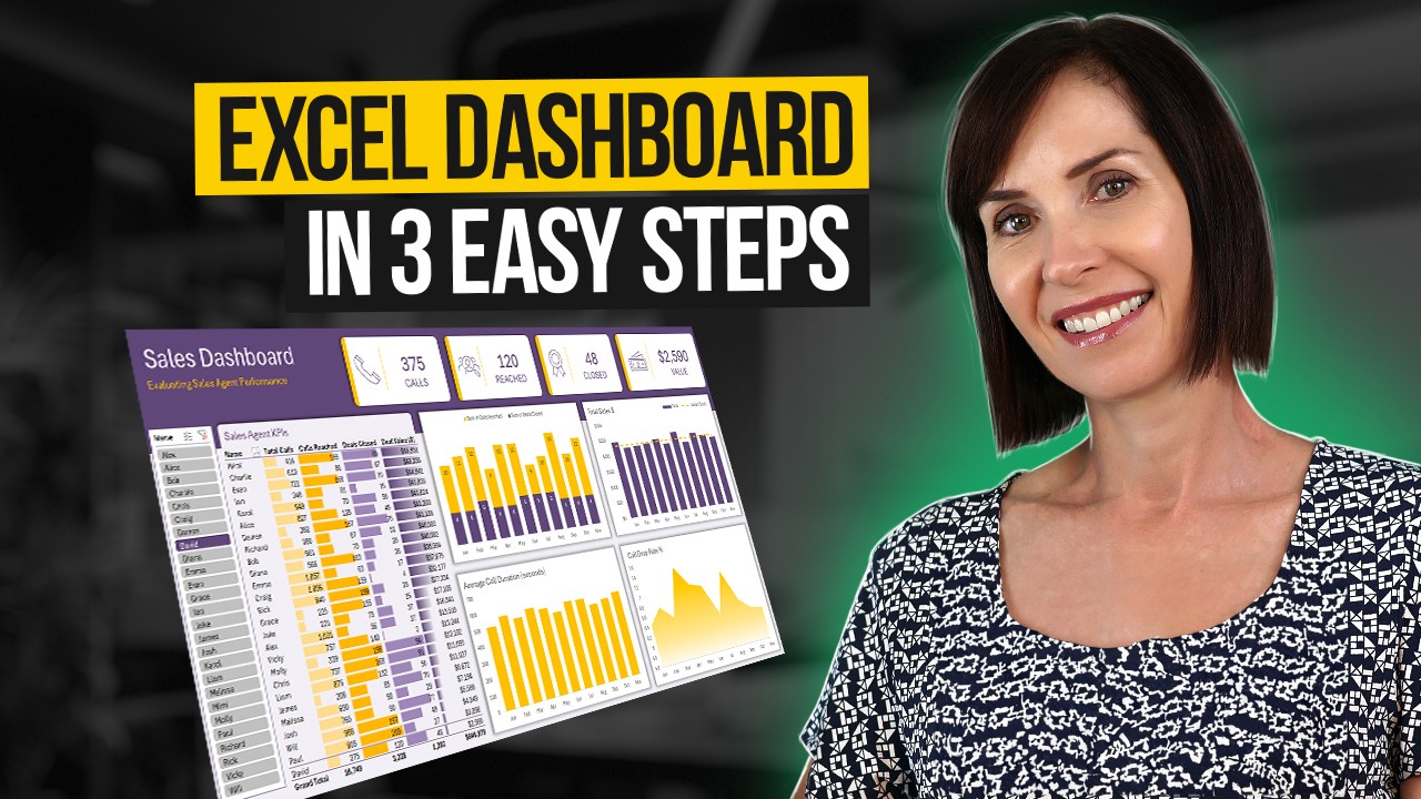
Interactive Excel Dashboard Tutorial in 3 Steps (+ FREE Template)

Wind Generation Database and Analysis Part 1

Prediksi Penyakit Serangan Jantung | Machine Learning Project 11
5.0 / 5 (0 votes)