Interactive Route Line Map in Python using folium
Summary
TLDRThis tutorial demonstrates how to visualize a roadmap using Python and the folium library. It guides users through connecting to Google Sheets, reading coordinate data (e.g., bus routes), and creating an interactive map. Key steps include adding markers for each coordinate, customizing icons, and connecting the points with lines. The tutorial also covers advanced customization, such as altering line styles and marker pop-ups. By the end, users can create and export dynamic, fully customized roadmaps, with additional resources available in the folium documentation for further exploration.
Takeaways
- 😀 Connect your Python code to Google Sheets to import coordinate data into your project using Google Colab.
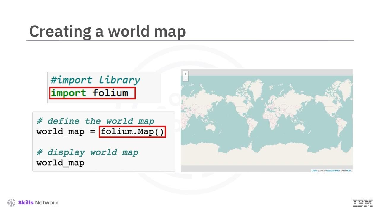
- 😀 Use the `folium` library to create interactive maps and visualize coordinates, such as bus routes, on a map.
- 😀 Read coordinate data into a Python DataFrame, whether your coordinates are separated by commas or stored in separate latitude and longitude columns.
- 😀 Initialize a map object in `folium` with a starting coordinate and zoom level to set up the base map for visualization.
- 😀 Split a single column of coordinate data into separate latitude and longitude lists, or directly use columns for each.
- 😀 Plot points on the map by iterating through the latitude and longitude lists and adding them as point objects.
- 😀 Connect the plotted points on the map with lines, starting from an initial coordinate and linking them sequentially.
- 😀 Customize the appearance of map elements, such as point icons, line colors, opacity, and dash styles to match the visualization’s needs.
- 😀 Use external resources to find and apply different icons for points, such as bus stations, to improve map clarity and usability.
- 😀 After customizing the map, generate an interactive visual that can be exported, embedded, or shared with others for use in projects or websites.
- 😀 Explore the `folium` library's documentation for further customization options, including different line styles, icon choices, and map features.
Q & A
What is the main goal of this tutorial?
-The main goal of the tutorial is to show how to visualize a roadmap by connecting a set of coordinates on a map using Python, specifically by using the `folium` library.
What is the significance of Google Sheets in this tutorial?
-Google Sheets is used as the data source for the coordinates. The tutorial demonstrates how to connect Python code in Google Colab to a Google Sheet and retrieve the coordinate data from it.
What is the first step in the process of creating a map visualization?
-The first step is to connect the code to the location where your data exists. In this case, the data is stored in Google Sheets, and the tutorial shows how to connect to it from Google Colab.
How does the tutorial handle the coordinate data format?
-The tutorial handles the coordinate data in two ways: either as comma-separated values in a single column or as latitude and longitude stored in separate columns.
How are the coordinates read and processed in the script?
-The coordinates are read from Google Sheets and stored in a DataFrame. The script then separates the coordinates into two lists: one for latitudes and one for longitudes.
What is the purpose of initializing the map object in Step 3?
-Initializing the map object (`M`) is important because it creates the map visualization. The starting coordinates and zoom level are provided, allowing users to control the map's initial view.
What is the `folium.Marker` function used for in the tutorial?
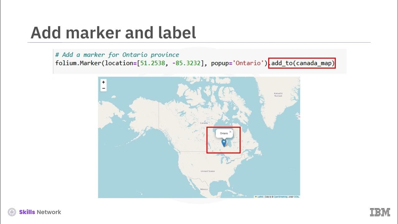
-The `folium.Marker` function is used to create point markers on the map at the specified latitude and longitude coordinates. These markers can be customized with icons and pop-up text.
What customization options are available for the map visualization?
-The tutorial demonstrates how to customize various elements of the map, such as the line style (solid or dashed), icon type (e.g., bus station icons), and other visual attributes like color, opacity, and pop-up text.
How are the points connected on the map?
-The points are connected using the `folium.PolyLine` function, which creates a line between consecutive points. The line style (e.g., color and dash pattern) can be customized.
Where can users find more icons for the points on the map?
-Users can find more icons on the Font Awesome website. The tutorial explains how to search for icons, get the corresponding icon name, and use it in the map visualization.
What is the final step in creating the map visualization?
-The final step is to connect all the elements together: plotting the points, drawing the lines between them, and applying any final customizations. The map is then saved in the `M` object, and users can interact with it.
Outlines

This section is available to paid users only. Please upgrade to access this part.
Upgrade NowMindmap

This section is available to paid users only. Please upgrade to access this part.
Upgrade NowKeywords

This section is available to paid users only. Please upgrade to access this part.
Upgrade NowHighlights

This section is available to paid users only. Please upgrade to access this part.
Upgrade NowTranscripts

This section is available to paid users only. Please upgrade to access this part.
Upgrade Now5.0 / 5 (0 votes)


