Customer Analysis using Tableau - Dashboard From Scratch
Summary
TLDRIn this tutorial, Stanley demonstrates how to effectively analyze customer data using Tableau, a powerful business intelligence tool. The video covers key techniques such as connecting to data sources, creating charts, and performing descriptive analysis on revenue, age, discounts, and regions. Viewers will learn to visualize and explore data using various chart types like maps, bar graphs, and donut charts. Stanley also walks through building a comprehensive, interactive dashboard, providing practical steps for formatting, filtering, and enhancing user engagement. This tutorial offers clear, actionable insights for anyone looking to leverage Tableau for data analysis.
Takeaways
- 😀 Tableau is a powerful business intelligence tool used for data visualization, analysis, and storytelling.
- 😀 Data visualization in Tableau involves presenting information using charts, graphs, tables, and maps for better understanding.
- 😀 It's important to know your audience when performing data analysis to ensure the presentation meets their needs (e.g., marketing, research, or management).
- 😀 Gather relevant datasets before starting the analysis, and ensure the data is appropriate for the task at hand.
- 😀 Choose the right type of analysis (descriptive, predictive, or prescriptive) based on your goals. This session focuses on descriptive analysis.
- 😀 Tableau offers 44 different chart types, so choosing the appropriate one is critical for effective communication of insights.
- 😀 For customer analysis, key tasks include examining revenue by state, month, age, quantity and discount correlation, and revenue by region.
- 😀 Creating maps in Tableau can visually show regional differences in revenue, with color intensity indicating higher or lower sales.
- 😀 You can manipulate data types in Tableau (e.g., converting month from string to date) to refine your analysis and charts.
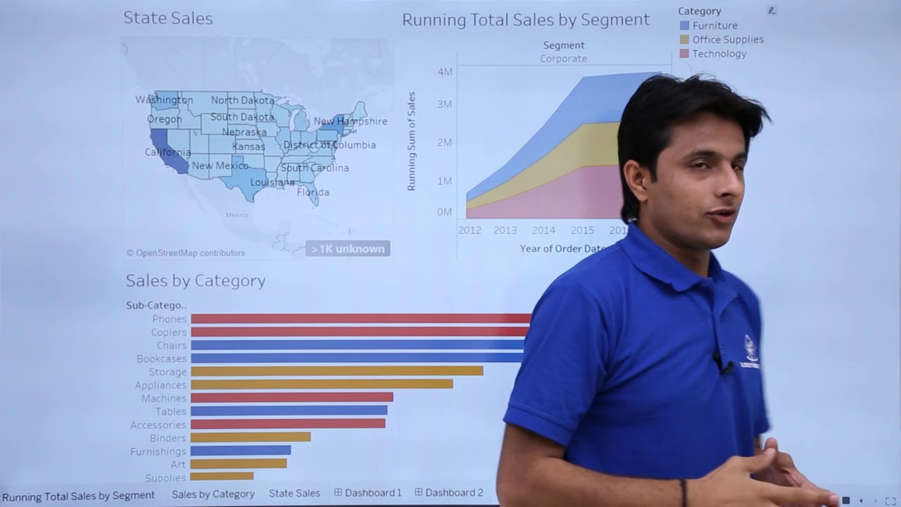
- 😀 Interactive dashboards can be built by combining charts and adding filters, allowing users to drill down into the data by specific categories or regions.
- 😀 Tableau enables the creation of custom visualizations, like donut and butterfly charts, by using calculated fields and dual axes for more complex presentations.
Q & A
What is Tableau and what is it primarily used for?
-Tableau is a business intelligence tool used for data visualization, analysis, and storytelling. It helps users graphically represent data through charts, graphs, tables, and maps. It is particularly useful for exploratory data analysis to identify trends and patterns.
What are the three main types of analysis in Tableau?
-The three main types of analysis in Tableau are descriptive analysis, predictive analysis, and prescriptive analysis. Descriptive analysis helps explain what happened, predictive analysis forecasts future trends, and prescriptive analysis provides recommendations for actions.
How does Tableau differentiate between dimensions and measures?
-In Tableau, dimensions are qualitative fields, such as categories or locations, which describe data. Measures are quantitative fields, such as sales or revenue, that contain numerical data for analysis. Dimensions are typically used in rows or columns, while measures are used for creating aggregations or calculations.
Why is it important to choose the right chart in Tableau?
-Choosing the right chart is crucial for presenting data effectively. Tableau offers 44 different chart types, and selecting the appropriate one helps convey the information clearly and accurately, making it easier for the audience to understand trends, patterns, and relationships in the data.
What does the 'Show Me' feature in Tableau do?
-The 'Show Me' feature in Tableau suggests suitable chart types based on the data you select. For example, if you choose a state column, Tableau may recommend a map visualization. This feature helps users quickly determine the best way to represent their data.
How do you create a histogram in Tableau for age-based revenue analysis?
-To create a histogram in Tableau for age-based revenue analysis, you need to create age bins. By right-clicking on the age field, you can define the size of the bins, such as 10-year intervals. These bins are then used to segment the age groups and analyze the total revenue for each group.
What is the relationship between discount percentage and quantity ordered in the analysis?
-The analysis shows a positive correlation between discount percentage and quantity ordered. As the discount percentage increases, the quantity of products ordered also tends to increase, suggesting that higher discounts encourage more purchases.
What is a donut chart, and how do you create one in Tableau?
-A donut chart is a variation of a pie chart where the center is cut out, giving it a ring shape. While Tableau doesn't have a built-in donut chart option, you can create one by using a dual-axis combination of a pie chart and a zero-axis field to overlay a blank circle in the center.
What steps are involved in building a dashboard in Tableau?
-To build a dashboard in Tableau, you need to: 1) Create individual charts and visualizations. 2) Drag and drop them onto a new dashboard layout. 3) Customize the layout by adjusting sizes, adding titles, and setting filters. 4) Apply formatting, such as changing number formats and adding background colors. 5) Make the dashboard interactive by linking filters across visualizations.
How do filters work in Tableau dashboards to improve interactivity?
-Filters in Tableau dashboards allow users to interactively modify the data displayed across multiple charts. For example, you can set a filter on a category field so that selecting a category in one chart updates all other charts to show data relevant to that category. This makes the dashboard dynamic and responsive to user input.
Outlines

This section is available to paid users only. Please upgrade to access this part.
Upgrade NowMindmap

This section is available to paid users only. Please upgrade to access this part.
Upgrade NowKeywords

This section is available to paid users only. Please upgrade to access this part.
Upgrade NowHighlights

This section is available to paid users only. Please upgrade to access this part.
Upgrade NowTranscripts

This section is available to paid users only. Please upgrade to access this part.
Upgrade NowBrowse More Related Video

Belajar Tableau : Apa itu Tableau?

TUTORIAL MENGGUNAKAN VOSViewer UNTUK PEMETAAN, VISUALISASI DAN EKSPLORASI PADA PENELITIAN

034 isochrones

Tableau Tutorial for Beginners in 20 Minutes | Complete Tableau Training for Beginners | Simplilearn

BERBICARA TENTANG ARSITEKTUR DATA BERSAMA AHLINYA #BMEDIATEKNOLOGI

Tableau - Dashboard Introduction
5.0 / 5 (0 votes)