12 Dashboard design tips for better data visualization
Summary
TLDRIn this informative video, Dale from Geckoboard shares 12 essential tips for designing effective dashboards. He emphasizes the importance of clearly defining the dashboard's purpose and understanding the audience to ensure it aids decision-making. Key strategies include minimizing visual noise, selecting the right visualizations, grouping related metrics, and providing context to key performance indicators. Dale encourages breaking design rules to enhance engagement and stresses the need for continuous improvement based on user feedback. By following these guidelines, viewers can create dashboards that effectively communicate data and drive insights.
Takeaways
- 📊 Define the purpose of your dashboard clearly to tailor the design to your audience's needs.
- 🎯 Avoid information overload by presenting only the essential data required for decision-making.
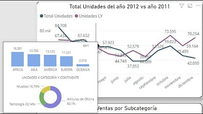
- 🗑️ Focus on improving the data ink ratio by eliminating unnecessary visual elements that do not convey data.
- 🔍 Use rounding for numbers to enhance comprehension and avoid overly precise figures.
- 📈 Select visualizations that communicate data clearly and efficiently; stick to familiar formats when necessary.
- 🔗 Group related metrics together to streamline the user's experience and minimize visual clutter.
- 💡 Make important KPIs stand out by placing them in prominent positions on the dashboard.
- ⚖️ Provide context for numbers using status indicators or comparisons to enhance understanding.
- 📜 Keep labels clear and concise; avoid lengthy explanations to reduce visual noise.
- 🔄 Continuously iterate and improve your dashboard based on user feedback to ensure it meets their needs.
Q & A
What is the primary purpose of a dashboard?
-The primary purpose of a dashboard is to present important data in a way that allows for quick and efficient decision-making.
Why is it important to understand the audience of a dashboard?
-Understanding the audience helps determine what information is necessary and what can be excluded, making the dashboard more effective.
What does the term 'data ink ratio' refer to?
-Data ink ratio refers to the amount of ink used to present data versus the ink used for non-data elements. A good data ink ratio means using minimal non-data ink.
How can visual noise impact a dashboard's usability?
-Visual noise can make dashboards difficult to interpret, especially if users need to look at them multiple times a day, leading to confusion.
What should be done with overly precise numbers in a dashboard?
-Overly precise numbers should be rounded to a meaningful level to enhance comprehension and highlight significant changes.
What type of visualizations are generally recommended for dashboards?
-It is recommended to use numbers, bars, lines, and tables, avoiding pie and area charts due to the difficulty people have in comparing spatial areas.
What is the benefit of grouping related metrics in a dashboard?
-Grouping related metrics helps users find relevant information easily and reduces the need for excessive labels.
How can key performance indicators (KPIs) be emphasized on a dashboard?
-KPIs can be emphasized by making them larger and positioning them in the top left corner of the dashboard, where users' eyes are naturally drawn.
Why is context important for presenting numbers on a dashboard?
-Context helps users understand the significance of numbers, such as whether they are good, bad, or unusual, by comparing them to targets or previous values.
What is the recommended approach to dashboard design according to the script?
-The recommended approach is to follow design rules but also to be flexible, allowing for creative elements that engage users without overdoing it.
Outlines

This section is available to paid users only. Please upgrade to access this part.
Upgrade NowMindmap

This section is available to paid users only. Please upgrade to access this part.
Upgrade NowKeywords

This section is available to paid users only. Please upgrade to access this part.
Upgrade NowHighlights

This section is available to paid users only. Please upgrade to access this part.
Upgrade NowTranscripts

This section is available to paid users only. Please upgrade to access this part.
Upgrade NowBrowse More Related Video
Introducción al Data StoryTelling Cápsula Uno: Cómo elegir el gráfico adecuado.

How To ACTUALLY Start A Clothing Brand In 2024!

10 Simple Ways To Improve Your Networking Skills - How To Network With People Even If You're Shy!

10 Home Design Mistakes to Avoid

How to Design Your Corporate Sustainability Report

PERHATIKAN 6 HAL INI UNTUK RANCANG PROGRAM LATIHAN BEBAN
5.0 / 5 (0 votes)