Cómo hacer un gráfico de barras
Summary
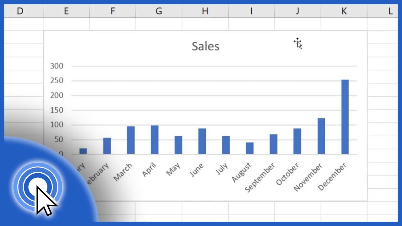
TLDRIn this video, the presenter provides a step-by-step guide on how to properly create a bar chart, also known as a column graph. The video covers essential tips, such as organizing data, choosing appropriate bar widths, and ensuring clarity in labeling. It emphasizes the importance of having data in order and understanding how to properly use axes for both data and frequencies. The presenter also explains how to avoid common mistakes, like misplacing bars or incorrect labeling. Overall, it's a comprehensive tutorial for creating visually clear and accurate bar charts, ideal for beginners and students learning statistical graphs.
Takeaways
- 😀 Make sure your data is properly organized before creating a bar chart. This includes grouping data in a clear and structured way, such as organizing by age and frequency.
- 😀 Always label your axes correctly: the horizontal axis should represent data categories (e.g., age) and the vertical axis should represent frequencies.
- 😀 Ensure that data points are evenly spaced and organized. This helps make the chart readable and avoids confusion.
- 😀 For bar width, consider the space between the bars. If you want them closer or more spread out, plan accordingly and keep consistency.
- 😀 Choose a clear and consistent scale for the vertical axis. If the highest frequency is 11, ensure your vertical axis can accommodate this value.
- 😀 The bar should start and end at the correct position. If you choose two squares for width, place the bars correctly and avoid making them uneven or unclear.
- 😀 Be mindful of the spacing between categories on the horizontal axis. Avoid cramming too much or too little space between data points.
- 😀 Use appropriate labels on your graph to ensure anyone viewing it understands the data, such as writing 'ages in years' for age data and 'number of people' for frequencies.
- 😀 Ensure bars are drawn correctly, with the height corresponding to the frequency. Do not misplace bars or place them on the wrong number.
- 😀 A well-constructed bar chart should be easy to understand, with clear labels, even spacing, and accurate data representation. Make sure the graph is informative and visually appealing.
Q & A
What is the primary purpose of the bar chart in the video?
-The primary purpose of the bar chart is to visually represent the frequency distribution of data, such as the number of people in each age group.
What are the necessary steps to create a bar chart according to the video?
-The necessary steps include organizing data, deciding on the axis for the data and frequencies, drawing the axes, and ensuring proper spacing and scaling for the bars. The bars should be uniform in width and accurately represent the frequencies.
Why is it important to organize the data before creating a bar chart?
-Organizing the data beforehand ensures that the graph is clear and accurate. It allows for easy identification of values and makes it possible to create a well-structured chart.
What advice does the video give about choosing the width of the bars?
-The video advises choosing an appropriate width for the bars, ensuring they are neither too wide nor too narrow. A good approach is to leave a small space between the bars for visual clarity, such as two or three units wide.
What mistake do students often make when positioning the numbers on the graph?
-A common mistake is placing numbers (frequencies or data) in an unordered or misaligned fashion. It's essential to arrange the numbers in a clear and consistent order, such as from smallest to largest, and to maintain uniform spacing.
What should be included in the vertical axis of a bar chart?
-The vertical axis should represent the frequencies of the data, such as the number of people corresponding to each category or data point.
Why is it necessary to label the axes in a bar chart?
-Labeling the axes is necessary to ensure the chart is understandable. The horizontal axis represents the data categories (e.g., ages), while the vertical axis represents frequencies. Labels make it clear what the numbers and bars represent.
What are the potential errors when drawing the bars?
-One error is positioning the bars incorrectly, such as not centering the bars properly over their corresponding data points or making them too wide or narrow, which can distort the chart's interpretation.
How should data be scaled if the frequency is very high, like 50 or more?
-If the frequency is high, it's important to adjust the scale of the vertical axis so that the chart can accommodate the higher values. This might involve increasing the range of numbers or modifying the units used for each interval.
What is the significance of using color in the bar chart?
-Color can enhance the visual appeal and clarity of the bar chart, but it is not essential. The most important thing is that the bars are uniformly sized and represent the data accurately. Multiple colors can be used for emphasis but should not overwhelm the viewer.
Outlines

This section is available to paid users only. Please upgrade to access this part.
Upgrade NowMindmap

This section is available to paid users only. Please upgrade to access this part.
Upgrade NowKeywords

This section is available to paid users only. Please upgrade to access this part.
Upgrade NowHighlights

This section is available to paid users only. Please upgrade to access this part.
Upgrade NowTranscripts

This section is available to paid users only. Please upgrade to access this part.
Upgrade NowBrowse More Related Video


5.0 / 5 (0 votes)