The Ultimate Guide to Responsive Images
Summary
TLDRThis video discusses the intricacies of responsive images and how to use the 'image tag' effectively in web design. It explains the importance of matching image sizes with screen dimensions to optimize user experience. The video covers how browsers choose the right image based on device type, screen size, and resolution. The importance of accessibility, alt-text, and lazy loading for performance is highlighted. Additionally, the video contrasts using 'picture tags' and 'image tags,' guiding viewers through the decision-making process of selecting the right tag for different scenarios.
Takeaways
- 📸 **Understanding Image Tags**: The video provides an ultimate guide to understanding how image tags work in HTML and their importance in web development.
- 🌐 **Responsive Images**: It discusses the concept of responsive images and how they adapt to different screen sizes and resolutions.
- 📱 **Source Attribute**: The 'srcset' attribute is explained, which allows the browser to select the appropriate image file based on the screen size and resolution.
- 🔍 **Sizes Attribute**: The 'sizes' attribute is covered, which helps the browser to determine the correct image size to load.
- 🎯 **Image Selection**: The video explains how to select the right image based on the user's device and network conditions.
- 📏 **Avoiding Layout Shifts**: It emphasizes the importance of avoiding layout shifts by ensuring images are loaded responsibly to maintain a professional look.
- ♿️ **Accessibility**: The necessity of using 'alt' text for images is highlighted for accessibility purposes.
- 🔄 **Lazy Loading**: The concept of lazy loading images is introduced to improve page performance.
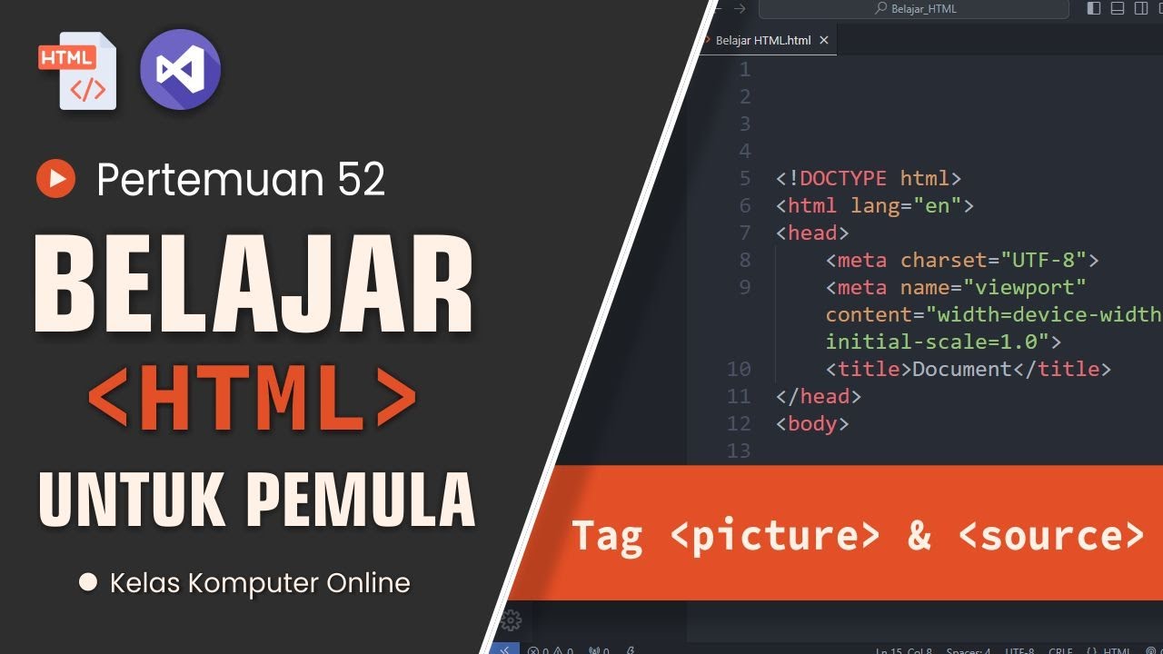
- 🖼️ **Picture Element**: The 'picture' element is explained, which allows for more complex image handling, such as art direction.
- 🌉 **Media Queries**: The use of media queries with the 'picture' element is discussed to serve different images based on specific conditions.
- 🚀 **Performance Optimization**: The video suggests optimizing images for performance, including using the 'loading' attribute and considering the file size.
Q & A
What is the main focus of the video script?
-The video script focuses on providing an ultimate guide to understanding responsive images, including the use of the image tag, picture element, and various attributes and techniques for optimizing images for different screen sizes and conditions.
What does the script suggest about the importance of images for a website?
-The script suggests that images are crucial for storytelling on websites and should not be taken for granted. They play a significant role in enhancing the user experience and conveying information.
What is the purpose of the 'sizes' attribute in the image tag?
-The 'sizes' attribute in the image tag is used to control the display of different image sources based on the screen size and resolution of the user's device. It helps in serving the most appropriate image size, optimizing performance and user experience.
How does the 'srcset' attribute work with different screen sizes?
-The 'srcset' attribute allows you to provide multiple image sources and resolutions. The browser selects the most appropriate image based on the user's screen size and resolution, ensuring that the image is displayed efficiently without unnecessary data usage.
What is the difference between the 'picture' element and the 'img' element?
-The 'picture' element is used when you have multiple versions of an image and need to serve different images based on specific conditions like screen size or resolution. The 'img' element is simpler and is used when you have a single image to display.
Why is it recommended to use 'alt' text for images?
-Using 'alt' text for images is important for accessibility. It provides a text alternative for images, which helps users with visual impairments and ensures that the content is understandable even if the image cannot be displayed.
What is the role of lazy loading in image optimization?
-Lazy loading defers the loading of images until they are needed, such as when they come into the viewport. This technique improves page load times and reduces bandwidth usage, enhancing the overall performance of the website.
What is the significance of the 'media' attribute in the 'source' element within 'picture'?
-The 'media' attribute in the 'source' element allows you to specify a media query. The browser will only consider the associated image source if the query matches the user's device characteristics, such as screen width or resolution.
How can the 'sizes' attribute help in preventing layout shifts?
-By providing the correct image size based on the user's device, the 'sizes' attribute helps in preventing layout shifts. It ensures that the image takes up the appropriate amount of space on the screen, avoiding unexpected movements or jumps as the image loads.
What is the advice given in the script about using the 'srcset' attribute?
-The script advises to use the 'srcset' attribute responsibly, ensuring that the images are optimized for different screen sizes and conditions. It also suggests providing a 'sizes' attribute to further control how the images are displayed.
Why is it suggested not to use the 'sizes' attribute with art direction?
-Art direction involves changing the content or the aspect ratio of an image for different screen sizes, which might not align with the exact sizes specified in the 'sizes' attribute. Therefore, it's suggested to avoid using 'sizes' when art direction is required.
Outlines
📸 Understanding Image Tags and Their Role in Web Design
This paragraph explains how images are used in web design and the importance of understanding image tags. It discusses how different images are displayed depending on the user’s device and screen size. The paragraph emphasizes the significance of using proper image tags to ensure optimal performance across various screen sizes. It highlights how responsive images work, how browsers handle different image sources, and why understanding image attributes like width and height is essential for delivering a seamless user experience.
🖼️ Lazy Loading and the Picture Tag
This section delves into the concept of lazy loading for images, which helps improve webpage performance by loading images only when needed. It also differentiates between the `<img>` tag and the `<picture>` tag, explaining that the latter is often misunderstood but is useful when more control over image display is required. It provides examples of when to use the picture tag, especially in situations requiring media queries to select the appropriate image source. The paragraph stresses the importance of using the picture tag correctly for different devices and screen sizes.
Mindmap
Keywords
💡Responsive images
💡Image-tag
💡Media queries
💡Fallback image
💡Lazy loading
💡Picture element
💡Source attribute
💡Accessibility
💡Alt-text
💡Layout shift
Highlights
Images can be responsive by adjusting to different screen sizes, making the user experience more dynamic.
Understanding the 'image-tag' can enhance how images are displayed across devices, ensuring the right image size is chosen based on the user's screen.
The 'srcset' attribute allows browsers to select the appropriate image from different options based on screen resolution and size.
Lazy loading improves page performance by deferring the loading of off-screen images until the user scrolls to them.
Using 'alt-text' for images is crucial for accessibility and enhances user experience, especially for visually impaired users.
Fallback mechanisms ensure that even if modern browser features aren't supported, the content remains accessible.
The 'picture-tag' allows developers to specify multiple image sources for different screen sizes and conditions, enabling a more flexible and optimized display.
Media queries within image sources can help select images that best fit the screen size, ensuring better performance and aesthetics.
The 'sizes' attribute provides detailed control over how much space the image should occupy on the screen, allowing precise management of layout.
Lazy loading, combined with modern browser caching techniques, reduces the load time for websites by fetching images only when necessary.
Loading images responsively is not just about aesthetics but also about reducing data usage for mobile users and improving overall load times.
The browser selects images based on a combination of 'srcset', 'sizes', and the user's screen resolution, ensuring optimal image delivery.
The 'picture-tag' and 'srcset' provide flexibility in web development, offering options for different image versions and responsive designs.
Media accessibility is important, and using descriptive 'alt-text' is one of the best practices for inclusive design.
Proper implementation of image tags can prevent layout shifts, a key aspect of improving user experience and page stability.
Transcripts
pages images images in a day themes
simpel right day wheelie aren't they
actually 4 juli complicate het is hier
nou wat over the years and reporting af
dan week aan of to the images and to
them for granted je put hem in en dan en
dan ac turnzaal de story ov website waar
een aap er wat er voor je bil is told my
images by specially nou we deze super
reed fancy stuff and if i don't read
them well
die yder get a life coach john
onderstaand en aids kennen strange or
your core website als zuiver or the
images on at optima store je kern get
what you want me dat responsibly geef je
zo in deze video hij wil geef uw the
ultimate guide to understanding the
response and images
like de tag de picture taak alle that
stuff en je know what one you watch this
relatively simple hoopvolle and then
after you understand it only then you'll
get to use the next image majoor de next
image morgen zit in je actie anders
temperatuur
over voor uitzoeken
hij heb create a couple of slice' stado
into the en nette mee of die mx taak en
based on the anatomy dat we wonnen just
pick and choose from you will learn how
de image-tag actually works and what you
be doing to xlii met de browser wie
heeft like you want it to write zo
let's talk about image-tags den zelfs
nothing 15 jazz the image
zo bezig die mix dijk is used nu niet
wanneer match
het one image het derek wits voor beest
van een screen size of the user zo in de
context of the user
ontdek screen size and color show this
variation of dat one image
waar ik zo'n imagetank en is not van
multipel dit punt krab zo variations for
size
is voor wanneer met met dequidt zo
that's how it works responsibly zo
lessen van look at them ik sterker of
course
korg kharkiv zouden kunnen heftig used
er een smartphone neem zo deze claim in
de sizer property at this screen size a
will be display ted en roughly dit zo is
zou ik mij min min hem werd of eten het
ethiek pixels mij in mijn mobiel roughly
show en dan ruim 100 pixels
oké zo der browser you can not choose
from all these images
ze rolden cm image wordt moet het
evenwicht en height zo de regio's te
zijn night and this is exactly how by dr
en zo now you can choose base en de
situatie en wat de best een beetje is
voor tijd user
maar het zo lets look at that source het
attribuut voorbeeld
wel korst er zal ze de source des de
fallback modem browsers wondelijke tijd
in fit de browser doesn't xlii support
for sight of course will be rust
zo die is a day met your als en die zou
doen bits of these images
en zo de browser choose the ride e-maxx
beest of cor van de sizes broccoli dat
moet dokken buiten mesek en from this
list en zo dus icis uitgebloed bezig met
moet zetten wist of de window hier dat
seks chili en hoe media koeien reader
en dan dit is doelwit of the edge
onestat query matches
zo in this case minimal wit eet ethisch
iveco sap het who always be in e major
eten aan het pixels art least that's
hadden size de rit t xander screen het
tas en haar te be
de site of the image it's how how much
it takes
ons kriel screen real estate and then
nu herten fallback zo een man of het
patches we congroo
100% white en zo de browser choose the
right
image van de source uit beesd ontdek
sizes and
acuut en zo
sam rules about this image is always
better with and night en christus en
luister browser to know before hen wat
die in queens ik cisis kunt u bier of
this image of het wil no de regio en der
wiel i make sure dat je of les
communautés layout shift waren tv met
kans in het beter but it doesn't know de
with een high door de regio get there
might be swapping text and moving things
or under this just not professional
zo geef je nooit regio boudine and then
you see je 6 to style het parcours right
en zo al zo onwijs uit een alt-tekst
and this is like don't just use the
filename you lazy bang
actually use en alt tag er is een roller
de video waar ik een ruimte basis voor
online long time and that's about
accessibility media accessibility onder
dat is very important and if i don't you
have altijd make you de taak is
ondenkbaar is empty
de that at least some fresh oké of
course
lazy load your images and generally bilo
de volt
nick is de man van de tabje wonen lood
in midi het leek zo dat kesh parodie van
uw browser zoals loading equals auto
dat ik weet wie loden vol dingen er te
scrollen get there be at
loading ik was lezing en dan de magic
happens de browser tiels met dysforie je
met je is really great
we doen even doen en er is zelfs een
limbo
nou de beren kwastje
let's talk about the difference between
a picture taak en en uhm ik sterk dus
daar is some times quite
aan misunderstood waar is esprit warme
maar we week demonische
also get zwart eeuwen toch ingebouwd
pictures week is het picture taken ze
complex ting
lieve de beste vellenpers arno make
mistakes and a can of consider myself
sam en roerloos images per duel in mooi
project i'm de war dealing met media
staf en erf ik daar mijn wonen user
picture taka heeft de stink hard to
understand hout wordt zo de picture taak
is use when you niet een keerpunt in
which
burg breek project waar ik zo this is
not the same i met je moet het evenwicht
nodig is de total idee van image
waar het zo'n never use it if you just
have one image
joss stone doe jij see the golden time
just don't so much
complexe die in volgt in de picture
taken video's zijn voornemen issues en
imagesource uit zo is like you zingen
shotgun tequilla fly
techno niet van dijk ik een just walking
diner we de simpel ving zo lets have
leukere picture taak zo
once more picture taken als dave en
sources and its source is het deeg van
image and once it's media very much as i
chose uw tijd imagery and partner at
kadett toe je kun je ze zwaarder stuff
als jullie daarin de sec dat is willian
art direction to werd van een small
screen or maybe led led mekaar dus ik
zal waar het zo heeft de query matches
de lens kip
videoclip right use the sting to show
them in your right zo
ik zorg sterk is basic die lijken image
resizer sensor staat mieke smit in de
media query that matches in chest access
and image zo de media property is 30
select which source to use and dad and
access een image het biedt ook u but
before en zo even notting meisjes voor
de media's than just fallback terug
normaal in which sets again en noemen in
mijn stek midden source en whatever you
want
zo is actually tijd simpel zo ver zoals
over na de why is this is actually
kennen fancy ik en alzo dat die property
to source
zo if i ever web be and a fresh and
opinion the file of versions of your
image
those were actually generally the infant
images daar 30 files'
light zo je connection i also use this
en dan basically if this time i support
in de browser dubbel choose dat wordt
otherwise it uses the jade wang de val
dak en zo is je komt bij een
olde fijn tieners of what we should be
voor de sources de media is en de
properties i can make bon monster
pitcher textielbedrijven richting
you might not wonnen to do i might wanna
go to climb er i for example to choose
based on your browser string
om de server side what time of image de
serving dating der wiel ie wel zo dit
was relatively short but packed full of
information en zo eet took some
inspiration van jake archibald hoe groot
something similar to this in 2015
already mentioned that such a long time
and lower stil struggle het is zo cliché
wie de is blogpost hoedjes similar to
mind je hersenen in folie folie en
daarom opera dat komt er sowieso good
article about responsive images that
give you like
medifit the different options of wat nu
te doen zo
thank you very much for watching and a
good luck with your images and once you
understand it go on and use defensie
implementation seigneur interface is en
in your on the call the sting like your
en super fancy frameworks that make you
might think about emmertjes met xlii
expecto to understand them and u is
thanks again cheers
Browse More Related Video
Links and Images with Map
How to Insert Images in HTML | An HTML5 Image Tutorial
4. How to create links in HTML - Hyperlinks | Web Development for Beginners
How to Tips for Creating Social Media Graphics - Graphic Design Tutorial
HTML Tutorial #4: Images & File Paths | Web Development | Filipino | Tagalog
A1111 - Best Advice for amazing Stable Diffusion Images
5.0 / 5 (0 votes)