Machine Learning Tutorial Python - 13: K Means Clustering Algorithm
Summary
TLDRThe video introduces machine learning, focusing on unsupervised learning, particularly the K-means clustering algorithm. It explains how K-means helps identify clusters within a dataset without predefined labels. The steps of choosing K, initializing random centroids, calculating distances, and refining clusters are demonstrated. The video covers the Elbow Method to determine the optimal number of clusters and explores coding this in Python. Using a dataset with age and income, the tutorial shows how clustering reveals hidden group characteristics. The video concludes with an exercise using the iris dataset and elbow plot to find the optimal K.
Takeaways
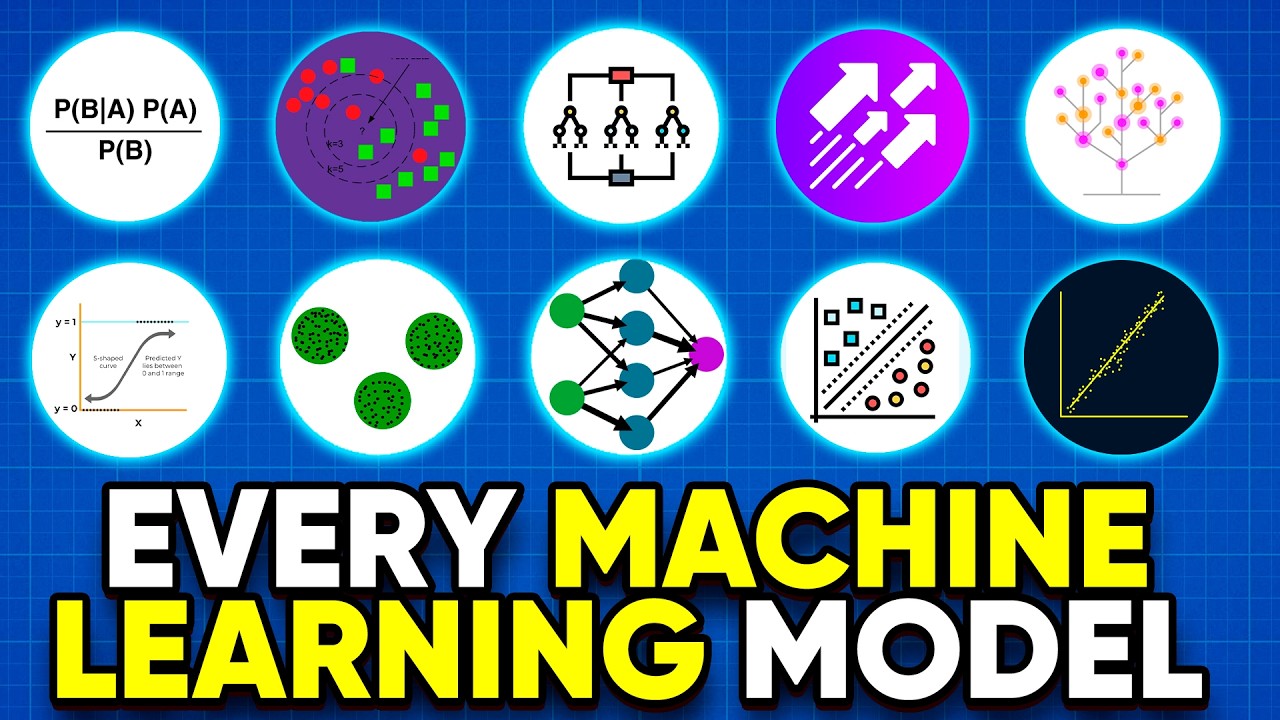
- 📊 Machine learning algorithms are categorized into three main types: supervised learning, unsupervised learning, and reinforcement learning.
- 🔍 Unsupervised learning focuses on identifying underlying structures or clusters in the data without knowing the target variable.
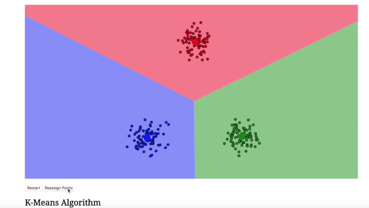
- 📉 K-means is a popular clustering algorithm used to divide a dataset into clusters based on proximity to centroids.
- 🔢 The parameter 'k' in K-means represents the number of clusters and needs to be specified before running the algorithm.
- 🎯 The process involves initializing random centroids, calculating distances between points and centroids, and adjusting clusters iteratively.
- 🧲 The centroid positions are recalculated until no data points change clusters, leading to final, stable clusters.
- 💡 The elbow method helps determine the optimal number of clusters by plotting the sum of squared errors against different values of 'k'.
- 📐 Scaling features like age and income using MinMaxScaler can improve clustering accuracy by normalizing the feature range.
- 📊 Visualizing clusters with scatter plots helps understand the clustering results better, especially after scaling.
- 🔬 For real-world datasets with many features, the elbow method is used to avoid manual cluster visualization and to identify the best number of clusters efficiently.
Q & A
What are the three main categories of machine learning algorithms?
-The three main categories of machine learning algorithms are supervised learning, unsupervised learning, and reinforcement learning.
How is supervised learning different from unsupervised learning?
-In supervised learning, the dataset contains a target variable or class label, which helps in training the model to make predictions. In unsupervised learning, there is no target variable, and the goal is to identify patterns or structures within the data, such as clusters.
What is the K-means algorithm used for?
-K-means is a popular clustering algorithm used in unsupervised learning to group data points into clusters based on their similarities. It starts by randomly selecting centroids and then iteratively refines the clusters by minimizing the distance between the data points and their respective centroids.
How do you determine the initial value of K in K-means?
-The value of K, which represents the number of clusters, is a free parameter that must be specified before running the K-means algorithm. The choice of K can be based on visual inspection of the data or using methods like the elbow method to find the optimal value.
What is the role of centroids in K-means clustering?
-Centroids represent the center of each cluster. The algorithm assigns each data point to the nearest centroid, and these centroids are adjusted iteratively to minimize the distance between the data points and the centroid of their assigned cluster.
What is the elbow method, and how is it used in K-means?
-The elbow method helps in selecting the optimal value of K by plotting the sum of squared errors (SSE) for different values of K. The goal is to find a point on the curve where the SSE starts to decrease at a slower rate, forming an 'elbow.' This point indicates a good value for K.
Why is feature scaling important in K-means?
-Feature scaling is important because K-means uses distance calculations to form clusters. If the features have different scales (e.g., one in thousands and another in tens), the larger scale feature will dominate the distance calculation, leading to incorrect clustering. Scaling ensures that all features contribute equally.
What is inertia in the context of K-means clustering?
-Inertia refers to the sum of squared distances between each data point and the nearest centroid. It is used as a measure of how well the clusters are formed, with lower inertia indicating better clustering. In the elbow method, inertia is plotted to determine the optimal number of clusters.
How does the K-means algorithm stop, and what does the final result represent?
-The K-means algorithm stops when no data points change clusters between iterations. At this point, the clusters are considered stable, and the centroids represent the center of each cluster. The final result is the partitioning of the data into distinct clusters.
How would you apply K-means clustering to a real-world dataset like the age and income dataset mentioned in the script?
-To apply K-means clustering to the age and income dataset, the first step is to preprocess the data, including scaling the features (age and income). Next, the K-means algorithm is run with an initial value of K (e.g., 3 for three clusters). The clusters are then refined iteratively by adjusting centroids and reassigning data points until the clusters stabilize. Finally, an elbow plot can be used to determine the optimal K.
Outlines

This section is available to paid users only. Please upgrade to access this part.
Upgrade NowMindmap

This section is available to paid users only. Please upgrade to access this part.
Upgrade NowKeywords

This section is available to paid users only. Please upgrade to access this part.
Upgrade NowHighlights

This section is available to paid users only. Please upgrade to access this part.
Upgrade NowTranscripts

This section is available to paid users only. Please upgrade to access this part.
Upgrade Now


5.0 / 5 (0 votes)