Patterns of Correlation
Summary
TLDRThis educational video explores the patterns and direction of correlation, focusing on linear, curvilinear, and no correlation. Linear correlation is identified by a straight-line pattern on a scatter plot, with positive correlations indicating variables moving in the same direction and negative correlations moving inversely. Curvilinear correlation presents a non-linear relationship, where the relationship between variables changes at certain points, as seen with kindness and desirability or anxiety and achievement. Lastly, no correlation is characterized by a random scatter of data points, indicating no systematic relationship between variables, exemplified by shoe size and creativity.
Takeaways
- 📈 There are three patterns of correlation: linear, curvilinear, and no correlation.
- 🔍 Linear correlation is visible on a scatter plot as a straight line, indicating a direct relationship between two variables.
- ⬆️ Positive linear correlation means that as one variable increases, the other also increases, and vice versa.
- ⬇️ Negative linear correlation indicates an inverse relationship, where one variable increases as the other decreases.
- 📊 Curvilinear correlation is non-linear, with the relationship between variables changing at certain points, often seen as a curve on a scatter plot.
- 🔁 The direction of linear correlation is crucial, distinguishing between variables moving together (positive) or in opposite directions (negative).
- 🌟 An example of curvilinear correlation is kindness and desirability, where an increase in kindness initially increases desirability but then levels off.
- 📉 Another example of curvilinear correlation is anxiety and achievement, which might show a U-shaped curve where moderate anxiety improves performance but too much impairs it.
- ❌ No correlation is indicated by a scatter plot with no discernible pattern, suggesting that the variables are unrelated.
- 👟 An example of no correlation is shoe size and creativity, where there is no systematic relationship between the two variables.
Q & A
What are the three patterns of correlation discussed in the video?
-The three patterns of correlation discussed are linear, curvilinear, and no correlation.
What is a linear correlation and how is it represented on a scatter plot?
-A linear correlation is when the relationship between two variables appears as a straight line on a scatter plot. It doesn't matter if the line slopes upwards or downwards.
What are the two types of linear relationships, and how do they differ?
-The two types of linear relationships are positive and negative correlations. Positive correlations mean that both variables increase or decrease together, while negative correlations mean that as one variable increases, the other decreases.
What does a positive correlation imply about the relationship between two variables?
-A positive correlation implies that as one variable gets bigger, the other also gets bigger, and vice versa. They move in the same direction.
Can you describe how a negative correlation is visualized on a scatter plot?
-A negative correlation on a scatter plot is visualized by a line that slopes from the upper left to the bottom right, indicating that as one variable increases, the other decreases.
What is a curvilinear relationship and how does it differ from a linear relationship?
-A curvilinear relationship is one where the relationship between variables is not a straight line but a curve on a scatter plot. It differs from a linear relationship by showing a change in the nature of the relationship at some point.
Can you provide an example of a curvilinear relationship mentioned in the video?
-An example of a curvilinear relationship mentioned is kindness and desirability, where initially, as kindness increases, desirability also increases, but after a certain point, desirability levels off despite further increases in kindness.
What is the significance of the direction in the context of correlation?
-The direction of correlation is significant as it indicates whether the variables are moving together (positive correlation) or in opposite directions (negative correlation).
How is 'no correlation' depicted on a scatter plot?
-No correlation is depicted on a scatter plot as a random distribution of dots with no discernible pattern or trend, indicating that the variables are unrelated.
What does it mean when each dot on a scatter plot represents?
-Each dot on a scatter plot represents the scores of one person for two different variables.
Can you explain the concept of a U-shaped curvilinear relationship using an example from the video?
-A U-shaped curvilinear relationship, as mentioned in the video, is exemplified by anxiety and achievement, where up to a point, increased anxiety might lead to higher achievement, but beyond that point, too much anxiety could impair performance, leading to lower achievement.
Outlines

This section is available to paid users only. Please upgrade to access this part.
Upgrade NowMindmap

This section is available to paid users only. Please upgrade to access this part.
Upgrade NowKeywords

This section is available to paid users only. Please upgrade to access this part.
Upgrade NowHighlights

This section is available to paid users only. Please upgrade to access this part.
Upgrade NowTranscripts

This section is available to paid users only. Please upgrade to access this part.
Upgrade NowBrowse More Related Video
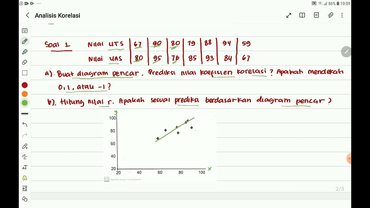
Analisis Korelasi "Nilai Koefisien Korelasi dan Tingkat Korelasi" Part 1 Mtk 11 SMA Kmerdeka
[Mathematics in the Modern World] Correlation & Simple Linear Regression
Belajar Statistika - Makna & Intepretasi Diagram Pencar (Scatter Plot)
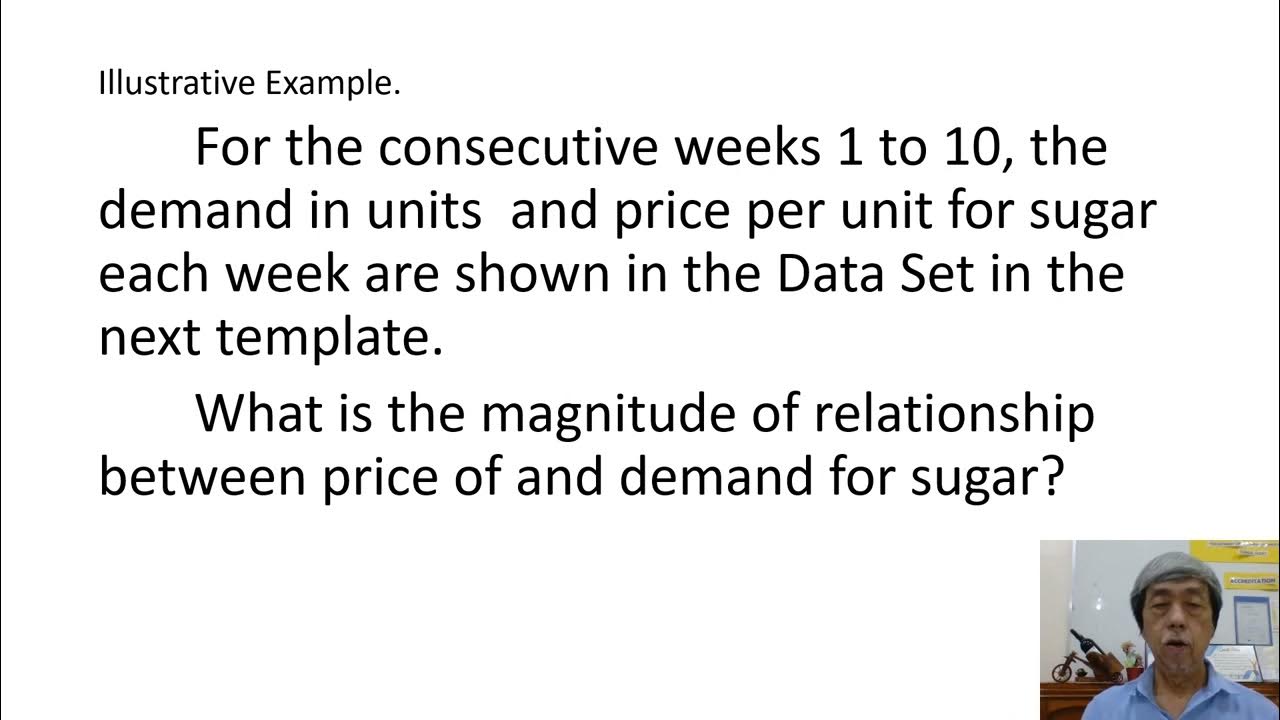
REGRESSION AND CORRELATION EDDIE SEVA SEE

Correlation Analysis

Correlation Interpret Numeric
5.0 / 5 (0 votes)