CSS position properties (relative, absolute, fixed, position sticky, and floats) — Webflow tutorial
Summary
TLDRThis video provides an in-depth exploration of CSS positioning controls for web design, covering six key types: static, relative, absolute, fixed, sticky, and floats. Viewers will learn how each positioning type affects element layout, from basic stacking to advanced control over positioning within the document flow and viewport. Practical examples demonstrate how to apply these techniques in real-world design scenarios, such as pop-up modals and navigation bars. The video also touches on using z-index, clearing floats, and customizing element behavior for modern, flexible web layouts.
Takeaways
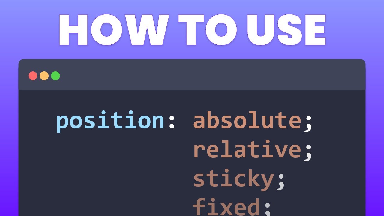
- 😀 Static positioning is the default setting for elements in web design, where items stack on top of or next to each other based on the box model.
- 😀 Relative positioning allows elements to move from their default position without affecting the rest of the page's flow, preserving their original space.
- 😀 Z-index controls the stacking order of elements along the z-axis, and a higher z-index value places elements in front of others.
- 😀 Absolute positioning removes elements from the document flow, allowing them to be positioned around specific parent elements or the body.
- 😀 Fixed positioning keeps an element fixed relative to the viewport, regardless of scrolling, and is useful for elements like banners or popups.
- 😀 Sticky positioning keeps an element fixed within its parent container once it reaches a specified position, allowing it to scroll with the page until it hits a defined boundary.
- 😀 Floats allow elements to move to the left or right, with text and other inline elements wrapping around them.
- 😀 Clears control the flow of elements around floats, allowing elements to start below or after floated elements.
- 😀 Absolute positioning looks up the element hierarchy to position itself relative to the nearest non-static parent element.
- 😀 Fixed elements, such as modals or popups, stay in place even as the page content scrolls, creating a persistent visual element that does not interfere with document flow.
Q & A
What is the default positioning method for elements on the web?
-The default positioning method for elements on the web is static positioning. It is used when no specific positioning is defined, and elements are positioned based on the normal document flow.
What is the main difference between static and relative positioning?
-Static positioning is the default, where elements are positioned according to the normal document flow. Relative positioning allows elements to be moved relative to their default position, but their space in the document flow remains preserved.
What does the z-index property do in CSS?
-The z-index property controls the stacking order of elements along the z-axis, allowing elements to be layered in front or behind others. It only works on elements that have a non-static position (relative, absolute, or fixed).
What is the effect of absolute positioning on elements?
-Absolute positioning removes elements from the document flow, meaning they no longer affect the layout of other elements. These elements are positioned relative to the nearest positioned ancestor (not static) or the body if no positioned ancestor exists.
How can absolute positioning be used practically in web design?
-Absolute positioning can be used to position elements such as popup modals. By positioning elements absolutely within a parent container that is set to relative positioning, you can ensure that the element stays in a specific place relative to the container.
What is the key difference between fixed and absolute positioning?
-Fixed positioning positions elements relative to the viewport, meaning they stay in a fixed location even when the page is scrolled. In contrast, absolute positioning is relative to the nearest positioned ancestor and does not move with the scroll.
What are some common use cases for fixed positioning?
-Fixed positioning is commonly used for elements such as banners, sticky headers, or popup modals that need to remain visible on the screen even as the user scrolls down the page.
What is sticky positioning, and how does it differ from fixed positioning?
-Sticky positioning allows an element to behave like a static element until it reaches a defined position (e.g., top of the viewport), after which it 'sticks' in place as the page scrolls. Unlike fixed positioning, sticky elements are constrained within their parent container and stop sticking when the parent element scrolls out of view.
How do floats work in web design?
-Floats allow elements like images to be placed on one side of the container, with other content (such as text) wrapping around it. They are commonly used to create layouts but have become less popular with the advent of flexbox and grid layouts.
How does the clear property interact with floats?
-The clear property is used to prevent elements from wrapping around floated elements. By setting 'clear: both', you ensure that the element will be placed below any preceding floated elements, clearing the space for normal document flow.
Outlines

This section is available to paid users only. Please upgrade to access this part.
Upgrade NowMindmap

This section is available to paid users only. Please upgrade to access this part.
Upgrade NowKeywords

This section is available to paid users only. Please upgrade to access this part.
Upgrade NowHighlights

This section is available to paid users only. Please upgrade to access this part.
Upgrade NowTranscripts

This section is available to paid users only. Please upgrade to access this part.
Upgrade NowBrowse More Related Video
Learn CSS Positions in 4 minutes

Learn CSS Positioning Quickly With A Real World Example
CSS Course | CSS Position Property | Complete Web Development Course Beginner to Advance Tutorial 21
#30 شرح بالتفصيل عن خاصية position
Layout Part 1A - Motivation, Divs & Spans Review

CSS Course | CSS Float & Clear | CSS Overflow | Complete Web Development Course Tutorial 22
5.0 / 5 (0 votes)