How To Read Candlestick Charts FAST (Beginner's Guide)
Summary
TLDRThis video tutorial offers a comprehensive guide to interpreting candlestick charts, a vital tool for traders. It explains the significance of green (bullish) and red (bearish) candles, the meaning of their bodies and wicks, and how their sizes indicate market momentum. The tutorial also covers the importance of understanding candlestick patterns for making informed trading decisions. Practical examples using Apple stock illustrate the concepts, and the video encourages viewers to engage by suggesting topics for future content.
Takeaways
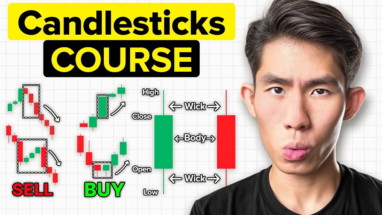
- 📈 Green candlesticks indicate a bullish market where prices have risen, while red candlesticks signal a bearish market where prices have fallen.
- 🔑 The body of the candlestick represents the opening and closing prices, with the wicks (shadows or tails) showing the highest and lowest prices within the period.
- 📊 A larger candlestick body signifies strong momentum, as the price moved a greater distance, whereas a smaller body indicates weak momentum.
- 🌀 A 'doji' is a small or non-existent candlestick body that suggests indecision in the market, with prices returning close to the opening level.
- ⏳ Candlestick patterns are crucial for understanding market sentiment and the actions of buyers and sellers, which can inform trading decisions.
- 📊 The time frame of the chart, such as daily, weekly, or hourly, determines the duration each candlestick represents.
- 📉 Red candles with a higher open and lower close indicate a bearish trend, while green candles with a lower open and higher close suggest a bullish trend.
- 📊 A series of red candles typically indicates a downtrend, whereas a series of green candles points to an uptrend.
- 🔄 A mix of red and green candles with sideways movement indicates market indecision and consolidation.
- 📈 Identifying trend changes involves looking for patterns like lower lows in an uptrend or higher highs in a downtrend, which can signal a reversal.
- 📉 Momentum gain can be spotted by increasing candlestick sizes or tight price movements without wide swings, indicating control by buyers or sellers.
- 📈 Momentum loss is indicated by wide price swings after tight movements or shrinking candlestick sizes, suggesting a potential price reversal.
Q & A
What is the significance of green and red candlesticks in candlestick charts?
-Green candlesticks are bullish, indicating that the price appreciated and went upwards for the time period. Red candlesticks are bearish, indicating that the price depreciated and went downwards for the time period.
What is the Candlestick body, and what does it represent?
-The Candlestick body, also known as the real body, is the rectangular area of the candlestick. It represents the price range between the opening and closing prices for the given time period.
What are the Wicks, Shadows, or Tails of a candlestick, and what do they indicate?
-The Wicks, Shadows, or Tails are the lines that stick out above and below the Candlestick body. They represent the highest and lowest price points of the time period, with the top wick indicating the highest price and the bottom wick indicating the lowest price.
How do you determine the opening and closing prices for green and red candlesticks?
-For green candlesticks, the opening price is at the bottom of the Candlestick body, and the closing price is at the top. For red candlesticks, the opening price is at the top, and the closing price is at the bottom.
What does the size of the Candlestick body indicate about market momentum?
-A larger Candlestick body represents momentum gain as the price traveled a greater distance during the time period. A smaller Candlestick body represents momentum loss as the price traveled a shorter distance.
What is a Doji in candlestick charts, and what does it signify?
-A Doji is a very small Candlestick body or one that is close to non-existent. It signifies indecision from buyers and sellers because the price swung up and down but closed near the same price it opened, indicating no clear direction.
Why are candlestick patterns important for traders?
-Candlestick patterns are important because they tell a story and reflect the actions of buyers and sellers. They provide insights into market sentiment and can help traders make informed trading decisions based on price action.
How can you identify the time frame of a candlestick chart?
-The time frame of a candlestick chart is indicated by the symbol next to the time period. For example, '1D' represents a daily time frame, '1W' represents a weekly time frame, and '1H' represents an hourly time frame.
How do you interpret the trend of a market based on the number of green and red candlesticks?
-More red candles than green indicates a downtrend or bearish price action, while more green candles than red indicates an uptrend or bullish price action. A mix of both colors with sideways movement shows indecision and consolidation.
What are the three types of trend changes from an uptrend to a downtrend as described in the script?
-Type 1 is a lower low forming after an uptrend. Type 2 is a lower low forming after a lower high pullback. Type 3 is a lower high forming before a trend change breakout and lower low.
How can you identify a sideways ranging market in candlestick charts?
-A sideways ranging market is identified by the price making the same highs and lows and moving in a sideways direction. In such markets, traders can take trades in both directions with confidence.
Outlines

This section is available to paid users only. Please upgrade to access this part.
Upgrade NowMindmap

This section is available to paid users only. Please upgrade to access this part.
Upgrade NowKeywords

This section is available to paid users only. Please upgrade to access this part.
Upgrade NowHighlights

This section is available to paid users only. Please upgrade to access this part.
Upgrade NowTranscripts

This section is available to paid users only. Please upgrade to access this part.
Upgrade NowBrowse More Related Video

Jenis-jenis Chart Saham untuk Trading | feat. Michael Yeoh
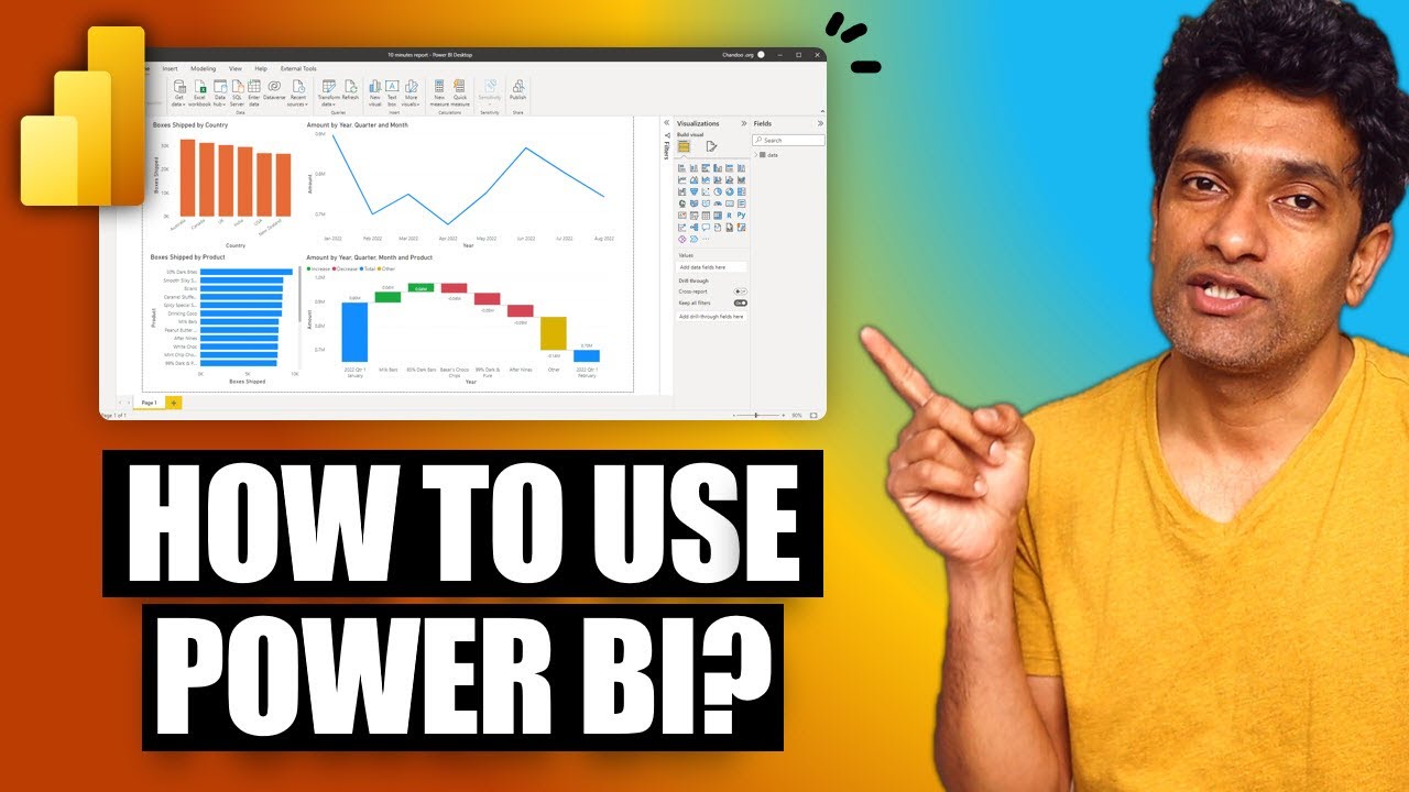
Your first 10 minutes of Power BI - A no-nonsense getting started tutorial for beginners

TEKNIKAL ANALISIS DARI NOL UNTUK PEMULA

TEKNIKAL ANALISIS DARI NOL SAMPAI MAHIR | TRADING MASTERCLASS
ULTIMATE Candlestick Patterns Trading Guide *EXPERT INSTANTLY*
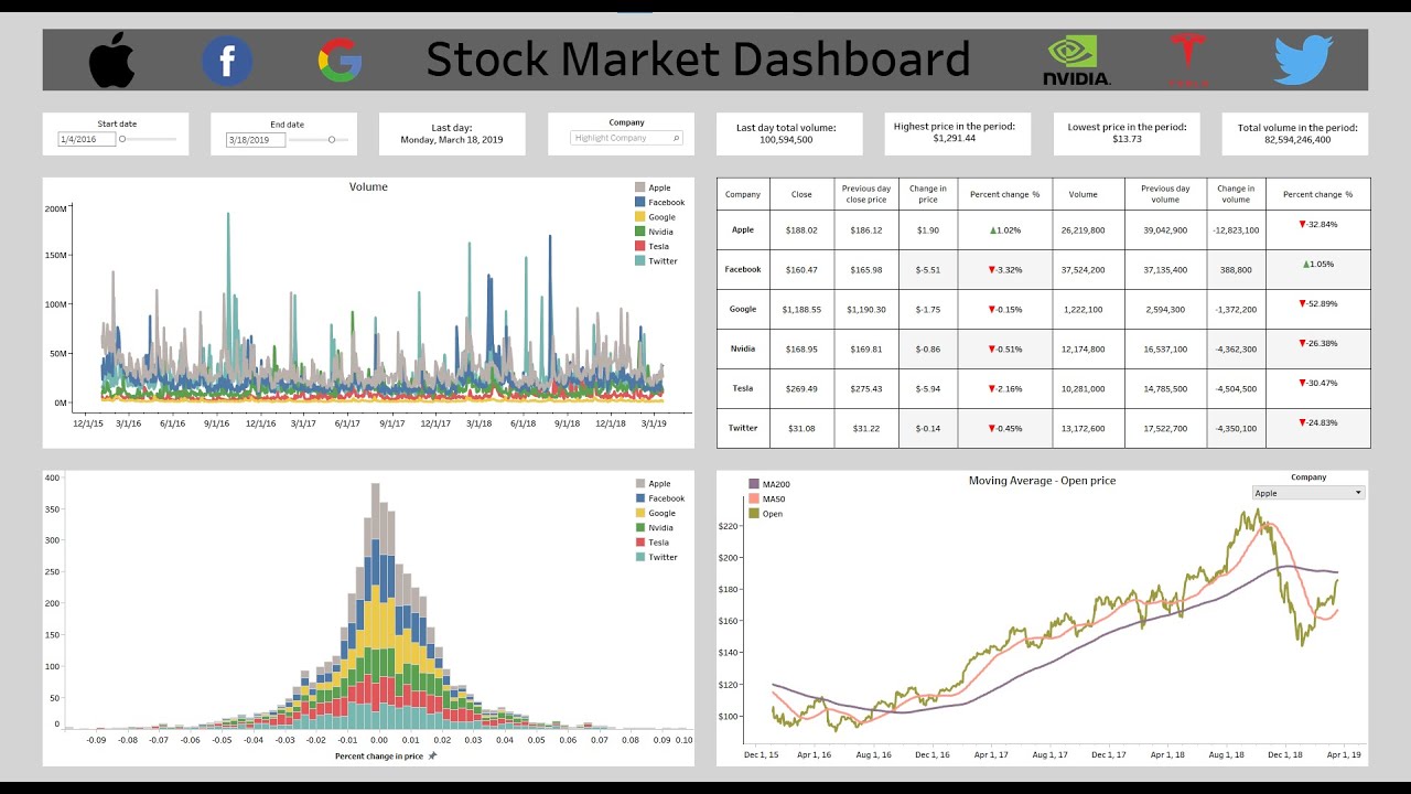
THE ULTIMATE TABLEAU PORTFOLIO PROJECT: From Pandas to an Amazing Interactive Stock Market Dashboard
5.0 / 5 (0 votes)