Visualizing CNNs
Summary
TLDRThis lecture delves into visualization methods for understanding convolutional neural networks (CNNs), focusing on the analysis of kernels, filters, and activations. It discusses how the first layers of various CNN models detect edges and textures, resembling Gabor filters, and how higher layers capture more abstract features. Techniques such as dimensionality reduction on feature vectors, neuron activation visualization, and occlusion experiments are explored to reveal the inner workings of CNNs, providing insights into their feature learning and decision-making processes.
Takeaways
- π The lecture discusses different visualization methods for understanding how Convolutional Neural Networks (CNNs) process images, focusing on the filters, activations, and representations within the network.
- π Visualizing the filters or kernels in the first convolutional layer of CNNs like AlexNet reveals that they tend to capture oriented edges, color-based edges, and higher-order variations, which are similar across various models like ResNet, DenseNet, and VGG.
- π Filters in the first layer of CNNs are often Gabor-like, detecting edges and textures in various orientations and colors, which is consistent across different models and datasets.
- π Higher layers of CNNs are more challenging to visualize due to the complexity and variety of features they learn, which may not be as interpretable as the first layer's edge detection.
- π Dimensionality reduction techniques like PCA and t-SNE can be applied to the output of the fully connected layer (e.g., FC7 in AlexNet) to visualize the representation space learned by the CNN, showing that different classes are well-separated.
- π The penultimate layer's feature vectors from CNNs like AlexNet can capture semantic information about images, with similar objects grouping together in the reduced dimensional space.
- π¨βπ« The script references the work of Zeiler and Fergus, which is foundational in visualizing and understanding what CNNs learn from image data.
- π¬ Occlusion experiments involve covering parts of an image to see how it affects the CNN's prediction, providing insights into which parts of the image the model relies on for classification.
- π€ The script suggests that each neuron in a CNN learns to fire for specific features or artifacts in the images, contributing to the model's overall understanding and classification capabilities.
- π The lecture recommends further reading and resources, including lecture notes from CS231n at Stanford and a deep visualization toolkit demo by Jason Yosinski, for a deeper understanding of CNN visualization techniques.
- π οΈ The methods covered in the lecture are 'don't disturb the model' approaches, meaning they utilize the trained model without altering it to gain insights into its learned representations and decision-making process.
Q & A
What is the primary focus of the lecture on visualization methods in CNNs?
-The lecture focuses on visualizing different kernels or filters in a CNN, activations in a particular layer, and other methods such as understanding what the CNN has learned through various visualization techniques.
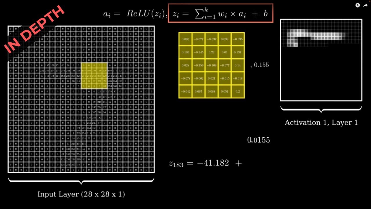
How many filters does the first convolutional layer of AlexNet have, and what is their size?
-The first convolutional layer of AlexNet has 96 filters, each with a size of 11x11.
What is a Gabor-like filter fatigue, and why is it called so?
-Gabor-like filter fatigue refers to the observation that the filters in the first convolutional layer of various CNN models across different datasets tend to have very similar structures, detecting edges and patterns in a similar manner, hence the term 'fatigue' implying it's the same across models.
What is the purpose of visualizing the filters of higher layers in CNNs?
-Visualizing filters of higher layers can help understand the features that the CNN has learned. However, it is generally not as interesting or interpretable as visualizing the first layer, especially in datasets with a wide variety of classes.
What is the role of the penultimate layer (e.g., fc7 in AlexNet) in CNNs?
-The penultimate layer, such as fc7 in AlexNet, provides a high-dimensional representation of the input image. This layer's output is used for classification, and visualizing these representations can help understand how different classes are separated in the feature space.
How can one visualize the high-dimensional space of feature vectors from a CNN's penultimate layer?
-Dimensionality reduction techniques such as Principal Component Analysis (PCA) or t-SNE can be used to project the high-dimensional feature vectors into a two-dimensional space for visualization.
What does the visualization of the first convolutional layer's filters across different models and datasets suggest about the initial learning of CNNs?
-The visualization suggests that the first layer of CNNs learns to detect low-level image features such as edges, color gradients, and textures, which is similar across different models and datasets.
What is the significance of visualizing which images maximally activate a particular neuron in a CNN?
-This visualization helps in understanding what specific features or artifacts in the images are being captured by individual neurons, providing insights into the learning process of the CNN.
What are occlusion experiments in the context of CNN visualization?
-Occlusion experiments involve covering parts of an image and observing the effect on the CNN's predictions. This method helps identify which parts of the image are most critical for the CNN's decision-making process.
How do occlusion experiments help in understanding the CNN's focus during image classification?
-By occluding different parts of an image and observing changes in the predicted probability, occlusion experiments reveal which pixels or regions the CNN relies on to make its classification, indicating its focus area.
What is the recommended approach for further understanding of the visualization methods discussed in the lecture?
-The lecture recommends reviewing the lecture notes of CS231n, exploring a deep visualization toolkit demo video by Jason Yosinski, and studying more about t-SNE as a dimensionality reduction technique through the provided links.
Outlines
π Visualizing CNN Kernels and Filters
This paragraph delves into the visualization methods of kernels or filters within Convolutional Neural Networks (CNNs), focusing on the initial layers where filters typically capture basic image features like edges and colors. The discussion references AlexNet, highlighting its first convolutional layer's filters and how they are visualized in a grid format. It's noted that these filters are not unique to AlexNet, as similar structures are found in other models like ResNet and DenseNet, which learn to detect edges, patterns, and color variations without being pre-programmed. The paragraph emphasizes the self-learning capability of CNNs in discerning low-level image features.
π Higher Layer Kernels and Representation Space Visualization
The second paragraph explores visualizing kernels in higher layers of CNNs, contrasting the general lack of interpretability in these layers with the more straightforward visualizations of the first layer. It mentions that higher layer filters can sometimes be understood in the context of specific applications but are less informative for broader datasets like ImageNet. The paragraph then introduces the concept of visualizing the representation space learned by CNNs, such as using PCA or t-SNE to reduce the dimensionality of feature vectors from layers like FC7 in AlexNet, allowing for the visualization and understanding of class separation in datasets like MNIST and ImageNet.
π Understanding CNN Representations Through Feature Maps
This section examines the visualization of feature maps in CNNs, particularly in AlexNet, to understand how the network captures higher-level semantics of objects in images. It describes the process of visualizing the CONV5 feature maps, which are 128 in number and each 13x13 pixels, to observe how certain filters respond to the presence of specific entities like people or dogs in the input image. The paragraph also touches on the idea of investigating individual neurons in intermediate layers to see which images maximally activate them, providing insights into the diverse features learned by the CNN.
π Neuron Activation and Receptive Field Analysis
The fourth paragraph discusses the method of understanding what specific neurons in a CNN respond to by monitoring their activation in response to various images. It explains how one can trace back the receptive fields of these neurons through the layers of the network to identify the regions in the original image that lead to their activation. The summary illustrates how different neurons may become specialized in detecting certain features like human busts, dog faces, or specular reflections, and relates this to the concept of dropout, ensuring a diverse learning across neurons.
π« Occlusion Experiments for Model Interpretability
This paragraph introduces occlusion experiments as a method for interpreting CNN models by understanding which parts of an image are critical for the model's predictions. It describes the process of covering different parts of an image with a gray patch and observing the effect on the predicted probability of the correct class. The summary explains how this method can reveal whether the model is focusing on the correct part of the image for its predictions, using examples where occluding parts of the image leads to a drop in the probability of the correct label, indicating the model's reliance on those areas.
π Recommended Readings and Visualization Tools
The final paragraph provides recommendations for further understanding CNN visualization techniques. It suggests reading the lecture notes from CS231n and exploring a deep visualization toolkit demo by Jason Yosinski. Additionally, it mentions resources for learning more about t-SNE as a dimensionality reduction technique and encourages exploring these tools and methods to gain a deeper understanding of CNNs and their learned representations.
Mindmap
Keywords
π‘CNN
π‘Filters or Kernels
π‘Activations
π‘Gabor Filters
π‘Feature Maps
π‘Dimensionality Reduction
π‘t-SNE
π‘Occlusion Experiments
π‘Receptive Field
π‘Semantics
π‘Dropout
Highlights
Introduction to visualization methods for kernels, filters, and activations in CNNs.
Lecture slides based on cs231n at Stanford and inspired by lectures of M. P. Kaa at IIT Madras.
Visualization of filters or kernels in CNNs, starting with the simplest form.
Filters in CNNs capture oriented edges and higher-order variations like checkerboard patterns.
Filters in the first convolutional layer of various models like AlexNet, ResNet, and DenseNet show similar structures.
Filters in higher layers are less interpretable due to the variety of classes and abstractions.
First convolutional layer filters across models and datasets exhibit Gabor-like filter characteristics.
Visualization of the representation space learned by CNNs using dimensionality reduction methods.
TSNE is a powerful dimensionality reduction technique for visualizing high-dimensional data.
Visualization of feature vectors from the penultimate layer shows class separation in 2D space.
Embeddings from the penultimate layer capture semantic nature of images, grouping similar objects together.
Visualization of Convolutional feature maps in AlexNet reveals higher-level semantics captured by later layers.
Understanding what specific neurons in CNNs respond to by monitoring their activation across images.
Occlusion experiments to determine which parts of an image are most relevant for CNN's predictions.
Heatmaps from occlusion experiments indicate the importance of specific image regions for classification.
Summary of 'Don't Disturb the Model' methods for understanding what a CNN has learned without altering the model.
Recommended readings and resources for further understanding of CNN visualization techniques.
Transcripts
[Music]
we will begin this lecture on
visualization methods
of different kernels or filters in a CNN
or perhaps even activations in a
particular layer of a CNN or even other
methods that we will see later in this
lecture most of this lecture slides are
based on lecture 13 of
cs231n at Stanford and some of the
content is borrowed from the excellent
lectures of mesh Kaa at I medras let's
start by the simplest form of
visualization which is visualizing the
filters or kernels themselves remember
that when you have a CNN in every
convolutional layer you have a certain
number of filters for example if you
recall in the Alex net the first
convolutional layer had 11 crossle
filters it actually had 96 of them 48
going to one GPU and 48 going through
the other GPU if you recall alexnet
architecture in this particular slide
that you see here we are looking at a
variant of alexnet which was developed
by Alex kvki a little later in
2014 when he came up with a method to
parallelize CNN this is just an example
to be able to visualize this more easily
so in this variant of
alexnet the architecture had 64 filters
in the first convolutional layer so what
you see on the left top here
is 64 filters each there are each 11
cross 11 in size and each of them have
three channels the r Channel G Channel
and B Channel the three colors so that's
what we have as the total number of
filters so if we visualized each of them
on a grid such as this remember that a
filter is an image in its own right just
like how convolution is commutative you
can always choose to look at an image as
a filter or a filter as an image it does
not matter uh any Matrix of the size of
the filter can also be plotted as an
image so when you do it that way you get
something like what you see on the top
right here so let's try to look at some
of them more carefully so if you
visualized some of these filters more
carefully you see that there are filters
that try to capture oriented edges so
you can see this one here on the bottom
Row the fourth from left which captures
it looks like a a gossan edge detector
which is smoothened out along a certain
orientation similarly you have another
Edge detector here another Edge detector
here on top you also have some which cap
capture slightly higher order variations
such as a checkerboard kind of a pattern
or a series of striations so on and so
forth you also have color-based Edge
detectors so in the last filter here on
the bottom right you see a an edge
detector that goes from green to pinkish
or red color so you see a similar uh
color based filters even on the top left
here so does is this a characteristic of
alexnet alone not really if you you took
even the filters of rest net 18 rest net
101 or dens net 121 in each of these the
filters in the first convolutional layer
have a very similar structure all of
them detect edges of different
orientations uh certain higher order
interactions such as checko patterns
striations and different orientations
color blobs certain
color uh gradation
as in edges in different colors so on
and so forth you will see this as part
of the assignment in this week where you
try out some of these
experiments so this tells us that the
first layer seems to be acting like
low-level image processing Edge
detection blob detection uh maybe a
checkerboard detection so on and so
forth remember here that these are
filters that are completely learned by a
neural network which we did not Prime in
any
way you can also visualize the kernels
of higher layers just like how we did it
for the first convolutional layer you
could also take all the filters of the
second convolutional layer the third
convolutional layer so on and so forth
but it happens that if you had to
generalize them across applications they
are not that interesting we did see an
earlier example last week where we took
face images and showed that filters in
the first layer correspond to low-level
uh image features then we talked about
middle layers extracting noses and eyes
and so on and then we talked about the
later layers extracting face level
information it does happen in certain
applications but in general if you had a
wider range of objects if you only
focused on faces or a smaller group of
objects maybe you could make sense of
the higher layers filters but in a more
General context text such as image net
which has thousand classes in the data
set these kinds of visualizations of
filters of higher layers are not that
interesting so here are uh some examples
here so you can see that the weights
remember in a CNN the weights are the
filters themselves so if you look at
weights in a later layer you see that it
may not be that interesting
for for understanding what a CNN is
actually learning that's because of the
variety of classes that may result in
various abstractions across the data
set so the input to the higher layers is
no more the images that we understand at
the input layer we know what we are
providing as input but when you go to
higher layers you really don't know what
you're providing as input so it becomes
a little bit more difficult to
understand what's
happening however if you take the
filters of the first layer alone across
various models and data sets Hope by now
you're familiar with the various CNN
models such as alexnet rest net dens net
vgg so on and so forth so if you had to
look at the filters of the first layer
first convolutional layer across all of
these models you get very similar kinds
of filters and it's generally called the
Gaborik filters fatigue why is that so
recall the gabar filters discussion that
we had earlier in the course where we
said a gabar filter is like a
combination of a gosan and a
sinusoid so and you can change the scale
and you can change the orientation of
the gabar filter and you end up
detecting edges in different
orientations uh you perhaps end up
detecting uh different striations
checkerboard patterns so on and so forth
which is exactly what we see as the CNN
learning on its own too so that's the
reason why we call this entire
visualization of the filters of the
first convolutional layer A Gabor like
filter fatig by fatigue here we just
mean it's exactly the same across all of
these models and data
sets another option other than
visualizing the filters in different
layers when we talk about visualizing
the filters remember it's 11 cross 11 or
a 7 cross 7 or whatever be the size of
the filter you simply have to plot it as
an
image another thing that you can do is
to visualize the representation space
learned by the
CNN what do we mean if you took the Alex
net remember that the output of fc7 or
the fully connected layer after the
seventh the in the seventh position of
the depth of the network which we denote
as fc7 is a 496 diens di menion Vector
right that's the layer immediately
before the
classifier so what we can do is take all
the images in your test set or
validation set for that matter and you
forward propagate those images until
this particular layer and collect all
these 496 dimensional
vectors what do we do with them you can
now visualize the space of these FC
feature vectors by reducing the
dimensionality from 496 to any dimension
of your choice but for Simplicity let's
say two
Dimensions how do we do this once again
hopefully you have done a basic machine
learning course and you know that you
can use any dimensionality reduction
method to be able to do this a simple
example could be principal component
analysis so you take all of those 49 to6
dimensional vectors of several input
images and you do a PCA on top of them
to bring all of them into a two-
dimensional space a more popular
approach which is considered to be a
very strong dimensionality reduction
method is also TSN which stands for T
stochastic neighborhood embedding this
was a method once again developed by
Hinton along with Vander Martin in 2008
uh we also have a link for this towards
the end of this lecture so you can play
around with TSN if you like to
understand it more so when you apply TSN
on the representations that you get as
output of the CNN in the penalty mate
layer you end up getting a result such
as this this is in specific for the
mnist data set where you have 10 classes
this is the handwritten digit data set
so you see here that each class
invariably go goes to its own cluster
this seems to tell us while we cannot in
reality visualize a 96 dimensional Space
by bringing it down to two Dimensions we
understand that the classes the
representations belonging to different
classes are fairly well separated into
different clusters and why is that
important now developing a
classification algorithm on these
representations becomes an easy task and
that's why having a classification layer
right after that penultimate layer of
representations makes the entire CNN
work well to
classify so here is an example of the
same for image net so where this is a
plot a two-dimensional plot of various
images in the image net data set taken
to 496 dimensional Space by alexnet and
then brought down to two- dimensional
space and plotted on a two dimensional
map the only thing we're doing here is
we are putting the respective image on
each location
just for understanding what's really
happening so this is just a huge map and
if you had to look at one particular
part of it let's try to zoom in into one
particular part of it you see that all
the images corresponding to say a
field seem to be coming together in this
space of representations for this matter
if you scroll around and see other parts
of it you will see that similar objects
you can see at many points of these uh
embeddings here that at many points you
see very similar objects being group
together you see all cars somewhere here
so on and so forth this tells us that
these embeddings or representations that
you get out of the penultimate layer
actually capture semantic nature of
these images and
similar objects of uh objects of similar
semantics are grouped together while
objects of different semantics are far
apart from each each other so this gives
us an understanding the CNN's
representations seem to be capturing the
semantics keep this in mind when we
talked about handcrafted features and
learn representations this is what we
were talking about in handcrafted
features such as sift or hog or LBP you
have to decide what may be useful for a
given app application and then hand
design that filter that you want to use
as a representation of the image after
which you may apply a machine learning
algorithm but now we are letting the
neural network the CNN in particular
automatically learn these
representations that it needs to solve a
particular
task here is a visualization of the con
five feature Maps uh in alexnet the con
five feature map is 128 cross 13 cross
13 so there are 128 feature Maps each
13x13 if you now visualize them as
grayscale images you can see something
interesting here so when this specific
image with two people is given as input
you see that one of the filters or
actually there are quite a few of them
in fact seem to be capturing the fact
that there are two entities in the image
so this could give you a hint that the
later layers in the CNN are able to
capture these higher level semantics of
the objects in the
images another way of visualizing and
understanding CNN is you could extend
the same thought and consider a trained
CNN uh remember that all of this
analysis is for a trained CNN after
training the CNN you want to understand
what it has learned remember that's the
context in which we're talking about
this so you can consider a CNN and
consider any single neuron in its
intermediate layers so let's consider
that particular one in green now you can
try to
visualize which images cause that
particular neuron to fire the most so
you can give different images as input
to the CNN and keep monitoring that
particular neuron and see which image is
making it fire the
most what can we do with that now we can
work backwards and understand that this
particular pixel here will have a
certain receptive field in the previous
convolutional layer right which means
that's the region that led to this pixel
being formed in this particular
convolutional layer similarly you can
take the pixels in the previous layer
and look at the receptive field of each
of them and find the receptive field in
the earlier layer in this case the first
convolutional layer you can go further
again and find out the receptive field
in the original image which was
responsible for this pixel in the third
convolutional layer remember we were
also discussing this when we talked
about back propagation through CNN where
we try to understand the receptive field
that leads to a particular pixel getting
affected in a particular layer it's the
same principle here now if we took
images and try to understand which of
them caused a particular neuron to fire
you end up seeing several
patterns so in this uh set of images
each row corresponds to one particular
neuron that was fired and the set of
images and the region inside the set of
images which is shown as a white
bounding box which caused that neuron to
fire so here is the first row
interestingly all of those images
correspond to people people especially
busts of people it looks like that
particular neuron was capturing people
until they bust until they chest the
second neuron here seems to be capturing
different dogs maybe some honeycomb kind
of a pattern uh maybe even a US flag
where it thought that honeycomb kind of
a pattern is is present a third neuron
captures a certain uh red blob across
all of the image
fourth neuron
captures uh digits in images and if you
look at the last neuron here the sixth
row you see that it seems to be
capturing specular reflection in all of
the images so over time as you train
these CNN each neuron is getting fired
for certain artifacts in the images and
this should uh probably go back and help
you connect to drop out where we try to
ensure that no particular neuron or
weight overfits to a training data and
we allow all neurons to learn a diverse
set of uh artifacts in images so that's
this should help you connect to Dropout
in that
sense here are further examples of the
same idea where you take different
neurons in uh CNN and try to see which
images or patches of images fired that
neuron the most once again you see a
fairly consistent Trend here that there
are some of them that seem to fire for I
think this is an eye of an animal there
is again some text in images there is
vertical Tex in images there is faces
there is dog faces again and so on and
so forth and the last method that we
will talk about in this lecture are what
are known as occlusion experiments
which attempt to leverage our objective
that we finally want to understand which
pixels in an image corresponded to the
object recognized by the
CNN why does this matter we'd like to
know if the CNN looked at the cat in the
image while giving the label as cat for
the image or did it look at a building
in the background or a grass on the
ground
remember a neural network learns
correlations between various pixels that
are present in your data set to be able
to give good classification performance
so if all of your cats in your data set
were found only on grass a neural
network could assume that the presence
of grass means a presence of a cat
obviously if you have a test set where a
cat is found in a different background
the neural NW work May now not be able
to predict that as a cat so to be able
to get that kind of a trust in the model
that the model was indeed looking at the
cat while calling it a cat the occlusion
experiments do this using a specific
methodology so given these images that
you see here we ude out different
patches in the image centered on each
pixel and you see the effect on the
predicted probability of the correct
class let's take an example so you can
see a gray patch here on the image so
you olude that part of the image fill it
with gray and send the whole image as
input to the CNN and you would get a
particular probability for the correct
label in this case which is Pomeranian
so that is plotted as a probability in
that particular location similarly you
would gray out a patch here send the
full image as input to a CNN get a
probability for a Pomeranian how do you
get the probability as the output of the
softmax activation function and that
probability value is plotted here in
this image so by doing this by moving
your gray patch across the image you
will have an entire heat map of
probabilities of whether a pixel or a
patch around a pixel reduces the
probability of a Pomeranian or does it
keep it the same way so in this
particular heat map red is the highest
value and blue is a lower value so you
notice here that when the patch is
actually placed on the dog's face the
probability of the image being a
Pomeranian drops to a low value so this
tells us that the image or the CNN model
was in fact looking at the dog's face to
call this a Pomeranian so in fact uh uh
this entire discussion came out of zyler
and fergus's work on visualizing and
understanding convolutional neural
networks it's a good read uh for you to
look at at the end of this lecture they
in fact observe that when you place a
gray patch on the dog's face the class
label predicted by the CNN is a tennis
ball which is perhaps the object that
takes precedence when you you cover the
dog's face similarly in the second image
you see that the true label is car wheel
and as you keep using this gray patch
all over the image you see that the
probability drops the lowest to the
lowest when the wheel is actually
covered and the third image more
challenging is where you have to humans
and a dog in between them which is an
aghan Hound which is the true label you
once again see that when the pixels
corresponding to the dog are uded by the
gray patch the probability drops for the
Afghan Hound drops low this is even
trickier because there are humans and
the the model could have been biased or
affected by the presence of those humans
that the model does well in this
particular case so occluding the face of
the dog causes a maximum drop in the
prediction probability to summarize the
meth methods that we covered in this
lecture given a CNN we're going to call
all of these methods as don't disturb
the model methods which means we're not
going to touch anything in the model we
are only going to use the model as it is
uh and be able to leverage various uh
various kinds of understanding from the
from the model so you can take the
convolutional layer and then visualize
your filters and kernels that's one of
the first methods that we spoke about
unfortunately this is only interpretable
at the first layer and may not be
interesting enough at higher layers and
we also talked about the gbar like
filter fatigue here you could also take
any other neuron for example in a pool
layer and visualize the patches that
maximally activate that neuron you can
get some understanding of what the CNN
is learning using this kind of an
approach the third thing that we talked
about is you can take the fully
connected layer the representations that
you get at the fully connected layer and
visualize the representation and then uh
do a dimensionality deduction method
such as TSN on these representations and
you get an entire set of embeddings for
image
net and lastly we spoke about occlusion
experiment where you take an input and
perturb the input and then see what
happens at the final classification
layer and that gives you a set of uh a
heat map that tells you which part of
the image the model was looking at while
making a
prediction recommended readings lecture
notes of
cs231n as well as a nice deep
visualization toolkit demo video on web
page by Jason yosinski I would advise
you to look at that you can also get to
know more about TSN and TSN
visualizations as a dimensionality
reduction technique on these links
provided
here here are some references
[Music]
Browse More Related Video
Simple explanation of convolutional neural network | Deep Learning Tutorial 23 (Tensorflow & Python)
Pooling and Padding in Convolutional Neural Networks and Deep Learning
Convolutional Neural Networks
Neural Networks Part 8: Image Classification with Convolutional Neural Networks (CNNs)
How Computer Vision Works
Taxonomy of Neural Network
5.0 / 5 (0 votes)