PowerPoints Do's and Don'ts
Summary
TLDRThis video offers essential tips for effective PowerPoint presentations, highlighting the importance of clear, concise slides with high-contrast colors and relevant visuals. It emphasizes the need for large fonts, numbered slides, and audience engagement through activities. Additionally, it provides a list of 'don'ts', including overuse of animations and avoiding cluttered slides, to prevent 'Death by PowerPoint' and ensure impactful communication.
Takeaways
- 📝 Use slides as a summary of key points and ideas, not as an essay.
- 🎨 Ensure high contrast colors for readability and include relevant visuals to engage visual learners.
- 🔍 Proofread presentations to avoid typos and maintain a professional appearance.
- 📐 Choose a font size of at least 30 to ensure visibility from the back of the room.
- 🔢 Number slides for easy reference and organization, which aids in presenter notes as well.
- 👀 Select simple, sans-serif fonts for ease of reading in projected presentations.
- 👥 Involve the audience through activities on slides, such as matching activities, to foster engagement.
- 🗺️ Utilize presentation plans or outlines to navigate disruptions and stay on track with your points.
- 🎨 Incorporate visual elements like SmartArt to transform bullet points into more engaging formats.
- 🚫 Avoid using all caps, acronyms, or overly complex terms that may confuse the audience.
- 👥 Maintain eye contact with the audience; avoid turning your back to read from the screen.
- 📝 Do not script every word of your speech into the slides, as it can bore the audience.
- 🖱️ Use the built-in pointer function instead of a laser pointer for highlighting on slides.
- 📑 Simplify messages and avoid clutter on slides; use more slides if necessary to keep content clear.
- 🎨 Stick to one or two fonts and avoid varying sizes excessively to maintain consistency and clarity.
- 🚫 Use bullet points sparingly to highlight key points and avoid overwhelming the audience.
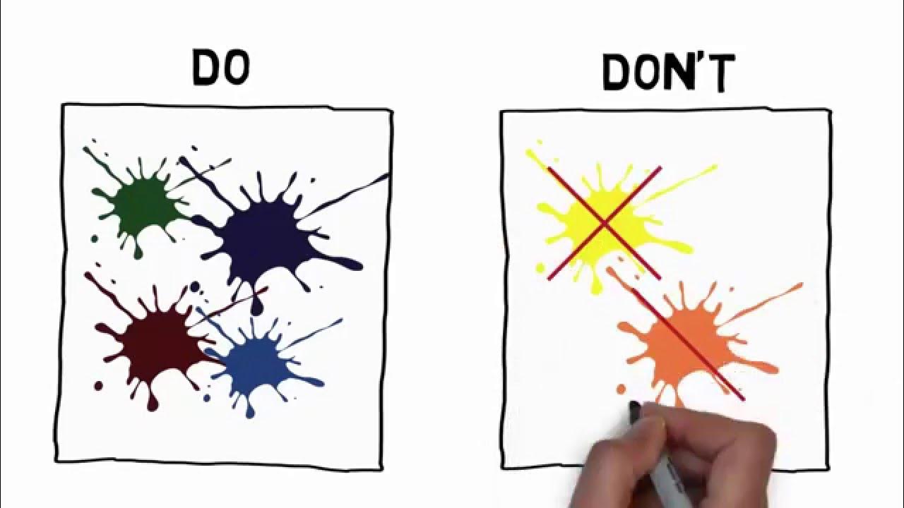
- 🌈 Avoid clashing colors and overly distracting backgrounds to keep the focus on content.
- 🔧 Anticipate technical issues by doing a tech check before the presentation to ensure smooth delivery.
- 🎉 Remember that flashy effects and animations should not overshadow solid content; use them sparingly.
Q & A
What is the main purpose of a PowerPoint slide according to the script?
-The main purpose of a PowerPoint slide is to serve as a summary of important points and key ideas. It should use keywords, main points, and phrases rather than full sentences or paragraphs.
Why is using colors with sharp contrast important in PowerPoint presentations?
-Using colors with sharp contrast is important because it makes the slides easy for the audience to read, ensuring that the information is clearly visible and accessible.
What role do relevant images and visuals play in a PowerPoint presentation?
-Relevant images and visuals play a crucial role in conveying meaning and content. They can appeal to visual learners and help in making the presentation more engaging and memorable.
Why is it essential to use spell check in PowerPoint presentations?
-Using spell check is essential to avoid typos, spelling, and grammar mistakes, which can make a presentation look unprofessional and distract the audience from the content.
What is the minimum font size recommended for projected presentations?
-The minimum font size recommended for projected presentations is 30 points, ensuring that the audience can read the content even from the back of the lecture hall.
Why should numbers be included on slides?
-Numbers should be included on slides to allow easy reference to a particular slide, which can also assist with presenter notes and help maintain the flow of the presentation.
What type of fonts are suggested for PowerPoint presentations, and why?
-Simple fonts, particularly sans-serif fonts, are suggested because they tend to be the easiest to read, enhancing the readability of the slides for the audience.
How can audience involvement be encouraged during a presentation?
-Audience involvement can be encouraged by using slides to provide activities, such as matching games, or by conducting polls, surveys, or quizzes using specialized hardware or web-based applications.
What is the benefit of having a presentation plan or outline for the presenter?
-A presentation plan or outline helps the presenter stay on track, manage disruptions or digressions, and serves as a reminder of all the points and examples they want to cover.
Why is it recommended to add visual elements like SmartArt to PowerPoint slides?
-Adding visual elements like SmartArt helps transform a boring bullet point and text format into one that shows how concepts are ordered or related, appealing to the visual learner in the audience.
What are some common mistakes to avoid when making a PowerPoint presentation, according to the script?
-Some common mistakes to avoid include using all capital letters, facing the screen while presenting, writing out every word of the presentation, using a laser pointer, overcrowding slides with information, using too many fonts, overusing bullet points, using clashing colors, and relying too much on animations and flashy effects.
Outlines

Этот раздел доступен только подписчикам платных тарифов. Пожалуйста, перейдите на платный тариф для доступа.
Перейти на платный тарифMindmap

Этот раздел доступен только подписчикам платных тарифов. Пожалуйста, перейдите на платный тариф для доступа.
Перейти на платный тарифKeywords

Этот раздел доступен только подписчикам платных тарифов. Пожалуйста, перейдите на платный тариф для доступа.
Перейти на платный тарифHighlights

Этот раздел доступен только подписчикам платных тарифов. Пожалуйста, перейдите на платный тариф для доступа.
Перейти на платный тарифTranscripts

Этот раздел доступен только подписчикам платных тарифов. Пожалуйста, перейдите на платный тариф для доступа.
Перейти на платный тарифПосмотреть больше похожих видео
5.0 / 5 (0 votes)


