PENYAJIAN DATA DALAM BENTUK DIAGRAM GARIS || PENGOLAHAN DATA
Summary
TLDRThis educational video introduces line graphs, explaining how they represent data using connected points on a straight line. The video showcases a specific example of a line graph depicting the number of beach visitors over a week. Viewers learn to interpret the graph by answering questions such as the number of visitors on specific days, the difference in visitors between Friday and Sunday, and the total number of visitors for the entire week. The video aims to teach viewers how to read and analyze data presented in line graphs in a simple, engaging manner.
Takeaways
- 😀 A line graph is a diagram that presents data through points connected by a straight line.
- 😀 Line graphs help visualize changes in data over time.
- 😀 Example of a line graph: The number of visitors to a beach over the course of a week.
- 😀 The points on a line graph represent specific data values at a certain time or date.
- 😀 To read a line graph, locate the data points and interpret the information they represent.
- 😀 On Wednesday, the number of visitors to the beach was 25.
- 😀 The difference in visitors between Friday and Sunday is 30 (35 on Sunday minus 5 on Friday).
- 😀 To calculate the total number of visitors, add up the visitors for each day of the week.
- 😀 The total number of visitors for the week is 140 (15 + 10 + 25 + 20 + 5 + 30 + 35).
- 😀 Understanding line graphs allows students to compare and analyze changes in data over a period.
- 😀 The lesson concludes with an invitation for students to revisit the content in future lessons.
Q & A
What is a line diagram?
-A line diagram is a type of graph that presents data using points which are connected by straight lines.
How are data points represented in a line diagram?
-In a line diagram, data is represented by points, and these points are connected with straight lines.
What is the main purpose of using a line diagram?
-The main purpose of a line diagram is to visually represent data trends over time or other continuous variables.
What data is presented in the line diagram example in the video?
-The data presented in the line diagram example is the number of visitors to Temporal Beach over the course of a week.
How many visitors were there on Wednesday?
-There were 25 visitors on Wednesday.
What is the difference in the number of visitors between Friday and Sunday?
-The difference in the number of visitors between Friday and Sunday is 30, with 35 visitors on Sunday and 5 visitors on Friday.
How is the difference in visitors calculated between Friday and Sunday?
-The difference is calculated by subtracting the number of visitors on Friday (5) from the number of visitors on Sunday (35), resulting in a difference of 30 visitors.
What is the total number of visitors over the week?
-The total number of visitors during the week is 140.
How are the total visitors for the week calculated?
-The total is calculated by adding the number of visitors for each day: 15 (Monday) + 10 (Tuesday) + 25 (Wednesday) + 20 (Thursday) + 5 (Friday) + 30 (Saturday) + 35 (Sunday), resulting in a total of 140 visitors.
Why is it important to use diagrams like the line diagram in the video?
-Using diagrams like the line diagram makes it easier to visualize data trends, identify patterns, and compare values over time, which helps in better understanding and analysis of the data.
Outlines

Этот раздел доступен только подписчикам платных тарифов. Пожалуйста, перейдите на платный тариф для доступа.
Перейти на платный тарифMindmap

Этот раздел доступен только подписчикам платных тарифов. Пожалуйста, перейдите на платный тариф для доступа.
Перейти на платный тарифKeywords

Этот раздел доступен только подписчикам платных тарифов. Пожалуйста, перейдите на платный тариф для доступа.
Перейти на платный тарифHighlights

Этот раздел доступен только подписчикам платных тарифов. Пожалуйста, перейдите на платный тариф для доступа.
Перейти на платный тарифTranscripts

Этот раздел доступен только подписчикам платных тарифов. Пожалуйста, перейдите на платный тариф для доступа.
Перейти на платный тарифПосмотреть больше похожих видео

Statistika menyajikan data dalam bentuk diagram garis | Matematika Dasar

Ternyata Begini Cara Mencari Gradien Persamaan Garis - Matematika SMP - Persamaan Garis Part 1

Grafik Garis Lurus Hal 207-219 Bab 5 Persamaan Garis Lurus Kelas 8 Kurikulum Merdeka Belajar
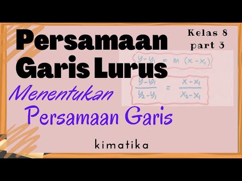
Persamaan Garis Lurus (3) | Menentukan Persamaan Garis
GCSE Revision Video 20 - Straight Line Graphs

BAHAS KONSEP PERSAMAAN GARIS LURUS DARI AWAL! (Episode 1)
5.0 / 5 (0 votes)
