Statistika menyajikan data dalam bentuk diagram garis | Matematika Dasar
Summary
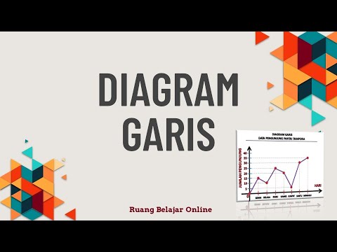
TLDRIn this educational video, the presenter introduces the concept of line graphs in basic statistics. The video explains how line graphs are used to represent data over time, showcasing examples like heart rate, sales data, and patient statistics. The focus is on guiding viewers through the process of creating a line graph using data from Ahmad’s corn harvest over five years. The steps include plotting data points for each year, connecting them with a line, and interpreting the results, emphasizing the importance of visualizing continuous data.
Takeaways
- 😀 Line graphs are used to present data that is continuous or periodic, such as heart rate, bicycle sales, or patient data.
- 😀 The script introduces the concept of line graphs and their usefulness in illustrating trends over time.
- 😀 A line graph uses a vertical axis (Y-axis) for the quantity being measured and a horizontal axis (X-axis) for time or categories.
- 😀 The first step in creating a line graph is to draw the vertical and horizontal axes.
- 😀 The Y-axis should be labeled with the data being measured, while the X-axis should represent time or specific categories.
- 😀 Plot points on the graph where the data values meet the corresponding time or category.
- 😀 In the example, Ahmad’s corn harvest data over five years is used to create a line graph.
- 😀 Ahmad’s corn harvest data includes the years 2014 to 2018, with harvests ranging from 10 to 30 tons.
- 😀 Each point representing harvest data is plotted on the graph and connected with a line to show the changes over time.
- 😀 The process concludes with connecting the plotted points to form a continuous line that visualizes the data trends.
- 😀 The key takeaway is understanding how to visualize data trends through a line graph, a fundamental concept in statistics.
Q & A
What is a line graph?
-A line graph is a type of diagram used to display data points connected by lines. It is typically used to represent data that changes over time or in a continuous manner, such as heart rate or sales figures.
Why are line graphs useful for representing certain data?
-Line graphs are particularly useful for displaying data that is periodic or continuous, such as yearly sales or temperature trends, as they show how the data changes over time and allow for easy identification of trends and patterns.
In the example given, what data is represented in the line graph?
-The data represents Ahmad's corn harvest results over five years, from 2014 to 2018, with the harvest amounts measured in tons.
How is the line graph constructed based on the given data?
-First, a vertical line (y-axis) is drawn to represent the harvest amounts in tons. A horizontal line (x-axis) is drawn to represent the years. Then, data points are placed on the graph based on the harvest for each year, and these points are connected by a line.
What are the harvest amounts for each year from 2014 to 2018?
-The harvest amounts are as follows: 10 tons in 2014, 15 tons in 2015, 25 tons in 2016, 20 tons in 2017, and 30 tons in 2018.
What is the significance of connecting the data points with a line?
-Connecting the data points with a line helps to visualize the trend or pattern in the data over time, making it easier to see increases or decreases in the values.
What does the vertical line (y-axis) represent in the graph?
-The vertical line (y-axis) represents the harvest amounts in tons. It shows the scale of the data, indicating the number of tons harvested in each year.
What does the horizontal line (x-axis) represent in the graph?
-The horizontal line (x-axis) represents the years from 2014 to 2018. It shows the timeline over which the corn harvest data is tracked.
Why might someone use a line graph instead of another type of graph?
-A line graph is ideal for showing trends over time or continuous data. It is especially useful when comparing changes in data over a specific period, making it easier to identify patterns such as growth, decline, or fluctuation.
How would you describe the overall trend of Ahmad's corn harvest data from 2014 to 2018?
-The trend in Ahmad's corn harvest data shows an overall increase in harvest amounts from 2014 to 2018. Starting at 10 tons in 2014, the harvest grows each year, reaching 30 tons in 2018, despite a small decrease in 2017.
Outlines

This section is available to paid users only. Please upgrade to access this part.
Upgrade NowMindmap

This section is available to paid users only. Please upgrade to access this part.
Upgrade NowKeywords

This section is available to paid users only. Please upgrade to access this part.
Upgrade NowHighlights

This section is available to paid users only. Please upgrade to access this part.
Upgrade NowTranscripts

This section is available to paid users only. Please upgrade to access this part.
Upgrade NowBrowse More Related Video

Statistika 1 - Penyajian Data Tunggal Matematika SMA / MA / SMK

Statistika part #1~ PJJ Matematika Kelas XII #diagrambatang #diagramlingkaran #diagramgaris

Kurikulum Merdeka Materi Matematika Kelas 7 Bab 6 Data dan Diagram

Ternyata Begini Cara Mencari Gradien Persamaan Garis - Matematika SMP - Persamaan Garis Part 1

Kelas 5 Matematika Analisis Data

PENYAJIAN DATA DALAM BENTUK DIAGRAM GARIS || PENGOLAHAN DATA
5.0 / 5 (0 votes)