07 | How to use colors in Graphic Design? | Color Theory 101 for Beginner Graphic Designers
Summary
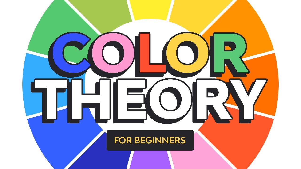
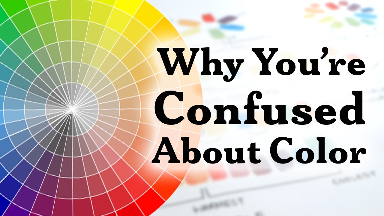
TLDRThis video explores the foundational concepts of color theory in graphic design, emphasizing the importance of understanding color relationships and palettes. It discusses primary, secondary, and tertiary colors, introducing the color wheel and its applications in creating effective designs. The presenter highlights the psychological effects of colors and their impact on audience perception, detailing warm, cool, and neutral color groups. By outlining various color combinations—monochromatic, analogous, and complementary—the video aims to equip designers with the knowledge to utilize colors strategically for enhanced visual communication.
Takeaways
- 🎨 Understanding color theory is essential for effective graphic design, as colors are integral to attracting viewers.
- 🖌️ The color wheel is a fundamental tool in design, helping to identify relationships between colors and their combinations.
- 🌈 Primary colors (red, blue, yellow) are the building blocks of all other colors and cannot be created by mixing other colors.
- 🔄 Secondary colors (orange, green, purple) are formed by mixing two primary colors, providing more options for design.
- 💡 Tints and shades can be created by adding white or black to a color, allowing for a broader palette of hues.
- 🧠 Research indicates that females tend to recognize and differentiate colors better than males, which may stem from evolutionary roles.
- ✨ Simplicity in design is key; using fewer elements with effective negative space can enhance visual impact.
- 🌡️ Colors can evoke different emotions: warm colors create energy and closeness, while cool colors provide relaxation.
- 🔍 Different color combinations, such as monochromatic and complementary schemes, influence the overall effectiveness of a design.
- 📈 The right color choices can significantly affect viewer perception and engagement, making color selection a crucial part of the design process.
Q & A
What is the significance of color in graphic design?
-Color is an integral part of design that attracts attention and conveys emotions. It helps establish the mood and effectiveness of the design.
What are primary colors and why are they important?
-Primary colors (red, blue, yellow) are fundamental because they cannot be created by mixing other colors. They serve as the basis for creating all other colors.
How are secondary colors formed?
-Secondary colors (green, orange, purple) are formed by mixing two primary colors together.
What is a monochromatic color scheme?
-A monochromatic color scheme uses variations of a single color, creating a harmonious and cohesive look without overwhelming the viewer.
What are complementary colors?
-Complementary colors are pairs of colors that are opposite each other on the color wheel, creating a strong contrast and vibrant visual appeal when used together.
How does color influence human emotions?
-Colors can evoke specific feelings; warm colors (like red and orange) tend to create excitement or warmth, while cool colors (like blue and green) can evoke calmness and relaxation.
What is the role of color temperature in design?
-Color temperature refers to the warmth or coolness of a color, which can significantly affect the mood and perception of a design.
How do neutral colors function in design?
-Neutral colors (like white, gray, and beige) help to balance and support other colors in a design, allowing for a more sophisticated and subdued look.
What are some common mistakes in using color in design?
-Common mistakes include overloading designs with too many colors, failing to consider color harmony, and not understanding the emotional impact of color choices.
Why is understanding color theory crucial for designers?
-Understanding color theory helps designers create visually appealing and effective designs that communicate the intended message and resonate with the audience.
Outlines

Этот раздел доступен только подписчикам платных тарифов. Пожалуйста, перейдите на платный тариф для доступа.
Перейти на платный тарифMindmap

Этот раздел доступен только подписчикам платных тарифов. Пожалуйста, перейдите на платный тариф для доступа.
Перейти на платный тарифKeywords

Этот раздел доступен только подписчикам платных тарифов. Пожалуйста, перейдите на платный тариф для доступа.
Перейти на платный тарифHighlights

Этот раздел доступен только подписчикам платных тарифов. Пожалуйста, перейдите на платный тариф для доступа.
Перейти на платный тарифTranscripts

Этот раздел доступен только подписчикам платных тарифов. Пожалуйста, перейдите на платный тариф для доступа.
Перейти на платный тариф5.0 / 5 (0 votes)


