Colour Theory Explained ✅ Colour Wheel Done Right
Summary
TLDRThis video introduces color theory in a simple and practical way, covering the basics of primary, secondary, and tertiary colors. It explains color harmonies, such as analogous and complementary colors, and their use in creating pleasing or contrasting palettes. The video also explores the concepts of warm and cool colors, color temperature, and the impact of surrounding colors on the perception of a hue. It emphasizes the importance of color mixing, desaturation, and creating cohesive palettes using limited colors to avoid visual chaos. The content is designed to help artists improve their color choices through understanding and practice.
Takeaways
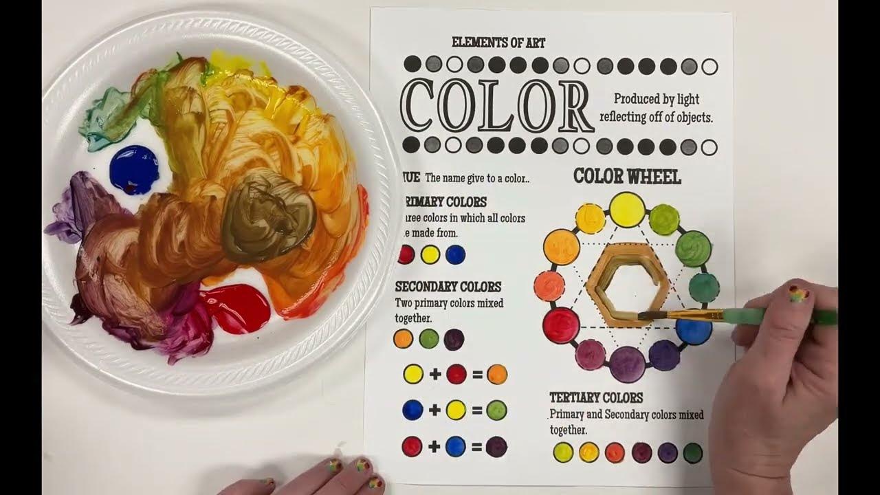
- 😀 Red, yellow, and blue are the primary colors, and these cannot be created by mixing other colors.
- 😀 Secondary colors—orange, purple, and green—are formed by mixing two primary colors together.
- 😀 Tertiary colors are created by mixing a primary and a secondary color, such as teal or cadmium orange.
- 😀 Harmonious (analogous) colors are groups of three colors next to each other on the color wheel and tend to work well together.
- 😀 Complimentary colors are opposites on the color wheel and create contrast; they can also help create a 3D effect in designs.
- 😀 Warm and cool colors are relative, meaning their perception changes depending on their surroundings.
- 😀 A color’s temperature (warm or cool) depends on the context and can be influenced by nearby colors, not just the color itself.
- 😀 Desaturating a color involves mixing in its complementary color, or adding black/white to alter its intensity and balance the palette.
- 😀 Adding white to a color creates a tint, while adding black creates a shade; these changes help create cohesive and harmonious color palettes.
- 😀 Overusing pure colors or mixing too many pigments can make a palette feel disjointed; limiting your color choices results in more harmonious compositions.
Q & A
What are primary colors, and why can't they be mixed from other colors?
-Primary colors—red, yellow, and blue—are the fundamental building blocks of color. They can't be mixed from other colors because they are pure hues, meaning they are not derived from combining any other colors.
What are secondary colors, and how are they created?
-Secondary colors—orange, purple, and green—are formed by mixing two primary colors. For example, mixing red and blue makes purple, blue and yellow make green, and yellow and red make orange.
What are tertiary colors, and how do they differ from secondary colors?
-Tertiary colors are created by mixing a primary color with a secondary color. These colors, like teal or cadmium orange, add more variety and nuance to a color palette. They sit between primary and secondary colors on the color wheel.
What is the difference between analogous and complementary colors?
-Analogous colors are adjacent to each other on the color wheel and tend to look harmonious when used together. Complementary colors, on the other hand, are opposite each other on the color wheel and create high contrast when paired together.
How does the concept of warm and cool colors work?
-Warm colors, such as red and orange, are associated with heat, while cool colors, like blue and green, are linked to cooler temperatures. However, the 'warmth' or 'coolness' of a color can change depending on the surrounding colors, meaning it’s relative to context.
Can a color change from warm to cool, and how?
-Yes, a color can appear to change from warm to cool depending on the colors around it. For example, purple can be made cooler by surrounding it with colors that are closer to blue, and warmer by placing it next to more red or orange hues.
What is the importance of color temperature in color theory?
-Color temperature is relative. It helps determine whether a color appears warm or cool in a specific context. The key is to measure the color against other nearby colors, which can shift its perceived temperature.
What are chromatic grays, and how are they created?
-Chromatic grays are muted or dull colors that are created by mixing complementary colors. These can help balance or harmonize a color palette by reducing the intensity of overly saturated hues.
Why should we avoid using too many pure pigments in a color palette?
-Using too many pure pigments can create a busy, disconnected look. It's better to limit your colors or mix them to create harmony. Using variations of primary colors or adding tints and shades helps make the palette cohesive.
How can mixing white or black into a color desaturate it?
-Adding white to a color creates a tint, lightening it and reducing its saturation. Adding black creates a shade, darkening the color and also reducing its intensity. These methods can help create softer, more harmonious palettes.
Outlines

This section is available to paid users only. Please upgrade to access this part.
Upgrade NowMindmap

This section is available to paid users only. Please upgrade to access this part.
Upgrade NowKeywords

This section is available to paid users only. Please upgrade to access this part.
Upgrade NowHighlights

This section is available to paid users only. Please upgrade to access this part.
Upgrade NowTranscripts

This section is available to paid users only. Please upgrade to access this part.
Upgrade NowBrowse More Related Video
5.0 / 5 (0 votes)


