EDA - Part 02 - Final Chapter
Summary
TLDRThis video discusses data exploration and visualization techniques using Python libraries like Seaborn and Matplotlib. It covers creating various plots, such as violin plots and heat maps, to analyze categorical data like bedroom count and sales prices. The presenter explains how to iterate through columns of a DataFrame, create subplots, and visualize correlations between variables using heat maps. The focus is on exploring relationships between features and sales prices, improving plot aesthetics, and refining insights for regression analysis and presentation.
Takeaways
- 📊 The video discusses plotting categorical data using Seaborn and Matplotlib, focusing on distribution visualization.
- 🎻 Violin plots are introduced as a tool to visualize data distributions, combining box plots and histograms.
- 🏡 Examples of plotting data include bedrooms and sale prices, where violin plots show the distribution of sales based on different categories like the number of bedrooms.
- 🔄 The video explains how to create subplots in Matplotlib to visualize multiple variables in a grid layout, such as 2x2 grids.
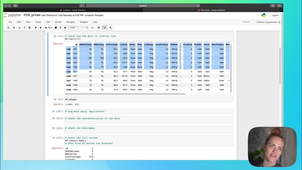
- 🧮 Iterating through categorical columns in a dataset is demonstrated, showing how to check and plot distributions for variables like 'Ms Zoning' and 'Street.'
- 📐 Subplots can be adjusted using `plt.subplot`, `plt.figure`, and adjusting figure sizes to display graphs more clearly and improve the layout.
- 🔥 Heat maps are introduced as a tool to explore correlations between different variables in a dataset.
- 📈 The script highlights how to select specific columns for correlation analysis and visualize the results with a heat map, showing relationships like overall quality vs. sale price.
- 🔧 Tips are provided on customizing plots in Seaborn, such as adding titles, adjusting figure sizes, and saving plots as images.
- 📝 The overall theme encourages exploratory data analysis, asking questions, and using visual tools like regression and correlation heat maps to understand data trends.
Q & A
What is the purpose of using a violin plot in data visualization?
-A violin plot is used to visualize the distribution of data across different categories. It combines a box plot and a density plot, showing the distribution, central tendency, and variability of the data.
How can we create subplots in Matplotlib?
-Subplots in Matplotlib can be created using the `plt.subplots()` function. You can specify the number of rows and columns for the grid of subplots, and then place individual plots in the specified positions within the grid.
What is the role of categorical data in the script?
-Categorical data, such as the number of bedrooms or types of zoning, is used to segment and analyze different features in the dataset. The script discusses how to visualize and explore these categorical variables using plots like the violin plot.
How can you customize the size of a plot in Matplotlib?
-You can customize the size of a plot in Matplotlib by using the `plt.figure(figsize=(width, height))` function, where `width` and `height` are numerical values that define the plot's size.
What is a heatmap and how is it used in the script?
-A heatmap is a graphical representation of data where individual values are represented by colors. In the script, a heatmap is used to visualize the correlation matrix of different variables, making it easier to identify relationships between them.
How does the script suggest handling large datasets with many columns for correlation analysis?
-The script suggests selecting a subset of columns to focus on for correlation analysis, as plotting all columns at once may be overwhelming and difficult to interpret. This allows for a clearer and more focused analysis.
What is the purpose of the `enumerate()` function in the script?
-The `enumerate()` function is used to iterate over a list while keeping track of both the index and the value. In the script, it is used to iterate through subplots and assign each one to its correct position.
What is the benefit of using Seaborn over Matplotlib for plotting?
-Seaborn is built on top of Matplotlib and is designed to work better with data frames, making it easier to create complex visualizations with less code. It also provides more aesthetically pleasing and informative default plots.
What are some examples of categorical columns mentioned in the script?
-Some examples of categorical columns mentioned in the script include 'MsZoning' and 'Street.' These columns contain categorical values that can be analyzed using plots to understand their impact on other variables.
How can you improve the readability of a Jupyter Notebook for data exploration?
-To improve the readability of a Jupyter Notebook, you can add descriptive text, titles to plots, explanations of each step, and structure the notebook to guide the reader through the analysis. This can include inserting markdown cells and explanations alongside the code.
Outlines

Этот раздел доступен только подписчикам платных тарифов. Пожалуйста, перейдите на платный тариф для доступа.
Перейти на платный тарифMindmap

Этот раздел доступен только подписчикам платных тарифов. Пожалуйста, перейдите на платный тариф для доступа.
Перейти на платный тарифKeywords

Этот раздел доступен только подписчикам платных тарифов. Пожалуйста, перейдите на платный тариф для доступа.
Перейти на платный тарифHighlights

Этот раздел доступен только подписчикам платных тарифов. Пожалуйста, перейдите на платный тариф для доступа.
Перейти на платный тарифTranscripts

Этот раздел доступен только подписчикам платных тарифов. Пожалуйста, перейдите на платный тариф для доступа.
Перейти на платный тариф

5.0 / 5 (0 votes)
