Boxplots in Statistics | Statistics Tutorial | MarinStatsLectures
Summary
TLDRThis video explains the concept of a boxplot, a statistical tool used to visualize data distribution through Tukey's five-number summary: minimum, first quartile, median, third quartile, and maximum. The speaker uses an example of 50 individuals' heights, discussing how the boxplot highlights the data's median, interquartile range (IQR), and outliers. Additionally, the video covers the calculation of 'fences' to define outliers and mentions related visualization tools like variable-width box plots and violin plots. The video emphasizes the importance of understanding these elements rather than manual calculation.
Takeaways
- 📊 A boxplot visually displays the distribution of a dataset and is useful for summarizing the data's spread.
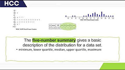
- 🧮 The boxplot shows Tukey’s five-number summary: minimum, first quartile (Q1), median, third quartile (Q3), and maximum.
- 📏 The median, marked inside the box, represents the middle value, splitting the dataset into two equal halves.
- 📉 Q1 represents the 25th percentile, meaning 25% of the data falls below this value.
- 📈 Q3 represents the 75th percentile, meaning 75% of the data falls below this value.
- 📐 The interquartile range (IQR) is the range between Q3 and Q1, showing the spread of the middle 50% of the data.
- 🚫 The whiskers extend to the minimum and maximum values, excluding outliers, which are represented as individual points.
- 🔍 Outliers are defined as values outside the upper and lower 'fences,' calculated as 1.5 times the IQR beyond Q3 and Q1.
- 🎻 Violin plots and notched boxplots are alternative visualizations, combining density estimates or adding notches around the median.
- 📉 Boxplots help identify the shape of the distribution, whether it is symmetric or skewed, based on the data layout.
Q & A
What does a boxplot show?
-A boxplot shows the distribution of a dataset, visually displaying key summary statistics like the minimum, first quartile, median, third quartile, and maximum values. It helps in understanding the spread and skewness of the data.
What is Tukey’s five-number summary?
-Tukey’s five-number summary consists of the minimum, first quartile (Q1), median, third quartile (Q3), and maximum. These are used to describe the spread and center of the dataset.
What does the median represent in a boxplot?
-The median represents the middle value of the dataset, where 50% of the data is below it and 50% is above. In the given example, the median height is approximately 66 inches.
What does the first quartile (Q1) represent?
-The first quartile (Q1) represents the value below which 25% of the data lies. In the example, Q1 is around 63 inches, meaning 25% of the individuals have a height of 63 inches or less.
What is the third quartile (Q3) and what does it indicate?
-The third quartile (Q3) is the value below which 75% of the data lies. In the example, Q3 is approximately 70 inches, indicating that 75% of individuals are 70 inches or shorter.
What is the interquartile range (IQR) in a boxplot?
-The interquartile range (IQR) is the difference between the third quartile (Q3) and the first quartile (Q1), representing the range of the middle 50% of the data. In this example, the IQR is 7 inches (70 - 63).
How are outliers represented in a boxplot?
-Outliers are represented as individual points outside the 'fences,' which are calculated using 1.5 times the IQR added to Q3 for the upper fence and subtracted from Q1 for the lower fence.
How is the upper fence calculated in a boxplot?
-The upper fence is calculated by adding 1.5 times the IQR to the third quartile (Q3). For example, with Q3 at 70 inches and the IQR at 7 inches, the upper fence is at 80.5 inches (70 + 1.5 * 7).
What is the lower fence and how is it calculated?
-The lower fence is calculated by subtracting 1.5 times the IQR from the first quartile (Q1). In the example, with Q1 at 63 inches and the IQR at 7 inches, the lower fence is at 52.5 inches (63 - 1.5 * 7).
What are variable width boxplots and how are they used?
-Variable width boxplots are used to compare multiple distributions, like the heights of males versus females. The width of each boxplot is proportional to the sample size, offering a comparison not only of the distribution but also of the sample size.
Outlines
📊 Understanding Boxplots and Their Components
In this paragraph, the speaker introduces the concept of a boxplot, explaining its usefulness in visualizing the distribution of a variable, in this case, height. The boxplot represents what is known as Tukey's five-number summary: the minimum, first quartile (Q1), median, third quartile (Q3), and maximum. These values help to show the central tendency and spread of data. The paragraph details how the median divides the data in half and explains the meaning of Q1 (25th percentile) and Q3 (75th percentile), emphasizing the significance of these points in understanding the distribution of the sample.
📏 Calculating Outliers Using Fences
This section focuses on calculating outliers using the concept of 'fences' in a boxplot. The upper fence is determined by adding 1.5 times the interquartile range (IQR) to Q3, while the lower fence is calculated by subtracting 1.5 times the IQR from Q1. Any value beyond these fences is considered an outlier, and the boxplot visually separates outliers from the rest of the data. The paragraph walks through an example of calculating the fences based on the IQR and points out that outliers are marked individually on the plot. It also notes that software typically performs these calculations.
Mindmap
Keywords
💡Boxplot
💡Median
💡First Quartile (Q1)
💡Third Quartile (Q3)
💡Interquartile Range (IQR)
💡Outlier
💡Upper and Lower Fences
💡Minimum and Maximum (Excluding Outliers)
💡Skewness
💡Violin Plot
Highlights
Introduction to box plots and their usefulness in visualizing data distributions.
The box plot represents a sample of 50 individuals and records their heights.
The box plot shows the distribution for the variable height, which is visually represented.
Box plots are based on Tukey's five-number summary: minimum, first quartile, median, third quartile, and maximum.
The median, shown by the tick inside the box, represents the middle value of the dataset.
The first quartile (Q1) represents the height below which 25% of the sample falls.
The third quartile (Q3) represents the height below which 75% of the sample falls.
The interquartile range (IQR) is the range of the middle 50% of the data, calculated as Q3 minus Q1.
The 'whiskers' in the box plot extend to the minimum and maximum values, excluding outliers.
Outliers are calculated based on the upper and lower fences using 1.5 times the IQR.
Software typically handles the calculation of fences and outliers automatically.
Upper fence = Q3 + 1.5 * IQR; lower fence = Q1 - 1.5 * IQR.
Example: For Q3=70 and Q1=63, the IQR is 7, making the upper fence 80.5 and lower fence 52.5.
Box plots also help in visualizing data symmetry and skewness, showing whether the data is balanced or skewed.
Related visualizations include variable-width box plots, notched box plots, and violin plots, which add more details.
Transcripts
so let's talk a little bit about what a
boxplot is exactly what it's showing and
what it's useful for we're gonna use
this example here of having collected a
sample of 50 individuals and recording
their heights and over here I've already
drawn in a box plot so let's discuss
exactly what info is being shown in this
plot or this picture here as noted in a
number of these videos this here shows
the distribution for the variable height
and again we'll talk about exactly what
we mean by that as we go through and
discuss this plot it's also worth
mentioning that this plot is a visual
display of what gets called two keys
five number summary the minimum the
first quartile median third quartile and
maximum so we'll show those where they
are on the plot as well as in separate
videos talk about what is the first
quartile and so on so the first thing to
note is that the tick in the box here is
showing us the median and in this
example the median looks like it's about
66 inches so the median which we
formally defined in a separate video is
the point that cuts the data set in half
50% below 50% above so 50% of the
individuals in our sample have a height
of 66 inches or less 50% 66 inches or
more the bottom of the box here shows
what gets called the first quartile and
abbreviated q1 q1 or the first quartile
and again this is 25% or 1/4 below it
and in our example here it looks like
it's at about 63 inches so again 1/4 or
25% of individuals in our sample have a
height of 63 inches or less right and
3/4 are greater than that the top of the
box here shows what gets called the
third quartile or abbreviated q3 so
let's write that here this is the third
quartile and it looks like it's about 70
inches right so again in our sample
75% or three-quarters have a height of
70 inches or less let's write that here
for completeness sake 75% or
three-quarters are below this value and
so the size of the box here gets
abbreviated the IQR or what's called the
interquartile range can we talk a bit
more about this in more detail in a
separate video but it's the third
quartile minus the first quartile or the
range of the middle 50% of data right so
what's the range of the 50% sitting in
the middle cutting off the bottom
quarter and the top quarter now these
lines here extend right in the line and
where the tick is here is what's known
as the minimum value excluding outliers
and the top up here that is the maximum
value excluding outliers and any
outliers get drawn in individually and
in a moment we'll get to talking about
how do we decide what's defined as an
outlier versus what's the maximum value
that's not an outlier so this plot here
helps us visualize the distribution for
the variable height so I'm going to draw
another version of it over here slightly
different exaggerated version and I'm
going to tip it on its side just so we
can see exactly what I'm trying to say
so suppose we had the box plot looking
like this again here's the height and
the lower end about 50 and the upper end
say 100 so again I've taken this box
plot and just tipped it on its side here
and we're looking at this we can see
that it drags out to the right side or
the positive side okay so the
distribution is a little bit skewed out
to the right here okay so again it helps
us visualize is the distribution of
heights roughly symmetric as shown here
or is it a little bit more skewed as
I've shown in this exaggerated example
here so that's what I mean by helping us
visualize the shape of the distribution
so in order to decide what's an outlier
verse
the maximum or minimum values that's not
an outlier what we can do is calculate
what we call an upper fence as well as a
lower fence anything within the fence is
not considered an outlier anything
beyond the fence is an outlier now all
this stuff will be done using software
we won't generally do it by hand but
we're gonna do the calculations here
once by hand so we can get a better
understanding of how is the plot
produced to define the upper fence we'll
look at that first the way that's
calculated as we go from q3 or the third
quartile and we add on one and a half
times the interquartile range so in our
example we saw the third quartile at 70
and if we add one and a half iqrs if the
interquartile range is 70 minus the 63
or seven right the range between q3 and
q1 or these quartiles is seven so we
take 70 Plus one-and-a-half times seven
that gives us 80 point five okay so
going here from 80 point five this is
where the upper fence gets drawn in it's
supposed to add value sitting here here
and here this is the largest value
that's within the fence
okay now note liar so the tick gets
drawn in there that's the maximum value
excluding outliers and then any outliers
get drawn in this individual points
creating the lower fence again is pretty
similar in order to do that we go from
q1 minus 1.5 interquartile ranges so
again we saw q1 the first quartile is 63
and minus one point five times the
interquartile range which was seven
gives us a value of 52 point five so
roughly right around here again this is
the lower fence so the tick okay at the
bottom of the whisker here goes to what
was the smallest value that is not
considered an outlier not outside the
fence so this would be the minimum value
within the fence and then
and if tick mark gets drawn there here
we can see at the bottom there are no
values sitting beyond the fence or as
outliers one final thing to mention
before we wrap this up is that other
definitions or other ways to define
outliers exist this is probably the most
commonly used one and this is what's
used to produce the box plot so we're
mentioning that here again you shouldn't
focus on doing this calculations you
probably should never be asked to do
these by hand but it helps us understand
how do we decide what's an outlier as
well as what's the maximum value that's
not considered an outlier when producing
a box plot it's also worth mentioning
some closely related plots to the box
plot our variable width box plots so
what those are is when we have multiple
box plots say you know heights of males
versus heights of females we may have
side by side box plots and the width of
the box plot is proportional to the
sample size there's also not box plots
that often drawn a little notch at where
the median is as well as violin plots
those look sort of like this here we
drew this nice smoothing it does it on
each side and tilt it so rather than
being the block's has sort of a violin
shape that a combination of a box plot
as well as a density plot in there the
box plots most commonly viewed ones but
you can explore those other ones on your
own if you want to learn a little bit
more stick around guys because we
darling
lots more hope you guys like the video 6
is high today
[Music]
you
Посмотреть больше похожих видео
5.0 / 5 (0 votes)