STATISTIKA BIVARIAT ( DIAGRAM PENCAR ) - PART 1
Summary
TLDRThis video presents a detailed explanation of bivariate statistics, focusing on scatter plots and data interpretation. It covers the essential concepts of variable relationships, trends (linear, nonlinear, and no trend), and types of correlation (positive, negative, and none). The speaker walks through the process of creating scatter plots, analyzing data distribution, and drawing conclusions based on trends and correlations. A practical example demonstrates how to interpret the data using scatter plots and emphasizes using tools like Excel for accurate analysis. The lesson concludes with the importance of applying statistical knowledge in real-world scenarios.
Takeaways
- 😀 Bivariate statistics studies the relationship between two variables to determine if they are connected.
- 😀 A scatter plot is a visual tool used in bivariate statistics to represent the relationship between two variables.
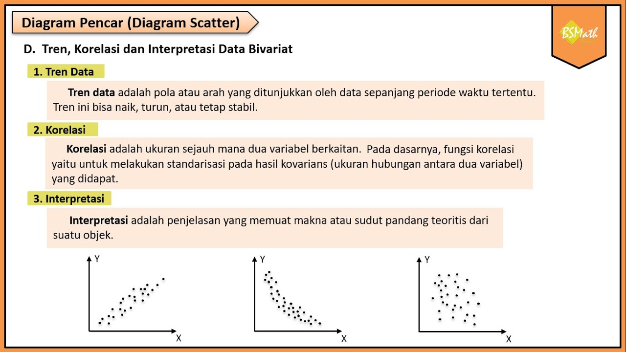
- 😀 Scatter plot data can be tightly clustered, loosely spread, or have no discernible pattern.
- 😀 Data trends in scatter plots can be linear (positive or negative), nonlinear (curved), or have no trend (random).
- 😀 Correlation measures the direction and strength of the relationship between two variables: positive, negative, or none.
- 😀 When creating a scatter plot, X represents the independent variable and Y represents the dependent variable.
- 😀 The process of plotting involves defining axes, determining scale, plotting points, and observing patterns.
- 😀 Trend lines or lines of best fit can be drawn manually but are more accurately determined using software like Excel.
- 😀 Interpreting a scatter plot involves analyzing patterns, trends, correlations, and drawing meaningful conclusions.
- 😀 An example given: increased time spent on social media may correlate positively with higher math scores, though multiple factors influence outcomes.
Q & A
What is bivariate statistics?
-Bivariate statistics is a branch of statistics that studies the relationship between two variables. Its purpose is to understand whether there is a correlation between the two variables.
What is the purpose of a scatter plot in bivariate statistics?
-The purpose of a scatter plot in bivariate statistics is to visually represent the relationship between two variables by plotting data points on a Cartesian plane. It helps to identify patterns, trends, and correlations between the variables.
What are the different types of data distribution in a scatter plot?
-The different types of data distribution in a scatter plot include: 1) Tightly packed distribution, where data points concentrate in a specific area, 2) Spread-out distribution, where data points are more dispersed, and 3) No pattern, where data points do not follow any specific trend.
What are the three types of data trends in a scatter plot?
-The three types of data trends are: 1) Linear trend, where data points follow a straight line (either positive or negative), 2) Nonlinear trend, where data points form a curve or bend, and 3) No trend, where the data is random and lacks a clear pattern.
How do you interpret the correlation between two variables?
-Correlation between two variables is interpreted based on whether the data points show a clear relationship. A positive correlation indicates that as one variable increases, the other also increases. A negative correlation indicates that as one variable increases, the other decreases. If there is no clear pattern, the variables are said to have no correlation.
What are the three types of correlation in bivariate statistics?
-The three types of correlation are: 1) Positive correlation, where both variables move in the same direction (e.g., both increase), 2) Negative correlation, where the variables move in opposite directions (e.g., one increases while the other decreases), and 3) No correlation, where there is no apparent relationship between the variables.
What are the steps to create a scatter plot?
-To create a scatter plot, you need to: 1) Collect data, 2) Determine the X and Y axes (X represents the independent variable and Y the dependent variable), 3) Choose a scale for each axis, 4) Plot the data points on the graph, and 5) Analyze the pattern to identify any trends or correlations.
What is the difference between X and Y variables in a scatter plot?
-In a scatter plot, the X variable is the independent variable that influences the Y variable, which is the dependent variable. The X axis typically represents the factor that is being manipulated or is the cause, while the Y axis shows the effect or outcome.
What is data interpretation in the context of a scatter plot?
-Data interpretation involves analyzing the pattern, trends, or correlations in the scatter plot. This can include identifying the type of trend (linear, nonlinear, or no trend) and understanding the relationship between the two variables based on how the data points are distributed.
How can Excel be used to approximate the best-fit line in a scatter plot?
-Excel can be used to approximate the best-fit line by creating a scatter plot and then adding a trendline. This trendline is the linear regression line that best represents the relationship between the variables, and Excel provides the equation for the line and the R-squared value, which shows how well the data fits the model.
Outlines

このセクションは有料ユーザー限定です。 アクセスするには、アップグレードをお願いします。
今すぐアップグレードMindmap

このセクションは有料ユーザー限定です。 アクセスするには、アップグレードをお願いします。
今すぐアップグレードKeywords

このセクションは有料ユーザー限定です。 アクセスするには、アップグレードをお願いします。
今すぐアップグレードHighlights

このセクションは有料ユーザー限定です。 アクセスするには、アップグレードをお願いします。
今すぐアップグレードTranscripts

このセクションは有料ユーザー限定です。 アクセスするには、アップグレードをお願いします。
今すぐアップグレード関連動画をさらに表示

Statistika Bivariat: Mengungkap Hubungan Dua Variabel!
Tren Data, Korelasi dan Interpretasi Data Bivariat | Matematika Wajib SMA Kelas XI Kurikulum Merdeka

Must know Visualization in Statistics | Descriptive Statistics | Ultimate Guide !! | Part 10

Menggambar Diagram Pencar Kelas XI Fase F Kurikulum Merdeka

Statistika 06 | Visualisasi Data dalam Statistika | Data Visualization | Belajar Statistika

Menggambar Diagram Pencar Secara Manual - Matematika Wajib SMA Kelas XI Kurikulum Merdeka
5.0 / 5 (0 votes)
