Create Netflix dashboard with Tableau in 30 minutes
Summary
TLDRThis tutorial walks through the process of creating an insightful Netflix dashboard using CSV data. It covers importing and analyzing Netflix movie and TV show data, with steps to create visualizations such as area charts, maps, and bar charts. The tutorial also includes formatting tips to align with Netflix's branding, applying filters for different data views, and building a dashboard that presents information on movies and TV shows by year, country, genre, rating, and more. The final product showcases various data points in an interactive and visually appealing format, with customization for personal preferences.
Takeaways
- 😀 Import the Netflix dataset using a CSV file, ensuring you have 12 fields and over 6,000 rows of data.
- 😀 Understand key fields in the dataset, such as type (movie or TV show), title, director, cast, release year, rating, duration, and description.
- 😀 Plot the number of movies and TV shows added to Netflix by year, using 'Date Added' in columns and 'Show ID' in rows, with a distinct count of IDs.
- 😀 Filter out null values for release year and adjust visual settings such as background color, gridlines, and text formatting to match Netflix's brand colors.
- 😀 Create a map visualization showing the distribution of movies and TV shows by country, with darker colors indicating more content in each country.
- 😀 Design a bar chart displaying the top 10 genres based on the number of movies and TV shows, using distinct count and sorting by show ID.
- 😀 Add percentages to the top 10 genre chart to visualize the proportion of each genre's share in the dataset.
- 😀 Create a distribution chart showing the percentage and total number of movies or TV shows based on their type (movie or TV show).
- 😀 Create separate worksheets for ratings, release years, and other key metrics like duration, with each field presented in a user-friendly format.
- 😀 Build a comprehensive dashboard combining all worksheets, including a title for each chart, formatting options like black background and red text, and space for filtering options.
- 😀 Customize the dashboard layout by adding elements like the Netflix logo, adjusting chart heights, and ensuring filters apply consistently across multiple visualizations.
Q & A
What is the first step in creating the Netflix dashboard?
-The first step is importing the CSV file containing the Netflix data. This is done by clicking on 'More' and locating the file on your system, then opening it.
What fields are included in the Netflix dataset?
-The Netflix dataset includes 12 fields such as show ID, type (movie or TV show), title, director, cast, date added, release year, rating, duration (for movies or TV shows), categories, and description.
How do you filter out null values in the dataset?
-You can filter out null values by dragging the 'year' field into the filters section, selecting 'omit null values,' and applying the filter.
How can you visualize the distribution of movies and TV shows over the years?
-You can create a visualization by placing the 'date added' field in columns, 'show ID' in rows, and using 'count distinct' as the measure. Then, use the 'type' field for color differentiation between movies and TV shows.
How do you customize the colors for movies and TV shows in the dashboard?
-You can customize the colors by clicking on 'Color' and selecting 'Edit Colors.' Then, assign dark red to movies and light red to TV shows.
What is the purpose of creating a map visualization in the dashboard?
-The map visualization shows the number of movies and TV shows released in each country. The color intensity indicates the number of releases, with darker colors representing more releases.
How do you create a map visualization for the countries?
-To create the map, double-click the 'Country' field, change the map type from 'Automatic' to 'Filled Map,' and drop the 'show ID' field into the 'Color' mark, using 'count distinct' as the measure.
How do you display the top 10 genres in the dashboard?
-To display the top 10 genres, use the 'Top 10' filter, select the genre field, and order by the count of distinct show IDs. Then, you can display the genres as horizontal bars.
How do you calculate the percentage distribution of movies and TV shows by type?
-You can calculate the percentage distribution by converting the visualization into a highlight table or packed bubbles. Then, use a quick table calculation to select 'percent of total' and show the percentage in the labels.
What is the process of adding ratings and description to individual movie details?
-To add ratings and descriptions, use filters to select the type (movie or TV show). Then, create separate views for description, rating, release year, and other details by duplicating fields and renaming them accordingly.
Outlines

このセクションは有料ユーザー限定です。 アクセスするには、アップグレードをお願いします。
今すぐアップグレードMindmap

このセクションは有料ユーザー限定です。 アクセスするには、アップグレードをお願いします。
今すぐアップグレードKeywords

このセクションは有料ユーザー限定です。 アクセスするには、アップグレードをお願いします。
今すぐアップグレードHighlights

このセクションは有料ユーザー限定です。 アクセスするには、アップグレードをお願いします。
今すぐアップグレードTranscripts

このセクションは有料ユーザー限定です。 アクセスするには、アップグレードをお願いします。
今すぐアップグレード関連動画をさらに表示
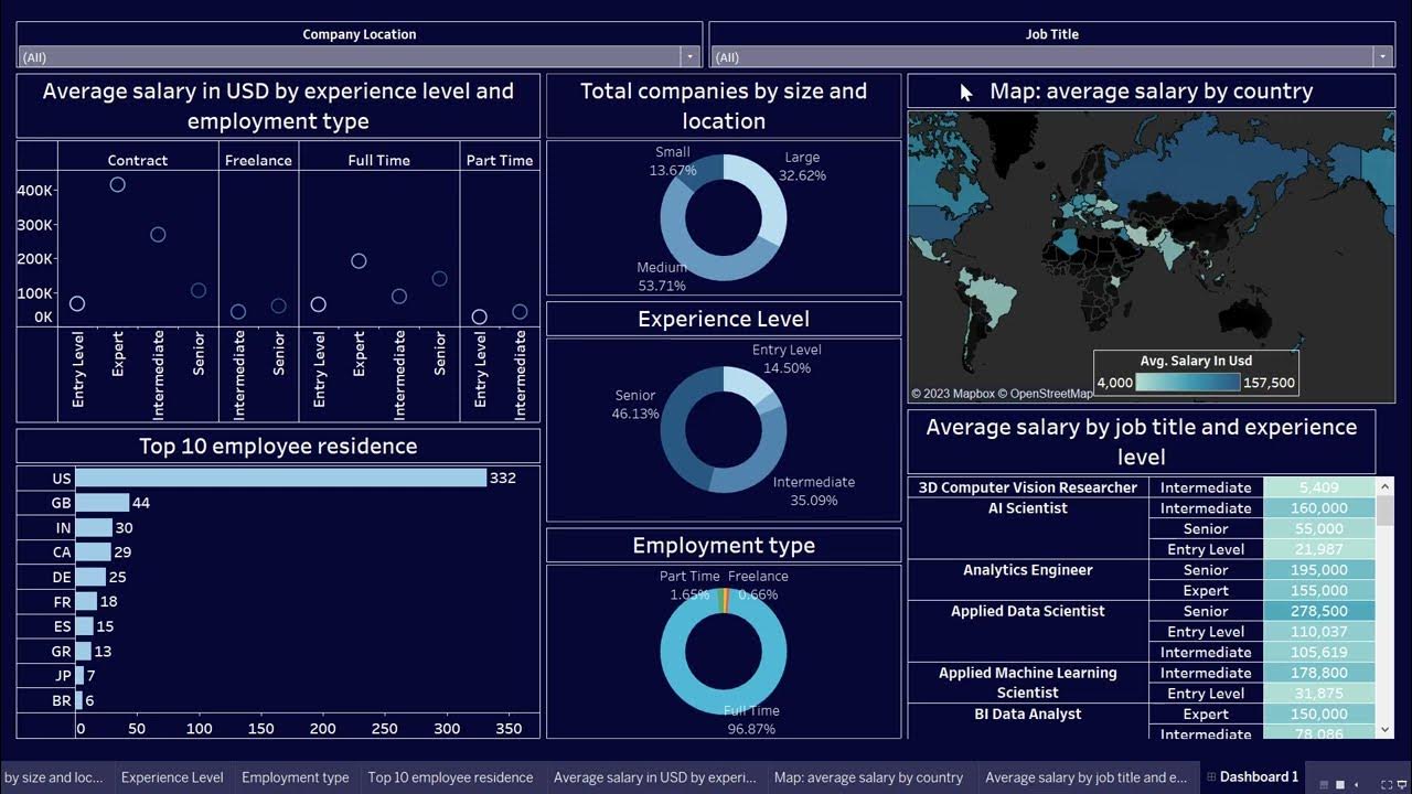
Create Data Science Jobs salaries dashboard with Tableau in 25 minutes

Olympic Data Analytics | Azure End-To-End Data Engineering Project | Part 2

Google Data Studio Tutorial 📊 - How to build a Dashboard with GDS

How I Built a ONE CLICK Excel Dashboard with ChatGPT 😎
Dashboard Visualisasi Budget Tracker di Looker Studio | Tutorial

Google Sheets - Dashboard Tutorial - Dynamic QUERY Function String - Part 3
5.0 / 5 (0 votes)
