UI Design Patterns | Part 5
Summary
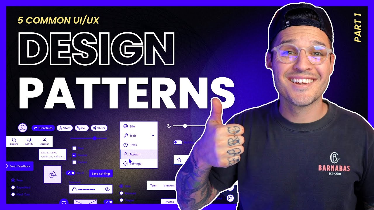
TLDRIn this video, the speaker explores five essential UI/UX design patterns every designer should know: modals, checkboxes, radio buttons, toast notifications, and sidebars. Each pattern is explained with examples, showing how they enhance user experience by offering functionality like quick actions (modals), multi-selection (checkboxes), binary choices (radio buttons), temporary feedback (toast notifications), and persistent navigation (sidebars). The video emphasizes the importance of integrating these common yet powerful patterns to improve design and usability across web and mobile applications.
Takeaways
- 😀 Modals are great for displaying additional information or actions without navigating away from the current screen.
- 😀 Checkboxes allow users to make multiple selections from a list, which is essential in tasks like bulk actions or form submissions.
- 😀 Radio buttons are used for making exclusive choices—only one option can be selected at a time from a group.
- 😀 Toast notifications are temporary pop-up banners that provide feedback to users, such as success or error messages, and disappear automatically.
- 😀 Sidebars are an effective way to present fixed, global navigation or contextual options, ensuring easy access to key content.
- 😀 Modals can improve user experience by enabling actions like form submissions or displaying information without page refresh.
- 😀 Checkboxes are commonly used in both mobile and web interactions and serve as a fundamental UI element.
- 😀 Radio buttons and toggles are different: radio buttons are for mutually exclusive choices, while toggles can be on or off, and checkboxes allow multiple selections.
- 😀 Toast notifications are designed to be non-intrusive and temporary, often disappearing after a few seconds or when dismissed by the user.
- 😀 Sidebars are versatile and can be placed either on the left or right, depending on the design context, providing users with quick access to global or situational navigation.
Q & A
What is the primary purpose of modals in UI design?
-Modals are used to display additional information or initiate actions without navigating away from the current page. They allow users to interact with content, such as filling out forms or receiving onboarding information, without interrupting their workflow.
How are checkboxes commonly used in UI design?
-Checkboxes allow users to select multiple options from a list, which is useful in situations like forms or bulk actions. They enable flexibility when a user needs to make more than one selection at a time.
How does a radio button differ from a checkbox in UI design?
-A radio button allows users to select only one option from a set, whereas a checkbox enables users to select multiple options. Radio buttons are typically used for exclusive choices, while checkboxes are for scenarios requiring multiple selections.
What is a toast notification, and when should it be used?
-A toast notification is a small, temporary banner that provides feedback to users, such as confirming an action or alerting them to an error. It appears briefly and automatically disappears, making it ideal for non-intrusive updates or notifications.
What is the difference between modals and toast notifications?
-Modals require user interaction and often involve actions like filling out forms, while toast notifications are temporary, passive alerts that provide feedback to the user without requiring direct engagement. Modals typically cover the screen, while toast notifications are smaller and disappear on their own.
Why are sidebars commonly used in UI design?
-Sidebars provide fixed navigation, offering users consistent access to global or contextual menu items. They improve usability by allowing quick navigation without disrupting the main content of the page, and they are commonly placed on the left or right side of the screen.
What is the advantage of using a modal for a payment form instead of redirecting to a new page?
-Using a modal for a payment form allows users to input their payment information without leaving the current page, preventing a page refresh and maintaining the flow of the user experience. It keeps the interaction seamless and efficient.
In what scenarios would you use a radio button over a checkbox?
-Radio buttons are used when a user must choose only one option from a set of exclusive choices, such as selecting a payment method or a subscription plan. If multiple selections are allowed, a checkbox should be used instead.
How do toast notifications enhance the user experience?
-Toast notifications enhance user experience by providing immediate, context-sensitive feedback without interrupting the user's workflow. They are especially useful for confirming actions, like successful submissions or errors, in a non-intrusive way.
What makes sidebars effective for navigation in UI design?
-Sidebars are effective because they provide persistent, accessible navigation elements. They allow users to quickly access different sections of a website or app without needing to navigate away from the current content, making the interface more user-friendly and efficient.
Outlines

このセクションは有料ユーザー限定です。 アクセスするには、アップグレードをお願いします。
今すぐアップグレードMindmap

このセクションは有料ユーザー限定です。 アクセスするには、アップグレードをお願いします。
今すぐアップグレードKeywords

このセクションは有料ユーザー限定です。 アクセスするには、アップグレードをお願いします。
今すぐアップグレードHighlights

このセクションは有料ユーザー限定です。 アクセスするには、アップグレードをお願いします。
今すぐアップグレードTranscripts

このセクションは有料ユーザー限定です。 アクセスするには、アップグレードをお願いします。
今すぐアップグレード5.0 / 5 (0 votes)


