Learn Excel Pivot Tables in 10 Minutes - A complete beginner's tutorial
Summary
TLDRIn this video, the presenter uses a playful analogy comparing raw data to potatoes, highlighting the transformative power of pivot tables in Excel. The tutorial walks through various techniques, including creating basic pivot tables, adding multiple fields, applying filters, sorting data, and using slicers for interactivity. Viewers also learn to create visually appealing reports, such as top product rankings and interactive pivot charts. The presenter demonstrates how to update pivot tables with new data, offering tips for efficient data management. This engaging and informative guide is perfect for those looking to master pivot tables in Excel.
Takeaways
- 😀 Pivot tables are like processed data, turning raw data (like potatoes) into valuable insights (like chips), making data analysis easier and more digestible.
- 😀 It's best practice to convert raw data into a table format before creating pivot tables, as this helps with future updates when new data is added.
- 😀 To create a pivot table in Excel, select your data, go to the Insert tab, and choose Pivot Table to begin structuring the report.
- 😀 Understanding the four key areas in the Pivot Table Field List (filters, columns, rows, and values) is essential to building a useful report.
- 😀 You can easily calculate total sales by sales person by dragging the relevant fields into the row and values areas of the pivot table.
- 😀 Formatting the numbers in your pivot table (e.g., to currency format) and applying a color scheme makes your report more readable and visually appealing.
- 😀 A multi-level pivot table allows you to break down data by different categories, such as showing total sales by both salesperson and geography.
- 😀 Filters in pivot tables allow you to focus on specific segments, such as viewing sales data only for one geography (e.g., New Zealand).
- 😀 Pivot tables allow you to filter and sort data to identify top products, like the top 10 products by number of customers, and customize the view accordingly.
- 😀 Interactive pivot tables can be created using slicers, which act as visual filters to instantly update the data based on your selection (e.g., by geography).
- 😀 Pivot charts, which integrate both pivot tables and charts, allow for dynamic and visual representation of data, and can also be made interactive using slicers.
Q & A
What is the analogy used in the script to explain raw data and pivot tables?
-The script compares raw data to raw potatoes, which cannot be consumed as they are. Similarly, raw data cannot be directly used for insights. But once processed, just like raw potatoes can be turned into fries or chips, raw data can be transformed into valuable insights through pivot tables.
What is the first step in creating a pivot table in Excel?
-The first step is to select all your data and then go to the 'Insert' tab and click on 'Pivot Table'. This will open a dialog box where you can specify the range of cells for the pivot table.
Why is it recommended to convert data into a table before creating a pivot table?
-Converting data into a table first helps when updating pivot tables with new data in the future. It allows for dynamic range referencing, making the process smoother when the data is updated.
What are the four key areas in the Pivot Table Field List?
-The four key areas in the Pivot Table Field List are Filters, Columns, Rows, and Values. These are used to organize and manipulate the data in the pivot table.
How do you format a pivot table to display currency values?
-To format a pivot table to display currency values, right-click on any of the numbers in the pivot table, select 'Number Format', and choose the 'Currency' format from the options.
What is a multi-level pivot table, and how can you create one?
-A multi-level pivot table is one that displays multiple levels of data. For example, by adding both 'Salesperson' and 'Geography' to the Rows area, you create a multi-level pivot table that shows the sales performance by salesperson and geography.
How can you filter data in a pivot table for a specific geography?
-You can filter data in a pivot table for a specific geography by adding the 'Geography' field to the Filters area. This will give you a drop-down filter on top of the pivot table, allowing you to select a specific geography.
What is the purpose of using the 'Top 10' filter in pivot tables?
-The 'Top 10' filter allows you to display only the top N items based on a specified metric, such as the top 10 products by number of customers or sales amount. This helps in focusing on the most significant data points.
What is a slicer in Excel, and how does it enhance pivot tables?
-A slicer is a visual filter that allows you to interactively filter data in a pivot table. It creates a floating box that you can click on to filter the data, providing a more dynamic and user-friendly way to view and analyze pivot table data.
How do you create an interactive pivot chart, and what makes it useful?
-To create an interactive pivot chart, you first insert a pivot chart from the 'Insert' tab. Then, add a slicer to the pivot table, which makes the chart interactive by allowing users to filter the data based on categories like geography or salesperson.
Outlines

このセクションは有料ユーザー限定です。 アクセスするには、アップグレードをお願いします。
今すぐアップグレードMindmap

このセクションは有料ユーザー限定です。 アクセスするには、アップグレードをお願いします。
今すぐアップグレードKeywords

このセクションは有料ユーザー限定です。 アクセスするには、アップグレードをお願いします。
今すぐアップグレードHighlights

このセクションは有料ユーザー限定です。 アクセスするには、アップグレードをお願いします。
今すぐアップグレードTranscripts

このセクションは有料ユーザー限定です。 アクセスするには、アップグレードをお願いします。
今すぐアップグレード関連動画をさらに表示

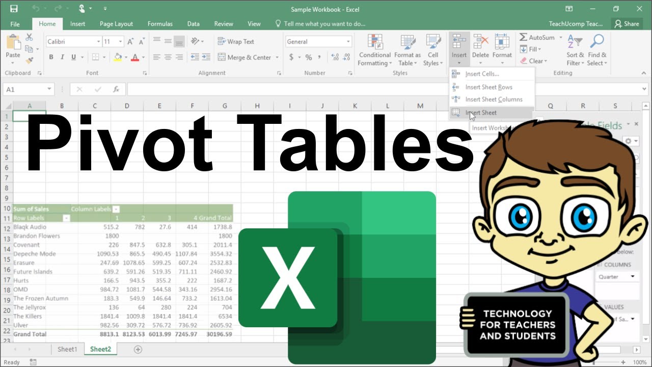
Advanced Excel - Creating Pivot Tables in Excel

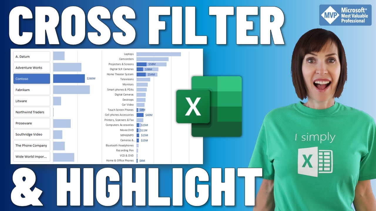
Cross Filter and Highlight Excel Charts like Power BI

How Business Analysts Use Excel - Business Analysis Software Tutorial

pivot table for beginners in excel in Hindi | pivot table excel in hindi

Excel Pivot Table EXPLAINED in 10 Minutes (Productivity tips included!)

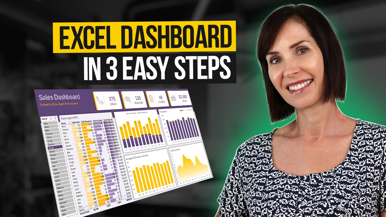
Interactive Excel Dashboard Tutorial in 3 Steps (+ FREE Template)
5.0 / 5 (0 votes)
